Designing a 16:9 banner in Photoshop is straightforward once you separate aspect ratio from resolution and lock in a reliable workflow. This guide compiles exact sizes, a clean Photoshop setup, and export/delivery tips so your banners look sharp across devices and platforms. Use it as a checklist or build a reusable template you can scale from 720p to 4K.
16:9 Photoshop Banner Guide: Sizes, Setup, and Template Options (Download or DIY)
If you typed “ratio of 16:9 photoshop banner donload” searching for the right dimensions and a solid workflow, you’re in the right place. This guide covers why 16:9 matters, exact sizes to use, step-by-step Photoshop setup, best practices, reusable templates, pro exports, responsive delivery, and platform-specific specs—plus pitfalls to avoid.
---
Why 16:9 Matters
The 16:9 aspect ratio is a width-to-height relationship used almost everywhere screens live. It’s the standard for:
YouTube thumbnails and channel art
Website hero images and billboard banners
Presentation slides (widescreen)
Twitter/X in-stream images
Many digital signage panels and TVs
Aspect ratio vs resolution:
Aspect ratio: the shape (e.g., 16:9), independent of size.
Resolution: actual pixels (e.g., 1920×1080). Many resolutions can share the same 16:9 shape.
Choose an aspect ratio first (the shape), then pick a resolution that fits your use case and performance constraints.
---
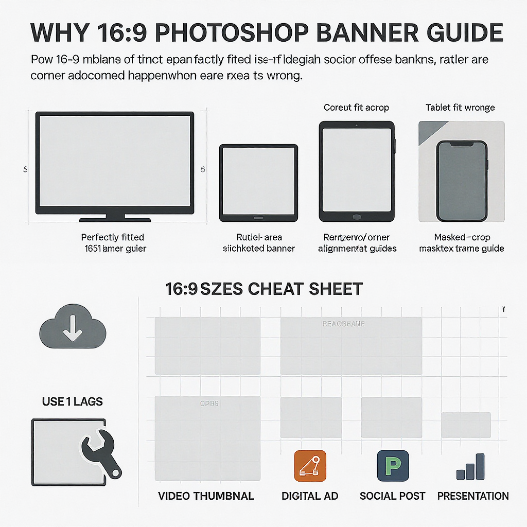
Exact 16:9 Sizes Cheat Sheet (and When to Use Each)
Size (px)
Common Name
Good For
Notes
2×/HiDPI Target
1280×720
HD / 720p
YouTube thumbnails; lightweight hero images
Balanced quality and bandwidth for mobile
2560×1440
1600×900
—
Twitter/X in-stream; mid-size site banners
Popular social-safe middle ground
3200×1800
1920×1080
Full HD / 1080p
Website heroes; presentations; TV displays
Great default for desktop hero sections
3840×2160
2560×1440
QHD / 1440p
YouTube channel art; hi-res hero banners
Extra detail on high-density displays
5120×2880
3840×2160
4K / UHD
Large screens; premium sites; cropping source
Heavy; pair with CDN/responsive delivery
—
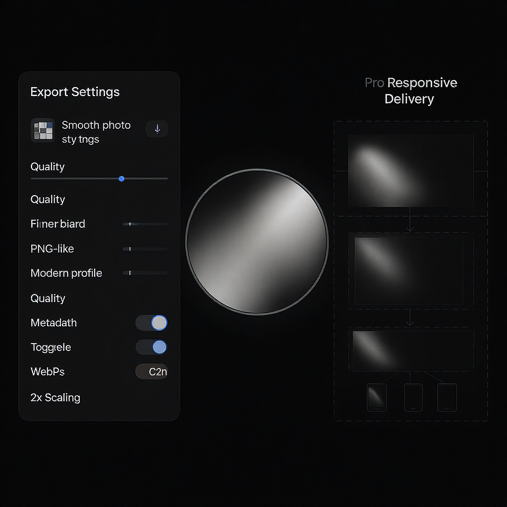
HiDPI guidance:
Export 2× variants for retina where it makes sense (e.g., 1920×1080 main, 3840×2160 @2×).
Use responsive images to serve the right size per device (details below).
---
Photoshop Setup Step-by-Step
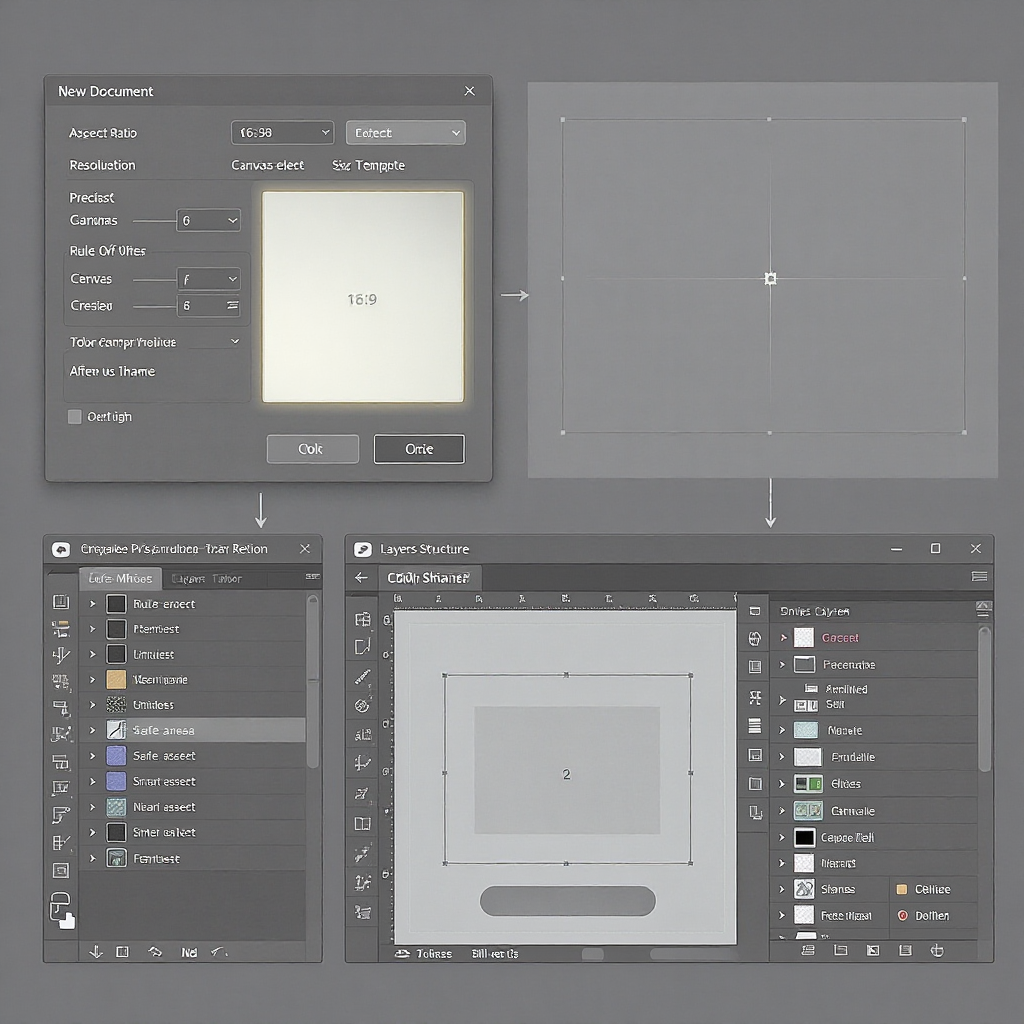
Create a new 16:9 document
File > New.
Units: Pixels.
Width × Height: pick from the cheat sheet (e.g., 1920×1080).
Orientation: Landscape.
Color management
Color Profile: sRGB IEC61966-2.1 for web/social.
Bit Depth: 16-bit while editing to reduce banding; you can export 8-bit.
Resolution (PPI)
For web: PPI doesn’t affect on-screen size; pixel dimensions do. 72–300 PPI is fine.
For print: set inches/cm and 300 PPI to reach sufficient pixels at 16:9 (e.g., 10"×5.625" at 300 PPI = 3000×1688 px).
Add guides and safe areas
View > New Guide Layout. Add uniform margins (e.g., 5–10%) as a “safe text zone.”
YouTube channel art special case (2560×1440):
Safe text/logo area is 1546×423 centered.
Draw a 1546×423 rectangle layer, center it (Align Horizontal & Vertical Centers).
View > New Guides from Shape to turn it into guides.
Keep text inside these guides.
Use Artboards for multiple sizes
File > New > Artboards or Layer > New > Artboard.
Create artboards for 1280×720, 1920×1080, 2560×1440, etc., sharing common assets.
Valid license, font list, and links to free/paid font sources.
Guide presets for YouTube safe zones and general text margins.
Safe import of third-party assets:
Run a virus scan on archives.
Replace embedded stock previews with your licensed imagery.
Sync fonts via Adobe Fonts or install properly licensed TTF/OTF.
Quality checklist before using a template:
Are text zones inside platform-specific safe areas?
Are layers named and grouped logically?
Is the color profile sRGB, and are colors consistent with brand swatches?
Do Smart Objects exist for hero imagery and logos?
Do exports stay sharp at target sizes?
---
Platform-Specific Specs and Common Pitfalls
YouTube Thumbnail: 1280×720; under 2 MB; 16:9 preferred.
YouTube Channel Art: 2560×1440; safe area 1546×423 centered. Keep all critical text/logos within that safe box to avoid TV/mobile cropping.
Twitter/X In-Stream Image: 1600×900 recommended; ensure key content is centered to survive trims in various views.
Website Hero Sections: Commonly 16:9; validate across popular breakpoints (e.g., 1440, 1280, 1024, 768, 390 px widths).
Watch out: Many ad placements are not 16:9—e.g., 1200×628 (≈1.91:1) on Facebook/Twitter ads. Don’t repurpose a 16:9 without re-layout; otherwise, auto-cropping will clip text.
---
Troubleshooting
Blurry or soft exports:
Start from higher resolution (e.g., 2× master); downscale with Bicubic Sharper.
Apply light Smart Sharpen after resizing.
Color shifts between Photoshop and browser:
Ensure sRGB IEC61966-2.1 is embedded/converted on export.
Disable wide-gamut previews when targeting standard displays.
Black bars/pillarboxing:
Match the container’s aspect ratio or use object-fit: cover or background-size: cover.
Maintaining aspect ratio on resize:
In Photoshop, hold Shift while transforming Smart Objects to constrain proportions.
On the web, enforce aspect-ratio CSS property when helpful:
.banner { aspect-ratio: 16 / 9; }
Oversized files:
Switch JPEG to WebP, reduce quality slightly (e.g., 80 → 70), and strip metadata.
Simplify heavy gradients or add subtle noise to allow better compression.
Gradient banding:
Work in 16-bit, add 0.5–1% monochromatic noise, consider a gentle overlay gradient.
Text clipped on smaller screens:
Keep CTAs and headlines within conservative safe margins (8–10%).
Test across breakpoints and in-platform previews (YouTube/X).
---
Final Takeaway
Decide the 16:9 resolution based on platform and performance, build a clean Photoshop template with guides and Smart Objects, and export sRGB-optimized images with responsive delivery. Whether you “download” a premade PSD or DIY, a thoughtful setup ensures sharp, on-brand banners that survive real-world crops and load fast.
Summary
Pick the 16:9 size that fits your platform, then design within safe areas using organized layers, guides, and Smart Objects.
Export in sRGB with efficient formats (WebP/JPEG), then serve responsively to match device capabilities.
Validate platform-specific specs and test across breakpoints to avoid crops, color shifts, and performance issues.