4:5 Aspect Ratio in Pixels: A Complete Guide for Social, Web, and Print
Master the 4:5 aspect ratio: pixel math, sizes, platform limits, and best practices for composition, export, and responsive use on social, web, and print.
Choosing the right aspect ratio can dramatically affect how your visuals perform across social media, the web, and print. This guide focuses on the 4:5 portrait ratio, outlining the math, common pixel sizes, platform rules, and best practices for composition, export, and implementation. Use it as a practical reference for design, marketing, development, and photography workflows.
4:5 Aspect Ratio in Pixels: A Complete Guide for Social, Web, and Print
The 4:5 aspect ratio is everywhere once you start looking—especially in social feeds. It’s a portrait orientation that’s taller than square but shorter than a full vertical (9:16), striking a great balance between screen coverage and readability. This guide demystifies 4:5 for designers, marketers, developers, and photographers—from pixel math to platform limits, composition, export settings, and responsive implementation.
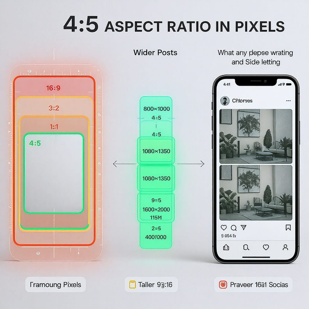
What 4:5 means and when to use it
- Definition: 4:5 means width:height = 4:5. If your width is 4 units, your height is 5 units.
- Orientation: Portrait (taller than it is wide).
- Where it shines:
- Social feeds (Instagram in particular): maximizes screen real estate without being truncated.
- Attention-rich layouts: editorial features, newsletter hero images, and product spotlights.
- Photography prints: 8×10" and 16×20" are 4:5 ratios.
Use 4:5 when you want stronger presence in feeds than a square, but without the awkward crops and readability issues that can come with 9:16 in non-Story contexts.
Pixel math made simple
- Ratio: 4:5 = 0.8 (width/height)
- Formulas:
- height = width × 1.25 (5/4)
- width = height × 0.8 (4/5)
Worked examples:
- 1080 × 1350 (Instagram feed classic)
- 1200 × 1500
- 1600 × 2000
- 2048 × 2560
- 2160 × 2700
- 2400 × 3000
Quick helper (JavaScript):
function size4by5({ width, height }) {
  if (width && !height) return { width, height: Math.round(width * 1.25) };
  if (!width && height) return { width: Math.round(height * 0.8), height };
  throw new Error("Provide exactly one dimension: width or height");
}

// Examples:
size4by5({ width: 1080 }); // { width:1080, height:1350 }
size4by5({ height: 2000 }); // { width:1600, height:2000 }
Common 4:5 pixel sizes and when to use them
| Pixels (W×H) | Use case | Notes |
|---|---|---|
| 1080×1350 | Instagram feed/ads, LinkedIn feed | Baseline social portrait size; compact file sizes |
| 1200×1500 | Pinterest tests, Facebook feed | Flexible across platforms; room for text |
| 1600×2000 | Web hero modules, content hubs | Good for moderate desktop display |
| 2048×2560 | Facebook “High Quality” uploads | Reduces heavy recompression on FB |
| 2160×2700 | HiDPI 2× source for 1080×1350 | Sharper on retina devices via srcset |
| 2400×3000 | 8×10" print at 300 DPI | Print-ready master |
Platform-ready sizes and limits
Platforms evolve, but these guidelines are stable and widely used:
| Platform | Recommended 4:5 size | Aspect tolerance | File type & size | Notes |
|---|---|---|---|---|
| Instagram (Feed/Ads) | 1080×1350 | 1.91:1 to 4:5 (portrait max 4:5) | JPG/PNG; ads up to ~30 MB; organic compressed | Taller than 4:5 is cropped in feed; grid thumbnails crop to square |
| Facebook (Feed/Ads) | 1200×1500 or 2048×2560 | Up to 4:5 in feed | JPG/PNG; ads up to ~30 MB | Upload larger (e.g., 2048 long side) to reduce compression |
| LinkedIn (Feed/Ads) | 1200×1500 or 1080×1350 | Portrait up to ~4:5 supported | JPG/PNG; ads commonly ≤5–10 MB | Tall images show well on mobile; captions truncate early |
| 1000×1250 (4:5) | Best: 2:3; >2:3 may be truncated | JPG/PNG; up to large sizes, compressed | 4:5 can work but 2:3 often performs better in feed |
Tip: Always preview after upload. Some contexts (e.g., link shares, carousels) may auto-crop differently than single-image posts.
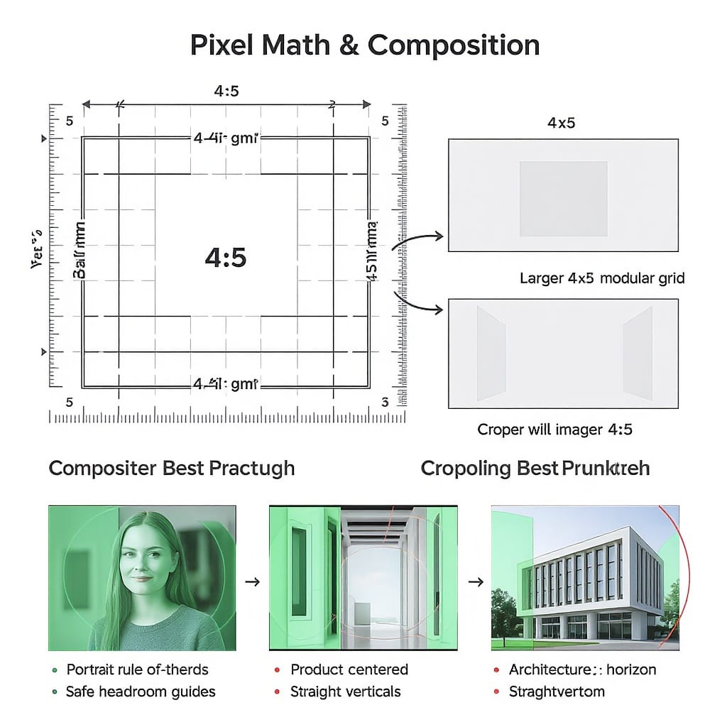
Composition and cropping best practices for 4:5
- Keep a safe margin: Reserve 5–10% padding inside edges for logos and text to survive auto-crops or UI overlaps.
- Subject placement: Keep faces/eyes on the upper third; avoid kissing the top edge.
- Use a simple grid: A 3×3 grid (rule of thirds) or a center-weighted grid works well for products and portraits.
- Negative space: Embrace whitespace/flat backgrounds for readability and ad overlays.
- Test crop variants: Simulate 1:1 (square) and 9:16 crops from your 4:5 master to ensure essential content remains visible in alternate placements.
- Consistent borders: If using frames or drop shadows, keep them thick enough (≥4–8 px at 1080 width) to withstand platform compression.
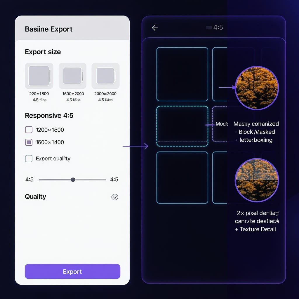
Quality and export settings
- File formats:
- JPEG: Best for photos. Use high quality (80–85) with MozJPEG for smaller files without banding.
- PNG: Use for UI, text, flat colors. Consider PNG-8 for limited palettes.
- WebP/AVIF (web): Smaller at similar quality; provide fallbacks.
- Color:
- Convert to and embed sRGB for consistent display.
- Avoid wide-gamut exports for the open web unless you control the rendering pipeline.
- Compression targets:
- Aim for 150–400 KB for a 1080×1350 JPEG without visible artifacts (varies by image complexity).
- For gradients, add slight noise or dither to prevent banding.
- Sharpening:
- For web: Unsharp Mask around Amount 50–100%, Radius 0.3–0.6, Threshold 0–2 (tune per image).
- Metadata:
- Keep ICC profile; strip heavy EXIF unless needed. Ensure correct orientation before stripping.
- Prevent recompression:
- Upload at platform-native resolutions (e.g., 1080×1350 to Instagram, 2048 long side to Facebook) to avoid server-side resizing that adds artifacts.
Responsive design: implementing 4:5 on the web
Use modern CSS so layout is stable before the image loads.
HTML:
CSS:
.portrait {
  display: block;
  aspect-ratio: 4 / 5;     /* reserves space; no CLS */
  overflow: hidden;
  border-radius: 12px;
  background: #f6f6f6;     /* skeleton background */
}
.portrait > img {
  width: 100%;
  height: 100%;
  object-fit: cover;        /* fills 4:5 box without distortion */
}
If you need a fixed 4:5 crop from a larger image:
.figure-4by5 {
  aspect-ratio: 4 / 5;
}
.figure-4by5 img {
  width: 100%; height: 100%;
  object-fit: cover;        /* center-crop */
  object-position: 50% 40%; /* bias toward upper face/eyes */
}
Photography and print crossover
- Pixels to inches:
- px = inches × DPI
- 8×10" @ 300 DPI = 2400×3000 px
- 16×20" @ 300 DPI = 4800×6000 px
- 8×10" @ 240 DPI = 1920×2400 px (lighter files, still good quality)
- 4:5-friendly print sizes: 8×10, 16×20, 12×15, 4×5 inches.
- Cropping from camera formats:
- 3:2 (most DSLRs): You’ll trim more from the long side to reach 4:5—compose with extra headroom.
- 4:3 (many phones): Slight crop; easier to convert to 4:5 while preserving subject.
- Framing tips:
- Leave breathing room at the top for matting.
- If printing borderless, account for slight printer overfill; keep key details ≥3–5 mm inside the edge.
When to choose 4:5 vs 1:1, 3:4, 2:3, or 9:16
- 4:5: Maximum portrait height in many feeds (esp. Instagram) without truncation; strong impact with good readability.
- 1:1 (square): Safest, consistent across platforms; less screen coverage.
- 3:4: Slightly taller than square; useful for galleries and listings that feel too cramped at 4:5.
- 2:3: Native to many cameras; ideal for prints like 12×18", but feels a bit narrow in feeds.
- 9:16: Best for Stories/Reels/TikTok; in standard feeds it’s often masked or cropped. Text can feel cramped in feed contexts.
Algorithmic and auto-crop behaviors vary. If you rely on head detection or auto-centering, 4:5 gives more vertical room while keeping text legible.
Workflow and tools
- Photoshop:
- Crop Tool (C) → Ratio → enter 4 and 5 → set composition → Export As… (sRGB, JPEG Quality ~80).
- Batch: Create an Action for resize/crop to 1080×1350 and run via File → Automate → Batch.
- Lightroom Classic:
- Develop → Crop Overlay (R) → Aspect → 4×5/8×10.
- Export presets for 1080×1350 (long edge 1350 px, sRGB, JPEG 80).
- Figma:
- Frames at 4:5 (e.g., 1080×1350). Use “Fill → Crop” and constraints. Export @1x, @2x as JPG/WebP.
- Canva:
- Create design with custom size 1080×1350 or 1200×1500. Use bleed guidelines if printing.
- ImageMagick (batch center-crop to 4:5 and resize):
mogrify -path out -format jpg -filter Lanczos ^
  -resize 1080x1350^ -gravity center -extent 1080x1350 ^
-strip -quality 85 *.jpg- Naming conventions:
- filename-1080x1350.jpg
- filename-2160x2700@2x.jpg
- campaign-ig-portrait-1080x1350.webp
FAQs and troubleshooting
- Why did my 4:5 image get cropped on a platform?
- Some placements enforce different masks (e.g., carousels, link previews). Ensure the placement supports 4:5; otherwise provide alternates (1:1, 1.91:1) or use safe margins.
- Can I post 4:5 video?
- Many feeds accept 4:5 video. For Stories/Reels/TikTok, use 9:16. On feeds that limit portrait height, 4:5 is the tall maximum.
- DPI for web—does it matter?
- No. Browsers use pixels, not DPI. For print, DPI matters; for web, pixel dimensions and compression control quality.
- My upload looks soft/pixelated. Fixes?
- Export at platform-native sizes (e.g., 1080×1350).
- Use sRGB and moderate JPEG quality (80–85).
- Apply subtle output sharpening after resizing.
- Avoid re-saving compressed images; always export from a clean master.
- Upscaling without artifacts?
- Prefer AI/super-resolution tools or high-quality Lanczos resampling. Upscale modestly (≤2×) and re-sharpen lightly.
- Banding in gradients?
- Add slight noise (1–2%), use higher quality JPEG or switch to WebP/AVIF. Keep everything in sRGB.
TL;DR
- 4:5 aspect ratio in pixels is width:height = 4:5. Use height = width × 1.25.
- Go-to sizes: 1080×1350 for social; 2048×2560 for FB high quality; 2400×3000 for 8×10" print.
- Embed sRGB, compress thoughtfully, and leave safe margins.
- On the web, use aspect-ratio: 4 / 5 with object-fit: cover and responsive srcset.
- For social impact without messy crops, 4:5 is a reliable, high-performing choice.
Summary
The 4:5 aspect ratio delivers maximum portrait presence in mainstream feeds while remaining versatile for websites and common print sizes. Calculate dimensions with height = width × 1.25, export in sRGB at platform-native resolutions, and keep safe margins to protect key content. For the web, combine aspect-ratio with responsive srcset to maintain layout stability and crisp rendering.