4:5 in Pixels: The Complete Guide (Examples, Formulas, Instagram Sizes)
Master the 4:5 aspect ratio in pixels with quick formulas, ready-to-use sizes, Instagram tips, and practices to avoid cropping, distortion, and compression.
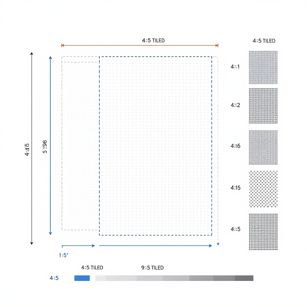
This guide is a practical reference to the 4:5 aspect ratio: what it means in pixels, how to calculate sizes quickly, and where it shines. You’ll find ready-to-use dimensions, conversion formulas, platform recommendations, and workflow tips for both design and code. Use it to prevent cropping, distortion, and surprise compression across apps.
4:5 in pixels — quick answer and examples
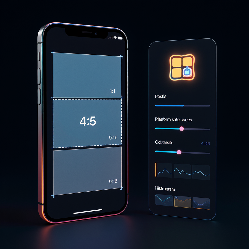

4:5 is an aspect ratio. It means width:height. When you see 4:5 in pixels, you’re looking for pixel dimensions that keep that proportion. The fast rule:
- Height = Width × 1.25
- Or equivalently, Height = Width × 5/4
Common 4:5 pixel pairs you can use right away:
- 800 × 1000
- 960 × 1200
- 1024 × 1280
- 1080 × 1350
- 1200 × 1500
- 1280 × 1600
- 1600 × 2000
- 2000 × 2500
- 2400 × 3000
Quick formula
H = W × 5/4
W = H × 4/5
If you’re posting to Instagram portrait, 1080 × 1350 is the most common choice and the maximum feed height Instagram fully shows without a tap.
What aspect ratio really means
Aspect ratio describes the shape, not the size. It’s the proportional relationship between width and height.
- 4:5 (portrait): Taller than it is wide. Great for mobile feeds because it fills more vertical screen space without being cut off.
- 1:1 (square): Balanced and versatile. Easy to reuse across platforms but less screen real estate than 4:5 on phones.
- 9:16 (vertical story/reel): Very tall. Perfect for Stories, Reels, TikTok, Shorts. Overflows in feeds unless cropped.
Why choose 4:5?
- Max visibility in mobile feeds (especially Instagram) without truncation.
- Natural fit for portraits, product shots, and carousels.
- Easy to print as 8×10 inches (same ratio).
Conversion formulas and quick math
Think of 4:5 as the fraction 4/5. It’s already reduced (simplest form). To convert between width and height:
- Width to height: H = W × 5/4 = W × 1.25
- Height to width: W = H × 4/5 = H × 0.8
Examples:
W = 1080 → H = 1080 × 1.25 = 1350
H = 2000 → W = 2000 × 0.8 = 1600
Scaling without quality loss:
- To scale the ratio, multiply both sides by the same factor k.
- 4:5 → (4k):(5k). Example: k=300 → 1200×1500.
- Resizing down (to fewer pixels) reduces file size; quality stays crisp if you export well.
- Resizing up from a small original can look soft. Capture or design at or above your target size when possible.
Tip: When in doubt, pick a width that’s divisible by 4 so the math lands on whole pixels.
Use cases where 4:5 shines
- Instagram portrait posts and carousels: 1080 × 1350 is the go-to.
- 8×10 inch photo prints: Exactly the same ratio as 4:5 (8:10 reduces to 4:5).
- Vertical ads: Eye-catching in feeds without awkward cropping.
- Portfolio shots: People, fashion, food, and product photography look strong in 4:5.
- Product imagery: Fits e-commerce thumbnails that allow portrait crops while remaining print-ready as 8×10.
Platform recommendations and safe specs
Below are practical recommendations that work well today. Always check the platform’s current spec pages, as limits and compression behaviors can change.
| Platform | Recommended 4:5 Size | Accepts 4:5 in Feed? | Preferred Formats | Notes |
|---|---|---|---|---|
| Instagram (Feed) | 1080 × 1350 | Yes | JPEG (sRGB), PNG | 1080 × 1350 is the max portrait size fully shown; keep text in safe margins. |
| Instagram (Carousel) | 1080 × 1350 | Yes | JPEG (sRGB), PNG | All slides must share the same aspect ratio. Export consistent dimensions. |
| Facebook (Feed) | 1200 × 1500 or 1080 × 1350 | Yes | JPEG (sRGB), PNG | Facebook accepts portrait images; compression varies. Use high-quality JPEG. |
| LinkedIn (Feed) | 1200 × 1500 | Yes | JPEG (sRGB), PNG | Good balance of clarity and size. Keep file sizes moderate for faster loading. |
| 1000 × 1250 or 1200 × 1500 | Yes | JPEG (sRGB), PNG | Portrait pins perform well; 2:3 is also common, but 4:5 works in many contexts. |
General notes
- Color profile: sRGB for web platforms.
- File sizes: Keep exports efficient (often under a few MB) to avoid heavy compression and speed up uploads.
- Always verify current docs: platforms occasionally adjust supported sizes and handling.
Quick reference chart (no table)
Widths → heights at 4:5:
- 640 → 800
- 720 → 900
- 800 → 1000
- 1000 → 1250
- 1080 → 1350
- 1200 → 1500
- 1440 → 1800
- 1600 → 2000
- 2000 → 2500
- 2160 → 2700
- 2400 → 3000
How to resize without distortion
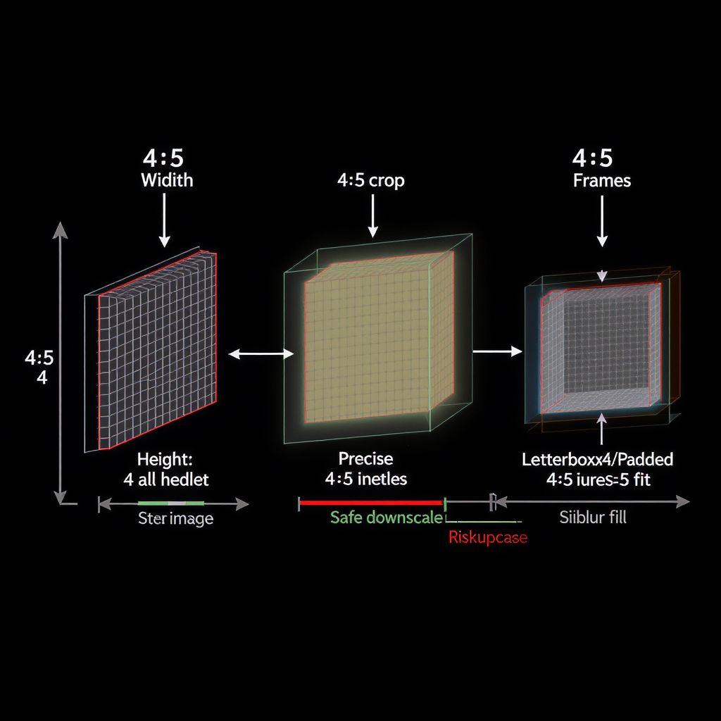
- Lock the aspect ratio:
- In Photoshop: Use the crop tool with “Ratio” set to 4:5, or Image Size with the chain/link icon enabled.
- In Figma/Canva: Set dimensions with constraint lock on; use a 4:5 frame for design.
- Crop vs. pad (letterbox/pillarbox):
- Crop if you can lose edges without harming the composition.
- Pad (add canvas space) with background color or blur when you must keep everything visible.
- Keep a safe area for text and logos:
- Leave ~5–7% padding on all sides to avoid UI overlays and trims in different apps.
- Export at target dimensions:
- If posting to Instagram portrait, export exactly 1080 × 1350.
- For print, export at calculated pixel size (see PPI tips below).
- Sharpen after downscaling:
- Apply a mild output sharpening to recover crisp edges after resizing smaller.
Pro tip workflow
- Start with the highest quality source.
- Crop to 4:5.
- Resize to your exact output size.
- Apply gentle sharpening.
- Export in sRGB with appropriate compression.
Design and print tips
- Photoshop:
- Export As → JPEG Quality 70–85 for web; Convert to sRGB checked.
- For PNG, use when you need transparency or flat graphics; otherwise prefer JPEG/WebP for photos.
- Figma:
- Use Frames at 1080 × 1350 or 1200 × 1500. Export @1x (PNG/JPEG) or WebP for smaller files.
- Canva:
- Set custom size to 1080 × 1350. Download as JPG quality ~80–90 or PNG for graphics.
- Color profile:
- sRGB for all web/social uploads to avoid dull or shifted colors.
- Print resolution:
- Use 240–300 PPI for high-quality prints.
- 8×10 inch print at 300 PPI = 2400 × 3000 px.
- 8×10 at 240 PPI = 1920 × 2400 px.
- Formula:
- Pixels = Inches × PPI
- Example: 10 inches × 300 PPI = 3000 pixels (height for the 10″ side in a 4:5 print is 3000 px; width is 8 × 300 = 2400 px).
Developer notes
Make 4:5 responsive without stretching:
CSS container with intrinsic ratio:
.card {
  aspect-ratio: 4 / 5;
  width: min(100%, 540px); /* cap width if desired */
  border-radius: 12px;
  overflow: hidden;
  background: #f6f6f6;
}

.card > img {
  width: 100%;
  height: 100%;
  object-fit: cover;   /* fill without distortion; crops excess */
  object-position: center;
}
Preserve image proportions in fixed areas:
.thumb {
  width: 240px;
  height: 300px;      /* 4:5 */
  overflow: hidden;
}
.thumb img {
  width: 100%;
  height: 100%;
  object-fit: contain; /* show all of the image, may letterbox */
  background: #fff;
}
High-DPI crispness with srcset
Or using sizes for responsive widths:
Quick conversion helpers:
// 4:5 conversions
const heightFromWidth = w => Math.round(w * 5 / 4);
const widthFromHeight = h => Math.round(h * 4 / 5);

// Examples:
heightFromWidth(1080); // 1350
widthFromHeight(2000); // 1600
Accessibility and layout tips
- Always include width/height attributes or an aspect-ratio to prevent layout shift.
- Use object-fit: cover for edge-to-edge visuals; object-fit: contain for galleries where the full image must be visible.
- Prefer WebP/AVIF (with fallbacks) for smaller payloads where supported.
FAQ quick hits
- Is 4:5 the same as 8×10? Yes. 8:10 reduces to 4:5, so they’re identical shapes.
- What’s the best Instagram portrait size? 1080 × 1350.
- Can I use 1200 × 1500 instead? Yes. Instagram will downscale as needed; keep sRGB and moderate compression.
- Will 4:5 crop in the feed? No, 4:5 is fully shown in the Instagram feed without a tap.
- Print-ready at 300 PPI for 8×10? Export 2400 × 3000 pixels.
Summary
4:5 in pixels means width:height where height is 1.25× the width. For social posts, 1080 × 1350 is the sweet spot; for print, 8×10 inches maps directly to 2400 × 3000 at 300 PPI. Lock the aspect ratio, choose crop or padding wisely, export in sRGB, and use responsive 4:5 containers with CSS aspect-ratio and object-fit.

