4:5 Resolution Explained: Pixel Sizes, Use Cases, and How to Export Perfect 4:5 Images
Learn what 4:5 really means, see common pixel sizes, and get export settings for Instagram and print. Includes DPI/PPI math, use cases, and sharpness tips.
4:5 Resolution Explained: Pixel Sizes, Use Cases, and How to Export Perfect 4:5 Images

If you create for Instagram, design mobile-first layouts, or print classic 8×10 portraits, you run into the 4:5 resolution a lot. But “4:5” is not a fixed pixel size—it’s an aspect ratio. This guide demystifies 4:5 with practical math, export settings, and composition tips so your images look razor-sharp everywhere.
What 4:5 Really Means
Aspect ratio vs. pixel dimensions:
- Aspect ratio describes shape, not size. 4:5 means width:height = 4:5.
- Any pixel dimensions that reduce to 4:5—like 1080×1350 or 4000×5000—are valid 4:5.
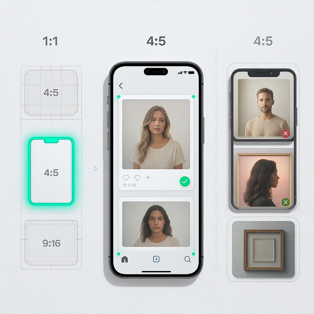
- Portrait orientation: 4:5 is taller than it is wide, ideal for vertical content without being as tall as 9:16.
How 4:5 compares to other common ratios:
- 1:1 (square): Stable in grids but less vertical space on mobile.
- 3:2 (full-frame DSLR native): Wider; needs cropping for portrait feeds and certain print sizes.
- 4:3 (micro four-thirds, many phones): A bit taller than 3:2 but still wider than 4:5.
- 9:16 (stories, reels): Full-screen vertical; much taller than 4:5.
Why Choose 4:5
Best use cases:
- Instagram portrait posts and ads: 4:5 maximizes on-screen real estate without clipping.
- Mobile-first design modules: Cards, product features, and UI blocks where you want prominence but not a towering 9:16.
- Photography cropping: Clean, classic portrait look; suits headshots and editorial fashion.
- Editorial layouts: 8×10 print equivalence simplifies page planning and gallery prints.
Benefits:
- Strong feed presence without feeling cramped like 1:1 or exaggerated like 9:16.
- Easy print-to-digital harmony (8×10, 16×20, 24×30 inches are all 4:5).
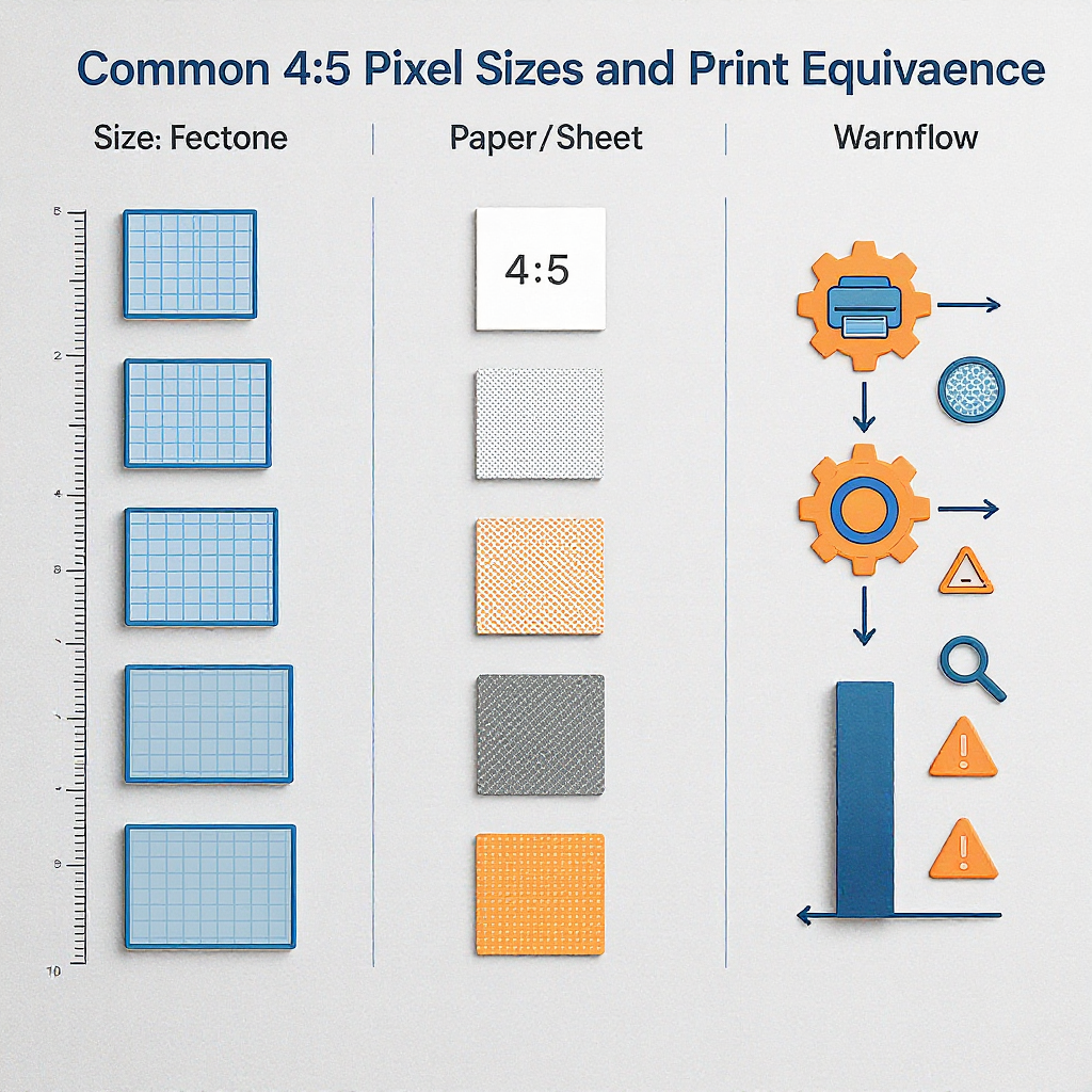
Common 4:5 Pixel Sizes Cheat Sheet
| Pixels (W×H) | Where it shines | Notes |
|---|---|---|
| 1080×1350 | Instagram portrait posts and ads | IG display “standard”; converts well to sRGB JPEG |
| 1200×1500 | Web content blocks | Round numbers; good for CMS and email modules |
| 2048×2560 | Hi-DPI web/UI assets | Nice balance of detail and weight |
| 2160×2700 | 2× exports from 1080×1350 layouts | Flexible master for downscaling |
| 2400×3000 | Small prints; crisp social | Also 8×10 at 300 PPI |
| 3200×4000 | Large-format web, light print | Plenty of room for cropping |
| 4000×5000 | Serious retouching, future-proof | Great master for multiple outputs |
When to pick each:
- For IG-only workflows: Export at 1080×1350 or 2160×2700 then downscale to 1080×1350 to improve detail.
- For mixed platforms: 2048×2560 is a solid “one-size-fits-most” master.
- For print and digital: 2400×3000 balances both worlds.
Print Equivalence and DPI
4:5 maps directly to classic print sizes:
- 8×10 in (4:5)
- 16×20 in (4:5)
- 24×30 in (4:5)
How to compute pixels from inches:
- Pixels = inches × PPI (often called DPI in print contexts).
- 300 PPI for high-quality prints; 150 PPI for large posters viewed at distance.
| Print Size (inches) | 300 PPI (pixels) | 150 PPI (pixels) | Common Uses |
|---|---|---|---|
| 8×10 | 2400×3000 | 1200×1500 | Portraits, small frames |
| 16×20 | 4800×6000 | 2400×3000 | Wall art, premium posters |
| 24×30 | 7200×9000 | 3600×4500 | Large gallery prints |
Tip: Design once at the largest print size you need (e.g., 7200×9000), then downsample for smaller prints and web.
Math Made Simple
Conversions you’ll actually use:
- height = width × 5/4
- width = height × 4/5
Avoid fractional pixels:
- Choose widths divisible by 4 to get whole-number heights.
- Choose heights divisible by 5 to get whole-number widths.
- Round to the nearest even number when you must round to preserve sampling symmetry.
Reduce to simplest ratio:
- Divide both sides by their greatest common divisor (GCD). For example, 3200×4000 → divide by 800 → 4×5.
Safe-area considerations:
- Keep critical content within a central 90% rectangle (5% margin on each edge).
- For IG captions and UI overlays, add a slightly larger bottom margin (e.g., 7–10%) to avoid edge collisions.
Quick calculator snippets:
// Convert a width to 4:5 height (rounded to nearest even integer)
function heightFromWidth(w) {
  return Math.round((w * 5 / 4) / 2) * 2;
}

// Convert a height to 4:5 width (rounded to nearest even integer)
function widthFromHeight(h) {
  return Math.round((h * 4 / 5) / 2) * 2;
}
/* Maintain 4:5 block in modern browsers */
.figure-4x5 {
aspect-ratio: 4 / 5;
width: 100%;
object-fit: cover; /* for images */
}Workflow Tips in Popular Tools
Photoshop
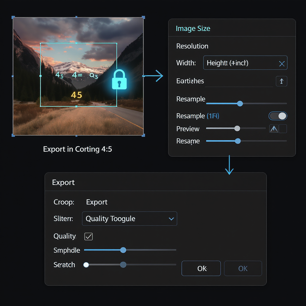
- Crop: Select Crop Tool → Ratio → enter 4 and 5 (unlinked from pixels).
- Export for Web:
- File → Export → Export As → JPEG (photos) or PNG (graphics).
- Resize to 1080×1350 (IG) or your target.
- Convert to sRGB, Embed Color Profile.
- Quality 75–85 for balance; Bicubic Sharper for reduction.
Lightroom Classic / Lightroom
- Crop: Develop Module → Crop Overlay → Aspect → 4×5/8×10.
- Export:
- Resize to Fit: Long Edge = 1350 px for IG portrait, or width/height exact values.
- Sharpen For: Screen → Standard.
- File Settings: JPEG, Quality 80, Color Space sRGB.
Canva
- Create a design → Custom size → 1080×1350 px.
- Export:
- JPEG (photos) with Quality ~80–90, or PNG (logos/UI).
- “Compress file” optional for uploads; keep under a few MB.
Figma
- Frame: 1080×1350 for 1×; duplicate and export @2x (2160×2700) when needed.
- Export:
- JPG at 80% for photos, PNG for flat graphics or transparency.
- Use an sRGB-safe palette; Figma exports sRGB by default.
Mobile Editors (Lightroom Mobile, Snapseed, VSCO)
- Crop to 4:5 aspect.
- Export at exact pixels when possible (e.g., 1080×1350).
- Enable “Sharpen” lightly after resizing to counter platform compression.
Maintaining sharpness with resampling:
- Downscale once, not in multiple steps.
- Use high-quality algorithms (Bicubic Sharper, Lanczos).
- Add subtle output sharpening after downsizing (amount 0.3–0.5 radius in PS as a starting point).
Instagram-Specific Guidance
- Aspect ratio: Portrait posts at 4:5 (width:height).
- Recommended size: 1080×1350 px displayed in feed.
- Upload strategy:
- Export exactly 1080×1350 to avoid unpredictable server resampling, or export 2× (2160×2700) and let Instagram downsample—test which looks cleaner for your content.
- Avoid unintended cropping:
- Set the crop correctly before upload; don’t rely on IG’s in-app crop for precision.
- Keep important text away from edges; IG’s UI can overlay corners.
- Compression:
- Save JPEG at 76–85 quality; avoid heavy noise or banding-prone gradients.
- Slight output sharpening helps retain detail after IG recompression.
- Color management:
- Convert to sRGB and embed the profile.
- Avoid CMYK or wide-gamut exports (Display P3, Adobe RGB) for IG.
- File formats:
- JPEG for photographs.
- PNG for graphics/text, but watch file size; IG may convert/compress.
- File size ceiling:
- Keep under ~8–10 MB to speed upload; IG re-encodes regardless.
Composition and Design Best Practices for 4:5
- Embrace vertical storylines: Use leading lines that guide the eye top-to-bottom.
- Portrait framing: 4:5 flatters head-and-shoulders shots; leave breathing room above the head and below the chin.
- Text-safe zones: Keep titles and key CTAs within the central 80–90% area; add extra bottom padding for captions/UI.
- Margin strategy:
- Balanced margins feel premium; test 4–6% inner padding for graphics.
- For carousels, align elements to consistent margins across slides.
- Avoid edge cuts:
- Don’t place faces or logos within 24–40 px of the edges at 1080×1350 scale.
- Check how the post previews in grid and full view.
Troubleshooting and Pitfalls
Letterboxing vs. true 4:5:
- Don’t slap black/white bars onto other ratios to “fake” 4:5; you lose real estate and can trigger extra compression.
- Properly crop or extend the canvas with content-aware fill or subtle background extension.
Stretching artifacts:
- Never non-uniformly scale to force an image into 4:5; it distorts faces and shapes. Crop instead.
Upscaling quality limits:
- If the source is smaller than your target, upscaling can blur detail.
- Use high-quality upscaling (e.g., Preserve Details 2.0 in PS) and apply modest sharpening; avoid >2× upscales when possible.
Retina/2× exports for UI:
- For UI or web modules, export both 1× and 2×:
- 1×: 600×750
- 2×: 1200×1500
- In CSS, serve appropriate sizes via srcset to reduce blur on HiDPI screens.
Handling mixed-ratio grids:
- Keep a consistent baseline: decide whether the grid supports 4:5, 1:1, or mixed—but avoid random switching.
- For IG carousels, keep all slides the same ratio; mixing 4:5 and 1:1 can crop unpredictably.
Bandwidth and performance:
- For web, compress images with modern codecs when supported (e.g., WebP, AVIF) while preserving 4:5.
- Provide fallbacks (JPEG) and use responsive sizes (srcset, sizes) to avoid overserving.
Quick Reference: Turn Anything Into 4:5
- Know which side is fixed:
- If width is set, compute height = width × 1.25.
- If height is set, compute width = height × 0.8.
- Choose friendly numbers:
- Multiples of 4 for widths, multiples of 5 for heights.
- Save master files bigger than your final need (e.g., 2400×3000) to allow safe downscaling.
Final Take
4:5 isn’t a single resolution—it’s a flexible, portrait-friendly shape that shines on mobile screens and translates perfectly to classic print sizes. Pick a pixel size suited to your destination, export in sRGB with careful resampling, and design with generous safe areas. Do that, and your 4:5 images will look clean, consistent, and compelling everywhere.