Aspect Ratio 4:5: The Complete Guide for Social Media, Printing, and Design
Master the 4:5 aspect ratio with ready-to-use pixel sizes, platform specs, print math, and workflow tips for Instagram, Facebook ads, and responsive web design.
This practical guide demystifies the 4:5 aspect ratio for creators who work across social media, printing, and responsive web design. You’ll find clear explanations, ready-to-use pixel dimensions, platform guardrails, and print math that reduce guesswork and rework. Keep it handy as a reference when exporting assets, composing shots, or building mobile-first layouts.
Aspect Ratio 4:5: The Complete Guide for Social Media, Printing, and Design

The 4:5 aspect ratio has become a sweet spot across social media and mobile-first design. It’s tall enough to dominate a phone screen without being so vertical that platforms crop it aggressively. Whether you’re posting an Instagram carousel, exporting a Facebook feed ad, or preparing an 8×10 print, mastering 4:5 will save time and preserve your composition.
This guide covers what 4:5 means, essential pixel sizes, platform specs, print math, cropping from common camera sensors, composition, workflow, web implementation, and pitfalls to avoid.
---
What 4:5 Means (And How It Differs From 5:4)
- 4:5 means width:height = 4:5. In decimal, 4 ÷ 5 = 0.8 (width/height).
- 5:4 is the inverse orientation (landscape); decimal 5 ÷ 4 = 1.25.
Portrait vs. landscape:
- 4:5 is a portrait ratio (taller than wide).
- 5:4 is a landscape ratio (wider than tall).
When to use which:
- Use 4:5 for mobile-first feeds and vertical-first galleries. It maximizes screen real estate without the cropping penalties of 9:16 in some feeds.
- Use 5:4 for horizontal banners and framed prints where a near-square landscape is preferred.
Why 4:5 wins on mobile:
- Compared to 1:1 (square), 4:5 is taller and therefore occupies more vertical real estate in scrollable feeds, increasing visual impact.
- Compared to 9:16, 4:5 is better supported in mixed-feed contexts (especially Instagram and Facebook feed) where taller-than-4:5 images may be auto-cropped or letterboxed.
Quick mental math:
- 4:5 portrait: height = width × 1.25.
- 5:4 landscape: width = height × 1.25.
---
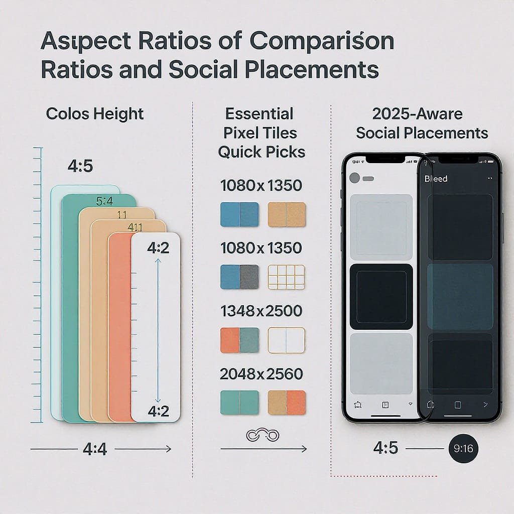
Essential Pixel Dimensions and Quick Picks
Below are practical 4:5 sizes that balance quality and file weight. Choose based on platform display size, desired detail, and compression budgets.
| Resolution (px) | Use Case | Why/Notes |
|---|---|---|
| 1080×1350 | Instagram feed/carousels; mobile-first social | Platform-native; lightweight; renders sharply on most phones |
| 1200×1500 | Web/blogs; Facebook feed ads; versatile baseline | Extra headroom for responsive displays and ad platforms |
| 1600×2000 | High-quality web; light retouching retained | Good balance of detail and file size for modern screens |
| 2400×3000 | Premium web, light print, cropping flexibility | Useful master for downsizing; preserves micro-detail |
| 4000×5000 | Print-first workflows; archival master | Excellent for retouching and large format prints |
Tips for choosing:
- Social-only: 1080×1350 or 1200×1500 keeps files small and crisp.
- Cross-platform campaigns: 1600×2000 or 2400×3000 offers better scaling and recrops.
- Print-first: Capture and edit at 4000×5000 (or higher) and export down as needed.
File weight guidance:
- For web/social: target 250 KB to ~1.5 MB JPEG depending on detail, with 80–90% quality.
- For ads: respect platform limits and loading requirements; re-check current specs before launch.
---
Social Platforms and Ads (2025-Aware)
Where 4:5 excels:
- Instagram feed posts and ads: 4:5 is the max portrait ratio in the feed and looks native.
- Facebook feed ads: 4:5 is widely supported and optimized for mobile.
- Mobile-first placements: many in-app feeds and content modules prefer tall-but-not-too-tall portrait.
Recommended export resolutions:
- Standard: 1080×1350.
- Higher quality: 1200×1500 or 1600×2000 (more resilient to platform recompression).
- Keep sRGB color profile embedded for consistent color on mobile.
Safe areas for text/logos:
- Keep essential text/logos within the central 90% of width and 85–90% of height to avoid UI overlaps (like CTA bars or captions).
- For Instagram profile grids, remember that feed posts preview as 1:1 in the grid; ensure the core subject fits within a centered square region.
Practical reminders:
- Platforms change specs. Confirm live guidelines in Ads Manager or Help Centers before campaigns.
- Check how carousels, boosted posts, and mixed placements treat your creative; auto-cropping can differ by placement.
---
Printing in 4:5 Made Simple
Common print sizes for aspect ratio 4:5:
- 8×10 inches
- 12×15 inches
- 16×20 inches
Recommended print resolution:
- 300 PPI for gallery-quality prints and close viewing.
- 240 PPI acceptable for general use or larger viewing distances.
Bleed and margins:
- If your print goes to the edge, add a bleed (commonly 0.125 in on all sides; confirm with your lab).
- Keep essential elements within a safe margin (at least 0.25 in inside the trim) to avoid clipping.
Convert inches to pixels:
- Pixels = inches × PPI.
- Example: 8×10 at 300 PPI = 2400×3000 px.
| Print Size (in) | Pixels at 300 PPI | Pixels at 240 PPI |
|---|---|---|
| 8×10 | 2400×3000 | 1920×2400 |
| 12×15 | 3600×4500 | 2880×3600 |
| 16×20 | 4800×6000 | 3840×4800 |
Tip: If you’ll both print and post online, edit a master at print resolution (e.g., 2400×3000 or higher), then export optimized web versions separately.
---
Cropping From Camera Sensors (3:2 and 4:3 → 4:5)
Most cameras shoot 3:2 (typical full-frame/APS-C) or 4:3 (many Micro Four Thirds/phones). To get aspect ratio 4:5, you’ll crop some of the image.
Precise crop loss in portrait orientation:
- From 2:3 (aka 3:2 rotated portrait) to 4:5: lose ~16.7% of height.
- Example: 4000×6000 portrait → crop to 4000×5000 (cut 1000 px off total height).
- From 3:4 to 4:5: lose ~6.25% of height.
- Example: 3000×4000 portrait → crop to 3000×3750 (cut 250 px off total height).
Pre-visualize in camera:
- Many cameras offer aspect overlays (e.g., 4:5 or 8×10 guides). Enable these to compose for the final crop.
- If your camera lacks 4:5 guides, use a grid and mentally reserve a little top and bottom margin for later trimming.
Pro tip:
- For maximum flexibility, shoot slightly wider. You’ll protect headroom and footing while cropping to 4:5 in post.
---
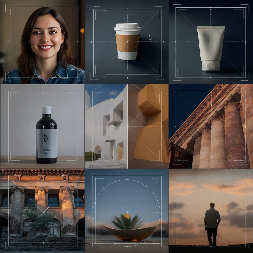
Composition Tips for 4:5
- Headroom and footing: 4:5 is slightly taller than square, so portraits look natural with modest headroom. Avoid crowding the top edge; leave breathing room.
- Leading lines: Streets, walls, and rails that climb vertically can feel more dynamic in 4:5. Let lines run from bottom corners toward the subject for depth.
- Subject placement:
- People: Place eyes around the upper third; center the torso within the inner square to ensure grid previews crop well.
- Products: Centered or rule-of-thirds both work; maintain generous padding for text callouts.
- Type-safe zones for ads: Keep copy away from edges and the bottom ~10% where UI bars or captions may overlay.
- Negative space: 4:5 can carry more vertical negative space; use it to lift the subject and guide the eye.
---
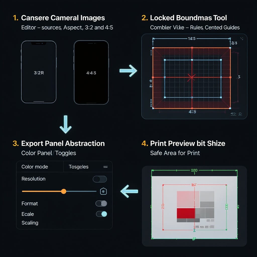
Workflow and Tools
Photoshop
- Select the Crop Tool (C).
- In the ratio dropdown, choose W x H x Resolution, then enter 4 and 5 (or pick Fixed Ratio and type 4:5).
- Drag to compose; hold Alt/Option to crop from center.
- Export: File → Export → Export As; set sRGB, JPEG 80–90% quality; add slight output sharpening.
Lightroom Classic / Lightroom
- Hit R (Crop).
- Choose Original → Enter Custom Aspect and set 4×5/8×10.
- Use the O key to cycle overlays for composition guides.
- Export presets: sRGB, JPEG quality 80–90%, long edge = 1350, 1500, 2000, or 3000 px as needed.
Canva
- Create a custom design with dimensions 1080×1350 (or any 4:5).
- Use frames or guides to keep text within safe areas.
- Download as JPG (Quality ~80–90) or PNG if flat colors need crisp edges.
Figma
- Frame (F) → set size to 1080×1350 or use Constraints with aspect plug-ins.
- Export panel → 1x JPG/PNG; consider 2x for high-DPI assets.
Mobile
- iOS/Android editors (Photos, Snapseed, VSCO, Lightroom Mobile) support 4:5 crop presets.
- Ensure sRGB on export; tune compression to keep files web-friendly.
Export best practices
- Color: sRGB embedded.
- Format: JPEG for photos; PNG/WebP for graphics/text overlays.
- Quality: 80–90% JPEG; visually compare vs. file size.
- Sharpening: Mild output sharpening for screen improves perceived detail post-compression.
---
Web Implementation: Preserve 4:5 Responsively
CSS aspect-ratio keeps containers proportional without fixed heights.
Basic responsive image
Caption text
.card img {
  aspect-ratio: 4 / 5;
  width: 100%;
  height: auto;        /* for natural ratio-aware browsers */
  object-fit: cover;   /* ensures no distortion when container constrains height */
  display: block;
  background: #eee;    /* placeholder color */
}
With srcset for high-DPI screens
Maintaining ratio with a placeholder
.ratio-box {
  aspect-ratio: 4 / 5;
  background: #f2f2f2; /* skeleton placeholder */
}
.ratio-box img {
  width: 100%;
  height: 100%;
  object-fit: cover;
  display: block;
}
Key notes:
- Use object-fit: cover to avoid distortion during responsive resizing.
- Provide appropriately sized sources via srcset; avoid serving over-large files to mobile.
- Lazy-load below-the-fold images, but keep aspect-ratio to prevent layout shifts (CLS).
---
Troubleshooting and Pitfalls
4:5 vs. 5:4 orientation confusion
- 4:5 is portrait (0.8 width/height). 5:4 is landscape (1.25 width/height).
- Label exports clearly (e.g., 4x5_portrait_1200x1500.jpg) to avoid mix-ups.
Platform auto-cropping
- Some placements crop to 1:1 or slightly differently. Keep key content centered and within safe margins.
- For Instagram profile grid previews, ensure the central square contains the subject.
Borders and background fills
- When a platform letterboxes your creative, consider adding intentional borders that match your brand palette rather than relying on default black/white bars.
- If extending background, sample from the image or use a subtle gradient to avoid harsh edges.
Watermark placement
- Keep watermarks inside the safe zone, away from edges and bottom UI areas.
- Aim for low-contrast, semi-transparent marks that don’t distract.
Compression artifacts
- Banding often appears in gradients when files are over-compressed. Add mild noise/dither to gradients and export at slightly higher quality.
- Text-on-photo: Prefer PNG/WebP if text edges look fuzzy after JPEG compression.
A pre-publish checklist
- Is the file truly 4:5 (e.g., 1200×1500) and sRGB?
- Do key subjects and text fit within inner safe zones?
- Have you previewed in dark/light UI modes and on-device?
- Are file sizes reasonable for target platforms?
- For ads: did you verify current placement specs and safe area guidance?
---
Quick Math Recap
- 4:5 aspect ratio 4 5 (portrait): width/height = 0.8; height = width × 1.25.
- 5:4 (landscape): width/height = 1.25; width = height × 1.25.
- From 2:3 (portrait) → 4:5: ~16.7% height crop.
- From 3:4 (portrait) → 4:5: ~6.25% height crop.
---
Final Takeaway
Use 4:5 when you need maximum impact in mobile feeds, clean print compatibility (8×10, 16×20), and flexible cropping from common sensors. Start with good composition, keep text within safe zones, export in sRGB at sensible quality, and double-check platform specs before publishing or launching ads. With a consistent 4:5 workflow, your images will look intentional and on-brand from Instagram to the print wall.
Summary
The 4:5 portrait ratio balances mobile visibility with print-friendly dimensions, making it a dependable choice for multi-channel campaigns. Select resolutions aligned to your platform, protect safe areas in your layout, embed sRGB, and test on-device before launch. Follow the workflow and web patterns here to keep assets sharp, lightweight, and consistent across feeds, ads, and prints.