The Best Apps to Edit Pics for Instagram: Pro-Level Results on Your Phone
Discover the best apps to edit Instagram photos on your phone. Compare tools, features, and workflows for pro-level color, retouching, and export settings.

Editing Instagram-worthy photos no longer requires a desktop suite—your phone is more than capable. This guide breaks down the best mobile apps by job, the features that matter, and practical workflows for fast, consistent results. Whether you’re building a cohesive aesthetic or fixing tricky lighting, you’ll find pro-level tools and export recipes that keep your feed looking sharp.
The Best Apps to Edit Pics for Instagram: Pro‑Level Results on Your Phone
If you’re searching for the best apps to edit pics for Instagram, you don’t need a desktop suite anymore. Today’s mobile editors can grade color like a film lab, retouch like a portrait studio, and export crisp, feed‑ready images—all in your pocket. This guide covers what to look for, which app excels at which job, and the settings and workflows that keep your feed consistent and high‑quality.
What to Look For in an Instagram Photo Editor
Before you download every editor under the sun, evaluate apps against these criteria:
- Ease of use: Clear UI, gesture-friendly controls, and fast access to core tools.
- Non-destructive edits: Adjustment stacks you can tweak later without degrading the image.
- RAW/DNG support: Extra headroom for highlights, shadows, and color tuning.
- Masking and local adjustments: Brush, radial/linear gradients, subject/sky selections.
- Color controls: HSL (Hue/Saturation/Luminance), Curves, WB/Tint, split toning.
- Presets and looks: One-tap grades plus sliders to adjust intensity.
- Repair tools: Healing, clone, and object removal that preserve texture.
- Geometry and perspective: Straighten lines, correct lens distortion.
- Layers and overlays: Light leaks, grain, textures, and blend modes for creative looks.
- Text/graphics and templates: For carousels, covers, and on-brand typographic posts.
- Export control: Aspect ratios, size, sharpening, color space (sRGB), and metadata.
- Batch editing and sync: Copy/paste settings and cloud sync across devices.
- Price and privacy: Transparent subscriptions, offline capability, and clear data policies.
Quick Look: Best Apps by Job
| App | Best For | Key Tools | Pricing | Platforms |
|---|---|---|---|---|
| VSCO | Film-style color and cohesive feeds | Presets, HSL, grain, fade | Free tier + Subscription | iOS, Android |
| Tezza | Warm editorial looks and subtle film vibes | Presets, dust/light textures, batch apply | Subscription | iOS, Android |
| Afterlight | Fine-tuned color and texture overlays | Curves, selective color, film dust, frames | Subscription | iOS, Android |
| Lightroom Mobile | Pro corrections and RAW workflows | RAW, HSL, Curves, Masks, Geometry | Free basics + Subscription | iOS, Android |
| Snapseed | Selective edits and quick fixes | Brush, Selective, Curves, Healing, Perspective | Free | iOS, Android |
| Facetune | Natural portrait retouching | Skin, texture, eyes, dodge/burn | Free trial + Subscription | iOS, Android |
| TouchRetouch | Object removal and cleanup | Content-aware erase, line removal, clone | One-time purchase | iOS, Android |
| PicsArt | Creative edits and composites | Layers, cutouts, overlays, AI effects | Free tier + Subscription | iOS, Android |
| Prequel | Stylized effects and motion aesthetics | Glitch, motion blur, glow, film effects | Subscription | iOS, Android |
| Lens Distortions | Cinematic light, weather, and atmosphere | Light leaks, sun flares, rain, fog overlays | Free tier + Subscription | iOS, Android |
| Canva | Text, graphics, and carousel templates | Brand kit, grids, font pairing, resize | Free tier + Subscription | iOS, Android, Web |
| GoDaddy Studio (Over) | Branded layouts and typography | Fonts, logo lockups, masks, grids | Free tier + Subscription | iOS, Android |
| Remini | AI upscaling and face rescue | Super-res, face enhance, de-noise | Free tier + Subscription | iOS, Android |
| Lensa | AI background and portrait tweaks | Subject cutout, bokeh, sky swap | Subscription | iOS, Android |
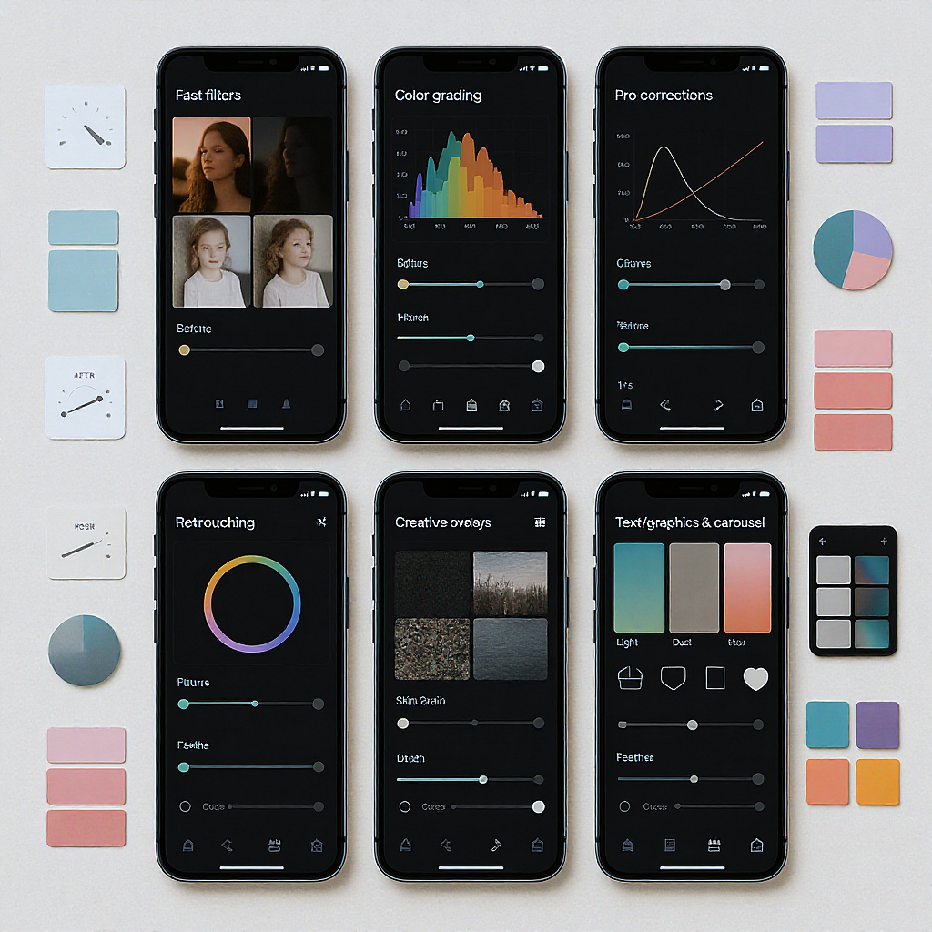
Fast Filters and Color Grading for a Cohesive Feed
For speed and style, a preset-first app keeps your feed consistent without heavy manual work.
- VSCO: Known for film-inspired presets that respect skin tones. Start with a base preset (e.g., A6 for clean neutrals, C8 for moody color, or K-series for warm film). Pull intensity down to 5–7, then fine-tune WB, exposure, and HSL for your subject.
- Tezza: Great for warm editorial looks, soft highlights, and dust/light textures that don’t destroy detail. Build a “Recipe” that you can apply across a batch, then tweak per image.
- Afterlight: Offers precise Curves, Selective Color, and tasteful textures. Use film dust at very low opacity and add a touch of grain (8–15) to unify images without waxy skin.
Tips:
- Always reduce preset strength to avoid overprocessing.
- Balance saturation with luminance (HSL) to keep skin natural.
- Add grain before sharpening; it helps hide compression artifacts later.
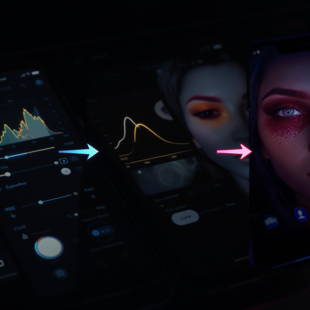
Pro-Level Corrections and Detail Work
When technical quality matters—architecture, food, product, or high-contrast scenes—reach for a pro editor.
- Lightroom Mobile
- Color: HSL for hue shifts and luminance control; Color Mix for specific ranges; Calibration for subtle overall palette shaping.
- Tone: Curves for contrast that doesn’t crush shadows. Use point curve for global contrast and RGB curves to steer color.
- Masks: Brush, Radial, Linear, plus AI Subject/Sky. Enhance faces, lift shadows in a subject, or tone down bright skies without affecting the rest.
- Geometry: Upright and Guided lines for perspective fixes; lens profile corrections for distortion and vignetting.
- RAW: Pull back highlights and open shadows with fewer artifacts.
- Snapseed
- Selective: Add control points to adjust brightness/contrast/saturation in a specific region.
- Healing: Quick cleanup for small distractions (dust, blemishes).
- Perspective: Intelligent fill to compensate edges after straightening.
- Curves and White Balance: Fast, precise tonal and color corrections.
- Stacks: Your edit steps are non-destructive—reorder or tweak before export.
Workflow tip: Do your global exposure and color in Lightroom first, then hop to Snapseed or TouchRetouch for perspective tweaks and fine cleanup where needed.
Retouching Without Overdoing It
Portraits thrive on subtlety. The goal is to preserve texture and character while removing temporary distractions.
- Facetune
- Use “Texture” (or “Detail”) to bring back pores around eyes and cheeks after any smoothing.
- Prefer “Heal” and “Patch” over heavy “Smooth.” Keep any skin blurring under 20–30% strength.
- Use Dodge/Burn lightly to refine facial shape with natural light rather than reshaping tools.
- TouchRetouch
- Best-in-class object removal. The “Line Removal” tool is perfect for power lines and seams.
- Clone for patterned areas (walls, fabric) where healing might smear detail.
- Work at higher zoom and use small brushes; multiple light passes beat one heavy pass.
Rule of thumb: If viewers can tell an image was “retouched,” you went too far. Preserve micro-contrast and texture.
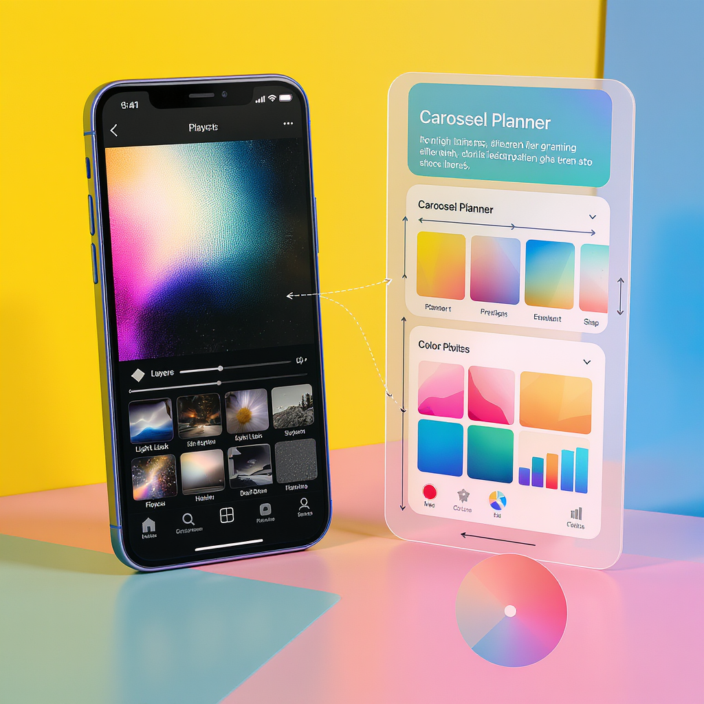
Creative Effects and Overlays to Stand Out
Subtle creative effects can add mood without shouting.
- PicsArt: Layer-based edits, blend modes, and masking. Add paper textures, film borders, or gradients. Keep effect layers low (10–30% opacity) and erase them from faces.
- Prequel: Stylized looks (glow, motion blur, chromatic aberration) that can bring dynamism to reels and stills. Pair with a neutral color grade to avoid clashing.
- Lens Distortions: Realistic light leaks, sun flares, fog, rain. Position light according to your scene’s actual light direction to make it believable.
Creative etiquette: Align effects with the story—warm flares at golden hour, cool haze for dawn, gentle grain for archival moods.
Text, Graphics, and Carousels That Stop the Scroll
When you need informative posts, cover slides, or multi-image carousels sized for Instagram:
- Canva
- Brand Kit: Lock in color palette, logos, and preferred typefaces for consistency.
- Layout Grids: Align elements and keep margins consistent across slides.
- Templates: 1080×1350 (portrait 4:5) for feed carousels and 1080×1920 for stories/reels covers. Design reels covers inside a 1080×1350 safe area to look good in the grid.
- GoDaddy Studio (Over)
- Strong typographic controls and masking for polished poster-style slides.
- Build reusable templates for cover slides and educational carousels.
Content tips:
- Use hierarchy (headline, subhead, body) and keep body text ≥ 36–42 px for legibility.
- Minimize text near edges; IG can crop slightly in the grid view.
AI Helpers for Speed and Rescue Jobs
AI tools can be lifesavers, but use them ethically and sparingly.
- Remini: Upscale older or grainy images, especially faces. Good for rescuing low-light shots before a subtle grade. Avoid “over-enhanced” plastic skin—dial it back.
- Lensa: Quick background replacement, sky swaps, and selective subject edits. Great for thumbnails and stylized portraits.
When to use:
- Rescue small files you must post (brand UGC, archival images).
- Replace blown skies if it’s editorial and clearly stylized.
When to avoid:
- News/editorial contexts where authenticity matters.
- Overhauls that change identity or body shape.
Export Settings That Keep Quality High on Instagram
Instagram recompresses images, so feed it files that survive compression gracefully.
Recommended aspect ratios:
- Feed portrait: 4:5 (1080×1350 recommended)
- Feed square: 1:1 (1080×1080)
- Feed landscape: 1.91:1 (1080×566) or 16:9 (1080×608)
- Stories/Reels: 9:16 (1080×1920)
General export targets:
- Color space: sRGB (widest compatibility across devices).
- Format: JPEG for photos, PNG only for graphics-heavy slides with flat colors.
- Quality: 80–90% to avoid banding yet keep size reasonable.
- Sharpening: “Standard for Screen” (Lightroom) or a light Unsharp Mask after resizing.
- File size: Under ~2–3 MB per image reduces heavy server-side recompression.
Portrait feed example (Lightroom Mobile):
- Resize: Long edge 1350 px
- Sharpen for screen: Standard
- Quality: 85
- Color space: sRGB
- Metadata: Remove location if privacy matters
Stories/Reels cover example:
- 1080×1920 canvas
- Keep essential text within a centered 1080×1350 safe area to look good in the grid.
Copyable “export recipe” (pseudo‑YAML):
export:
  color_space: sRGB
  format: JPEG
  quality: 85
  resize:
    mode: long_edge
    pixels: 1350   # use 1080 for square/landscape, 1920 height for stories
  sharpening:
    type: screen
    amount: standard
  metadata:
    remove_location: true
Workflow Tips for Consistency and Speed
- Build a preset stack:
- Choose one base film-style preset (VSCO/Tezza).
- Add a subtle grain layer and vignette (Afterlight or Lightroom).
- Save as a reusable “look” you can apply to batches.
- Batch editing:
- Lightroom: Copy/paste settings to multiple images; adjust white balance per scene.
- VSCO/Tezza: Apply a recipe to a set, then fine-tune exposures.
- Maintain a brand palette:
- Lock 2–3 brand colors and 1–2 typefaces in Canva/GoDaddy Studio.
- Save swatches for backgrounds, shapes, and accent text.
- Organize across iOS/Android:
- Lightroom Cloud collections keep RAW + edits synced.
- Use shared folders in Google Photos or iCloud for a small team handoff.
- Back up originals:
- Keep RAWs/DNGs in cloud storage (Drive, Dropbox) or Lightroom cloud.
- Export “Edited + Original” versions occasionally for redundancy.
- Name and plan carousels:
- Use numeric suffixes (postname_01.jpg … _10.jpg) so order is obvious during upload.
- Design covers that also look good in the square grid.
A Practical Two-to-Four App Loadout
You don’t need everything. Start lean:
- Lightroom Mobile: Global exposure/color, masking, geometry, and RAW.
- Tezza or VSCO: One-tap film-style cohesion across the feed.
- TouchRetouch: Fast object removal and cleanup.
- Canva: Text-forward covers and carousels.
Optional add-ons:
- Afterlight or Lens Distortions for textures and realistic light overlays.
- Snapseed for selective tweaks if you prefer its brush/control point workflow.
Common Pitfalls to Avoid
- Over-smoothing faces: Preserve texture; keep skin edits under 30% strength.
- Crushed blacks and neon saturation: Use curves gently; manage saturation via HSL luminance.
- Orange skin tones: Balance WB with HSL—reduce orange saturation and increase orange luminance slightly.
- Halos from over-sharpening: Sharpen after resizing, not before, and keep amounts moderate.
- Mismatched white balance across a carousel: Sync WB, then tweak per slide for consistency.
- Wrong color space: Export sRGB; Display P3 can look dull on non-P3 devices.
- Text too small: Minimum ~36–42 px for body text on 1080-wide images.
- Heavy AI artifacts: Look for repeating patterns, plastic skin, or edge halos and dial it back.
Final Thoughts
With the right combination of apps to edit pics for Instagram, you can achieve pro-level results quickly and consistently. Use a preset-first app for style cohesion, a pro editor for technical accuracy, a retouching tool for subtle cleanups, and a layout app for scroll-stopping carousels. Lock in smart export settings, and your visuals will look crisp and consistent everywhere your audience sees them.
Summary
- Choose a lean toolkit: one grading app, one pro editor, one retoucher, and one layout app.
- Build a repeatable workflow: preset-first grading, targeted corrections, restrained retouching, and sRGB exports tuned to Instagram’s sizes.
- Keep it natural: protect texture, maintain consistent white balance, and avoid heavy AI artifacts.


