Best Facebook Cover Photos: Dimensions, Safe Zones, and Design Ideas That Convert
Get Facebook cover photo dimensions, safe zones, and export tips. See desktop vs mobile crops, retina upload sizes, and design ideas that drive clicks.

Best Facebook Cover Photos: Dimensions, Safe Zones, and Design Ideas That Convert
A great Facebook cover photo is both a brand statement and a performance asset. This guide explains exactly how to size, compose, and export covers that look sharp across devices while guiding attention to your primary CTA. You’ll find practical specs, safe-zone diagrams, creative themes, workflow tips, and measurement tactics to turn impressions into actions.
Your Facebook Page cover image is still the biggest, most visible canvas you control on your Page. It frames first impressions, sets brand credibility, and can nudge visitors toward the primary Page button (Shop Now, Sign Up, Call, etc.). The best Facebook cover photos do three things at once: communicate a clear value proposition, look impeccable across devices, and subtly guide attention to your CTA.
Why your Facebook cover photo still matters
- Above-the-fold real estate: On first load, people see your cover before scrolling. It’s your billboard.
- Credibility signal: A crisp, on-brand cover sets a professional tone instantly.
- Behavioral nudge: Smart composition can direct eyes to the Page button, tabs, or a pinned post.
- Campaign surface: You can update it to reflect launches, promos, or seasonal moments without overhauling your whole Page.
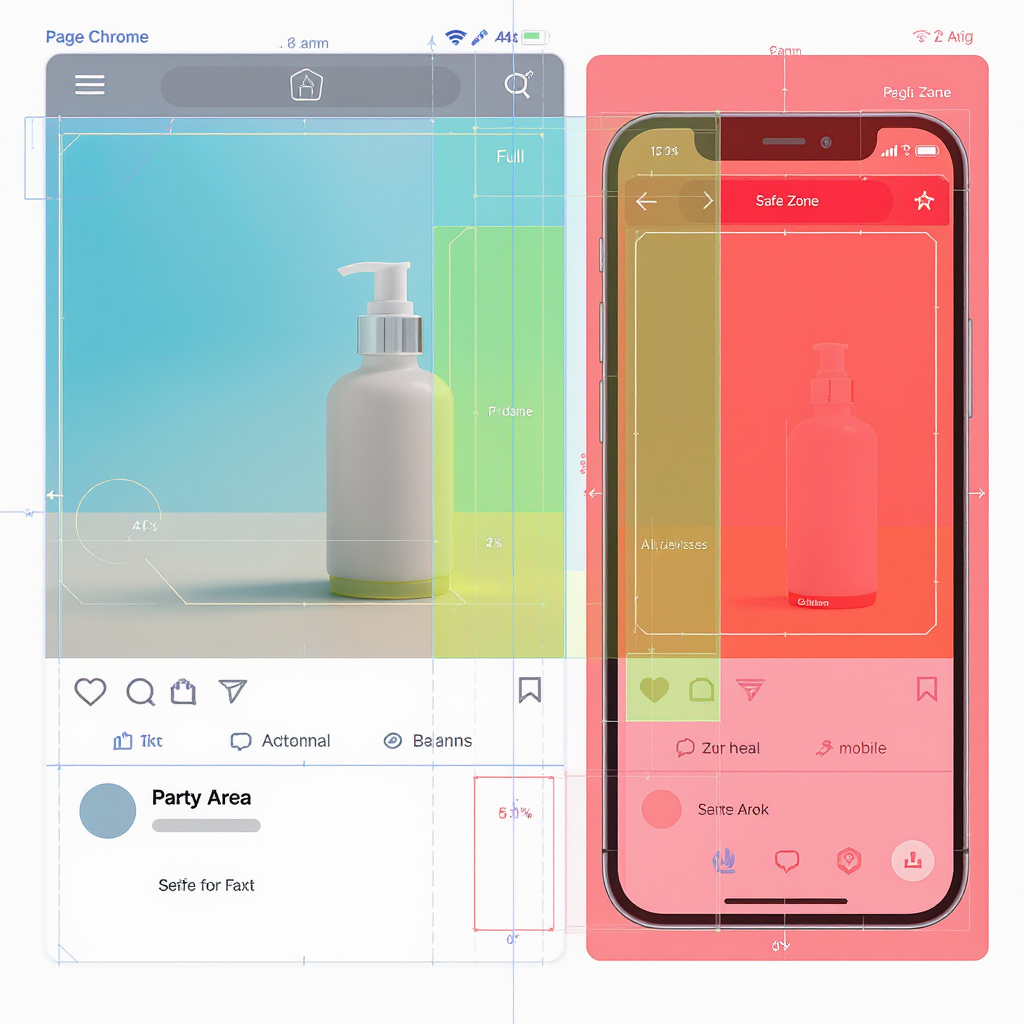
Specs and safe-area cheat sheet
Meta tweaks layouts periodically, but these working specs are reliable and field-tested.
| Surface | Visible Size | Aspect | Notes |
|---|---|---|---|
| Desktop cover | 820 × 312 px | ~2.63:1 | Classic minimum desktop display |
| Mobile cover | 640 × 360 px | 16:9 | Mobile crops the sides compared to desktop |
| Ideal “retina” upload (desktop-first) | 1640 × 624 px | ~2.63:1 | 2× desktop; keep critical content centered for mobile |
| Alternative “retina” upload (mobile-first) | 1640 × 922 px | 16:9 | 2× mobile; desktop crops top/bottom |
| Formats | JPG/PNG (WebP sometimes accepted) | - | Use PNG for UI/text; JPG for photos. FB may re-compress. |
| File strategy | < 500 KB (target < 100 KB for JPG) | - | Embed sRGB profile for color consistency |
| Cover videos | Deprecated for most Pages | - | Plan for static images; legacy videos may still display |
Two proven approaches:
- Desktop-first (1640 × 624 upload): Everything shows on desktop; mobile crops left/right to 16:9. Keep important elements in the centered strip.
- Mobile-first (1640 × 922 upload): Everything shows on mobile; desktop crops top/bottom to 624 px tall. Keep critical content in the central band.
| Approach | Upload Size | Shared “safe zone” to keep critical content | How it crops |
|---|---|---|---|
| Desktop-first | 1640 × 624 | ≈ 1109 × 624 centered (mobile-visible width) | Mobile trims ~265 px each side |
| Mobile-first | 1640 × 922 | 1640 × 624 centered (desktop-visible height) | Desktop trims ~149 px top and bottom |

Quick rules of thumb:
- Keep logos, headlines, and faces inside the center safe zone.
- Avoid placing critical text near edges or corners; they’re the first to crop.
- On new Pages layouts, profile photos typically do not overlap the cover, but allow at least 24–40 px internal margins for visual breathing room.
High-performing cover photo themes
- Product-in-context hero: Show the product solving a real problem in a relatable scene.
- Before/after transformation: Visual proof of outcome (great for services, fitness, home improvement).
- Social proof: Ratings, review snippets, “As seen in” media logos (keep it tasteful).
- Event/launch teaser: Big date, short promise, clear brand. Swap when the moment passes.
- Seasonal/limited-time campaigns: Limited palettes, small badge for urgency.
- UGC mosaic: Collage of customer photos or creator shots for authenticity.
Design principles of the best examples
- Clear hierarchy: One headline, one image, one supporting detail—no clutter.
- Single focal point: Avoid dueling elements; guide the gaze.
- Strong contrast: Light text on dark areas (or vice versa) for instant legibility.
- Ample whitespace: Space creates emphasis; don’t fill every pixel.
- Grid alignment: Snap elements to a baseline grid for polish.
- Brand typography/colors: Use the same type scales and palette as your site.
- Legible text over busy backgrounds: Add a subtle gradient, blur, or overlay.
CTA alignment with Page layout
Your cover can “aim” attention to the Page’s primary action.
- Desktop: The primary Page button typically sits to the right of your name. Compose with visual weight (subject gaze, diagonal lines, or an asymmetric layout) leading rightward.
- Mobile: The button is below the cover. Position the focal subject near the lower middle and let visual cues (arrow, gaze, or V-shaped composition) point downward.
- Copy placement: Keep any buttons or short CTAs within the safe zone. Don’t crowd the area near Page tabs or the profile picture.
- Pinned post synergy: If your main link lives in a pinned post, mirror the headline in your cover and direct attention down.
Branding consistency at scale
- Reusable templates: Create master files (desktop-first and mobile-first) with safe-zone overlays baked in.
- Style guide for covers: Define logo placement, minimum margins, color usage, headline length, and iconography.
- Versioning: Maintain a semantic naming convention with dates and campaign tags.
- Refresh cadence: Quarterly updates plus major promos keep the Page feeling current.
Workflow, tools, and file optimization
- Tools: Figma for collaborative templates, Canva for speed and brand kits, Photoshop for pixel-perfect retouching.
- Export settings:
- Color: sRGB IEC61966-2.1 profile embedded.
- Format: PNG for text/UI edges; high-quality JPG (70–85) for photography; WebP if the upload flow accepts it (Facebook may convert on ingest).
- Size: Keep under 500 KB; aim for fast loads on mobile networks.
- Quality checks:
- Zoom to 100% and 200% to check edges and text halos.
- Test on desktop, iOS, and Android. Use Meta Business Suite’s preview if available.
- Verify that auto-cropping on mobile doesn’t cut off key content.
A/B testing and measurement
- Hypothesis-driven rotations: E.g., “Social proof cover will increase ‘Shop Now’ clicks by 10% vs. lifestyle hero.”
- One variable at a time: Change the headline or background, not everything.
- Run time: At least 7–14 days (unless a campaign is shorter) to smooth day-of-week effects.
- Attribution:
- Track Page button clicks, website clicks, and profile visits in Page Insights.
- Use UTM parameters on your Page button/pinned post links to tie outcomes to cover variants.
- Note secondary signals: saves, follows, and DMs.
Compliance and accessibility
- Licensing: Use properly licensed images; secure model/property releases when faces or locations are identifiable.
- Inclusive visuals: Represent your audience respectfully and avoid stereotypes.
- Accessibility:
- High color contrast (aim for WCAG AA: 4.5:1 for text).
- Minimal dense copy; large font sizes (visually equivalent to 18–24 px on desktop).
- Add or edit alt text where Facebook allows; keep it descriptive and succinct.
- Claims and policies: Avoid misleading “guarantees,” restricted content, or noncompliant health/financial claims.
Industry-specific inspiration
- SaaS: Tight UI close-up with a single benefit (“Automate invoices in minutes”) and a subtle gradient to ensure text contrast.
- eCommerce: Lifestyle hero featuring the product in use + a small seasonal badge (“Fall Drop”) and free-shipping teaser.
- Nonprofit: Mission-driven portrait paired with an impact stat (“$25 feeds a family for a week”) to motivate donations.
- Restaurants: Signature dish in directional light + concise hours or “Reserve Now” prompt.
- Local services: Team photo on location + service area (“Serving Austin & Round Rock”) to build trust.
Quick checklist before you hit Publish
- Is the headline scannable in under 2 seconds?
- Do logo and key text sit inside the safe zone?
- Does the composition lead eyes toward your Page button?
- Are colors, type, and tone consistent with your brand?
- Does it look crisp on desktop and mobile test devices?
- Is the file exported in sRGB and under your size target?
- Are claims accurate and imagery fully licensed?
Summary
Use a retina-ready upload with a centered safe zone so critical content survives device crops. Keep a clear visual hierarchy, strong contrast, and composition that nudges attention toward your Page CTA, then measure impact with hypothesis-driven tests. Refresh on a regular cadence and follow accessibility and compliance best practices to keep performance and trust high.