Best Image Size for Web for Fast Loading and High Quality
Learn how to choose the best image size for web to boost loading speed, maintain high quality, and improve SEO with formats, compression, and dimensions.
Why Image Size Matters for Web Performance and SEO
Optimizing the best image size for web is critical for improving site speed, enhancing user experience, and boosting search engine rankings. Images are among the heaviest elements on a webpage, and their size directly affects Core Web Vitals, bounce rates, and conversion. When you balance quality with efficiency—through correct dimensions, compression, and file formats—you not only streamline load times but also help your pages rank higher in SERPs.

In this guide, you’ll learn how to choose the optimal image dimensions, formats, and compression strategies to create a visually appealing site that loads quickly across all devices.
---
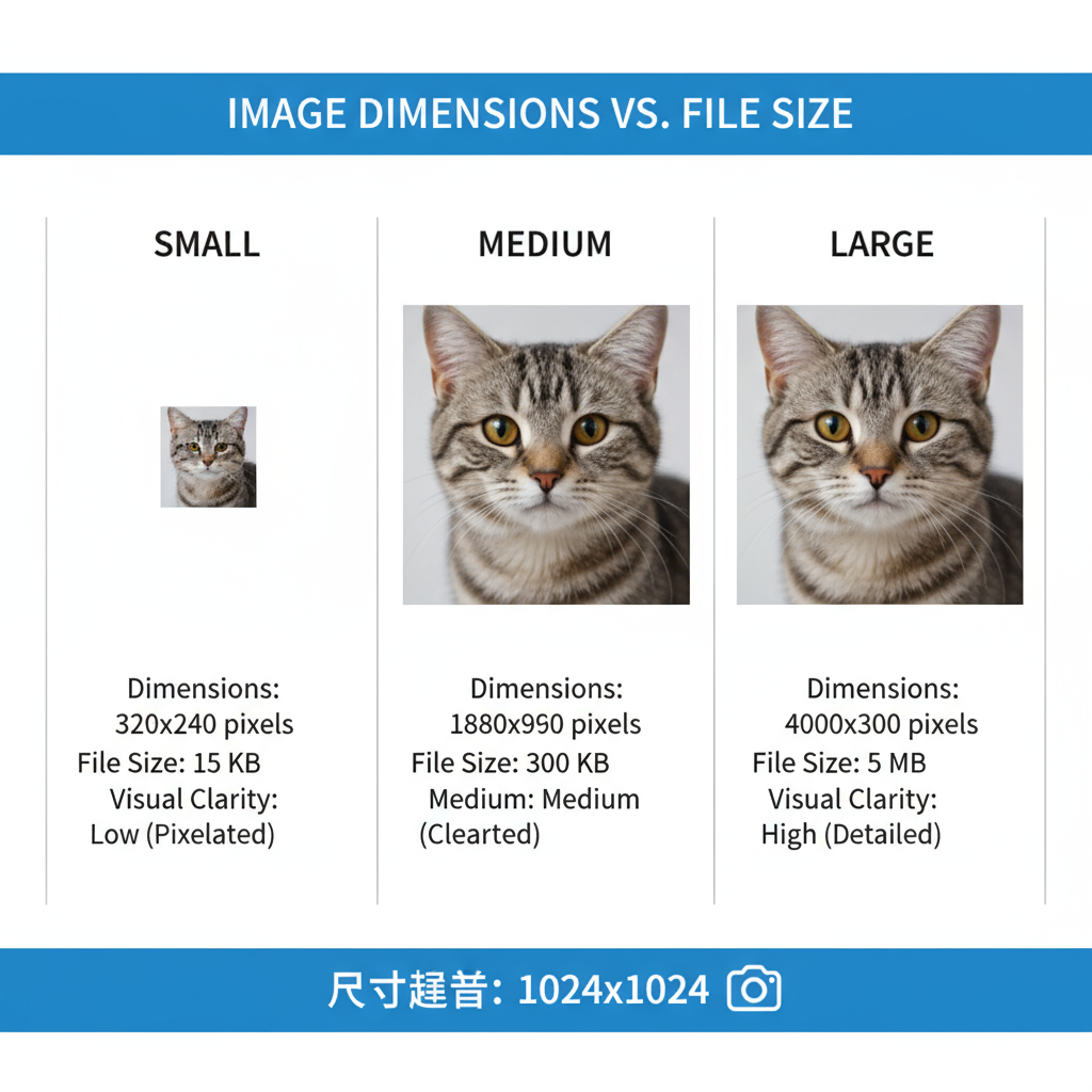
Image Dimensions vs. File Size
Before diving into recommendations, it’s important to differentiate:
- Image dimensions (width × height in pixels) affect visual display size.
- File size (KB or MB) refers to the data the browser downloads.
An image can have large dimensions but a small file size if compressed properly. However, serving excessively large dimensions where not needed wastes bandwidth and slows down rendering.
---
Recommended Standard Image Dimensions
Choosing the right image dimensions depends on their placement and purpose on your website.
Here are recommended sizes for common use cases:
| Image Type | Recommended Dimensions (px) | Notes |
|---|---|---|
| Hero Banner | 1920 × 1080 | Full-width desktop background; serve smaller sizes for mobile. |
| Blog Post Inline | 1200 × 800 | Sharp without excessive pixels. |
| Thumbnail | 150 × 150 | Square crop for consistent grid layouts. |
| Social Media Preview | 1200 × 630 | Matches Open Graph standards for major platforms. |
| Product Image (E-commerce) | 800 × 800 | Good zoom quality with balanced load performance. |
Tip: Upload images only at the max display size required—avoid serving 4000px wide images in 1200px containers.
---
Ideal File Size Benchmarks
To keep images fast-loading without visible quality loss, aim for:
- Hero images: ≤ 500 KB (ideally under 300 KB after compression)
- Content images: 100–200 KB
- Thumbnails: ≤ 50 KB
Overall, aim for total page weight under 2 MB (broadband) or under 1 MB for mobile-focused design.
---
Image Formats and When to Use Them
Format choice impacts both file size and visual clarity.
| Format | Best For | Pros | Cons |
|---|---|---|---|
| JPEG | Photographs | Good compression, widely supported | Lossy, may show artifacts |
| PNG | Logos, icons, transparent backgrounds | Lossless, crisp edges | Larger file size than JPEG |
| WebP | Most images | High compression and quality, supports transparency | Older browsers need fallback |
| AVIF | High-quality photos | Superior compression, HDR support | Partial browser support |
Pro Tip: Use WebP or AVIF primarily, with JPEG/PNG as fallback for compatibility.
---
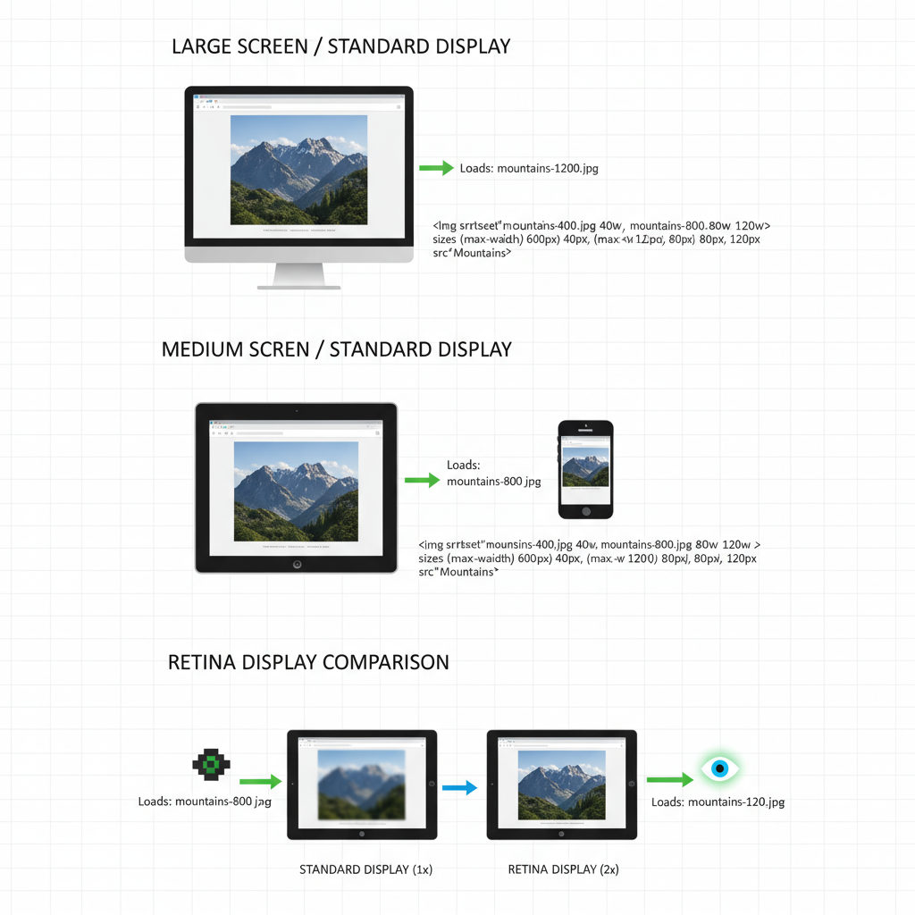
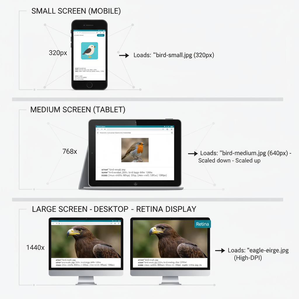
Retina vs. Standard Displays
High-density (Retina) displays pack more pixels into the same physical space, requiring higher resolution images for crispness. Strategies include:
- Create standard (@1x) and high-DPI (@2x) versions.
- Use `srcset` attributes for responsive serving.
- Apply stronger compression to high-DPI files to keep page weight down.
---
Responsive Images with `srcset`
Responsive images allow browsers to load the optimal size based on screen width and resolution.
Benefits:
- Mobile downloads are smaller and faster.
- Desktop images are clear and sharp.
- Efficient bandwidth usage.
---
Image Compression Tools
Compression reduces file size without significant quality loss.
Free Tools
- TinyPNG / TinyJPG — Batch processing online.
- Squoosh (Google) — Adjustable compression and format conversion.
- ImageOptim — Lossless optimization for Mac.
Paid Tools
- Adobe Photoshop — Fine control via “Save for Web”.
- Affinity Photo — Strong, affordable export options.
---
SEO and Core Web Vitals Impact
Large images significantly affect Largest Contentful Paint (LCP). A poor LCP score harms user experience and can lower Google rankings.
- LCP: Slow hero image = bad UX signal.
- CLS: No set dimensions can cause layout shifts.
- FID: Heavy pages delay scripts and interactivity.
---
Exporting and Naming Best Practices
Export Settings:
- Remove extra metadata.
- Match dimensions to display needs.
- Choose the correct format & compression.
File Naming:
- Descriptive, keyword-rich (`sunset-beach-california.jpg`).
- Use hyphens for spacing.
- Avoid generic names like `IMG_001.jpg`.
Alt Text:
- Provide meaningful descriptions to aid accessibility and SEO.
---
Long-Term Image Optimization Workflow
A sustainable process ensures ongoing performance:
- Optimize before upload in your publishing workflow.
- Automate with CMS plugins or build tools.
- Monitor KPIs with PageSpeed Insights/Lighthouse.
- Audit for oversized/outdated images regularly.
Extra Tip: Deploy a CDN that performs dynamic image optimization for size and format on the fly.
---
Summary
The best image size for web achieves a harmony between crisp visuals and lightning-fast load times. By applying correct dimensions, optimal formats, responsive techniques, and smart compression, you’ll strengthen Core Web Vitals, enhance SEO, and deliver a better user experience on any device.
Ready to take your site images to the next level? Apply these tips today and see the difference in both speed and engagement.