Best Image Size for Website Speed and Quality Guide
Learn how to choose the best image sizes, formats, and compression techniques to balance website speed, quality, and SEO performance.

Best Image Size for Website Speed and Quality
Selecting the best image size for website performance is a balancing act between crisp visuals and fast load times. Images directly impact user experience, search rankings, and conversion rates. In this guide, you’ll learn how to choose dimensions, resolution, file formats, and compression settings to optimize images for both speed and quality—without sacrificing aesthetics.
---
Why Image Size Matters for Web Performance and SEO
Large, unoptimized images are among the top culprits for slow-loading pages. When your site loads slowly:
- Bounce rates increase as visitors leave before engaging.
- Search rankings drop due to poor Core Web Vitals scores.
- Mobile users suffer delays on slower connections.
From an SEO standpoint, speed is rewarded with better visibility. From a business perspective, a fast-loading, visually appealing site converts more visitors into customers.
---
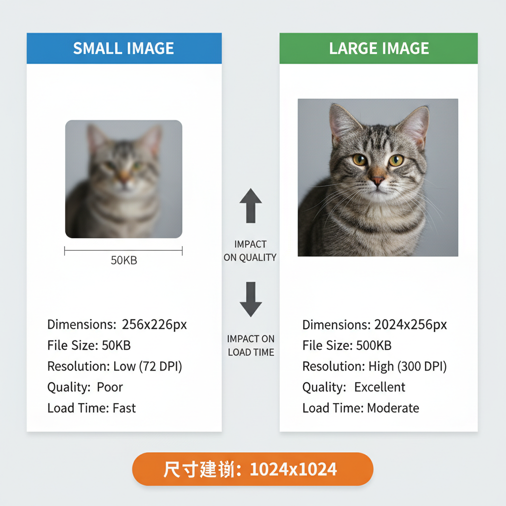
Difference Between Image Dimensions, File Size, and Resolution
Although many use “image size” loosely, it has multiple components:
| Term | Definition | Measured In | Impact on Performance |
|---|---|---|---|
| Dimensions | Width and height of an image | Pixels (px) | Influences display size; larger dimensions often increase file size |
| File Size | Storage space the image occupies | KB or MB | Directly affects load speed; smaller is faster |
| Resolution | Pixels per inch (PPI) | PPI/DPI | Primarily affects print quality, but also clarity on high-density screens |
---
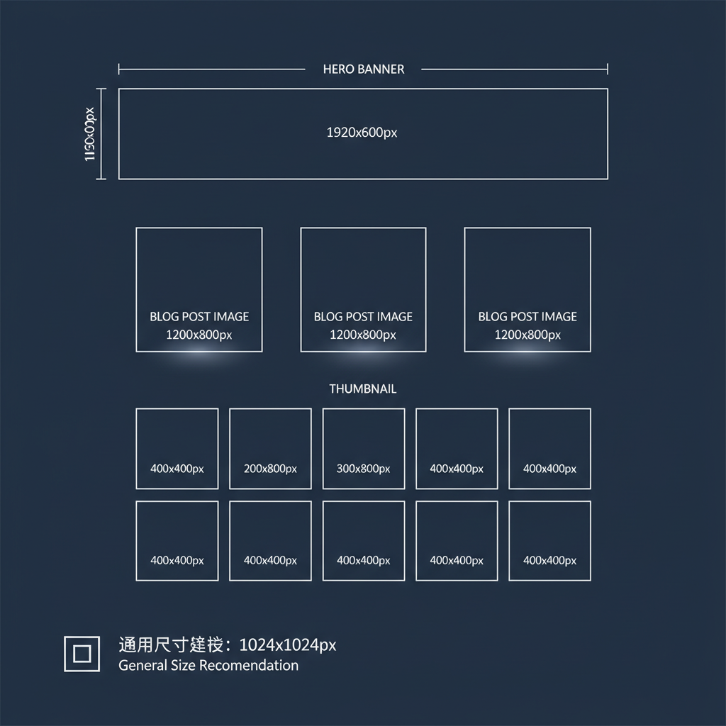
Ideal Image Dimensions for Common Website Layouts
Hero Banners
- Desktop: 1920 × 1080 px full-width.
- Mobile: around 1080 × 720 px using responsive delivery.
Blog Post Images
- Featured image: 1200 × 630 px.
- In-content: 800–1000 px wide based on content column width.
Thumbnails
- 150 × 150 px or 300 × 200 px for image grids.
Serving appropriately sized images prevents unnecessary data transfer.
---
Recommended File Sizes for Fast-Loading Pages
Aim for images that are visually clear yet as small as possible:
- Hero banners: 150–200KB
- Blog content images: 70–150KB
- Thumbnails/icons: 10–50KB
For image-heavy pages, all image files combined should ideally remain under 1–2MB per page.
---
Optimal Resolutions for Screens
Standard Displays
- 72 PPI is the web default and works for most monitors.
Retina/HiDPI Screens
- Provide images at 2× the displayed dimensions for high-density displays.
- Example: A 1000 px wide display image should have a 2000 px source with optimized compression.
Implement responsive delivery so mobile devices aren’t forced to download unnecessarily large files.
---
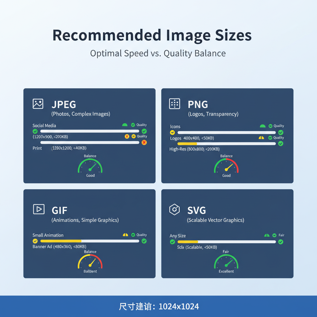
Common Image Formats and When to Use Them
| Format | Best For | Pros | Cons |
|---|---|---|---|
| JPEG | Photographs & gradients | Small size, wide compatibility | Lossy compression may cause artifacts |
| PNG | Graphics with transparency | Lossless quality, supports alpha | Bigger file sizes |
| WebP | Modern alternative to JPEG/PNG | High compression, supports transparency | Limited legacy browser support |
| SVG | Logos, icons, simple vector art | Infinite scalability, minimal size | Not ideal for complex photos |
---
How to Compress Images Without Losing Quality
Effective compression reduces file size without noticeably lowering quality.
Popular Tools:
WordPress Plugins:
- ShortPixel
- Smush
- EWWW Image Optimizer
Adjust settings to find the sweet spot between clarity and size.
---
Responsive Image Techniques
Serve different images depending on screen size:
Advantages:
- Smaller downloads for mobile.
- High resolution on desktops and Retina devices.
---
Lazy Loading to Improve Perceived Speed
Delay image loading until users scroll near them:
This reduces initial payload and improves Largest Contentful Paint (LCP).
---
Testing and Monitoring Image Performance
Check optimization results with:
- Google PageSpeed Insights
- GTmetrix
- Chrome DevTools Network tab
Regularly review file sizes and formats to ensure ongoing performance.
---
Accessibility Considerations for Web Images
Optimized images should also be accessible:
- Add descriptive alt text matching image purpose.
- Use descriptive file names (`coffee-cup.jpg` vs `IMG1234.jpg`).
- Maintain high contrast for text overlays.
- Avoid embedding text in images—use HTML when possible.
---
Workflow Example: Preparing and Uploading Images
- Determine required dimensions.
- Select correct format (JPEG, PNG, WebP, SVG).
- Resize before upload to match display needs.
- Compress with a web tool or app.
- Preview quality to ensure clarity.
- Add responsive attributes (`srcset`, `sizes`).
- Write alt text and rename with keywords.
- Publish and test with speed metrics.
Following this routine ensures each upload maintains both quality and speed.
---
Summary and Next Steps
Optimizing the best image size for website speed is a blend of proper dimensions, efficient formats, careful compression, and modern delivery methods. By continually testing and refining your approach, you create a lightning-fast, visually impressive, and accessible site that search engines and visitors will love.
Call to Action:
Audit a few pages on your site today with PageSpeed Insights. Identify any oversized or unoptimized images, apply the above techniques, and measure the improvement in both load time and user engagement.