Best Photo Size for Website to Improve Speed and SEO
Learn the best image sizes, formats, and compression tips to boost website speed, improve SEO rankings, and enhance user experience across devices.
Best Photo Size for Website to Improve Speed and SEO
Selecting the best photo size for website performance is essential for creating a fast-loading, visually appealing, and search engine–friendly online presence. In an era where core web vitals and user experience directly influence rankings, optimizing image dimensions, file size, and format can make a significant difference. Whether you operate an online store, a blog, or a portfolio, properly optimized photos will improve page speed, reduce bounce rates, and enhance SEO results.

This comprehensive guide explains the ideal image sizes for various use cases, recommended file formats, compression strategies, responsive image best practices, and SEO-focused optimizations.
---
Why Photo Size Matters for Websites
Proper image optimization impacts:
- Faster Page Loads – Smaller files mean quicker load speeds.
- Improved SEO – Google uses speed as a ranking factor.
- Better UX – Visitors expect responsive, sharp visuals without delays.
- Reduced Bandwidth – Smaller files lower costs and improve mobile performance.
Google’s PageSpeed Insights and Lighthouse emphasize image optimization as a major factor for improving site performance metrics.
---
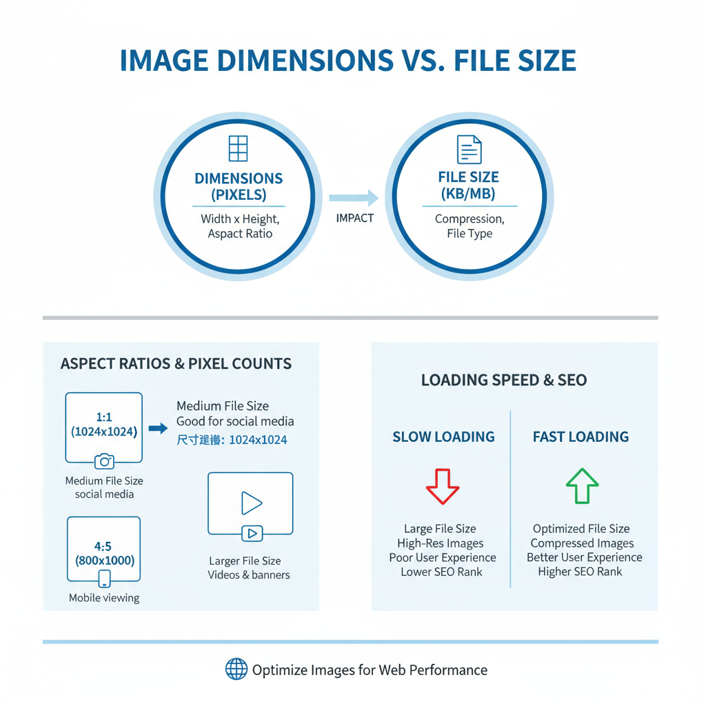
Image Dimensions vs. File Size
Image dimensions measure the pixel area (e.g., 1920×1080 px) and determine how much screen space an image occupies.
File size measures storage space in KB or MB.
- Large pixel dimensions usually increase file size.
- Balance dimensions and weight for optimal clarity and load times.
- For example, a 1200 px wide JPEG at 150 KB often looks crisp and loads quickly.
---
Typical Best Dimensions for Websites
Different site sections require specific image dimensions.
| Use Case | Recommended Dimensions | Aspect Ratio |
|---|---|---|
| Website Banner / Hero | 1920 x 1080 px | 16:9 |
| Blog Post Main Image | 1200 x 630 px | ~1.91:1 |
| Thumbnail | 150 x 150 px — 300 x 300 px | 1:1 |
| Gallery Image | 800 x 600 px | 4:3 |
| Full-Width Content Image | 1600 px width | Varies |
These dimensions are optimized for visual quality without overloading the browser.
---
Choosing Optimal File Formats
Each file format has strengths:
- JPEG (JPG) – Best for photos; supports millions of colors; lossy compression.
- PNG – Suitable for transparency and sharp graphics; larger file sizes.
- WebP – Modern compression with minimal quality loss; widely supported.
- SVG – Scalable vector graphics for logos/icons; tiny file sizes.
---
Recommended File Sizes for the Web
Guidelines for maximum sizes while keeping quality high:
- Hero/Banner: 150–300 KB
- Blog images: 100–200 KB
- Thumbnails: < 50 KB
- Icons: < 10 KB
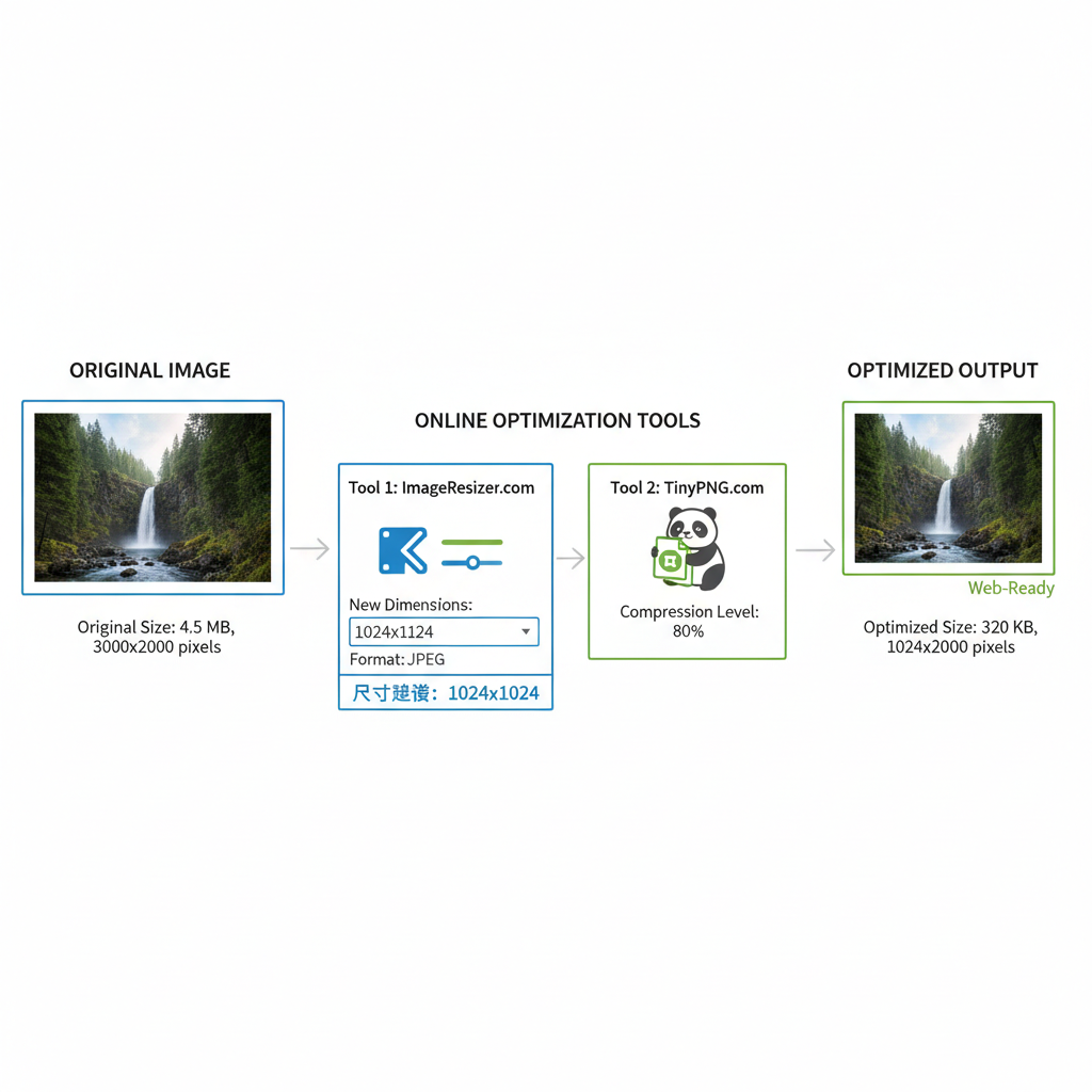
Compression Tips:
- Use TinyPNG, Squoosh, or ImageOptim.
- Save at 72 DPI for the web.
- Test lossy vs. lossless output.
---
Tools for Resizing and Optimizing Images
Popular options include:
- Adobe Photoshop – Professional-grade compression.
- GIMP – Free, open-source editor.
- TinyPNG / TinyJPG – Quick online compression.
- Squoosh – Google’s web-based optimizer.
- ImageMagick – Bulk processing via command line.
Example ImageMagick command:
convert input.jpg -resize 1200x -quality 80 output.jpg---
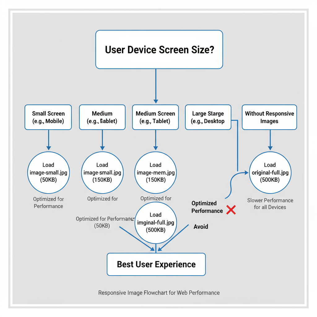
Responsive Image Best Practices
Ensuring images adapt to device size boosts both UX and SEO.
- Use `srcset` and `sizes` in HTML to serve different image widths.
- Avoid full-desktop images on mobile to save bandwidth.
- Apply responsive CSS (`max-width: 100%`) to prevent overflow.
Example responsive markup:
---
How Large Images Impact SEO and Core Web Vitals
Oversized images can negatively affect Largest Contentful Paint (LCP) — a key core web vital.
Potential issues include:
- Slower perceived load times.
- Higher bounce rates and reduced engagement.
- Negative ranking signals from Google.
Optimizing image size helps maintain excellent LCP scores.
---
Image Naming, Alt Tags, and Structured Data
Enhance SEO by:
- Descriptive File Names: e.g., `best-photo-size-for-website-banner.jpg`.
- Alt Attributes: Clear descriptions for accessibility and SEO context.
- Structured Data: Use `ImageObject` schema.
Example JSON-LD:
{
  "@context": "https://schema.org",
  "@type": "ImageObject",
  "contentUrl": "https://example.com/images/hero.jpg",
  "description": "Hero banner image showing optimal website photo size",
  "name": "Best Photo Size for Website"
}
---
CDNs and Lazy Loading for Faster Delivery
A Content Delivery Network (CDN) serves images from geographically close servers for faster load times.
Lazy Loading improves load speed and CLS scores:
---
Checklist for Optimizing Images Before Publishing
- Set correct display dimensions.
- Choose the best format for the content.
- Compress while maintaining quality.
- Test on multiple devices.
- Add SEO details: filename, alt text, schema.
- Implement responsive code.
- Use a CDN.
- Activate lazy loading.
---
Quick Reference Table for Image Sizes by Use Case
| Use Case | Dimensions (px) | Max File Size | Format Recommendation |
|---|---|---|---|
| Hero/Banner | 1920 x 1080 | 300 KB | WebP/JPEG |
| Blog Post Main | 1200 x 630 | 200 KB | WebP/JPEG |
| Thumbnail | 150-300 square | 50 KB | WebP/PNG |
| Gallery | 800 x 600 | 150 KB | WebP/JPEG |
| Logo/Icon | Variable (SVG preferred) | < 10 KB | SVG/PNG |
---
Summary
Choosing the best photo size for website use is a critical component of site performance and SEO success. By applying optimal dimensions, smart compression, proper formats, and responsive delivery techniques, you can achieve fast-loading, high-quality visuals across devices. Implement the checklist above to streamline your workflow and reap both user experience and search ranking benefits.
Action Step: Before uploading your next image, run through sizing, compression, and SEO checks — your visitors and search rankings will thank you.