Best Picture Size Guide for Web and Social Media
Learn optimal image sizes for websites and major social media platforms, plus tips on compression and responsive design for faster loading and better SEO.

Best Picture Size Guide for Web and Social Media
Choosing the best picture size for your website and social media platforms is key to delivering crisp visuals, faster load times, and better SEO. When you know the optimal dimensions for each platform, you ensure your images look professional everywhere — from blog hero banners to Instagram stories. This guide covers image resolution basics, why sizing matters, ideal dimensions by major platform, and pro tips for compression and responsive design.
---
Understanding Image Resolution Basics
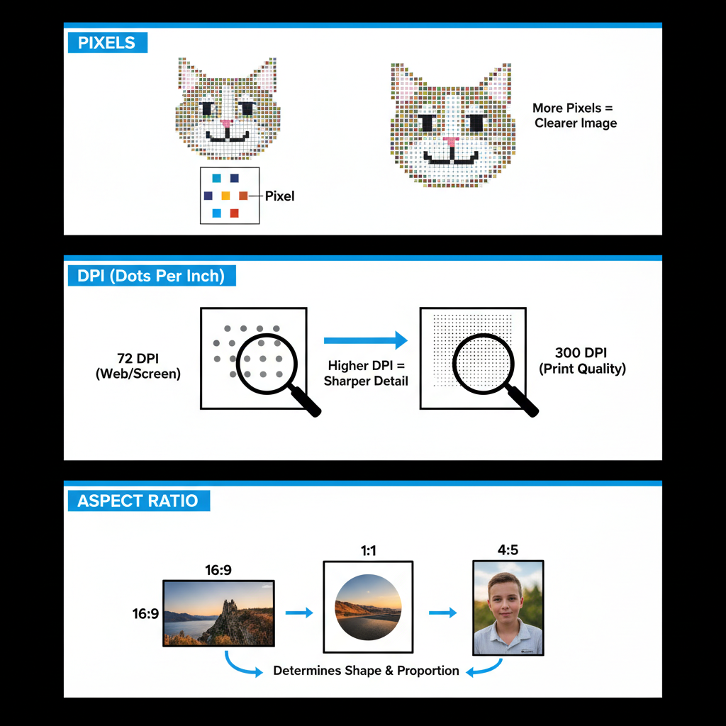
Before diving into platform-specific image sizes, it’s important to grasp a few technical terms and concepts.
Pixels
Pixels are the smallest units of a digital image. Dimensions are measured in width × height pixels (e.g., 1920×1080).
DPI (Dots Per Inch)
DPI refers to print resolution. For web use, DPI has minimal impact, but 72 DPI is a common standard for images displayed on screens.
Aspect Ratio
The aspect ratio is the proportional relationship between width and height. For example, a 16:9 ratio is common for widescreen content, while 1:1 indicates a square format.
---
Why Picture Size Matters
Choosing the right image dimensions impacts:
- Quality – Larger images can look sharper but may also slow page loading.
- Load Speed – Oversized files cause delays, harming user experience and increasing bounce rates.
- SEO – Optimized images help search engines prioritize your page in rankings.
- Cross-Platform Consistency – Correct sizing ensures visuals look good on desktops, tablets, and smartphones.
---
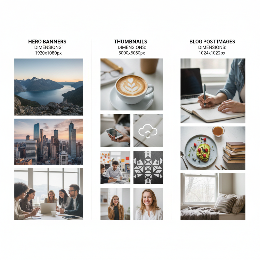
Optimal Dimensions for Websites
Web images include hero banners, inline blog visuals, and thumbnails. File size optimization is crucial.
Recommended Website Image Sizes
- Hero Images: 1920×1080 px (16:9)
- Blog Post Images: 1200×628 px (adjust to 4:3 if needed)
- Thumbnails: 150×150 px (for grids or previews)
Tip: Stay under 200 KB per image for faster load times.
---
Best Picture Sizes for Facebook
On Facebook, your image’s location determines how it appears to users.
Recommendations:
- Profile Picture: 180×180 px (displays at 170×170 px desktop)
- Cover Photo: 820×312 px (center important content for mobile views)
- Shared Image / Link Preview: 1200×630 px
- Facebook Ads:
- Carousel: 1080×1080 px (square)
- Single Image Ad: 1200×628 px
---
Best Picture Sizes for Instagram
Different Instagram areas require specific aspect ratios for best effect.
Recommendations:
- Feed Posts:
- Square: 1080×1080 px
- Portrait: 1080×1350 px (4:5)
- Landscape: 1080×566 px (1.91:1)
- Stories: 1080×1920 px (9:16)
- Reels: 1080×1920 px
- Instagram Ads: Match the format — Stories ads use the story dimensions; carousel feed ads use 1080×1080 px.
---
Recommended Picture Sizes for Twitter/X
Fast-moving feeds on X (formerly Twitter) demand striking visuals.
Recommendations:
- Profile Picture: 400×400 px
- Header Photo: 1500×500 px
- In-Stream Photo: 1200×675 px
- Twitter Ads: Use same in-stream dimensions; keep multiple images consistent.
---
Best Picture Sizes for LinkedIn
LinkedIn is ideal for professional networking and branding.
Recommendations:
- Profile Picture: 400×400 px
- Background / Banner: 1584×396 px
- Shared Link Image: 1200×627 px
- LinkedIn Ads:
- Single Image: 1200×627 px
- Carousel: 1080×1080 px
---
Optimal Dimensions for Pinterest
Pinterest thrives on vertical, high-visibility images.
Recommendations:
- Standard Pin: 1000×1500 px (2:3 aspect)
- Square Pin: 1000×1000 px
- Board Cover: 222×150 px (display size)
---
How to Compress Images Without Losing Quality
Large image files slow down load speeds, hurting user satisfaction and SEO.
Compression Tools:
- TinyPNG/TinyJPG – Drag-and-drop simplicity
- ImageOptim – Mac-friendly optimization
- Squoosh – A free, robust tool by Google
Tips:
- Use JPEG for photos, PNG for transparent backgrounds
- Apply moderate compression to retain clarity
---
Responsive Image Sizing Techniques
Responsive design ensures images adapt smoothly to any device.
Strategies:
- Use `srcset` in HTML to serve appropriate image resolutions
- Leverage CSS `max-width: 100%` to prevent overflow
- Consider WebP format for modern, lightweight visuals
---
Common Mistakes to Avoid
- Uploading raw, unoptimized camera files
- Distorting aspect ratios during resizing
- Overlooking mobile-specific cropping
- Skipping compression entirely
- Using file names without SEO-friendly keywords
---
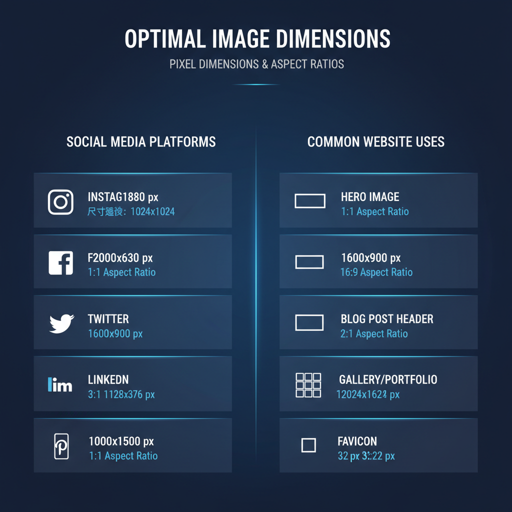
Quick Reference Size Chart for Major Platforms
| Platform | Image Type | Best Size (px) | Aspect Ratio |
|---|---|---|---|
| Website | Hero Image | 1920×1080 | 16:9 |
| Website | Thumbnail | 150×150 | 1:1 |
| Cover Photo | 820×312 | varies | |
| Portrait Post | 1080×1350 | 4:5 | |
| Twitter/X | Header Photo | 1500×500 | 3:1 |
| Banner | 1584×396 | 4:1 | |
| Standard Pin | 1000×1500 | 2:3 |
---
Final Thoughts
By consistently using the best picture size for each platform, you can ensure that your visuals remain sharp, load quickly, and perform better in search results. Whether you’re managing a blog, running ads, or curating social content, investing time in proper sizing will pay off in improved engagement and SEO benefits.
Ready to optimize your content visuals today? Start implementing these size guidelines and watch your overall performance improve across every digital channel.