Best Picture Size for Website for Fast Load and High Quality
Learn how to choose the best picture size for your website to improve load speed, boost SEO, and maintain high-quality visuals across devices.

Best Picture Size for Website for Fast Load and High Quality
Choosing the best picture size for website projects is one of the most effective ways to improve page speed, boost SEO, and maintain a visually appealing user experience. Images that are too large waste bandwidth and slow pages down, while those that are too small or poorly formatted can look unprofessional.
This guide explains how to select the right dimensions, aspect ratios, formats, and optimization techniques so your site loads faster without sacrificing quality.
---
Why Image Size Matters for Website Performance and SEO
Large, unoptimized images are among the biggest causes of poor site performance. Your choice of image size directly affects:
- User Experience: Visitors leave if a page takes too long to load.
- Search Rankings: Search engines include load time in their ranking criteria.
- Conversion Rates: Faster websites tend to generate more engagement and sales.
Improving image delivery also boosts Core Web Vitals scores — a key factor in Google’s view of your site quality. In many cases, properly optimized images can cut total page weight by half or more.
---
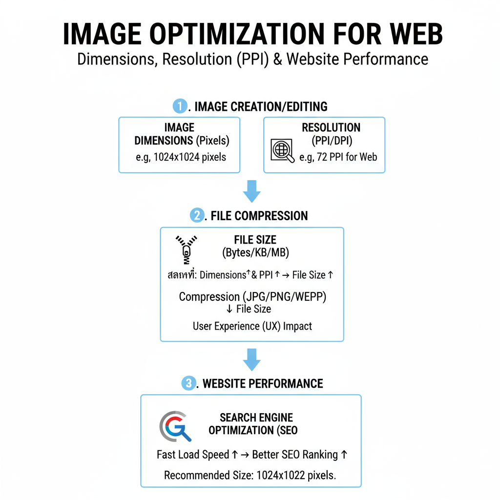
Understanding Dimensions, Resolution, and File Size
Before determining the best picture size for a website, it’s crucial to distinguish between three often confused terms:
| Term | Definition | Impact on Website |
|---|---|---|
| Dimensions (px) | Width and height in pixels (e.g., 1200×800px) | Controls on-screen display size; oversized dimensions increase file size |
| Resolution (ppi) | Pixels per inch, mostly relevant to print media; beyond 72ppi makes little difference on screens | Minimal effect on digital sharpness once a baseline is met |
| File Size (KB/MB) | Digital “weight” of the image file | Directly impacts page load time and bandwidth |
Key takeaway: Focus on proper pixel dimensions and reduced file size rather than excessively high resolution.
---
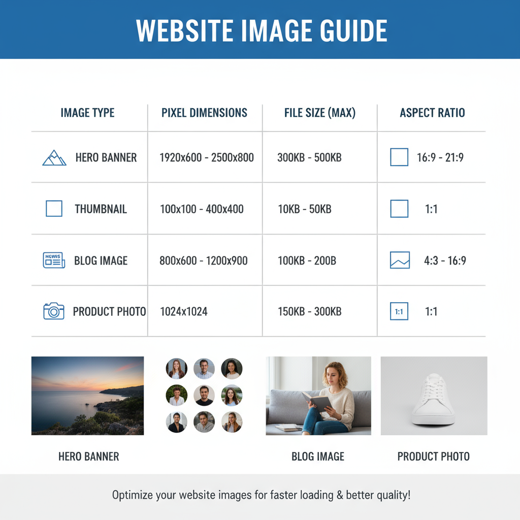
Recommended Pixel Dimensions for Common Website Images
Different placement areas require different pixel dimensions. Oversizing wastes resources, while undersizing can appear blurry.
| Image Type | Recommended Size | Notes |
|---|---|---|
| Hero images | 1920×1080px | Full-width banners for desktops; scale down for smaller devices |
| Website banners | 1600×500px | Wide-and-short format ideal for headers |
| Blog post feature images | 1200×628px | Matches Open Graph aspect for social media sharing |
| Thumbnails | 300×200px | Sharp and lightweight for previews |
| Gallery images | 800×600px | Balanced size for lightboxes and moderate zoom |
Pro tip: Match the maximum display width of the element — avoid uploading excess pixels “just in case.”
---
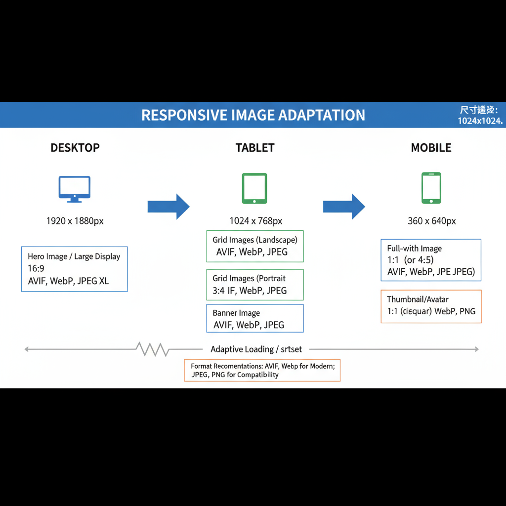
Best Aspect Ratios for Responsive Design
Aspect ratio is the proportional relationship between width and height. Consistent ratios help maintain visual harmony across devices.
Common ratios include:
- 16:9: Excellent for hero images, slideshows, video thumbnails.
- 4:3: Common for product and blog images.
- 1:1: Square format ideal for avatars and grid-based galleries.
- 3:2: Popular in photography and e-commerce catalogs.
Responsive Design Tips
- Use `object-fit: cover` in CSS for non-distorted scaling.
- Crop key elements centrally for mobile and wide displays.
- Implement multiple sources via the HTML `srcset` attribute to serve the right size for each device.
---
Ideal File Formats for Different Uses
The best picture size strategy also depends on file type selection:
| Format | Best For | Advantages | Drawbacks |
|---|---|---|---|
| JPEG | Photos, gradients | Compact size, good quality control | Lossy; no transparency support |
| PNG | Logos, graphics, transparency | Lossless, transparency supported | Larger size than JPEG |
| WebP | Almost all web imagery | Very small files, supports transparency | Fallback needed for old browsers |
| SVG | Icons, vector graphics | Perfect scaling, ultra-light | Not suited for photographs |
---
Compression Tools and Techniques
Image compression reduces file size with little or no noticeable quality loss:
Popular tools:
- TinyPNG / TinyJPG
- ImageOptim
- Squoosh (by Google)
- ShortPixel, Imagify (WordPress plugins)
Compression Types
- Lossy: Smaller files, slight quality drop (usually unnoticeable on the web).
- Lossless: Maintains pixel-perfect quality, but with bigger files.
General guideline: Keep most images under 200KB, large banners under 1MB.
---
Lazy Loading and CDN Usage
Speed gains also come from intelligent loading and delivery.
Lazy Loading
Load images only as they scroll into view:
Content Delivery Networks (CDNs)
Distribute files across global servers for faster delivery. Providers like Cloudflare, Amazon CloudFront, and Imgix also offer automatic optimization.
---
Before/After Optimization Example
For example, consider a blog with 10 images at 1MB each:
- Before: Total load = 10MB, ~6 sec on 4G.
- After: Compressed to 200KB each, WebP format = 2MB total, ~2 sec load.
This represents a ~67% speed improvement, benefiting both UX and SEO.
---
Testing Image Performance
Measure the effect of image optimization with:
- Google PageSpeed Insights
- GTmetrix
- WebPageTest
- Lighthouse in Chrome DevTools
Look at metrics such as:
- Largest Contentful Paint (LCP)
- Total Blocking Time (TBT)
- Cumulative Layout Shift (CLS)
---
Common Mistakes to Avoid
Avoid these errors when targeting the best picture size for a website:
- Uploading full-resolution camera images without resizing.
- Using PNG for full-screen photos (prefer JPEG/WebP).
- Leaving out `alt` text, reducing SEO and accessibility.
- Serving desktop-size images to mobile users.
- Skipping compression altogether.
---
Conclusion
Achieving the best picture size for website optimization is about balance: selecting smart dimensions, matching aspect ratios, using efficient formats, and applying compression. Combined with lazy loading and CDN delivery, these practices can make your pages load noticeably faster, improve SEO signals, and enhance user satisfaction.
Start by optimizing key templates or landing pages, then roll out these image guidelines across your entire site to enjoy sustained performance gains and better rankings.