Best Size for Web Images for Speed and Quality
Learn how to choose optimal web image sizes, formats, and compression methods to balance speed, quality, and SEO for a better user experience.

Best Size for Web Images for Speed and Quality
Selecting the best size for web images is essential for creating visually sharp yet fast-loading, SEO-friendly websites. Oversized or poorly optimized visuals can bloat page weight, slow loading times, and hurt search engine rankings. In this comprehensive guide, you’ll learn how to choose optimal dimensions, formats, and compression methods to balance speed with image quality—ensuring your site delivers both a great user experience and strong performance metrics.
---
Why Image Size Matters for Websites
When you understand the direct link between an image’s size and overall site health, you’ll see why proper optimization is essential.
- Speed improvements: Large files take longer to load, raising bounce rates.
- Search engine optimization: Google prioritizes mobile-first and fast websites.
- User experience: People expect clear visuals but won’t wait more than a couple of seconds for content.
- Bandwidth efficiency: Smaller images reduce server load and hosting costs.
A perfectly sized image enhances design quality without compromising performance, giving your site a competitive edge.
---
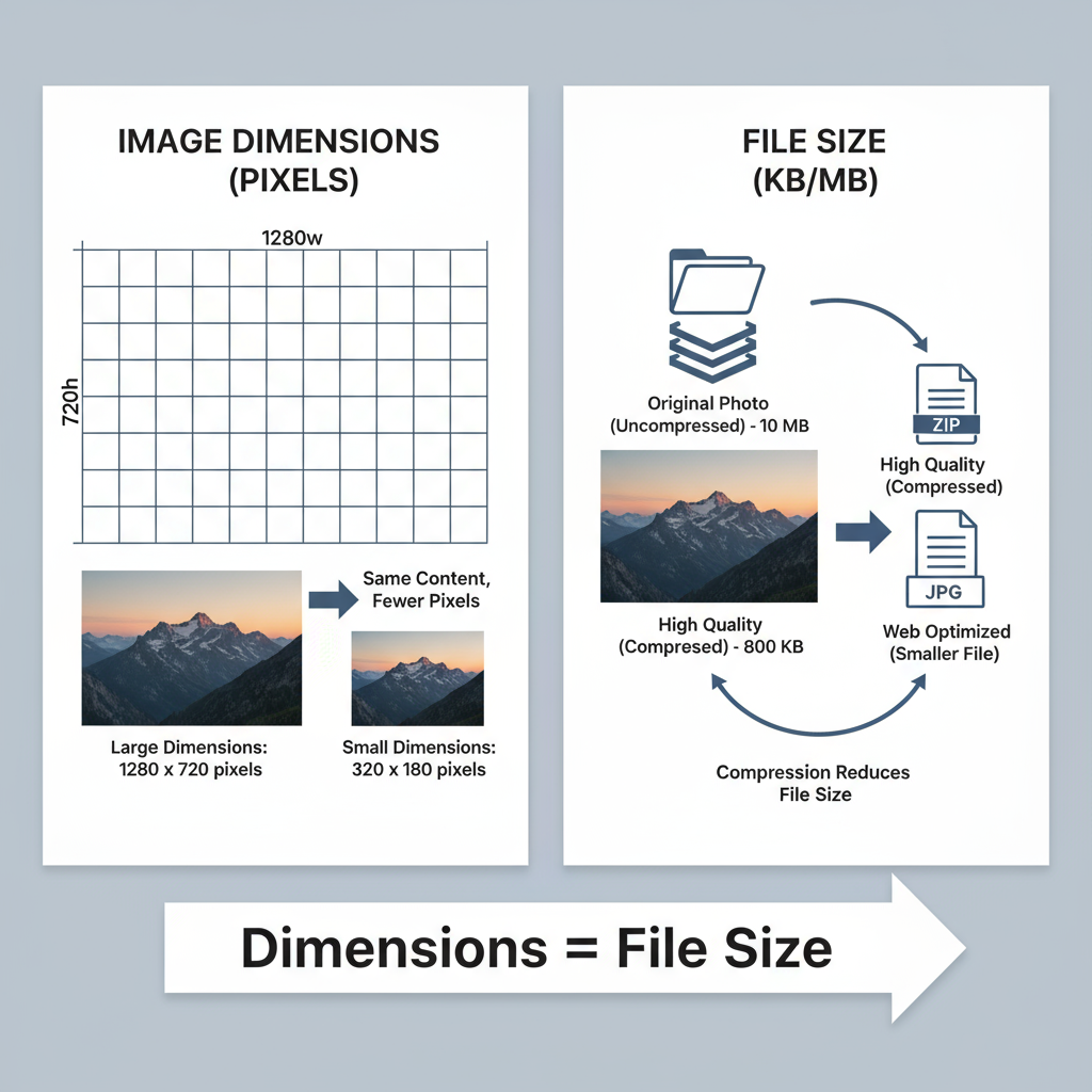
Image Dimensions vs. File Size
While often confused, dimensions and file size are two different metrics:
- Dimensions (px): The width and height of an image in pixels.
- File Size (KB or MB): Storage space the file occupies, affected by resolution, color depth, and compression.
For instance, a 1200×800 px JPEG might be 350 KB after compression, whereas a PNG at the same size could be several MB.
---
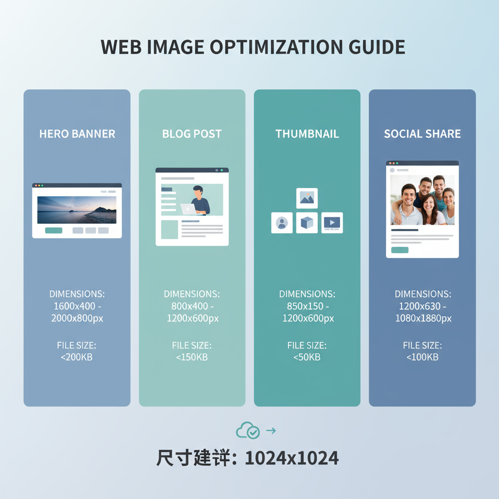
Recommended Dimensions for Common Uses
Different placements need different pixel dimensions. Using unnecessarily large images wastes bandwidth and slows the site.
Hero Banners
- Suggested size: 1920×1080 px (standard) or up to 2560×1440 px for large displays.
- Tip: Keep under 500 KB with JPEG or WebP.
Blog Post Images
- Suggested size: 1200×800 px (landscape) or 1200×1200 px (square).
- Tip: Save at 70–80% JPEG quality for a good balance.
Thumbnails
- Suggested size: 150×150 px to 400×400 px.
- Tip: Use PNG for icons/logos, JPEG or WebP for photos.
Social Sharing Previews
- Suggested size: 1200×630 px (Facebook, LinkedIn), 1080×1080 px (Instagram), 1024×512 px (Twitter/X).
- Tip: Review platform specifications periodically.
---
Ideal File Formats for the Web
Choosing the best image format impacts both quality and file size.
| Format | Best For | Pros | Cons |
|---|---|---|---|
| JPEG | Photos, gradient artwork | Small size, broad compatibility | Lossy compression may degrade quality |
| PNG | Logos, transparency graphics | Lossless, supports transparency | Larger file sizes |
| WebP | Photos & graphics | High compression efficiency | Requires fallback for older browsers |
| SVG | Icons, simple line art | Scalable without loss, minimal size | Poor choice for complex images |
---
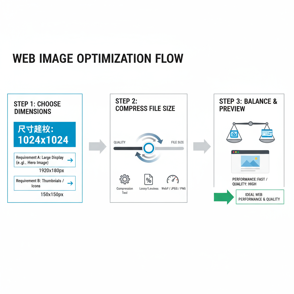
Compression Tools and Techniques
Compression reduces file size without sacrificing necessary quality.
Compression types:
- Lossy: Removes data to shrink size (e.g., JPEG 80% quality).
- Lossless: Retains complete data but optimizes storage (e.g., PNG compression).
Popular tools:
- TinyPNG / TinyJPG: Simple drag-and-drop.
- ImageOptim: Mac app for lossless results.
- Squoosh: Google’s in-browser compressor.
- Photoshop ‘Save for Web’: Fine-tune quality and output.
Tip: Always compress before uploading to avoid server strain.
---
Responsive Images & `srcset` for Mobile Optimization
Serving appropriate image sizes to different devices saves bandwidth and speeds load time.
- `srcset` lists available versions.
- `sizes` guides browser selection.
- Use `` for varied crops or art direction.
---
DPI vs. PPI Explained
The difference:
- DPI: Dots per inch—printing term for ink density.
- PPI: Pixels per inch—screen image density.
Note: Online display is governed by pixel dimensions. DPI settings don’t change on-screen appearance.
---
Balancing Quality and Performance: Case Examples
Example:
- A: 4000×3000 px PNG at 12 MB.
- B: 1920×1080 px WebP at 420 KB.
Both look sharp on desktop, but B loads ~28× faster, improving SEO metrics.
Similarly, transforming 1 MB thumbnails into 30 KB JPEGs can make pages load significantly quicker without visible quality loss.
---
Common Mistakes to Avoid
- Uploading original, full-resolution camera images.
- Using the wrong format for the content type.
- Skipping compression.
- Failing to use responsive images for mobile.
- Over-compressing, causing artifacts.
---
Quick Checklist for Optimized Image Uploads
- Resize to fit the intended display size.
- Choose the correct format (JPEG/WebP for photos, PNG for transparency, SVG for icons).
- Compress to under 500 KB for large visuals; much smaller for smaller displays.
- Implement responsive loading with `srcset` and `sizes`.
- Test load speed using Google PageSpeed Insights.
- Preview across devices to confirm scale and clarity.
- Use descriptive file names for SEO benefits.
- Add alt text for accessibility and search visibility.
---
Conclusion
Optimizing the best size for web images means finding the sweet spot where visual impact meets loading efficiency. By tailoring dimensions to placement, selecting the right formats, compressing smartly, and leveraging responsive techniques, you boost both user satisfaction and search engine performance.
Take action now: audit your current site images, apply these practices, and watch your page speed improve—alongside your SEO rankings and user engagement.