Using Black Social Media Icons for Brand Design
Discover how black social media icons enhance brand consistency, add elegance, and adapt across styles, platforms, and marketing materials.

Introduction: Why Icon Color and Style Matter for Brand Consistency
Your brand identity is shaped by every visual element you put into the world. While social media icons may seem minor, they are powerful gateways to your online presence. The choice of color and style can directly influence how cohesive and professional your brand appears. Opting for black social media icons is a smart, design-focused decision that adds elegance, clarity, and uniformity to your visual strategy.

When every detail — including the subtle color choice of a Facebook, Instagram, or LinkedIn icon — is intentional, you create a consistent brand image that builds trust, professionalism, and memorability.
---
Benefits of Using Black Social Media Icons
Black icons are not mere “plain” options; they bring distinct advantages that can elevate your design:
- Minimalist Appeal – Naturally aligns with modern, minimalist trends.
- Versatility – Harmonizes with light and colorful backgrounds.
- Professionalism – Conveys confidence, timelessness, and sophistication.
Because black offers superb contrast on light backgrounds, your icons remain instantly recognizable without overpowering your other brand visuals.
---
Understanding Different Styles of Black Social Media Icons
Black social icons come in many styles. Knowing the visual personality each style conveys helps you choose wisely.
Popular styles include:
- Solid (Filled) Icons – Strong visibility, especially at small sizes.
- Outline Icons – Clean and airy, ideal for contemporary or minimalist brands.
- Flat Icons – 2D simplicity without gradients or shadows.
- 3D Icons – Add depth and texture for playful or distinctive applications.
- Minimalist Line Icons – Ultra-thin stroke, perfect for luxury or high-end branding.
---
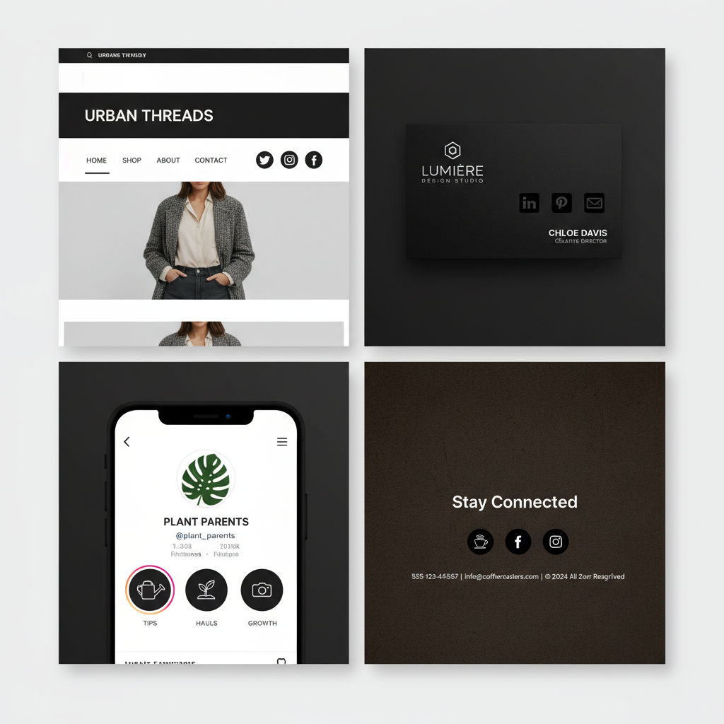
Where Black Icons Work Best
Because they’re neutral yet striking, black icons can adapt to many platforms and media:
- Websites – In headers, footers, or floating sidebars.
- Email Signatures – To connect subscribers to your social media.
- Business Cards – As a subtle, clear representation of online channels.
- Presentations – Clean, distraction-free visual links within slides.
---
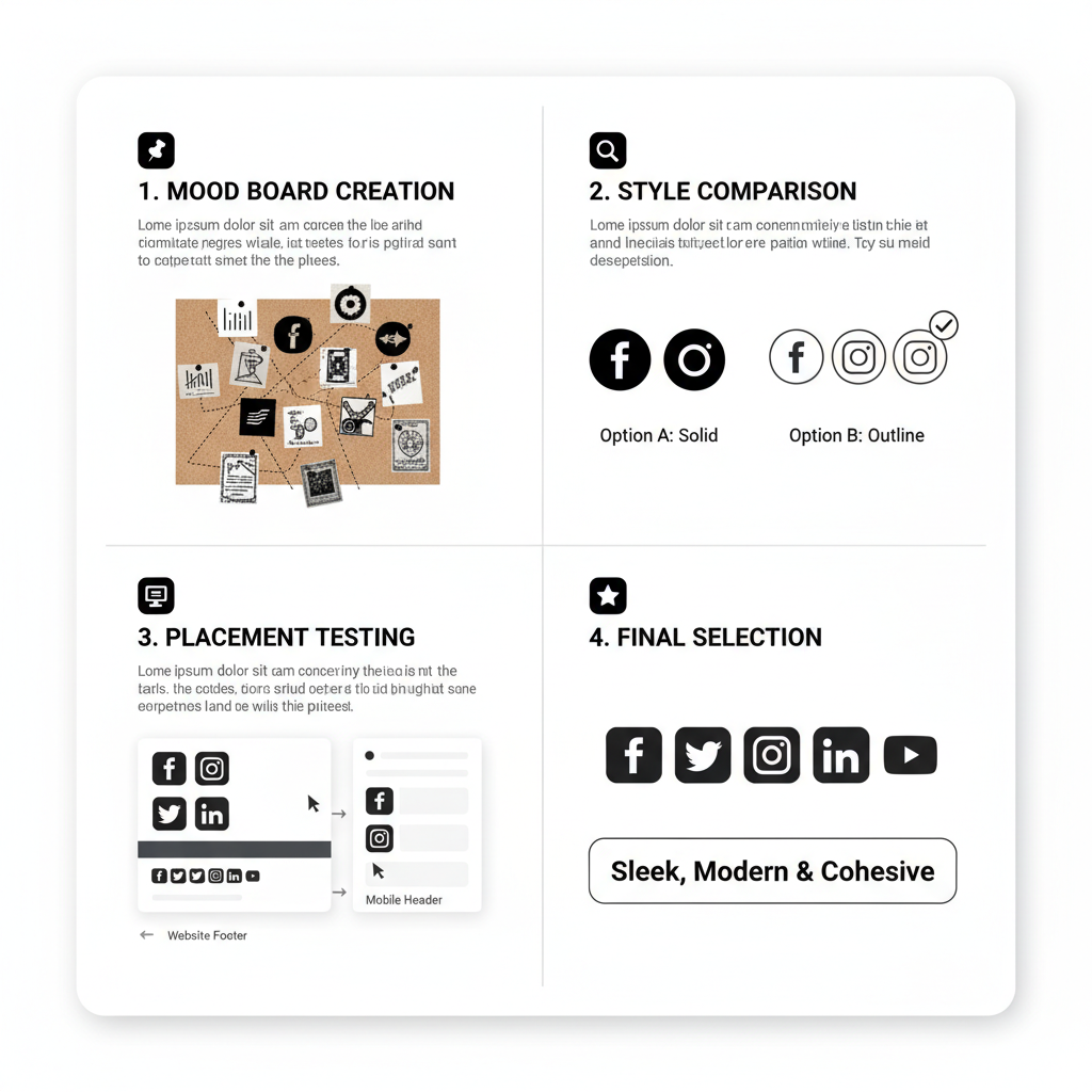
How to Choose the Right Icon Set for Your Brand’s Tone and Audience
Selecting black social media icons is about harmonizing style with function:
- Understand Your Audience – Corporate vs. creative segments prefer different aesthetics.
- Match Brand Tone – Complement brand fonts, imagery, and color palettes.
- Test Integration – Ensure icons align visually with existing brand elements.
---
Best Practices for File Formats and Resolutions
Right file formats ensure your icons look sharp on all screens and in print:
| Format | Best Use Case | Advantages |
|---|---|---|
| SVG | Web and responsive design | Scales infinitely, lightweight |
| PNG | General web & print | Supports transparency, high quality |
| EPS | Professional print design | Fully editable vector format |
Tips:
- Maintain vector originals for maximum flexibility.
- Export multiple sizes for various devices.
- Compress images for faster site loading.
---
Customizing Black Icons to Match Your Brand Palette
You can personalize black icons without compromising their elegance:
- Pure Black – Creates a bold, confident appearance.
- Accent Highlights – Add subtle borders or colored backgrounds to bridge with your palette.
- Opacity Adjustments – For softer integration in muted designs.
For instance, a luxury fashion house might opt for charcoal instead of pure black for cohesion.
---
Where to Find High-Quality Black Icon Sets
Great sources include:
- Free – Flaticon, Iconfinder, The Noun Project (check license terms).
- Premium – Envato Elements, Creative Market, UI8 Marketplaces.
- DIY – Create custom icons in Illustrator, Sketch, or Figma.
Always check for consistent line thickness, padding, and aspect ratio within a set.
---
How to Add and Link Black Icons Effectively in Website Builders
Each platform offers different ways to embed icons:
- WordPress – Add via widgets, theme customizer, or page builder modules; link in settings.
- Squarespace – Use built-in social blocks or image blocks with links.
- Wix – Drag icon elements to your page and attach links in properties.
Example HTML Snippet
---
Common Mistakes to Avoid
Keep your black icons professional by avoiding:
- Low Resolution – Blurry edges reduce trust.
- Mixed Styles – Combining outline and filled icons creates visual imbalance.
- Poor Contrast – Prevent black icons from getting lost on dark backdrops.
- Wrong Format – Avoid low-quality raster when scaling.
---
Accessibility Considerations with Black Icons
Accessibility ensures inclusivity for all users:
- Contrast – Use light backgrounds behind black icons if placed over dark sections.
- Alt Text – Always include descriptive alt attributes for screen readers.
- Interactive Size – Provide sufficient click/tap area for mobile friendliness.
Attention to accessibility makes your icon links usable for everyone.
---
Conclusion: Enhance Your Brand with Black Social Media Icons
Sleek, versatile, and timeless, black social media icons strengthen brand cohesion across print and digital platforms. To maximize their impact:
- Sync icon style with brand personality.
- Use correct file formats for clarity.
- Prioritize accessibility and visual balance.
By choosing and implementing black icons intentionally, you send a clear, consistent visual message — turning even the smallest design element into a strategic brand asset. Explore curated black icon sets today to elevate your brand presence across all channels.

