Using Black Social Media Icons for Cohesive Branding
Learn how using black social media icons can enhance minimalist branding, convey sophistication, and maintain a cohesive identity across platforms.

Introduction to Minimalist Design in Branding
Minimalist design has become a cornerstone in modern branding, valued for its clean, professional, and timeless aesthetic. By focusing on simplicity and removing visual clutter, brands can deliver messages in a direct, impactful way. A key element in executing such an approach is the use of social media icons black, which offer a refined look while maintaining clarity and presence.

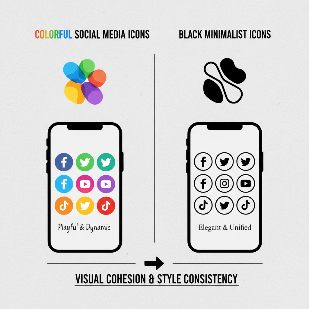
Black social media icons fit seamlessly within minimalist palettes, providing contrast, balance, and a subtle sense of authority. They help create a cohesive identity across digital and print touchpoints without overwhelming the viewer.
---
Psychology of Black in Design and Marketing
Understanding color psychology informs better design decisions. Black is often interpreted as:
- Sophistication – Viewed as elegant, refined, and premium.
- Authority – Communicates professionalism and confidence.
- Neutrality – Pairs well with any color scheme without competing.
- Versatility – Flexible enough to suit formal, corporate, or trendy settings.
Depending on accompanying typography, shapes, and secondary colors, black can convey either cutting-edge modernity or timeless tradition. This versatility ensures black social media icons remain effective in industries ranging from high fashion to emerging tech.
---
Benefits of Using Black Social Media Icons
Adopting black icons offers several strategic advantages:
- Aesthetic Consistency – Complements monochrome or restrained design systems.
- Brand Uniformity – Maintains consistent look across websites, emails, social media, and printed materials.
- Timelessness – Avoids the rapid dating of trend-dependent styles.
- High Adaptability – Works over bright, muted, or light-toned backgrounds.
- Premium Visual Cue – Signals quality, attention to detail, and professionalism.
---
Where and When Black Icons Work Best
Black icons excel when used intentionally in particular contexts:
- Website Footer – Offers contrast on light or pale backgrounds.
- Email Signature – Keeps correspondence clean and uncluttered.
- Print Collateral – Suitable for business cards, brochures, and flyers.
- Social Media Headers – Supports minimal branding strategies.
- App UI – Effective on light surfaces within mobile or web applications.
---
Tips for Choosing or Designing Black Social Media Icons
When sourcing or designing your social media icons:
- Size – Opt for scalable vector graphics (SVG) for responsive layouts.
- Format – Use SVG or PNG for web; EPS for high-quality prints.
- Resolution – Ensure sufficient resolution for crisp display at larger sizes.
- Stylistic Consistency – Maintain a unified style across all platforms.
- Spacing – Include adequate margins to keep visuals breathable.
---
Accessibility Considerations
Even with black’s versatility, accessibility must remain a priority:
- Contrast Compliance – Verify icons meet WCAG guidelines for visibility.
- Alt Text – Use accurate and descriptive alternative text for screen readers.
- Interactive Cues – Provide hover or focus effects (color shifts, shadows) to enhance usability.
This not only improves inclusivity but also strengthens brand trust.
---
Sources for Free and Premium Black Icon Sets
Designers often rely on ready‑made icon sets, but checking licensing terms is vital.
| Source | Type | License Notes |
|---|---|---|
| Flaticon | Free & Premium | Free with attribution; premium for no attribution |
| Iconfinder | Free & Premium | License varies; review terms before use |
| Noun Project | Free & Paid | Free with attribution; paid plans available |
| Envato Elements | Premium | Subscription-based; commercial usage included |
Match file types to intended channels, and for critical brand assets, premium options often deliver unique styles and broader usage rights.
---
Customizing Black Icons to Match Brand Style
Tailoring generic icons ensures better brand alignment:
- Shape Variations – Rounded vs. square shells.
- Border Width – From delicate outlines to bold frames.
- Hover Animations – Subtle scaling or lightening effects via CSS.
- Grid Integration – Spacing should align with other UI components.
Example CSS for a hover scale effect:
.social-icon img {
  transition: transform 0.3s, filter 0.3s;
}
.social-icon img:hover {
  transform: scale(1.1);
  filter: brightness(1.2);
}
---
Step-by-Step: Replacing Default Icons with Black Versions
WordPress
- Upload black icon files into the media library.
- Replace existing icon URLs via widgets or theme customization.
- Adjust CSS to achieve desired sizing and spacing.
Squarespace
- Open the social links block settings.
- Swap default icons with custom black versions.
- Use CSS injection to fine-tune appearance.
Shopify
- Access the theme’s code editor.
- Replace SVG paths in the assets directory.
- Preview and refine layout on all device breakpoints.
---
Testing Icon Visibility Across Devices
To ensure optimal visibility:
- Responsive Display – Check proportions on desktop, tablet, and mobile.
- Retina/High-DPI Screens – Use vector or high-resolution raster files.
- Dark Mode – Prepare alternate lighter versions if required.
- Cross‑Browser Testing – Validate consistency on Chrome, Safari, Firefox, and Edge.
---
Mistakes to Avoid with Black Icons
Avoid these common missteps:
- Visual Overload – Too many black elements can feel heavy.
- Low Contrast – Black on dark backgrounds compromises readability.
- Uneven Sizing – Breaks layout rhythm.
- Mixed Styles – Combining outline, flat, and shaded icons without clear intent.
---
Conclusion and Call-to-Action
Incorporating social media icons black into your branding strategy can deliver timeless style, professional appeal, and adaptability across all channels. By leveraging black’s color psychology, honoring accessibility, and customizing for brand fit, you create icons that resonate with audiences and enhance brand cohesion.
Whether updating a website, fine‑tuning print materials, or creating app interfaces, black icons offer understated impact and lasting relevance.
Start experimenting with curated icon sets today, adapt them to your style guide, and watch your brand presentation become sharper and more unified.

