Common Image Sizes for Websites and Optimization Tips
Learn typical website image dimensions and smart optimization tactics to boost load speed, maintain quality, and improve SEO across devices.

Common Image Sizes for Websites and How to Optimize Them
Images play a critical role in web design — they add emotion, enhance aesthetics, and explain concepts faster than text alone. Yet, if images are not sized or optimized correctly, they can slow down your site, hurt SEO, and create poor user experiences. By understanding common image sizes for websites and implementing optimization strategies, you can achieve both visual quality and fast load times.
---
Why Image Sizing Matters
Website performance is heavily influenced by image dimensions and file sizes. Oversized images waste bandwidth and slow page loads, while tiny, proportionally incorrect images can look pixelated or distorted, detracting from your site’s professional feel.
Top reasons to use correct image sizes:
- Improved Load Speed – Appropriately scaled images load faster.
- Better User Experience – Crisp visuals build trust and look professional.
- SEO Boost – Search engines favor sites with fast load times and mobile-friendly visuals.
- Reduced Bandwidth Costs – Helps with hosting efficiency and accessibility.
---
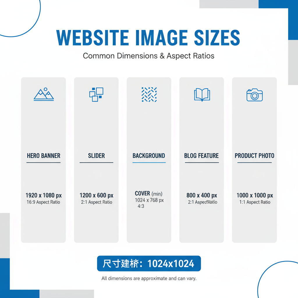
Key Image Dimensions for Hero Banners, Sliders, and Backgrounds
Hero banners, sliders, and full-width backgrounds span across the top of your site, defining the visual tone from the first screen.
Common Sizes
| Image Type | Typical Dimensions (px) | Aspect Ratio |
|---|---|---|
| Hero Banner | 1920 × 1080 | 16:9 |
| Full-width Background | 2560 × 1440 | 16:9 or 4:3 |
| Slider Image | 1600 × 600 | 8:3 |
Optimization tips:
- Generate versions for retina/high-DPI screens.
- Keep the focal area visible in varying aspect ratios.
- Use lazy loading for sliders with multiple images.
---
Blog Post Feature Images and Inline Graphics
Blog feature images act as thumbnails in posts or archives, while inline graphics provide visual support within articles.
Recommended Sizes:
- Feature Image: 1200 × 630 px — consistent for social media sharing and crisp display.
- Inline Graphics: 800 × 600 px or sized to match your content column.
A widely adopted aspect ratio of 1.91:1 ensures optimal compatibility with social platforms.
---
Thumbnails, Gallery Images, and Product Photos
These smaller images are crucial for interactive elements and e-commerce, where detail and clarity influence engagement and conversion rates.
| Use Case | Dimensions (px) | Notes |
|---|---|---|
| Thumbnail | 150 × 150 | Square aspect ratio; keep file size minimal |
| Gallery Image | 800 × 800 | Square ratio prevents cropping issues |
| Product Photo (Main) | 1024 × 1024 | Supports zoom without losing detail |
---
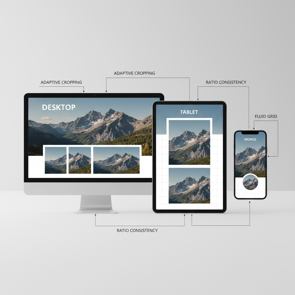
Responsive Design Considerations
Devices vary dramatically in resolution and screen size. Supplying a large desktop image file to smartphones is inefficient and unnecessary.
Responsive tips:
- Use HTML’s `srcset` and `sizes` attributes for resolution-specific delivery.
- Scale for device widths:
- Desktop: Hero (1920px wide)
- Tablet: Medium hero (~1280px wide)
- Mobile: Compressed hero (~720px wide)
- Preview on multiple devices to ensure important visual areas remain in focus.
---
Aspect Ratios and Cropping Consistency
Maintaining consistent aspect ratios ensures that images are harmonious and avoids awkward cropping.
Common aspect ratios:
- 1:1 – Perfect square; thumbnails & products.
- 16:9 – Widescreen; hero banners & videos.
- 4:3 – Traditional photography.
- 1.91:1 – Ideal for social sharing previews.
Best Practices:
- Define ratios during design planning.
- Use reusable templates for uniformity.
- Avoid relying solely on auto-cropping tools for critical visuals.
---
File Formats and Compression Methods
Choosing the correct image format is essential for balancing quality and speed.
Popular Formats:
- JPEG – Best for photos; uses lossy compression.
- PNG – Supports transparency; larger file size.
- WebP – Superior compression with quality retention.
- SVG – Vector format for icons and scalable graphics.
Compression Tips:
- Lossy Compression – Smaller file size with minor quality loss.
- Lossless Compression – Retains all image data but heavier files.
- Tools: TinyPNG, ImageOptim, CMS-native compression.
---
Optimizing for Retina and High-DPI Displays
Retina and high-DPI screens display pixels at higher densities. For best clarity, supply images at 2× the display resolution.
Example:
- Display size: 400 × 400 px
- Retina version: 800 × 800 px
HTML:
---
Downloadable Image Size Cheat Sheet
Use this quick-reference chart for rapid design and development workflows.
| Category | Recommended Size (px) | Aspect Ratio |
|---|---|---|
| Hero Banner | 1920 × 1080 | 16:9 |
| Slider | 1600 × 600 | 8:3 |
| Full-width Background | 2560 × 1440 | 16:9 |
| Blog Feature | 1200 × 630 | 1.91:1 |
| Inline Graphic | 800 × 600 | 4:3 |
| Thumbnail | 150 × 150 | 1:1 |
| Gallery | 800 × 800 | 1:1 |
| Product Photo | 1024 × 1024 | 1:1 |
Pro Tip: Keep a shared team resource with these specs to streamline content preparation.
---
Common Mistakes to Avoid
- Oversized Files – 5MB+ images drastically slow down load times.
- Poor Ratios – Improper cropping breaks layout flow.
- Pixelation – Scaling low-res images up results in blur.
- No Retina Assets – High-DPI users see diminished quality.
- Skipping Compression – Increases load times and reduces SEO scores.
Solutions:
- Resize and edit images before upload.
- Test your site with Google PageSpeed Insights or similar tools.
- Maintain descriptive, size-specific file names (e.g., `hero-mobile.jpg`).
---
Final Thoughts
Choosing the right common image sizes for websites is a balancing act between impact and efficiency. With planned dimensions for each image type, responsive scaling, aspect ratio consistency, modern file formats, and strategic compression, your site will load quickly and look stunning on all devices.
When you implement a comprehensive image strategy — including retina-ready resources and deliberate cropping — you enhance user experience while reaping SEO benefits. Start optimizing your images today to deliver a faster, more engaging website that both visitors and search engines will love.