Common Picture Dimensions for Web, Social Media, and Print
Learn optimal image dimensions for social media, websites, and print, plus aspect ratio tips to keep visuals sharp and properly displayed everywhere.

Introduction to Common Picture Dimensions and Their Importance
Understanding common picture dimensions is essential for photographers, designers, marketers, and anyone dealing with digital or print imagery. Using the right dimensions ensures clarity, fast loading speeds, and compatibility with the platform or medium. Incorrect sizes can make your visuals appear stretched, cropped, or pixelated, which can hurt both user experience and engagement.
If you’ve ever uploaded what you thought was the perfect image only to have it appear fuzzy, off-centered, or strangely cropped, the culprit was likely the wrong dimensions.
This guide explains the most common picture dimensions for social media, websites, and print. You’ll also learn about aspect ratios, resolution standards, and practical resizing techniques so you can maintain visual quality across all channels.
---
Definition of Picture Dimensions
Picture dimensions refer to the width and height of an image. For digital content, these are usually measured in pixels (px), while print uses inches (in) or centimeters (cm).
Key concepts include:
- Pixels – Tiny squares that make up a digital image; more pixels mean higher resolution.
- Inches – Physical measurement used in print.
- Aspect Ratio – The relationship between width and height (e.g., 16:9).
Example
A 1920x1080px image has:
- Width: 1920 pixels
- Height: 1080 pixels
- Aspect Ratio: 16:9
---
Common Picture Dimensions for Social Media
Each social media platform has specific optimal image sizes. Using the recommended dimensions ensures your images display without unwanted cropping or distortion.
Here’s a quick reference for common social media image dimensions in 2024:
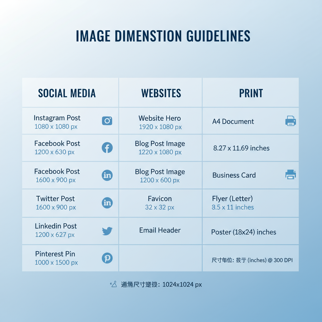
| Platform | Profile Picture | Cover Photo / Header | Post Image |
|---|---|---|---|
| 180 x 180 px | 820 x 312 px | 1200 x 630 px | |
| 320 x 320 px | N/A | 1080 x 1080 px (1:1), 1080 x 1350 px (portrait) | |
| Twitter (X) | 400 x 400 px | 1500 x 500 px | 1200 x 675 px |
| 400 x 400 px | 1584 x 396 px | 1200 x 627 px | |
| TikTok | 200 x 200 px | N/A | 1080 x 1920 px (vertical) |
| 165 x 165 px | N/A | 1000 x 1500 px |
---
Standard Dimensions for Websites
For web design, consistent image dimensions help maintain a polished look and improve performance.
Common website image types and sizes:
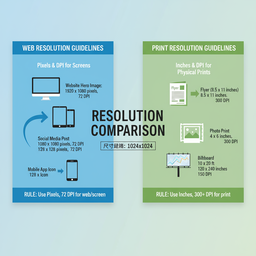
- Hero images – Large banners at the top, around 1920 x 1080px.
- Thumbnails – Small previews, often 150 x 150px or 300 x 300px.
- Banners – Horizontal formats, typically 1200 x 300px.
- Blog featured images – Around 1200 x 630px.
---
Typical Print Picture Sizes
Print uses standard measurements in inches or centimeters. Below are some commonly used print photo sizes:
| Type | Inches | Centimeters |
|---|---|---|
| Standard Photo | 4 x 6 | 10.2 x 15.2 |
| Medium Photo | 5 x 7 | 12.7 x 17.8 |
| Large Photo | 8 x 10 | 20.3 x 25.4 |
| A4 | 8.27 x 11.69 | 21.0 x 29.7 |
| Poster | 24 x 36 | 61.0 x 91.4 |
---
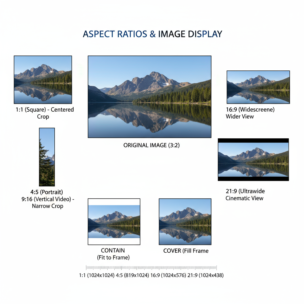
Understanding Aspect Ratios
The aspect ratio shows how an image’s width relates to its height. Common ratios include:
- 1:1 – Square format (e.g., 1080 x 1080px)
- 4:3 – Classic photographic format (e.g., 1024 x 768px)
- 16:9 – Modern widescreen (e.g., 1920 x 1080px)
Changing aspect ratios without mindful cropping can add borders, crop vital details, or stretch visuals unnaturally.
---
Resolution Guidelines for Web vs Print
Resolution is measured in PPI (pixels per inch) for digital and DPI (dots per inch) for print.
- Web – Standard resolution: 72 PPI/DPI (good balance of quality and speed).
- Print – High quality requires 300 PPI/DPI.
Tip: Multiply your desired print dimensions (in inches) by 300 to get the required pixel dimensions.
Example: 8 x 10 in → 2400 x 3000 px.
---
How to Resize Images Without Losing Quality
Follow these practices to resize images effectively:
- Start with high-resolution originals.
- Downscale in gradual steps instead of one big drop.
- Use vector graphics when possible for designs.
- Employ professional tools such as Photoshop, GIMP, or Affinity Photo.
## Example command using ImageMagick for resizing

magick input.jpg -resize 1200x800 output.jpg
---
Tips for Choosing the Correct Dimensions
- Match platform specs to avoid distortions.
- Optimize for load speed by balancing size and quality.
- Account for cropping differences between mobile and desktop.
---
Common Mistakes with Picture Dimensions
Mistake 1: Uploading unnecessarily large images.
Solution: Resize before uploading to save bandwidth.
Mistake 2: Ignoring aspect ratios.
Solution: Always maintain proportional scaling.
Mistake 3: Using low resolution for print work.
Solution: Export print files at 300 DPI.
---
Tools and Resources
Helpful tools for image dimension management:
- Adobe Photoshop – Professional-grade image editing.
- Canva – Easy resizing and templates.
- GIMP – Free, open-source editor.
- ImageMagick – Command-line resizing and batch processing.
- Figma – Excellent for UI and social images.
---
Conclusion: Best Practices for Picture Dimensions
To keep visuals sharp and professional across platforms:
- Follow platform-specific guidelines for common picture dimensions.
- Maintain aspect ratio when resizing.
- Use the right resolution: 72 DPI for web, 300 DPI for print.
- Work from high-quality masters.
- Optimize for performance without sacrificing clarity.
By applying these principles, you’ll present your images at their best on websites, social media, and in printed materials. Consistency in picture dimensions not only improves aesthetics but also your overall brand perception.
---
Want to make this even easier? Create your own quick-reference chart of common image dimensions for the platforms you use most. That way, you’ll never have to hunt down specs before posting or printing again.