Common Web Image Sizes for Designers and Marketers
Learn optimal web image sizes, formats, and responsive strategies to improve site speed, visual appeal, and SEO for blogs, stores, and social shares.
Optimizing Common Web Image Sizes for Performance and User Experience
Images are a core component of modern websites, enhancing aesthetics and aiding communication. However, poorly optimized visuals can slow page loads and harm user satisfaction. Understanding common web image sizes—and how to use them effectively—can help balance beauty with speed, boosting engagement and SEO performance at the same time.
In this guide, you'll learn the optimal dimensions for key image types, how to choose the best formats, and how to implement responsive, search-friendly strategies for a polished, professional site.

---
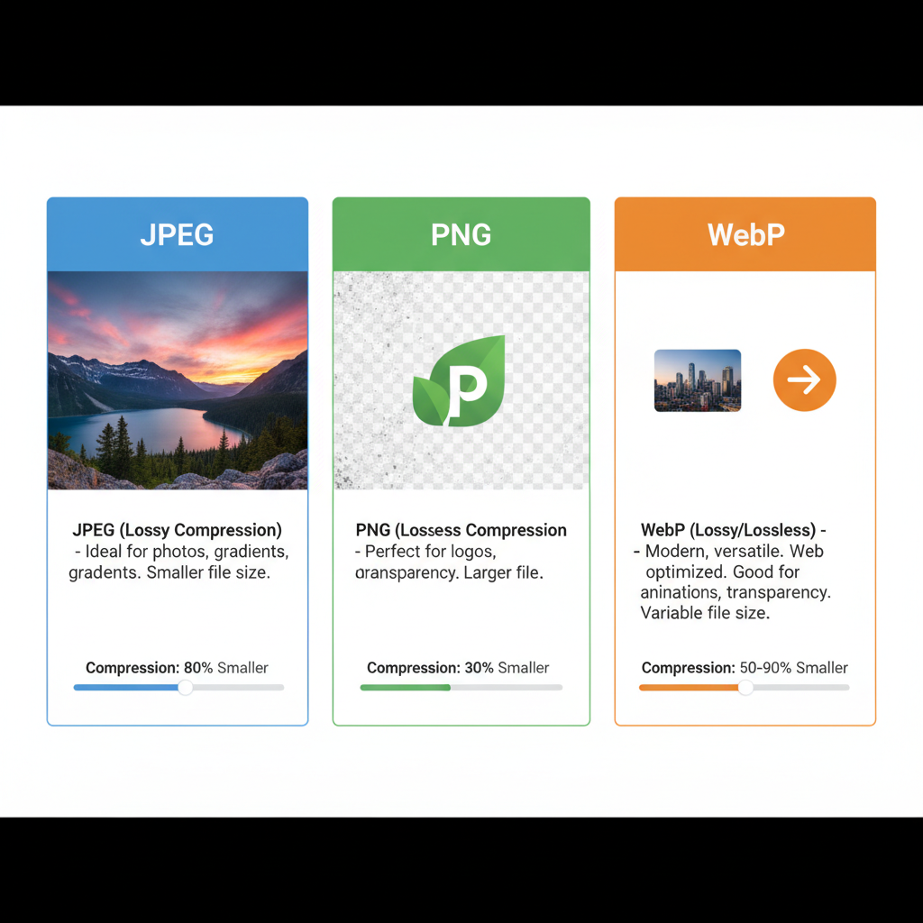
Standard Image Formats and Their Typical Uses
Choosing the right image format is as important as picking the right size. Each format suits specific content types:
| Format | Best Used For | Advantages | Disadvantages |
|---|---|---|---|
| JPEG (.jpg) | Photographs, hero banners | Small file size with acceptable quality | Lossy compression can reduce quality |
| PNG (.png) | Graphics, images with transparency | Lossless compression preserves detail | Larger file size |
| WebP (.webp) | All-purpose, modern sites | Higher compression ratio, supports transparency | Not supported by some legacy browsers |
---
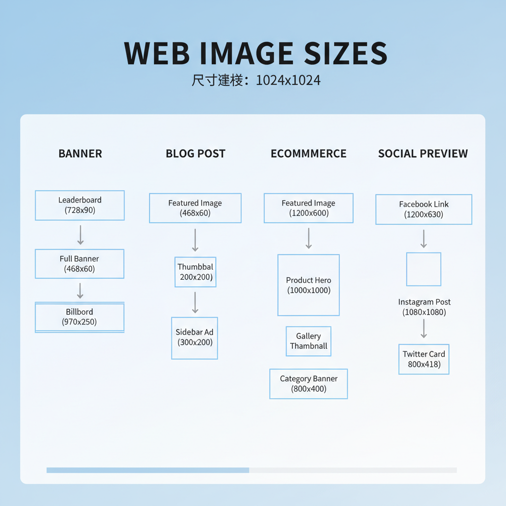
Common Banner and Hero Image Sizes
Hero images and banners dominate the visual space at the top of web pages, attracting immediate attention. Recommended dimensions include:
- 1920×1080 px — full-screen desktop hero shots
- 1600×900 px — large banners with reduced bandwidth usage
- 1366×768 px — suited for mid-sized displays
- 1280×720 px — smaller banners for faster loading
Crop and scale to fit your site’s layout grid while maintaining visual impact.
---
Popular Blog Post and Content Image Sizes
Blog featured images drive clicks from social media and search results. Common sizes:
- 1200×628 px — perfect for Open Graph shares and featured placements
- 800×600 px — balanced inline image size for text-heavy articles
- 1024×512 px — works well for wide in-content visuals
Maintain consistent aspect ratios (e.g., 16:9, 4:3) for uniform appearance across posts.
---
Recommended eCommerce Product Image Sizes
Product photos influence buying decisions and must offer detail without overloading pages. Typical dimensions:
- 1024×1024 px — primary product image in square format
- 800×800 px — catalog gallery thumbnails
- 600×600 px — smaller preview or related product imagery
Store high-resolution originals, then dynamically deliver scaled versions for appropriate contexts to maintain site speed.
---
Social Media–Linked Preview Image Sizes
Optimized preview images via Open Graph and Twitter Cards help content stand out when shared:
| Platform | Recommended Size | Aspect Ratio |
|---|---|---|
| Facebook Open Graph | 1200×630 px | ≈ 1.91:1 |
| Twitter Summary Card with Large Image | 1200×628 px | ≈ 1.91:1 |
| 1200×627 px | ≈ 1.91:1 | |
| 735×1102 px (vertical pins) | 2:3 |
Correct sizing prevents awkward cropping and ensures crisp display on feeds.
---
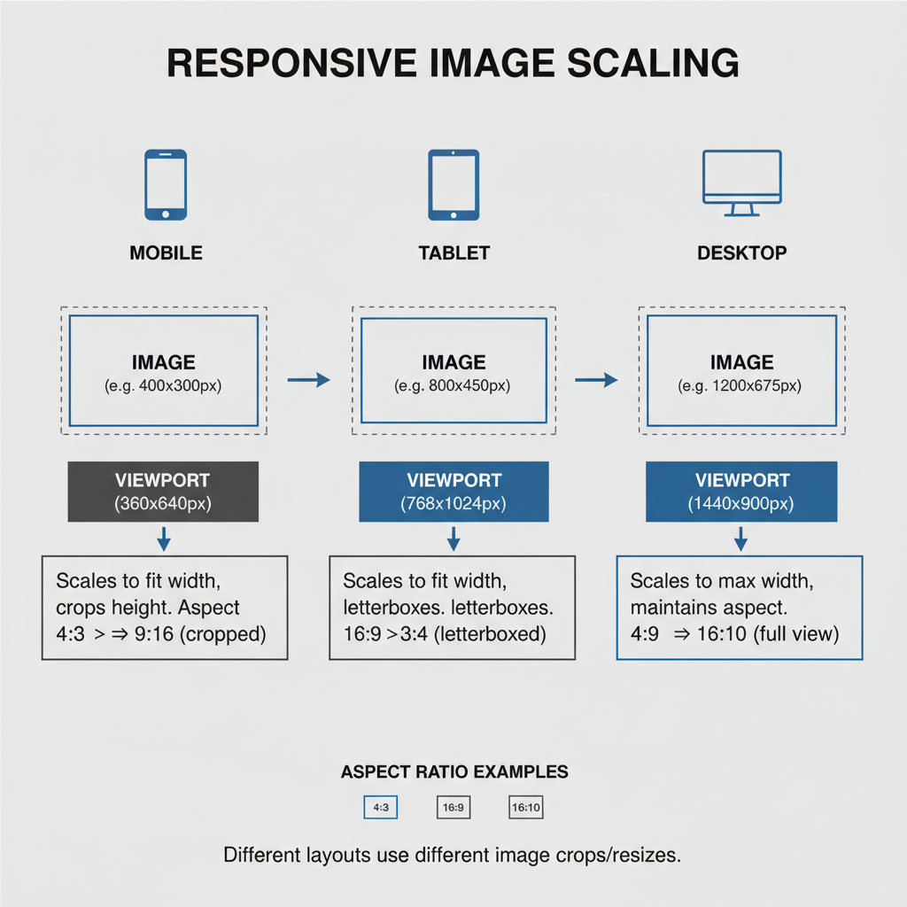
Responsive Image Guidelines for Mobile, Tablet, and Desktop
Responsive design delivers the right image size based on the user's device:
- Mobile: max 640 px width for faster loading
- Tablet: around 1024 px width for balanced clarity
- Desktop: up to 1920 px width for high-resolution visuals
Example responsive HTML:
This approach minimizes bandwidth waste, delivering an optimal experience.
---
Tips for Optimizing Images Without Losing Quality
Keep your site fast and attractive by applying:
- Compression tools: TinyPNG, Squoosh, ImageOptim
- Lazy loading: Defer non-critical images with `loading="lazy"`
- CDN delivery: Distribute via a content delivery network
- Batch resizing: Use Photoshop actions or CLI utilities for efficiency
---
When and How to Use SVG for Logos and Icons
SVG format is perfect for vector-based assets:
- Scales indefinitely without losing clarity
- Small file sizes for simple designs
- Editable via code or vector software
- Styleable with CSS
Ideal uses include company logos, interface icons, and illustrative charts. Avoid for complex photographic content.
---
Best Practices for Naming and Structuring Image Files for SEO
Proper file naming enhances image SEO:
- Use descriptive, keyword-rich file names: `common-web-image-sizes-hero.jpg`
- Replace spaces with hyphens
- Add relevant, concise alt text
- Organize directories logically (`/images/products/`, `/images/blog/`)
Good naming improves indexing and simplifies asset management.
---
Conclusion
Understanding and implementing common web image sizes is key to designing fast, visually engaging websites. By selecting appropriate formats, matching dimensions to their context, and leveraging responsive techniques, you can retain high-quality imagery without sacrificing performance.
Apply these practices to your blog, eCommerce store, or social campaign to impress visitors while meeting search engine speed benchmarks. Start optimizing your visuals today to boost both user satisfaction and your SEO results.