Image Guidelines for Web and Social Media Platforms
Learn the latest 2024 optimal image sizes, formats, and optimization tips for web and social media to boost branding, accessibility, and performance.

Image Guidelines for Web and Social Media Platforms
Establishing image guidelines for web and social media is essential for building a strong, consistent brand identity while ensuring peak technical performance and accessibility. This comprehensive guide covers the purpose of clear image standards, optimal sizes for different platforms, best practices for file formats, accessibility, optimization techniques, and strategies to unify your visual style across channels.
Whether for marketing campaigns, brand storytelling, or day-to-day content publishing, following platform-specific requirements and web performance best practices will help your visuals stand out while loading quickly for every visitor.
---
Purpose of Image Guidelines
Image guidelines serve several key purposes:
- Branding Consistency: Create a recognizable look and feel across all media channels.
- Accessibility: Ensure that people with visual impairments or using assistive technology can understand visual content.
- Performance Optimization: Deliver fast, responsive experiences without sacrificing quality.
- Platform Adaptation: Prevent cropped content or blurry images on various networks.
When consistently applied, these guidelines streamline design workflows, speed up content production, and reduce costly creative revisions.
---
Optimal Image Sizes for Major Social Media Platforms
Each social platform has distinct requirements for image dimensions, aspect ratios, and file sizes. Using incorrect sizes can result in image distortion, cropped visuals, or reduced engagement. Below is a consolidated reference for the latest 2024 recommendations.
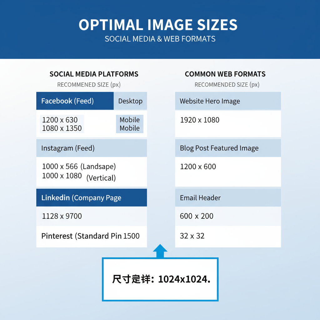
| Platform | Image Type | Optimal Dimensions (px) | Aspect Ratio |
|---|---|---|---|
| Cover Photo | 820 × 360 | ~2.28:1 | |
| Shared Image | 1200 × 630 | 1.91:1 | |
| Square Post | 1080 × 1080 | 1:1 | |
| Portrait | 1080 × 1350 | 4:5 | |
| Twitter/X | Header | 1500 × 500 | 3:1 |
| Company Banner | 1128 × 191 | ~5.9:1 | |
| Standard Pin | 1000 × 1500 | 2:3 |
Tip: Always verify sizes periodically since platforms update their recommended dimensions without prior notice.
---
Web Image Size Standards for Desktop and Mobile Performance
To achieve optimal performance on websites:
- Desktop Hero Images: 1920 px wide for full-width backgrounds.
- Content Area Images: 1200 px wide maximum.
- Mobile-Optimized Images: Serve versions between 640–1080 px wide.
- Use Responsive Loading: Implement `srcset` and `sizes` attributes in HTML to deliver device-appropriate versions.
Example:
---
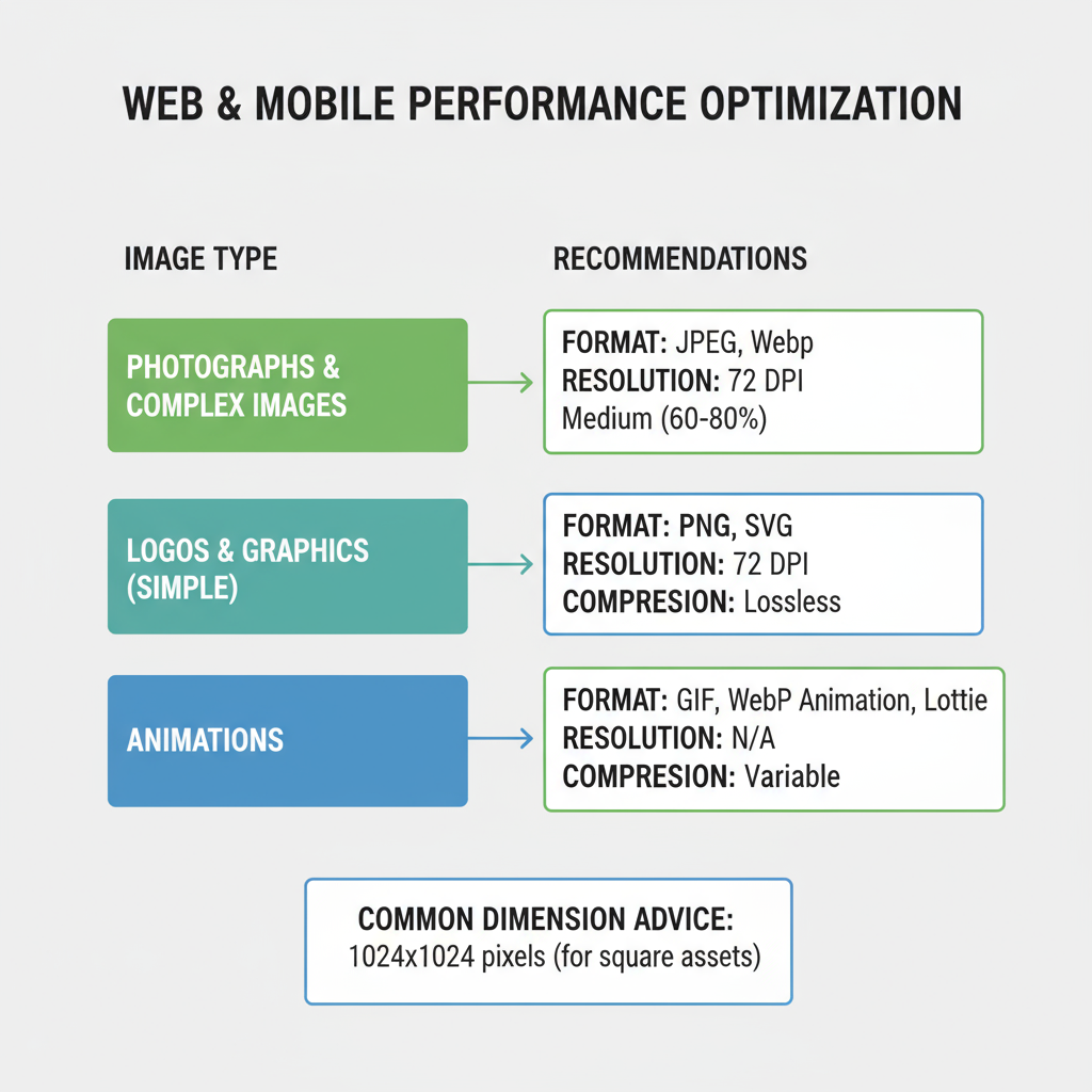
Choosing the Correct File Formats
Your chosen image format directly affects quality, transparency, scalability, and file size:
- JPEG: Best for photographs; small file sizes; no transparency.
- PNG: Supports transparency; great for graphics/logos; larger files.
- WebP: Modern compressed format; supports transparency; browser compatibility improving.
- SVG: Vector graphics; infinitely scalable; minimal file size for icons/logos.
Guideline: Use WebP where possible for modern browsers, fallback to JPEG/PNG for compatibility.
---
Image Resolution and DPI Settings
- Digital Displays: Standard 72 PPI (pixels per inch); no need for higher DPI as it increases file weight without visible benefit.
- High-DPI Displays (Retina): Provide 2× or 3× assets to maintain sharpness.
- Print: Requires 300 DPI minimum to ensure clarity and sharpness.
For web performance, compress and resize images to the minimum resolution needed for their display context.
---
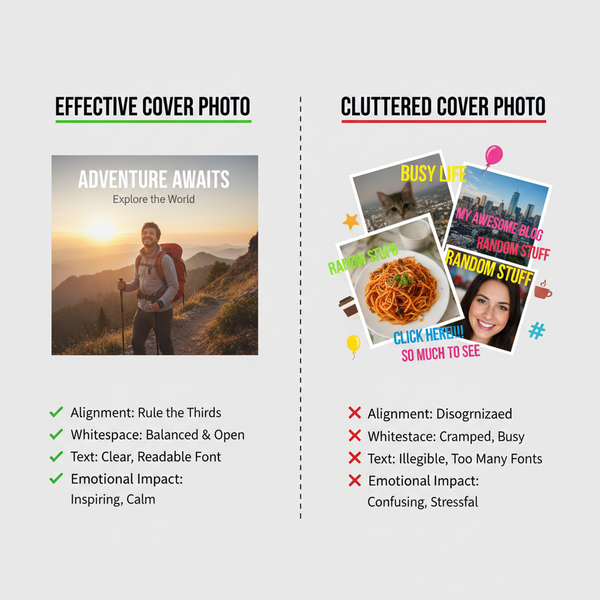
Consistent Color, Lighting, and Editing Styles
A strong brand visual identity relies on predictable and cohesive presentation. Define:
- Color Palette: Use brand-approved colors for overlays, backgrounds, and accents.
- Lighting Style: Bright, natural light for consumer products; moody tones for luxury goods.
- Editing Guidelines: Preset filters, contrast settings, and saturation levels.
- Composition Rules: Framing, whitespace, and focal points.
Create a brand style guide that includes reference samples for designers and photographers.
---
Accessibility Best Practices for Images
Making images accessible ensures inclusive experiences:
- Alt Text: Describe the content and purpose of an image, not just the visual features.
- Contrast Ratios: Maintain adequate contrast between text overlays and backgrounds.
- Descriptive Captions: Give context beyond the image itself to enhance comprehension.
- Avoid Text in Images: Where possible, use HTML text over backgrounds.
Accessibility is not only a best practice but, in many cases, a legal requirement.
---
Optimizing Image Compression Without Quality Loss
Good compression balances small file size with acceptable clarity:
- Lossless Compression: PNG for logos; WebP lossless mode for graphics.
- Lossy Compression: JPEG/WebP for photos at 70–85 quality setting.
- Use tools like ImageOptim, Squoosh, or server-side processing (e.g., Sharp with Node.js).
Automate image optimization during your build process to ensure consistent performance.
---
Safe Area and Margin Guidelines
Different devices and layouts may crop edges:
- Keep critical text/logos within the central safe area of the image.
- For banners: Maintain at least 10–15% margin around all sides.
- Test images across devices and orientations to ensure visibility.
Example: On Facebook cover photos, profile pictures overlap the bottom-left corner—plan compositions accordingly.
---
Watermarking and Intellectual Property Considerations
Protecting brand assets is vital:
- Apply subtle watermarks for shareable but valuable media (e.g., premium catalog photos).
- Store original assets securely and grant access only to authorized users.
- Use licenses or Creative Commons-appropriate images when sourcing external visuals.
- Track image usage rights and expiration dates.
---
Maintaining a Centralized Brand Image Library
A central library ensures team-wide alignment:
- Use cloud-based DAM (Digital Asset Management) tools like Bynder, Brandfolder, or Dropbox Business.
- Include metadata such as photographer, usage rights, tags, and alt text.
- Create folders by campaign, product line, and image type.
- Keep retired assets archived but separate to prevent accidental reuse.
---
Image Guidelines Checklist for Content Creators
To help content creators, provide a quick pre-publish checklist:
- Correct dimensions per platform or web context.
- Appropriate file format selected (JPEG, PNG, WebP, SVG).
- Resolution/DPI optimized for display or print.
- Colors, lighting, editing match brand style guide.
- Accessibility alt text, contrast, captions included.
- Optimized compression without visible quality loss.
- All critical content within safe area margins.
- Watermarks and intellectual property rights verified.
- Assets uploaded to central brand library.
---
Summary & Next Steps
Well-crafted image guidelines go beyond technical specifications—they provide a framework for brand recognition, accessible content, and data-efficient performance. By combining size requirements, format optimization, color consistency, and accessibility standards, your team can produce imagery that thrives across platforms.
Ready to optimize your visuals? Audit your current library against these image guidelines, update outdated assets, and integrate best practices into your workflows to ensure every image maximizes impact while maintaining brand integrity.