4.5 Inches to Pixels Conversion for Web and Print Design
Learn how to convert 4.5 inches to pixels accurately using PPI values for web, print, and device-specific design to ensure consistent visuals.
Understanding “4.5 Inches to Pixels” in Digital Design
In digital design—whether for web graphics, UI layouts, or print media—the concept of "4.5 inches to pixels" is essential for translating physical measurements into on-screen dimensions. This inches-to-pixels conversion ensures that your creative assets maintain proportion and clarity across various devices and resolutions. By mastering this process, designers can create pixel-perfect visuals that look consistent from desktops to smartphones and in print.
Pixel values represent a count of dots on a display or image, while inches measure physical length. To bridge these units, you must know the pixel density of the display or the output resolution you are designing for.
---
Why Inches-to-Pixels Conversion Matters
When you prepare a visual asset—be it a web banner, an app icon, or a printed flyer—the way it renders depends on accurate size translation. Understanding the conversion makes a difference in:
- Web Design: Keeping proportions consistent across varied screen sizes.
- Print Design: Matching digital previews to physical outputs.
- UI Components: Ensuring buttons, menus, and icons scale properly on different devices.
- Cross-media Projects: Smooth transition of assets from high-res print to optimized web files.
Without proper conversion, you may encounter distortion, blurry text, or misaligned layouts.
---
How Physical Dimensions and Pixel Density Work Together
Pixel density defines how many pixels appear in one inch. Measured as PPI (Pixels Per Inch) or DPI (Dots Per Inch), this metric is central in converting inches to pixels.
- PPI: Used in digital screens.
- DPI: Pertains more to printing, denoting ink dot density.
The universal conversion formula is:
> Pixels = Inches × PPI
This simple equation allows designers to move seamlessly between the physical and digital design space.
---
Common Standard PPI Values
Different mediums adopt different PPI standards:
- 72 PPI – Legacy display standard.
- 96 PPI – Common default in Windows OS.
- 300 PPI – High-quality print standard.
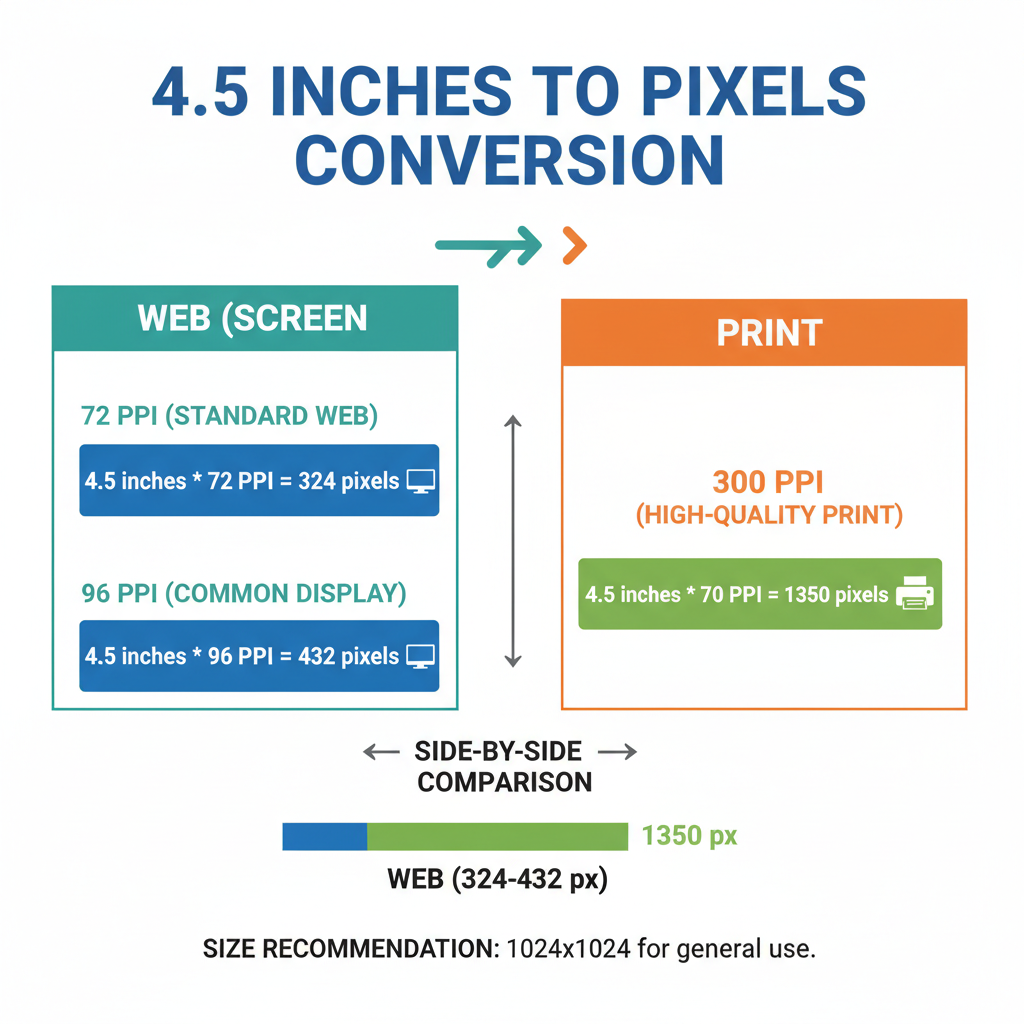
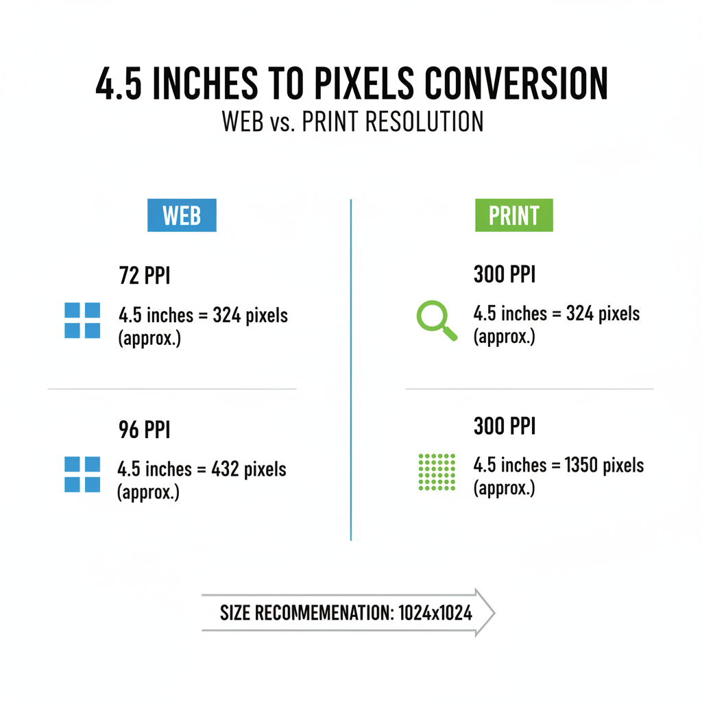
Using 4.5 inches as an example, changing the PPI drastically changes its pixel width:
- At 72 PPI → 324 pixels
- At 96 PPI → 432 pixels
- At 300 PPI → 1350 pixels
---
Converting 4.5 Inches to Pixels Step-by-Step
Here’s the method for precision conversion:
- Determine the PPI value for your target medium.
- Apply the formula:
- Compute the result:
Pixels = Inches × PPI- 72 PPI: `4.5 × 72 = 324`
- 96 PPI: `4.5 × 96 = 432`
- 300 PPI: `4.5 × 300 = 1350`
---
Example Code Snippet in JavaScript
function inchesToPixels(inches, ppi) {
    return inches * ppi;
}

console.log(inchesToPixels(4.5, 96)); // 432
---
Conversion for Different Devices
Since PPI varies widely by device:
- Desktop monitors: 96–110 PPI
- Retina MacBook: ~220 PPI
- Smartphones: 300–500+ PPI
- High-end tablets: 250–320 PPI
Examples:
- Retina MacBook: `4.5 × 220 = 990 pixels`
- Smartphone at 400 PPI: `4.5 × 400 = 1800 pixels`
---
Tools and Calculators for Quick Conversion
To streamline inches-to-pixels conversions:
- Adobe Photoshop: Adjusts automatically based on document resolution.
- Online converters: Input measurement and PPI for instant results.
- Spreadsheet formulas: Useful for multiple conversions.
Excel example:
=4.5 * 96---
Designing with Precision: Avoiding Distortion
Best practices include:
- Locking aspect ratios during resize.
- Using vector formats for scalability.
- Testing across diverse devices and print proofs before production.
This ensures fidelity of design in all formats.
---
Common Mistakes in Conversion
Avoid these common issues:
- Ignoring PPI differences between screens.
- Over-resizing raster images—results in pixelation.
- Mixing measurement units without proper conversion (e.g., centimeters vs inches).
- Overlooking print bleed requirements—may cut off critical content.
---
Practical Applications of 4.5 Inches in Pixels
Banners and Web Graphics
A sidebar banner can be sized perfectly, e.g., 432 px width at 96 PPI.
App Icons
Pixel precision ensures compliance with platform guidelines.
Photography
Photographers size images appropriately for both web and print.
Responsive Layouts
Conversions enable exact CSS breakpoints in code.
---
Summary Table: 4.5 Inches in Pixels at Various PPI
| PPI (Resolution) | Pixels (Width) |
|---|---|
| 72 | 324 px |
| 96 | 432 px |
| 110 | 495 px |
| 220 | 990 px |
| 300 | 1350 px |
| 400 | 1800 px |
---
Choosing the Right PPI for Your Project
Guidelines:
- Web: Usually 96 PPI unless targeting high-resolution screens.
- Print: 300 PPI or higher for sharpness.
- Dual-use assets: Prepare screen and print versions separately.
---
Conclusion
Converting 4.5 inches to pixels is a key skill for any designer working across physical and digital mediums. The correct PPI ensures that your design’s proportions, clarity, and intent remain intact wherever it appears. Remember:
> Pixels = Inches × PPI
By applying this formula carefully and following best practices, you’ll deliver professional, platform-perfect visuals. Start implementing this in your projects today and see your designs maintain their integrity from screen to print.