Create and Optimize Image 2560 x 1440 for Web and Media
Learn how to create and optimize 2560 x 1440 QHD images for web, gaming, and media, balancing sharpness, performance, and SEO best practices.

Creating and Optimizing Images in 2560 x 1440 Resolution (QHD)
If you want professional visuals that strike the ideal balance between sharpness and performance, mastering the image 2560 x 1440 resolution is essential. Also known as Quad HD (QHD) or 1440p, this format offers more detail than Full HD without the heavy processing demands of 4K. In this guide, you'll learn its uses, setup steps, optimization methods, and SEO best practices to make your QHD images stand out online.
---
Understanding the 2560 x 1440 Resolution (QHD)
The 2560 x 1440 resolution, often referred to as Quad HD (QHD) or 1440p, delivers 3,686,400 pixels for crisp visuals in:
- Digital design projects
- Gaming environments
- Video and media production
- Presentation slides
For creative workflows, it offers detail that's high enough for precise work while remaining manageable for file sizes and system resources.
---
Uses in Design, Gaming, and Media
Designers opt for 2560 x 1440 when they need:
- High-quality wallpapers with balanced storage use
- Banners for websites, social media, or YouTube channels
- Video thumbnails with clean edges and legible text
- Game assets compatible with widespread QHD monitors
Gamers appreciate the boost over 1080p without the extreme GPU strain of 4K, while media producers rely on it for polished presentations and mid-range video outputs.
---
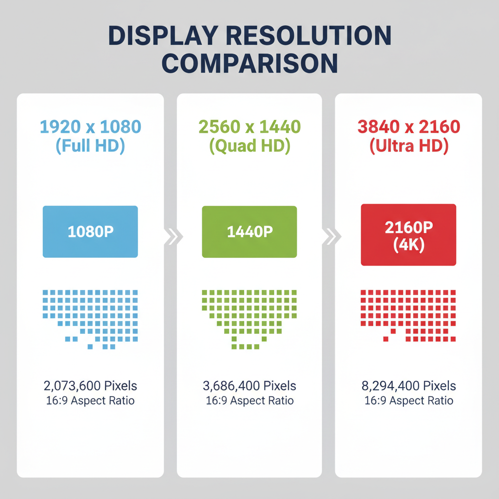
Comparing 2560 x 1440 with Other Popular Resolutions
Choosing the right resolution means understanding the differences:
| Resolution | Pixels | Aspect Ratio | Common Use |
|---|---|---|---|
| 1920 x 1080 (Full HD) | 2,073,600 | 16:9 | Standard web, streaming, entry gaming |
| 2560 x 1440 (QHD) | 3,686,400 | 16:9 | Enhanced gaming, design, mid-tier video |
| 3840 x 2160 (4K UHD) | 8,294,400 | 16:9 | Cinema-quality video, high-end design |
QHD delivers approximately 1.77× more detail than Full HD and is far less resource-intensive than 4K.
---
Aspect Ratio and File Format Choice
The 2560 x 1440 resolution uses the familiar 16:9 aspect ratio, ensuring compatibility with most screens and online content.
Recommended file formats include:
- JPEG – Ideal for photographs and gradients; balances quality and size.
- PNG – Best for text, transparency, or sharp graphics.
- WEBP – Efficient compression with strong quality for web use.
---
Recommended Tools for Creating Images at 2560 x 1440
Popular tools for QHD image creation:
- Adobe Photoshop – Industry leader for maximum editing control
- Canva – Quick templating via browser
- GIMP – Free and open-source with advanced features
- Online Resizers – Tools like Fotor or Pixlr for fast resizing
Professional editors offer the greatest flexibility and quality.
---
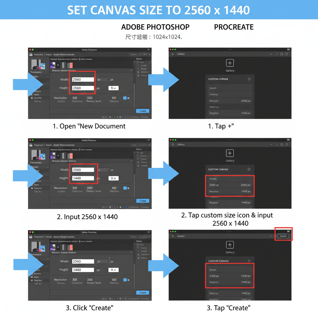
Step-by-Step: Setting Canvas Size to Exactly 2560 x 1440
In Photoshop:
File -> New
Width: 2560 px
Height: 1440 px
Resolution: 72–300 ppi (based on use case)
Color Mode: RGB
Background: Transparent or White
In Canva:
- Select “Create a Design”.
- Click “Custom Dimensions”.
- Enter Width 2560, Height 1440.
- Save preset for repeat use.
In GIMP:
File -> New
Image Size: Width 2560 px, Height 1440 px
Advanced Options -> Resolution 72 ppi
This ensures accurate proportions and avoids distortion.
---
Optimizing Image Quality Without Increasing File Size
Effective compression techniques include:
- Lossless compression for graphics (use OptiPNG, TinyPNG).
- Lossy compression for photos (via ImageOptim, Squoosh).
- Conversion to WEBP for the web, reducing file size by 30–70% with minimal quality change.
Always preview your compressed image to ensure quality retention.
---
Ensuring Responsiveness Across Devices
In web design, QHD images should scale properly:
- Apply CSS media queries for different screen sizes.
- Use srcset attributes in HTML for multiple resolutions.
- Test responsiveness using Chrome DevTools or similar tools.
---
Applications of 2560 x 1440 Images
Practical QHD image uses include:
- Wallpapers – High detail, vibrant visuals
- Website banners – Professional appearance with balanced file size
- Slides & presentations – Works with modern display standards
- YouTube channel art – meets recommended size for sharp visual impact
- Video backgrounds – Enhanced quality without 4K bulk
---
SEO Tips for Naming and Tagging Images
For search visibility:
- Use descriptive file names like `mountain-landscape-2560x1440.jpg`.
- Integrate target keywords such as `image 2560 x 1440` in alt text naturally.
- Add captions when suitable.
- Maintain quality during compression to avoid lowering engagement rates.
---
Common Mistakes to Avoid
Steer clear of:
- Incorrect Aspect Ratio – Causes inconsistent outputs.
- Oversized Files – Slow load times hurt user experience.
- Overcompression – Can ruin sharp lines or text.
- Ignoring Color Profile – Use sRGB for web consistency.
---
Testing and Previewing Across Devices
Before finalizing:
- Display the image on different monitors and mobile devices.
- Simulate screen sizes in browser developer tools.
- Check results on QHD and non-QHD displays.
- Ensure correct cropping in responsive layouts.
---
Final Checklist for Perfect 2560 x 1440 Images
- Canvas set precisely to 2560 x 1440 px
- Consistent 16:9 aspect ratio
- Appropriate format chosen (JPEG/PNG/WEBP)
- Optimized with suitable compression methods
- Responsive variants created
- SEO-friendly names and alt tags applied
- sRGB profile active
- Verified on multiple devices and browsers
---
Summary
By mastering the image 2560 x 1440 resolution process—selecting the best tools, applying compression wisely, and leveraging SEO-friendly practices—you can deliver visuals that look sharp, load quickly, and display beautifully across devices. Start creating your QHD images today and give your designs, videos, and websites the clarity they deserve.