Cute Instagram Stories: A Practical Guide to Pastel, Playful, On‑Brand Designs
Design cute Instagram Stories that convert. Learn pastel palettes, kawaii motifs, readable layouts, motion, and on-brand systems for cohesive, playful posts.
Cute Instagram Stories: A Practical Guide to Pastel, Playful, On‑Brand Designs

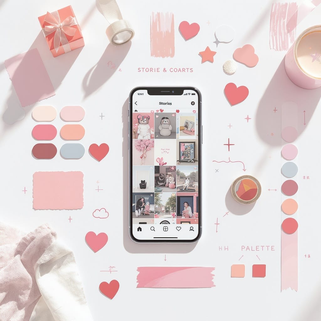
Cute Instagram Stories aren’t just “pink and sparkly.” They’re thoughtfully designed micro-experiences that blend pastel palettes, soft textures, kawaii motifs, and generous negative space with your brand’s personality. This guide breaks down the aesthetic, the systems, and the practical workflows to make cute instagram stories that feel cohesive, readable, and high-converting.
What makes an Instagram Story “cute”
The “cute” aesthetic is a set of visual and motion choices that evoke warmth, whimsy, and approachability.
- Color language: Pastel palettes (mint, blush, lavender, butter yellow), soft gradients (peach-to-lilac), and low-contrast duotones.
- Shapes and motifs: Hearts, stars, clouds, bows, bears, bunnies, simple face doodles, speech bubbles, and scalloped frames.
- Line quality: Hand-drawn doodles, jittered outlines, sticker-like drop shadows.
- Texture: Paper grain, washi tape, sparkles, subtle noise; avoid heavy grunge.
- Space: Generous margins, breathing room around text, clear focal points.
- Typography: Rounded sans-serifs, playful scripts (used sparingly), consistent hierarchy.
- Motion: Gentle bounces, slow fades, stop-motion loops, and restrained GIF accents.
Cute design doesn’t mean cluttered. The magic comes from restraint—one focal motif, one main pastel shade, and a small supporting cast.
Aligning cuteness with your brand
Cuteness must serve your brand story. Start with a moodboard and a micro style guide that translates brand traits into cute choices.
- Build a moodboard: 12–20 images (textures, color swatches, motifs, UI snippets). Pull from Pinterest, Dribbble, and your own products.
- Define color hexes: 1–2 core pastels, 1 accent, 1 neutral, 1 high-contrast text color.
- Set visual rules: Max 2 typefaces, sticker corner radius, doodle stroke width, animation speed ranges, safe areas.
- Curate do/don’t examples: “Do” for negative space and legibility; “Don’t” for overstuffed sticker collages.
| Brand Trait | Cute Aesthetic Choices | Example Elements |
|---|---|---|
| Calm & Minimal | Pale neutrals, soft gradients, thin doodle lines, slow fades | #F6F1EE, #E7EAF2, 12–16px stroke hearts, 0.6s opacity in |
| Playful & Youthful | Candy pastels, chunky stickers, rounded fonts, bouncy motion | #FFD1DC, #C7F2FF, balloon letters, 0.3s scale bounce |
| Premium & Sweet | Muted pastels, metallic accents, serif display headlines | #E6D6F2, #FDEBD3, foil textures, elegant title case |
Design building blocks
Choose components that work together repeatedly.
- Fonts
- Headline: Rounded sans (e.g., Poppins Rounded, Nunito) or delicate display serif for premium brands.
- Body: Clear sans (Inter, SF Pro, Roboto) for readability.
- Scripts: Use sparingly for one word emphasis (e.g., “new!”).
- Pastel palettes
- 60-30-10 rule: 60% base pastel, 30% neutral, 10% accent.
- Keep text at AA contrast minimum against backgrounds.
- Stickers and doodles
- Create a consistent sticker set (corner radius, shadow depth, outline thickness).
- Library: Bows, ribbons, sparkles, hearts, arrows, tape strips.
- Textures
- Paper grain 3–8% opacity, sparkles at focal points, soft vignette for depth.
- Layout grids
- Simple 3- or 4-column grid with 16–24px gutters.
- Define safe areas to avoid UI overlap.

Content ideas that naturally suit cute Stories
Cute works best when content is candid and human.
- Day-in-the-life snippets: Tiny timelines with doodled clocks and arrows.
- Mini-tutorials: 3–5 steps with numbered heart badges and short captions.
- Unboxings: Stop-motion of opening packaging, sparkle accents on reveal.
- BTS (behind-the-scenes): Pastel frames around tools, labels, and bloopers.
- UGC shoutouts: Stickered Polaroid frames, handwritten “thank you!” overlay.
- Make the mundane adorable: Coffee breaks with smiley faces, desk flat lays with stationery props, progress bars as candy stripes.
Pro tip: Anchor each story to one small narrative (“One cozy desk upgrade”) rather than a loose collage.
Motion that delights without clutter
Motion is the difference between cute and chaotic. Set limits.
- Subtle animations: 5–10% scale bounces, 6–12° wiggles, 0.4–0.8s duration.
- Stop-motion loops: 6–12 frames for a “handmade” vibe.
- GIF stickers: Use 1–2 max; prefer line-art sparkles, hearts, or arrows.
- Pacing
- 1–2 beats per slide (headline enters, sticker twinkles).
- Keep total per-slide motion under 2 seconds; leave 3–4 seconds static for reading.
- Tools
- Mojo: Elegant text animation templates and subtle motion presets.
- CapCut: Keyframes, masks, speed ramping, and noise overlays.
- Prequel: Textures (grain, sparkle), pastel filters, and film looks.
Photo and video capture tips
Make your footage cute-ready before editing.
- Soft lighting
- North-facing window or sheer curtain; add a white foam board bounce.
- Avoid mixed color temperatures; set white balance lock if available.
- Composition
- 9:16 framing; keep text-safe margins top/bottom.
- Flat lays: Use props—washi tape, pens, stickers, small florals.
- Rule-of-thirds for hero items; leave negative space for copy and stickers.
- Phone settings
- Video: 1080p at 30fps for Stories; 60fps if you’ll slow it down.
- Lock exposure and focus; slightly underexpose to protect highlights.
- Quick edit recipes
- Pastel pop: +8 exposure, -10 contrast, +12 highlights, +8 warmth, +10 vibrance, +6 fade.
- Creamy film: +6 exposure, -8 clarity, +10 grain (low size), -4 saturation, soft vignette.
Interactive features with a cute twist
Make interactivity part of the design system.
- Polls and quizzes
- Use matching pastel backgrounds; ensure button text contrast AA+.
- Micro-CTAs: “Tap your fave,” “Pick one,” “Guess!”
- Emoji sliders
- Choose kawaii emojis (✨💖🐻); add a label like “How cozy?”
- Countdowns
- Frame with ribbon stickers; add event name and date for clarity.
- Link stickers
- Place within thumb zone (lower middle); use text like “Open the cute drop” or “Get the free preset.”
- Placement rules
- Keep interactive elements away from the top username area and bottom reply bar.
- Don’t overlap with animated stickers; reserve a clear tap target zone.
Templates and workflow
Systematize your cuteness so you can scale it weekly.
- Reusable packs
- Build 6–12 Canva or Unfold templates: cover, tutorial step, quote, UGC, poll, announcement.
- Prewire safe areas, guides, text styles, and sticker placeholders.
- Sticker libraries
- Export transparent PNGs/WebPs in small, medium, large sizes; keep a consistent stroke/shadow.
- Batch-create
- Shoot one afternoon per week; edit and schedule in batches of 8–12 slides.
- Naming conventions and cadence
- Choose logical names, maintain version control, and schedule a steady rhythm (e.g., Mon/Wed/Fri).
Example library structure:
/IG-Stories/
  /Templates/
    01_Cover_pastel-lilac_v2.canva
    02_Tutorial_step_v3.canva
    03_UGC_frame_polaroid_v1.canva
  /Stickers/
    sparkles_12px-stroke_set-a/
    hearts_puffy_set-b/
    tape_washi_neutral/
  /Presets/
    pastel_film_prequel.prql
    creamy_soft_capcut.cpt
  /Exports_YYMM/
    2509_week2_story-set_A/
Scheduling: Use Instagram’s native scheduler in Meta Business Suite or tools like Later/Buffer to queue stories and track completion rates.
Accessibility and inclusivity
Cute should be kind to all users.
- Contrast: Ensure body text has at least AA contrast; add a semi-opaque pastel card under text if needed.
- Font size: Minimum ~16–18px for body; ~24–32px for headlines. Test on small phones.
- Captions: Always caption spoken audio; keep lines under ~40 characters.
- Motion sensitivity
- Avoid rapid flashes or strobe effects.
- Provide a calm “hold-to-read” slide with minimal animation.
- Sticker descriptions
- If a sticker is essential (e.g., arrow pointing to a link), echo its meaning in text (“Tap link to download”).
- Clear controls
- Use concise micro-CTAs: “Tap to vote,” “Hold to read,” “Tap for link.”
Inspiration and trends
Keep your look fresh without chasing every fad.
- Seasonal themes
- Spring: Mint, blush, floral doodles.
- Summer: Sorbet gradients, citrus motifs.
- Autumn: Cozy beige, latte foam textures, knit overlays.
- Winter: Icy lavender, snow sparkles, ribbon bows.
- Kawaii micro-trends
- Puffy hearts, bow-core, sanrio-inspired faces, scalloped frames.
- Competitor scans
- Once a month, capture 10–15 examples; note what’s readable, what’s busy, and what engaged you.
- Adaptation framework: SCAN
- Spot: Identify a trend element (e.g., puffy sticker shadows).
- Curate: Save 3–5 references; note common rules (shadow softness, angle).
- Adjust: Apply your palette, type, and motion speed.
- Narrate: Tie it to your story (“Our bow-core holiday wrap reveals!”).
Example pastel palette and type pairing
| Role | Value | Notes |
|---|---|---|
| Base | #FDECF2 (blush) | 60% backgrounds |
| Secondary | #E6F6FF (powder blue) | Cards and accents |
| Accent | #FFC98B (peach) | Buttons, highlights |
| Neutral | #FFF9F2 (cream) | Negative space |
| Text | #2E2A2A (choco) | Readable on pastels |
| Headline Font | Poppins Rounded | Bold 700, -2 tracking |
| Body Font | Inter | Regular 400, +2 tracking |
| Script Accent | Pacifico (sparingly) | One-word emphasis |
Style tokens (quick-start)
Codify choices so collaborators create consistent cute instagram stories.
colors:
  base: "#FDECF2"
  secondary: "#E6F6FF"
  accent: "#FFC98B"
  neutral: "#FFF9F2"
  text: "#2E2A2A"
type:
  headline: { family: "Poppins Rounded", weight: 700, size: 32, tracking: -2 }
  body: { family: "Inter", weight: 400, size: 18, tracking: 2, leading: 120% }
motion:
  durations: { in: 0.4, out: 0.3, bounce: 0.3 }
  easing: { default: "easeOutQuad", bounce: "easeOutBack" }
sticker:
  stroke: 14
  shadow: { y: 8, blur: 16, opacity: 0.18 }
layout:
  grid: { cols: 3, gutter: 24, margins: { top: 160, bottom: 200, sides: 64 } }
Quick checklist before posting
- One focal message per slide; readable in under 3 seconds.
- AA contrast for all text; captions included.
- Max 2 animated elements per slide; no flashing.
- Stickers and CTAs within safe areas and thumb zone.
- Consistent palette, fonts, and sticker style.
- Link sticker labeled clearly with a micro-CTA.
Cute instagram stories win when they’re charming, legible, and purposeful. With a small system—a palette, a few templates, and gentle motion—you can ship Stories that feel delightful and on-brand week after week.
Summary
This guide organizes the cute aesthetic into practical systems: clear palettes and type, cohesive stickers and textures, motion limits, and reusable templates. Use the capture tips, interactivity rules, and accessibility checks to keep stories readable, on-brand, and delightful. Follow the checklist before posting to ensure every slide is focused, contrast-safe, and easy to interact with.