Datawhale Contribution Visualization Platform Launch: See the “Small Efforts”

Datawhale Project
Why We Want to See Contributions
In the open-source world, every commit, reply, and tiny improvement is fuel for community growth. Yet for years, these scattered _micro-efforts_ have often been lost in the flood of information—making it difficult to tangibly track the value each contributor brings.
- Communities rarely have a clear picture of their growth trajectory.
- Newcomers struggle to quickly understand the ecosystem.
To address this, Datawhale members created the Contributor Visualization Platform. Its purpose is straightforward: make every contribution visible, track community growth, and help people feel the warmth and power of open collaboration.
On this platform:
- Your code commits will be counted
- Your research focus will be displayed
- Your engagement will be recognized
The result? Transparent data that inspires participation, giving contributors recognition and helping outsiders quickly grasp the community’s pulse.
---
Project Overview: Illuminating Every Quiet Contribution
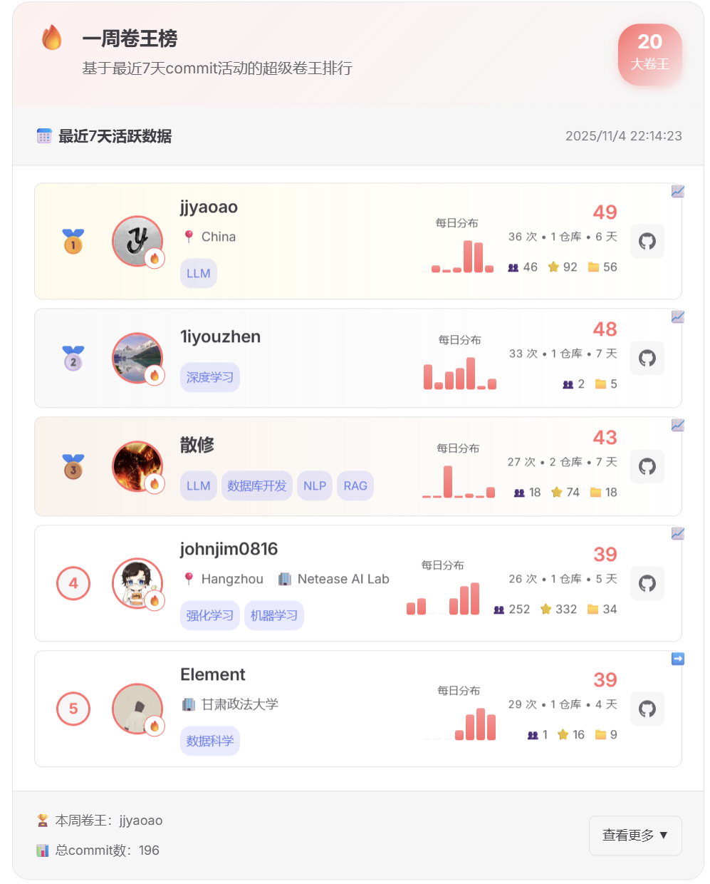
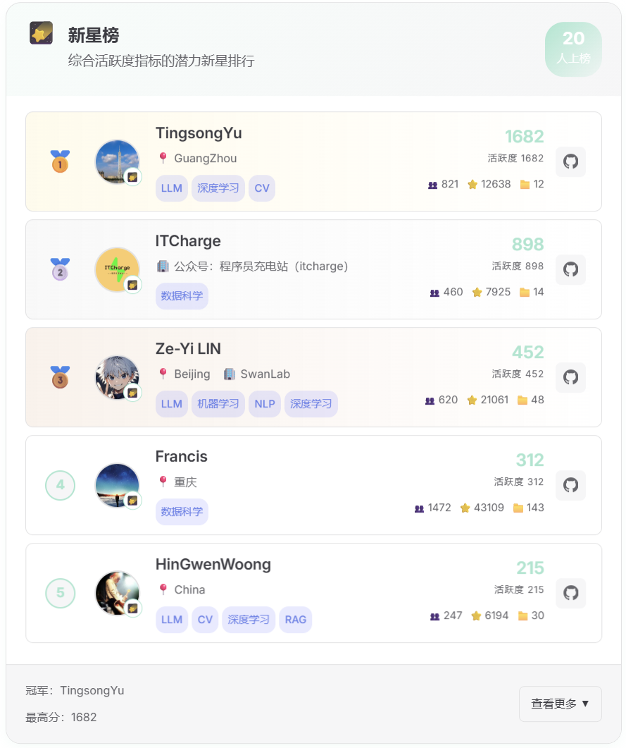
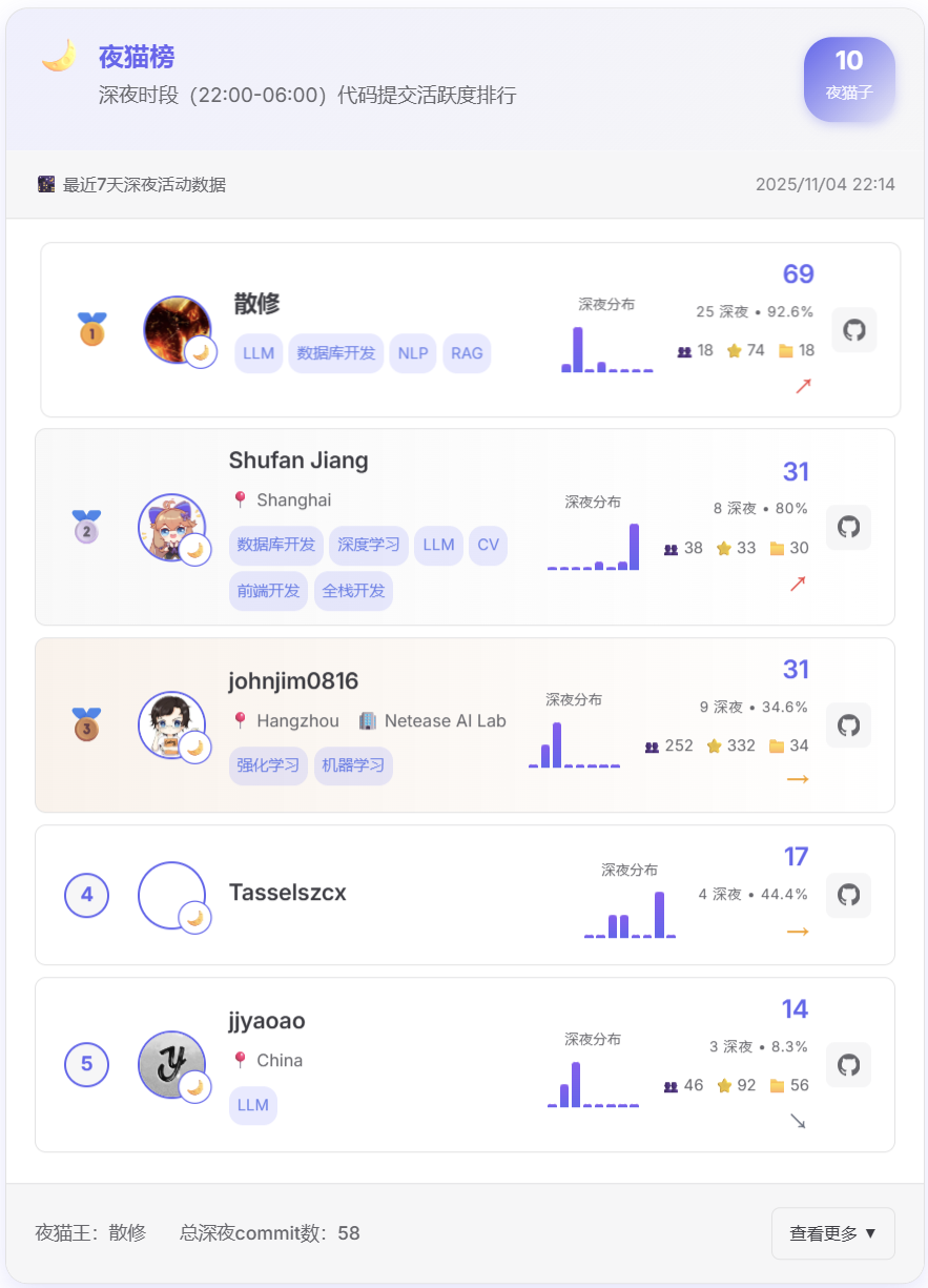
1. Core Leaderboards — Effort That Never Goes Unseen
The platform offers multi-dimensional leaderboards that spotlight different contributions:
- Hard-Worker Board: Uses a “hard-work index” (weekly commits, repo contribution count) to reveal the most diligent members.
- Prolific Creator Board: Honors contributors with at least 5 public repositories, celebrating consistent quality creation.

- Night Owl Board: Tracks commits between 23:00–06:00 to recognize late-night work sessions.
- Fastest-Growing Board: Highlights rapid growth in followers and repository stars.
- Specialization Board: Ranks leaders by research domains (deep learning, LLMs, data analysis).
> These leaderboards serve as real-time feedback loops — every contribution leaves measurable footprints.
---
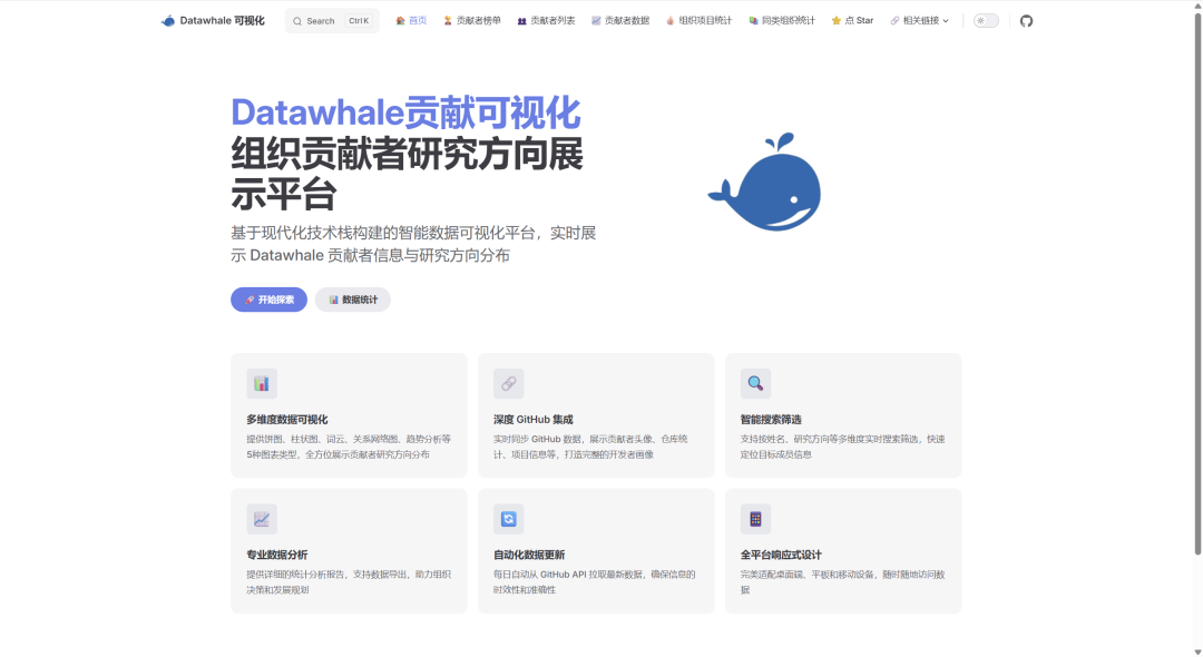
2. Core Features — Not Just “Seeing,” But Truly Understanding
The platform blends data visualization with deep GitHub integration:
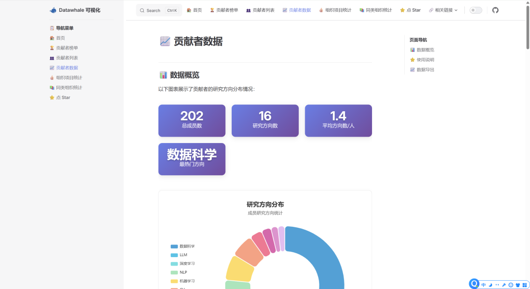
- Multi-Dimensional Visualization:
- Ring pie charts for research focus distribution
- Dynamic bar charts for member stats
- Word clouds for trending fields
- Network graphs for member relationships
- More than 5 visualization types for rich insights
- Deep GitHub Sync: Avatars, stars, forks, and follow relations—updated automatically with profile links.
- Smart Search & Filters: Instant search by name, domain, and activity levels.
- Automated Updates: Data fetched from GitHub every midnight—no manual upkeep.
---
3. Tech Stack — Efficient and Beautiful
- Frontend: Vue 3 + VitePress for fast static pages, ECharts for interactive graphics
- Backend: Python scripts process GitHub API data with quality filtering
- Automation: GitHub Actions for deployment and updates—zero maintenance cost
- Adaptive Design: Works seamlessly across desktop, tablet, and mobile
---
Connecting the Ecosystem & Monetization
Tools for tracking and visualizing contributions are essential—but creators also need ways to monetize their influence.
Platforms like AiToEarn官网 enable AI-powered content creation, publishing, and monetization across multiple channels.
For open-source contributors aiming to expand beyond GitHub, integration with services like AiToEarn博客 can transform visibility into a broader audience and sustainable revenue—while preserving the open-source spirit.
---
Experience It Now: 3 Steps Into Datawhale's Open Source World
Step 1 — Access the Platform
https://datawhalechina.github.io/members-visualization/
Step 2 — Explore Features
- Contributor Leaderboards: Find top contributors and “Night Owl” achievers
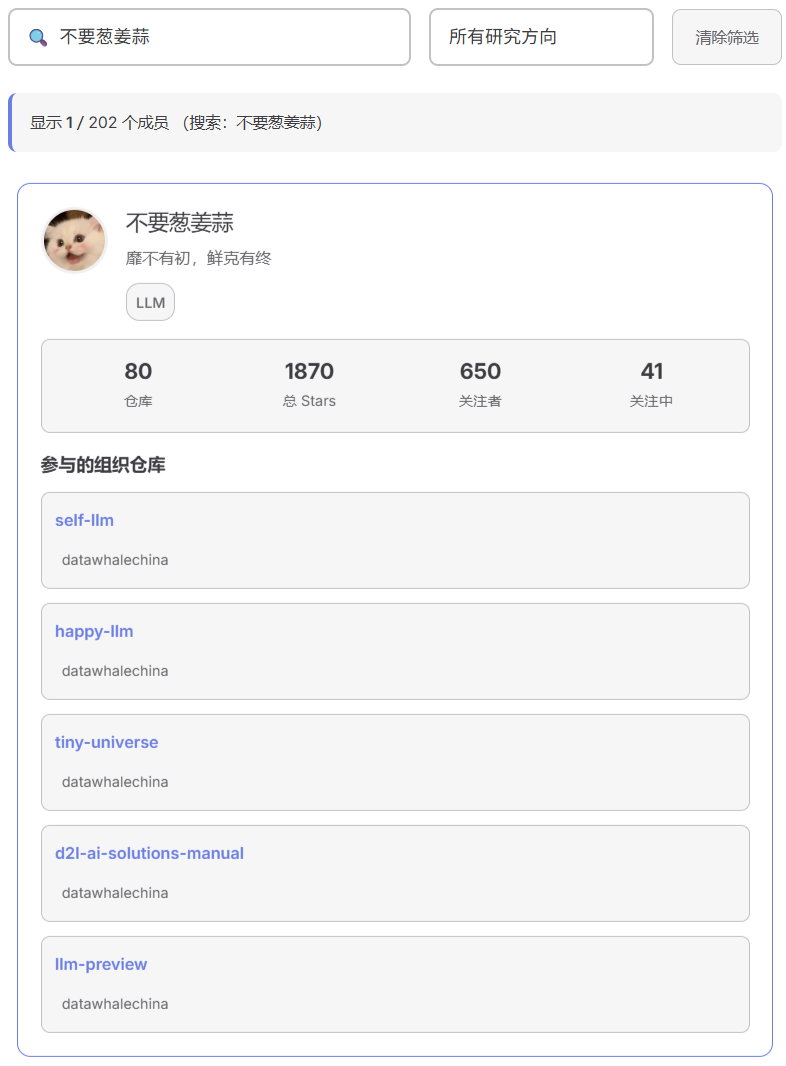
- Contributor List: Search names, view research areas, and track leaderboard positions
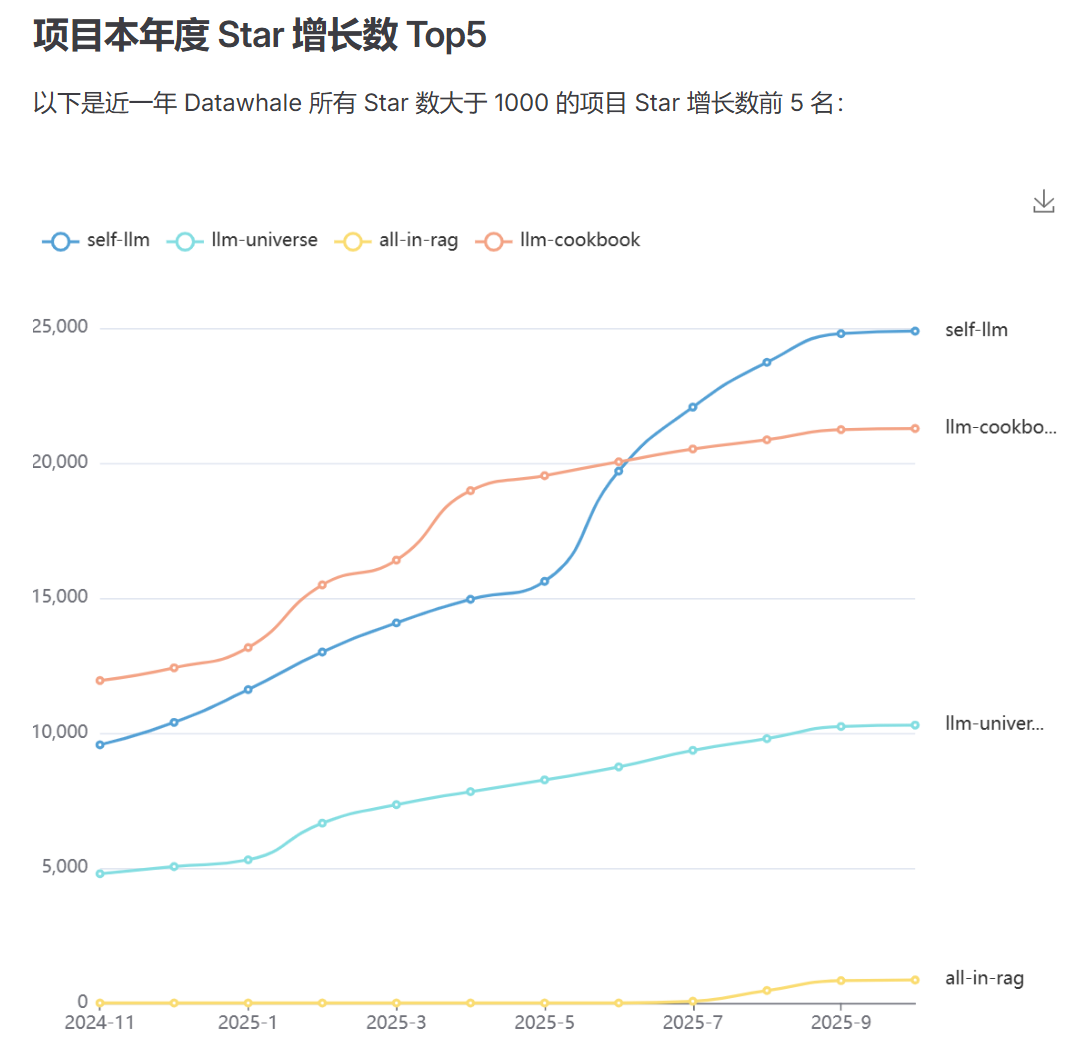
- Organization Project Statistics: Spot star growth trends in top projects
- Similar Organization Stats: Compare growth with other knowledge-sharing communities

Step 3 — Interact & Engage
Give the project a GitHub ⭐ or post feedback in Issues—because feedback is also a contribution.
---
Looking Ahead — Visualization as Open-Source Infrastructure
Future plans include:
- Contributor Achievement System: Honor badges for multi-dimensional excellence
- Member Growth Paths: Show skill evolution from newcomer to core member
- Expanded Analytics: Heatmaps, domain trends, predictive insights
- One-Click Org Integration: Make “Contribution Visualization” a standard across communities
We believe that when every effort is visible and valued, open source unlocks its full creative potential.
---
👉 Start exploring now:
Visit the platform and track the story behind every commit.
If you're an AI-powered creator, AiToEarn官网 helps you publish across platforms, analyze engagement, and monetize creativity effectively.