The Complete Guide to Different Photo Sizes: Print, Web, and Social Media Dimensions Explained
Learn how to choose the right photo dimensions for print, web, and social. Understand aspect ratios, PPI/DPI, platform specs, and a repeatable export workflow.
Before you export a single image, it helps to know which sizes, ratios, and formats will actually look right across print, web, and social. This document gives you a clean, practical framework for choosing dimensions, calculating pixels for print, and meeting platform requirements without guesswork. Use it as a reference and a repeatable workflow to keep your photos crisp, fast-loading, and consistently on-brand.
The Complete Guide to Different Photo Sizes: Print, Web, and Social Media Dimensions Explained

Choosing the right dimensions isn’t just a technicality—it’s how you keep your photos sharp, fast-loading, and on-brand everywhere from gallery walls to Instagram Reels. This guide breaks down different photo sizes, aspect ratios, pixels vs PPI/DPI, platform-specific requirements, and a practical workflow you can reuse.
Why Photo Size Matters
Different photo sizes influence perceived quality, loading speed, and composition. Four related but distinct concepts drive most decisions:
- Dimensions (pixels): The width × height of an image. Determines how many dots are available to render detail on a screen or in print.
- Resolution (PPI/DPI): Pixels per inch (PPI) for screens and print workflows; DPI is technically dots per inch in printing devices. In practice, labs say “300 DPI,” meaning supply 300 pixels per inch.
- Aspect ratio: The shape of the frame (e.g., 3:2, 4:3, 1:1). Impacts cropping and composition.
- File size (KB/MB): Actual storage weight. Affects page speed and upload limits. Influenced by dimensions, format, and compression.
Key effect:
- On screens, pixel dimensions and compression dominate apparent sharpness and speed.
- In print, PPI at output size is critical. 300 PPI is a widely recommended target for photo labs.
Conversion you’ll use repeatedly:
- Pixels = inches × PPI. Example: 8 × 10 inches at 300 PPI = 2400 × 3000 px.
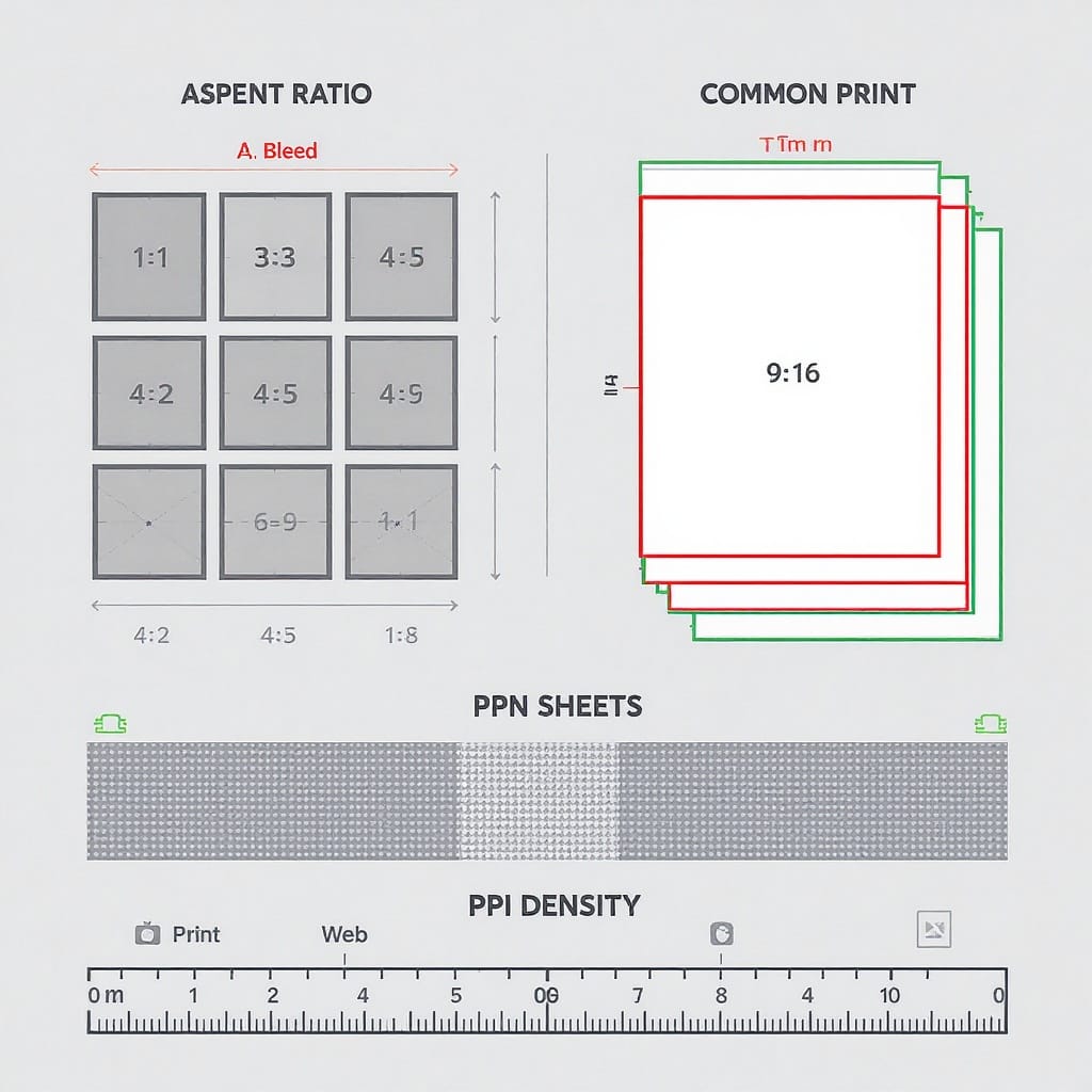
Aspect Ratios Decoded

Common aspect ratios and where they show up:
- 3:2: Native to most DSLRs and full-frame/mirrorless cameras. Great for 4×6 prints; cropping needed for 8×10.
- 4:3: Native to many phones and Micro Four Thirds cameras. Aligns well with 8×10-ish outputs.
- 1:1: Square. Perfect for grid aesthetics and products; social-friendly on many platforms.
- 16:9: Widescreen/landscape. Ideal for hero banners, slides, YouTube thumbnails.
- 9:16: Vertical video/story format; dominant on TikTok, Reels, Shorts.
Cropping trade-offs:
- Cropping from 3:2 to 4:5 (Instagram portrait) can clip edges—compose with extra breathing room.
- Going from 4:3 to 16:9 typically trims top/bottom; watch for horizon and headroom.
- If you must fit a mismatched ratio without cropping, you can letterbox (black bars top/bottom) or pillarbox (bars left/right). Acceptable for some video contexts but often undesirable for photos.
Tip: Shoot slightly wider if you know multiple outputs are needed. This preserves the subject when cropping into different shapes.
Common Print Sizes, PPI, and Bleed
Photo labs frequently want 300 PPI files for crisp results. Some large prints look fine at 240 PPI or even 180 PPI if viewed from farther away.
Add bleed and safe margins:
- Bleed: Extend your artwork 0.125 in (3 mm) beyond the trim on all sides if your image goes to the edge.
- Safe margin: Keep critical content (faces, text) at least 0.125–0.25 in inside the trim line.
Inches-to-pixels at 300 PPI examples:
| Print Size (in) | Aspect Ratio | Pixels @ 300 PPI | Pixels @ 240 PPI | Notes |
|---|---|---|---|---|
| 4 × 6 | 3:2 | 1200 × 1800 | 960 × 1440 | No crop for 3:2 photos |
| 5 × 7 | 7:5 | 1500 × 2100 | 1200 × 1680 | Mild crop from 3:2 or 4:3 |
| 8 × 10 | 5:4 | 2400 × 3000 | 1920 × 2400 | Common portrait print size |
| 11 × 14 | 14:11 | 3300 × 4200 | 2640 × 3360 | Popular wall size; crop required |
| 16 × 20 | 5:4 | 4800 × 6000 | 3840 × 4800 | Good for posters |
| A4 (8.27 × 11.69) | ~1.41:1 | 2481 × 3508 | 1984 × 2807 | ISO standard; mild crop from 3:2/4:3 |
| A3 (11.69 × 16.54) | ~1.41:1 | 3508 × 4961 | 2807 × 3969 | Great for large displays |
Reminder: If adding 0.125 in bleed, increase your canvas by 0.25 in in both width and height before converting to pixels.
Social Media Size Cheat-Sheet for 2025
Platform specs evolve. These recommendations reflect current norms and common safe zones to keep UI overlays from covering text or logos.
| Platform | Type | Recommended Dimensions | Aspect Ratio | Notes / Safe Zones |
|---|---|---|---|---|
| Feed Square | 1080 × 1080 | 1:1 | Great for consistent grids | |
| Feed Portrait | 1080 × 1350 | 4:5 | Maximum vertical for feed; best engagement | |
| Feed Landscape | 1080 × 566 | ~1.91:1 | Widescreen; avoid tiny text | |
| Stories / Reels | 1080 × 1920 | 9:16 | Keep text in central ~1080 × 1420; leave ~250 px top/bottom | |
| Page Cover | 1640 × 624 | ~2.63:1 | Design critical content centered for mobile/desktop crops | |
| Feed Post | 1200 × 1500 or 2048 on long edge | 4:5 or variable | Link shares: 1200 × 630 (1.91:1) | |
| X (Twitter) | Header | 1500 × 500 | 3:1 | Keep text centered; edges can crop |
| X (Twitter) | Post Image | 1200 × 675 | 16:9 | Vertical 1200 × 1500 (4:5) also displays well |
| Personal Background | 1584 × 396 | 4:1 | Keep text away from left avatar overlay | |
| Company Cover | 1128 × 191 | ~5.9:1 | Center the key message | |
| Feed Post | 1200 × 1200 or 1080 × 1350 | 1:1 or 4:5 | Square and portrait perform well | |
| Standard Pin | 1000 × 1500 | 2:3 | Stay 2:3 to avoid truncation | |
| TikTok | Vertical Video/Thumb | 1080 × 1920 | 9:16 | Keep key text away from edges; central safe area |
Tip: Always preview in-platform before publishing. UI overlays (captions, buttons) shift often.
Web and Blog Images
Fast, crisp images improve Core Web Vitals and conversions.
- Hero widths: 1600–2400 px wide. Larger only if you truly need it on 4K displays.
- Responsive images:
- Provide multiple sizes and let the browser choose via srcset and sizes.
- Serve modern formats (AVIF/WebP) with JPEG fallback.
- Retina/HiDPI: Supply 2× assets for sharpness on high-density screens when appropriate.
- Target weights:
- Inline/inline-list images: 50–150 KB
- Content images: 100–250 KB
- Heroes/backgrounds: 150–400 KB (optimize aggressively)
- Formats:
- AVIF: best compression/quality, slower encode.
- WebP: strong balance, broad support.
- JPEG (baseline or progressive) still acceptable fallback.
- PNG: only for transparency or graphics with few colors; consider WebP lossless.
Example responsive markup:
CSS helpers:
img, picture {
  max-width: 100%;
  height: auto;
}
.hero {
  object-fit: cover;
  aspect-ratio: 16 / 9;
}
E‑commerce Requirements
Consistency across different photo sizes is essential for shop polish and trust.
- Amazon
- Minimum: 1600 px on the longest side to enable zoom; 2560 px preferred.
- Background: Pure white (#FFFFFF) for the main image; product should fill ~85% of frame.
- Formats: JPEG (recommended), PNG, TIFF; sRGB color.
- Aspect: Square (1:1) for main, add lifestyle shots as alternates.
- eBay
- Minimum: 500 px on the longest side; recommended 1600–2000 px.
- Background: Clean, preferably white; avoid borders/watermarks.
- Ratios: Square or 4:3 play well in grid.
- Etsy
- Listing image: Recommend 3000 × 2400 px (4:3); minimum ~2000 px width.
- Thumbnails auto-crop center; keep subject centered with padding.
- Additional: Lifestyle images and detail close-ups build trust.
- Shopify
- Product images: 2048 × 2048 px (1:1) recommended; zoom works above ~800–1000 px.
- Collection banners: 1600–2500 px width; maintain consistent height (e.g., 16:9 or 21:9).
- Keep background/lighting consistent across products for a uniform catalog.
General e‑commerce practices:
- sRGB color space, embedded profile.
- Consistent angle, lighting, and aspect ratio per product category.
- Test thumbnails and zoom behavior on mobile and desktop.
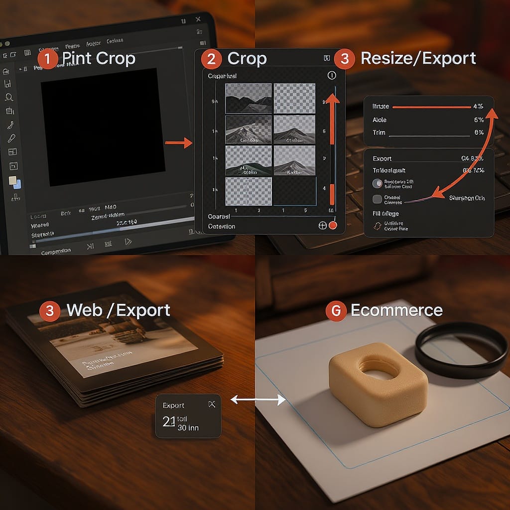
Cropping and Resizing Workflow
Aim for a non-destructive, repeatable pipeline.
- Start non-destructive
- Keep RAW or master PSD/TIFF.
- Use Lightroom virtual copies or Photoshop Smart Objects.
- Save crops as named presets (e.g., “4:5 IG Portrait”).
- Choose your output size
- Print: Inches × 300 PPI (or lab-specified PPI).
- Web/social: Platform pixel specs and aspect ratio.
- Resize method
- Downscaling: Bicubic Sharper (Photoshop) or Lanczos (many tools).
- Upscaling:
- AI (Photoshop Super Resolution, Topaz Gigapixel) preserves detail better.
- Traditional Bicubic Smoother for small enlargements.
- Practical limit: Try to keep upscales to 2× or less if possible.
- Output sharpening
- Screen: Lower radius (0.3–0.8 px), moderate-high amount.
- Print: Slightly higher radius (0.8–1.2 px), moderate amount; soft proof if possible.
- Color management
- Edit in wide-gamut (Adobe RGB or ProPhoto RGB) if you need it.
- Convert to sRGB for web and most e‑commerce.
- For print labs, download their ICC profile and soft-proof.
- Export settings
- JPEG: Quality 75–85 for web balance; progressive enabled.
- WebP: Quality ~40–70 depending on content.
- AVIF: Quality ~45–60; verify banding on gradients.
- Strip metadata unless required; keep copyright if needed.
- Batch presets
- Lightroom: Export presets by destination (IG 1080×1350, Web 1600w, Print 300 PPI).
- Photoshop: Image Processor or Export As; use Actions for repeatability.
- CLI: ImageMagick or Sharp for automated pipelines.
Composition and Orientation
- Orientation choice:
- Landscape: Banners, slides, wide scenes.
- Portrait: People, mobile-first social, posters.
- Square: Grids, products, thumbnails.
- Leave negative space
- Add room for headlines/CTAs on marketing images.
- Keep faces/subjects away from outer 10% edge to avoid unintentional crops.
- Rule of thirds and eye line
- Place eyes on the upper third for portraits.
- Use leading lines; protect fingers/feet from cropping at joints.
- Platform overlays
- Stories/Reels/TikTok: Keep text in the central safe area (avoid top/bottom 10–15%).
- Facebook/LinkedIn covers: Keep key content centered to survive device-specific crops.
Quick Decision Tree
Use this to pick the right size fast:
- Where will the image live?
- Print → go to 2
- Web/blog → go to 3
- Social → go to 4
- E‑commerce → go to 5
- Choose physical size (e.g., 11×14) and confirm aspect ratio.
- Add bleed if required (0.125 in each side).
- Compute pixels (inches × 300 PPI).
- Soft-proof with lab ICC; export TIFF/JPEG as requested.
- Web/Blog
- Choose hero/content role. For hero, 1600–2400 px wide.
- Export AVIF/WebP + JPEG fallback with srcset.
- Aim for < 250 KB (content) / < 400 KB (hero).
- Social
- Pick platform preset (IG 1080×1350, Story 1080×1920, X 1200×675).
- Keep text in safe zones. Test in-app preview.
- Export sRGB JPEG/WebP, moderate compression.
- E‑commerce
- Meet marketplace rules (Amazon 1600+ longest side, white background).
- Use consistent aspect (often 1:1) across the catalog.
- Verify zoom thresholds and thumbnail crops.
Ready-to-Use Presets and Templates
Save these as export presets in Lightroom/Photoshop/Canva:
- 8×10 in at 300 PPI → 2400 × 3000 px, JPEG quality 90 (lab), Adobe RGB or lab ICC.
- A3 at 300 PPI → 3508 × 4961 px, TIFF or high-quality JPEG.
- Social (sRGB)
- Instagram Portrait → 1080 × 1350, JPEG q80.
- Instagram Stories/Reels → 1080 × 1920, central safe area guide.
- X Post → 1200 × 675, JPEG/WebP q80.
- LinkedIn Feed → 1200 × 1200 (alt: 1080 × 1350).
- Pinterest Pin → 1000 × 1500.
- Web
- Content: 1200w, 1600w, 2000w AVIF/WebP/JPEG triplet.
- Hero: 2000w AVIF primary, WebP fallback, JPEG fallback; quality tuned to target size.
- E‑commerce
- Amazon Main → 2560 × 2560, white background, sRGB, JPEG q90.
- Shopify Product → 2048 × 2048, sRGB, JPEG/WebP.
Export checklist before you hit “Save”:
- Correct aspect ratio for destination?
- Adequate pixels (print PPI or social px)?
- Safe zones respected (covers/stories)?
- sRGB for web/social/e‑commerce?
- Optimized format and file weight?
- Embedded profile (if required) and metadata handled?
Final Notes on Handling Different Photo Sizes
- Keep a master, uncropped, high-resolution file.
- Build a small library of crops (1:1, 4:5, 16:9, 9:16) and automate exports.
- For mixed outputs, compose with extra margin to accommodate multiple aspect ratios.
- Recheck platform guidelines quarterly—dimensions shift as apps evolve.
With the right understanding of aspect ratios, PPI, and platform constraints, you can confidently deliver crisp, fast, and perfectly framed images across print, web, and every social feed.
Summary
This guide helps you choose the correct dimensions, ratios, formats, and export settings for print, web, and social platforms—without sacrificing quality or speed. Refer to the tables, presets, and decision tree to streamline your workflow and avoid rework. Keep a master file, verify specs before exporting, and revisit platform guidelines periodically to stay current.