Dimensions for Pictures on Print, Web, and Social Media
Learn the ideal dimensions for print, web, and social media images to ensure crisp visuals, fast load times, and consistent display across platforms.
Understanding Image Dimensions and Why They Matter
When it comes to creating visually appealing content, understanding the correct dimensions for pictures is essential. Image dimensions — the width and height in pixels for digital media or inches for print — influence clarity, load speed, and how well visuals adapt to different platforms. Whether you’re designing for web, print, or social platforms, the right size can ensure images look crisp and professional while improving overall user experience.
Pixels are the smallest unit of a digital image. The combination of width × height in pixels, along with the aspect ratio (the proportional relationship between width and height), determines how much visual space an image occupies. For example, an aspect ratio of 16:9 is standard for widescreen displays, while 1:1 is square.
Proper image dimensions ensure:
- Crisp, professional visuals without blurriness.
- Optimized load times (especially important for websites).
- Consistent display across devices and platforms without unwanted cropping.

---
Standard Photo Dimensions for Printing
Print media demands higher precision than digital displays, especially regarding DPI (dots per inch). A higher DPI produces more detail, with 300 DPI generally regarded as professional quality.
Common print photo sizes include:
- 4×6 inches – Standard snapshots.
- 5×7 inches – Perfect for portraits, small frames.
- 8×10 inches – Larger prints suited for prominent display.
- 11×14 inches – Posters and wall art.
DPI Guidelines for Print
At 300 DPI:
- 4×6 inch print → 1200×1800 pixels.
- 5×7 inch print → 1500×2100 pixels.
- 8×10 inch print → 2400×3000 pixels.
Rule of thumb: Always resize and set photos to the correct DPI before printing to prevent pixelation.
---
Optimal Dimensions for Website Images
When optimizing for the web, correct image dimensions enhance both appearance and site performance.
Common web image types:
- Hero banners – 1920×1080 pixels or larger for full-width backgrounds.
- Blog post images – Around 1200×800 pixels for balanced quality and load speed.
- Thumbnails – 150×150 pixels for galleries, listings, or archives.
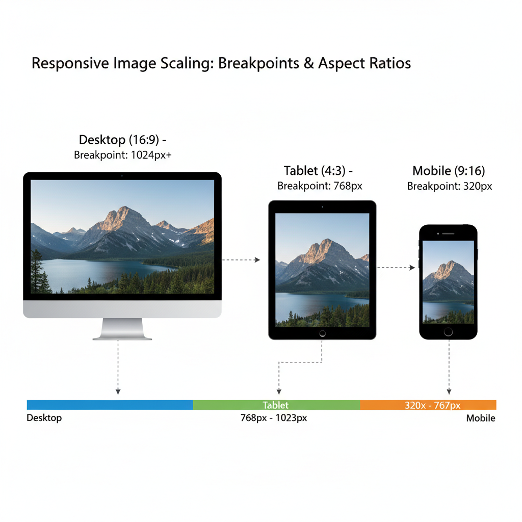
Responsive Web Images
For responsive design, use `srcset` to serve different sizes depending on device display:
---
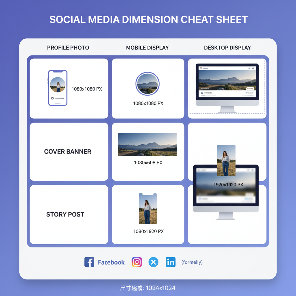
Social Media Image Dimension Cheat Sheet
Using the wrong social media image dimensions can result in awkward cropping or distortion. Always follow each platform’s recommended sizes.
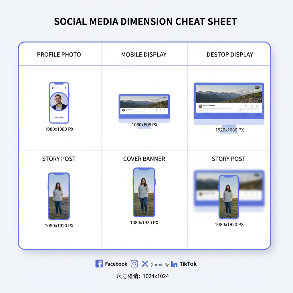
| Platform | Profile Picture | Cover / Banner | Post Image | Story |
|---|---|---|---|---|
| 180x180 px | 820x312 px | 1200x630 px | 1080x1920 px | |
| 320x320 px | N/A | 1080x1080 px (square) / 1080x1350 px (portrait) | 1080x1920 px | |
| Twitter/X | 400x400 px | 1500x500 px | 1200x675 px | N/A |
| 400x400 px | 1584x396 px | 1200x627 px | N/A | |
| N/A | N/A | 1000x1500 px | N/A |
---
Profile Photos, Cover Banners, and Story Posts
Different image types serve distinct purposes:
- Profile Pictures – Typically small; prioritize clarity of your face or logo.
- Cover Banners – Wide panoramic visuals for brand identity or storytelling.
- Story Posts – Vertical 9:16 ratio content ideal for mobile-first engagement.
Pro tip: Keep main subjects centered for profile pictures, as many platforms use circular cropping.
---
Mobile vs. Desktop Presentation
An image may look different when viewed on mobile versus desktop because of:
- Viewport width – Mobile scales images smaller.
- Responsive cropping – Some platforms crop dynamically for smaller screens.
Tips for Responsive Images:
- Use flexible container widths in CSS (`%` or `max-width: 100%`).
- Limit overlay text to maintain legibility on smaller displays.
- Test across multiple devices before finalizing.
---
Tools to Resize and Optimize Images
Leverage the right tools to ensure professional-quality resizing without guesswork.
Popular tools:
- Adobe Photoshop – Precision control over dimensions and export options.
- GIMP – Free, open-source editor.
- Canva – Templates pre-sized for social media.
- TinyPNG – Compress images without visible quality loss.
- ImageMagick – Command-line batch processing.
Example ImageMagick command:
convert input.jpg -resize 1200x800 output.jpg---
Common Mistakes in Image Sizing
Avoid these common pitfalls:
- Stretching images – Always maintain aspect ratio to prevent warping.
- Uploading low-resolution files – Leads to pixelation on large screens.
- Ignoring safe zones – Faces or text can be cut off by platform cropping.
- Oversized files – Slow load times harm SEO.
---
SEO Advantages of Optimal Image Dimensions
Correctly sized and compressed images benefit your search visibility by:
- Speeding up page loads – Enhances user experience and SERP rankings.
- Improving mobile performance – Reduces bounce rates.
- Boosting accessibility – Descriptive alt text provides context for search engines and users with assistive tech.
Combined with next-gen formats (WebP, AVIF) and techniques such as lazy loading, perfect image dimensions can elevate both UX and SEO.
---
Best Practices Checklist
Before publishing, check:
- Identify target platform before designing the image.
- Use the required aspect ratio.
- For print, match DPI to physical size.
- For web, compress and serve appropriately sized images.
- Test on both mobile and desktop displays.
- Retain a high-resolution master file.
- Use descriptive filenames (e.g., `summer-beach-hero.jpg`).
- Add accurate alt text.
- Balance file size and quality with smart compression.
- Save sizing templates for future use.
---
By mastering dimensions for pictures, you can produce images that are crisp, platform-ready, and performance-optimized. This attention to detail fosters brand consistency, enhances engagement, and supports stronger SEO results.
Ready to level up your visual strategy? Start applying these image sizing best practices to your next project for sharper designs and faster websites.