Dimensions of a Picture Explained for Beginners
Learn what picture dimensions are, how they differ from resolution, and ways to optimize images for web, social media, and print without losing quality.

Understanding the Dimensions of a Picture
When working with visual assets—whether for websites, social media, or print—you’ll often encounter the term picture dimensions. This refers to the measurable size of an image, and getting it right is crucial for clarity, performance, and SEO. In this comprehensive guide, we’ll explore what dimensions mean, how they differ from resolution, and how to select and optimize them for different platforms.
---
What Are Picture Dimensions?
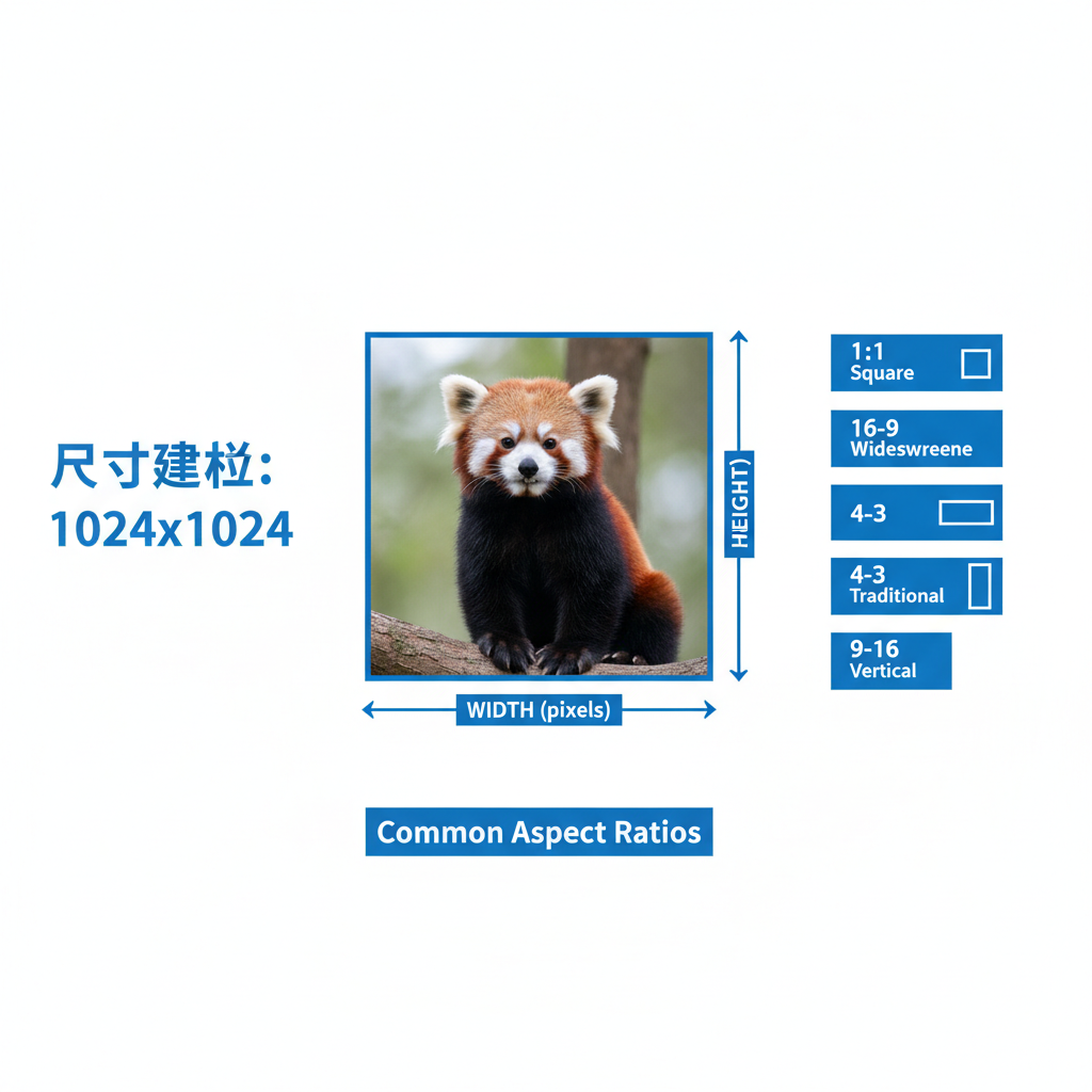
The dimensions of a picture describe its width and height and can be represented in multiple units:
- Pixels (px): The count of individual dots making up the digital image. For example, 1920×1080 px means 1920 pixels wide and 1080 pixels tall.
- Inches or Centimeters: Used in physical measurements, important for print output.
- Aspect Ratio: The proportional relationship between width and height (e.g., 16:9, 4:3, 1:1).
Why Dimensions Matter
Knowing exact image dimensions helps ensure your visual:
- Fits its intended platform without distortion.
- Maintains clarity and legibility.
- Avoids oversized files that slow page loading.
---
Resolution vs Dimensions
Many confuse resolution with dimensions, but they are different.
Dimensions
Measured in pixels, inches, or centimeters — defines physical or digital size.
Resolution
Measured in pixels per inch (PPI) or dots per inch (DPI) — determines pixel density and influences print clarity.
Key Difference:
An image could be 3000×2000 pixels (dimensions) but will scale differently depending on resolution settings.
| Term | Unit | Description |
|---|---|---|
| Dimensions | Pixels | Width and height in digital size |
| Resolution | PPI/DPI | Pixel density affecting print clarity |
| Aspect Ratio | Ratio | Width:Height proportion |
---
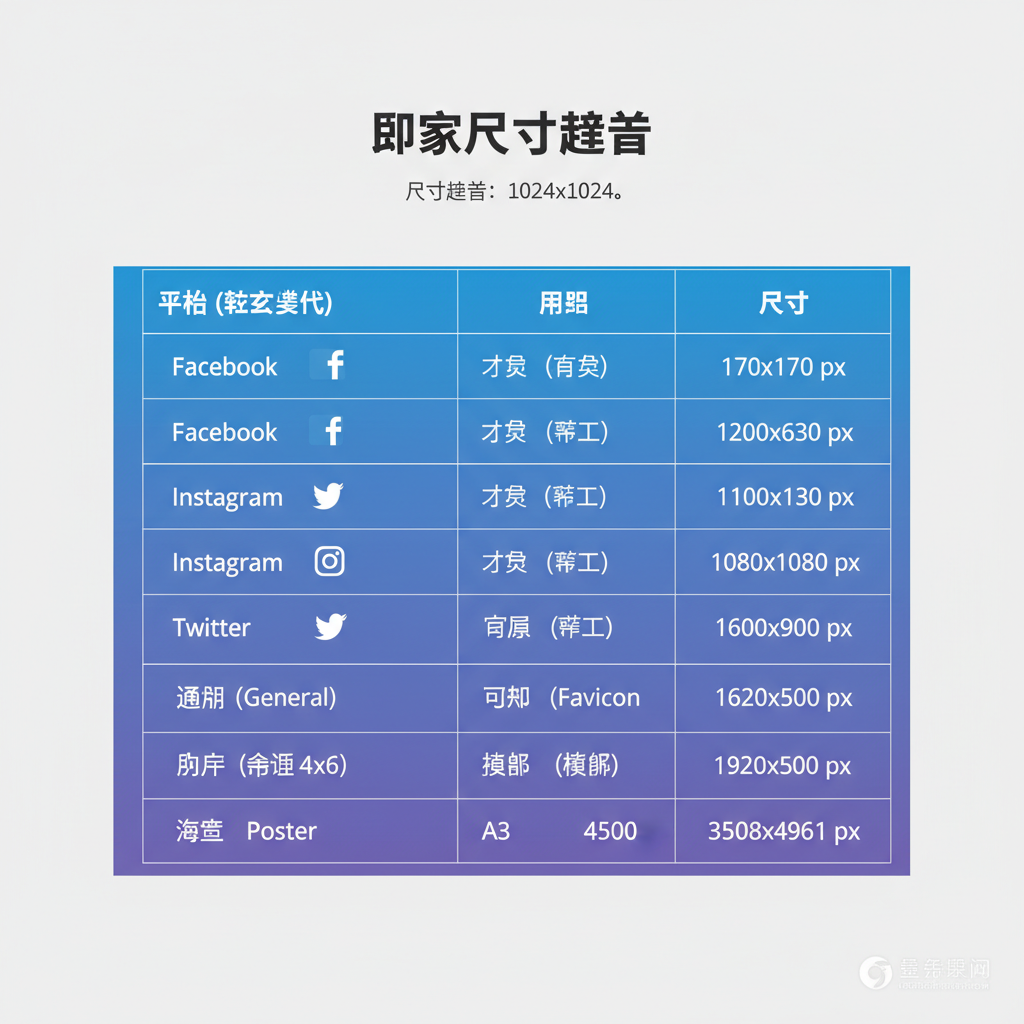
Common Picture Dimensions Across Platforms
Different platforms require different dimensions for optimal display.
Web Recommendations
- Blog feature: ~1200×628 px
- Website banner: 1920×800 px
Social Media Standards
- Instagram post: 1080×1080 px
- Facebook cover: 820×312 px
- Twitter header: 1500×500 px
Print Examples
- A4: 8.27×11.69 in at 300 DPI
- Posters: large resolution depending on size
---
Aspect Ratios and Composition
Aspect ratio determines how your image is framed and displayed.
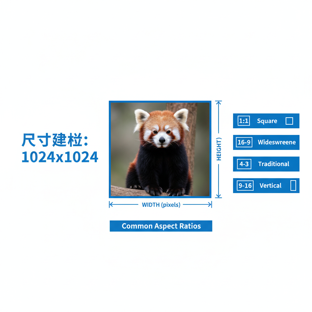
Common Ratios
- 1:1 – Square, ideal for social posts.
- 4:3 – Classic photography and older displays.
- 16:9 – Widescreen, standard for modern video.
Pro Tip: Choose your aspect ratio before capturing or designing to avoid heavy cropping later.
---
Tools to Check and Change Dimensions
You can use online and offline tools for dimension adjustments.
Online Options
- Canva
- Pixlr
- Fotor
Offline Options
- Adobe Photoshop
- GIMP
- Microsoft Paint
To check dimensions via terminal:
## Using ImageMagick

identify -format "%wx%h" image.jpg
---
Resizing Images Without Quality Loss
Improper resizing can result in pixelation or blur.
Best Practices:
- Begin with high-resolution source files.
- Maintain aspect ratio when resizing.
- Use vector formats (SVG) when possible for scalability.
Methods:
- Bicubic interpolation for smooth scaling.
- Smart object scaling in Photoshop.
- Lossless compression tools like PNGGauntlet.
---
How Dimensions Affect File Size and Speed
Larger dimensions mean bigger file sizes, which:
- Slow page load times.
- Consume bandwidth.
- Can negatively impact SEO rankings.
Optimization Strategies
- Compress image files without visible quality loss.
- Use WebP format for browsers supporting it.
- Match dimensions to device breakpoints.
---
Optimizing for Responsive Design
On responsive sites, images adapt to varying screen sizes.
Techniques:
- Use `srcset` to serve multiple sizes.
- Apply CSS `max-width: 100%` for scaling.
- Prepare versions for mobile, tablet, desktop.
---
Mistakes to Avoid When Adjusting Dimensions
- Stretching horizontally or vertically.
- Ignoring aspect ratio during crops.
- Using ultra-high resolution for web unnecessarily.
- Skipping previews before publishing.
---
Summary Checklist
Use this checklist to choose the ideal picture dimensions:
| Step | Action |
|---|---|
| 1 | Identify the target platform |
| 2 | Check recommended dimensions |
| 3 | Maintain aspect ratio |
| 4 | Match resolution to output |
| 5 | Optimize for speed |
| 6 | Test visual on multiple devices |
---
Final Thoughts
Mastering the dimensions of a picture ensures your visuals are sharp, correctly displayed, and optimized for both performance and aesthetics. Whether you’re publishing online or preparing for print, understanding size, resolution, and aspect ratio will help you deliver professional-quality imagery. Start applying these tips today to improve appearance and SEO for all your visual content.