Dimensions of Image Explained and Their Impact on Quality
Learn how image dimensions affect quality for web and print, the difference from resolution and file size, and best sizing practices for clarity.

Understanding the Dimensions of an Image and How They Impact Quality
When creating or optimizing digital visuals — whether for websites, social media, or print — image dimensions are one of the most important factors influencing visual quality, clarity, and usability. While many people confuse image dimensions with resolution or file size, each represents a separate concept that affects your output differently. Understanding these differences can dramatically improve how your visuals appear on screen and in print.
In this guide, you'll learn:
- What image dimensions are and their common units.
- The relationship between dimensions, resolution, and file size.
- Best practices for web and print.
- Common mistakes to avoid.
- A quick reference chart of recommended sizes for major platforms.
---
What Are Image Dimensions?
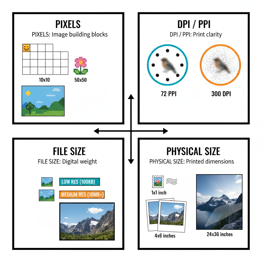
Image dimensions are the measurements of an image in pixels, usually expressed as width × height (e.g., 1920 × 1080 px). This is the most common sizing convention in digital workflows.
Common Units for Image Dimensions
- Pixels (px): Standard unit for on-screen display.
- Inches (in): Typically used in printing.
- Centimeters (cm): Common in print specifications outside the US.
Pixels vs. Physical Measurements
Pixels are the smallest element of a digital image and don’t have a fixed physical size — their on-screen size depends on the device’s pixel density. Physical measurements like inches or centimeters matter primarily when the image will be printed or reproduced at a fixed scale.
---
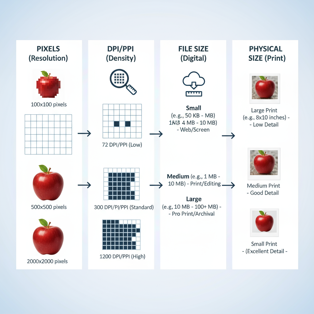
Dimensions vs. Resolution (PPI / DPI)
Understanding dimensions vs. resolution is key:
- Resolution (PPI/DPI): Pixels per inch (PPI) or dots per inch (DPI) determine density when printing.
- On screens: Two images of 1920 × 1080 px will look the same regardless of resolution settings unless printed.
- In print: The combination of dimensions and resolution determines how large an image can be printed clearly.
Example:
A 3000 × 2000 px image at 300 PPI will print at about 10 × 6.67 inches with sharp detail.
---
Dimensions vs. File Size
Dimensions and file size are related but distinct:
Factors influencing file size include:
- Dimensions (pixel count)
- File format (JPEG, PNG, WebP, etc.)
- Compression settings
- Color depth and image complexity
You can have a large-dimension image with a small file size if compressed aggressively, and small-dimension images with large file sizes if saved uncompressed.
---
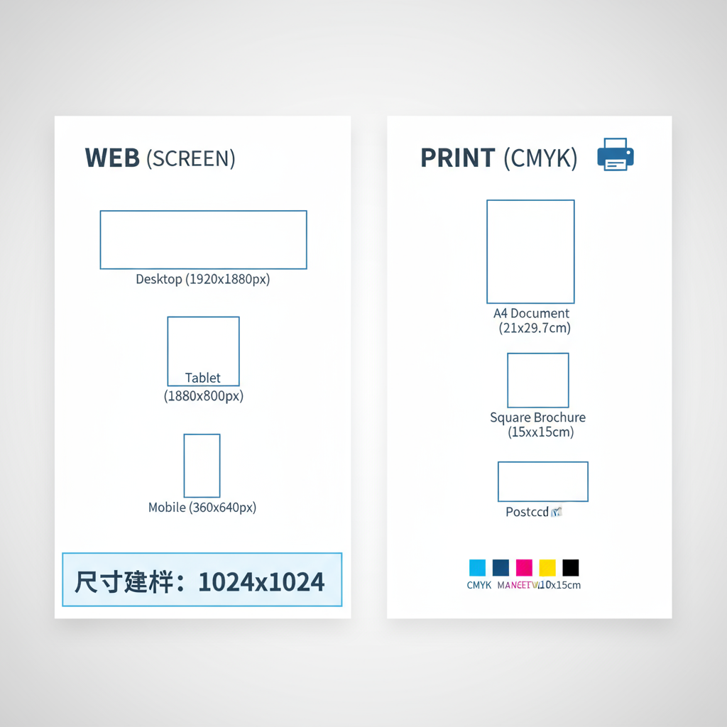
Standard Image Dimensions for Web
Choosing the right web image dimensions ensures optimal quality without wasting bandwidth.
Common examples:
- Blog feature images: Around 1200 × 628 px
- Full-width website banners: Around 1920 × 1080 px or wider
- Social media posts: Depends on platform (see chart below)
---
Ideal Dimensions for Print
In print, both image dimensions and resolution matter:
- A4: 8.27 × 11.69 in → at 300 DPI ≈ 2480 × 3508 px
- Poster (24 × 36 in): At 300 DPI = 7200 × 10800 px
- 4 × 6 photo: At 300 DPI = 1200 × 1800 px
For professional print, always capture or design at the largest size needed.
---
How Resizing Affects Quality
Resizing changes pixel count:
- Downsizing: Removes pixels, potentially improving sharpness if done well, but may lose fine detail.
- Upscaling: Adds pixels through interpolation, often creating blur or artifacts.
Pro tip: Do not enlarge beyond original dimensions unless using advanced AI upscalers.
---
Tools for Checking and Changing Image Dimensions
Popular tools include:
- Adobe Photoshop: Industry standard for precision.
- Canva: Fast resizing for non-designers.
- GIMP: Free, open-source alternative.
- Online editors: Pixlr, Fotor, Kapwing.
In Photoshop:
Navigate to `Image > Image Size`. Unchecking “Resample” changes resolution without altering dimensions.
---
Tips for Choosing Correct Dimensions
- Identify the end use: Web, print, or both.
- Follow platform requirements: Check official specs.
- Consider Retina/High-DPI screens: Often use 2× dimensions for best display.
- Keep aspect ratio: Avoid distortion.
- Balance file size: Ensure fast web loads with compression.
---
Common Mistakes to Avoid
- Confusing resolution with dimensions when preparing for print.
- Uploading oversized images for web (slows loading).
- Ignoring cropping in previews or thumbnails.
- Stretching by editing only one dimension.
- Forgetting device display differences between mobile and desktop.
---
Quick Reference: Recommended Dimensions for Popular Platforms
Here’s a visual reference to save you time:
| Platform | Use Case | Recommended Dimensions |
|---|---|---|
| Cover Photo | 820 × 312 px | |
| Shared Image | 1200 × 630 px | |
| Post (Square) | 1080 × 1080 px | |
| Story | 1080 × 1920 px | |
| Twitter (X) | Header | 1500 × 500 px |
| Twitter (X) | In-Stream Photo | 1600 × 900 px |
| Cover Photo | 1584 × 396 px | |
| Shared Image | 1200 × 627 px | |
| Pin Image | 1000 × 1500 px |
---
Summary and Next Steps
Mastering the dimensions of an image means more than memorizing numbers — it’s about knowing how dimensions interact with resolution, file size, and the intended medium. By applying the guidelines above, using the correct tools, and avoiding common mistakes, you can ensure your visuals remain sharp, clear, and optimized for every platform.
Call to Action:
Review your existing images and update them to match the dimensions best suited for their platform or medium. This quick optimization can have an immediate impact on both aesthetic quality and performance.