Examples of Photo Sizes for Print Web and Social Media
Learn the best photo sizes for print, web, and social media, with aspect ratio tips and resolution guidelines to keep images sharp and optimized.

Introduction: Why Photo Sizes Matter
In today’s digital-first world, selecting the right photo size is essential for achieving crisp, professional results across print, web, and social media platforms. Photo dimensions impact both visual quality and performance, influencing how quickly a page loads, how an audience engages with the content, and whether images display correctly without distortion. Key factors to understand include resolution (measured in DPI or PPI) and aspect ratio (the proportion between width and height).
For example:
- Print projects need high-resolution images to avoid blurring or pixelation.
- Web content benefits from optimized images that balance clarity with fast load times.
- Social media posts must fit specific platform dimensions to prevent unwanted cropping.
This article details examples of photo sizes for common use cases, explains aspect ratios, and provides practical tips and tools to resize your images without losing quality.
---
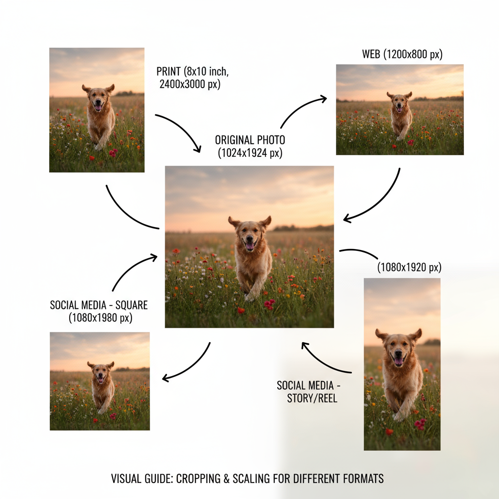
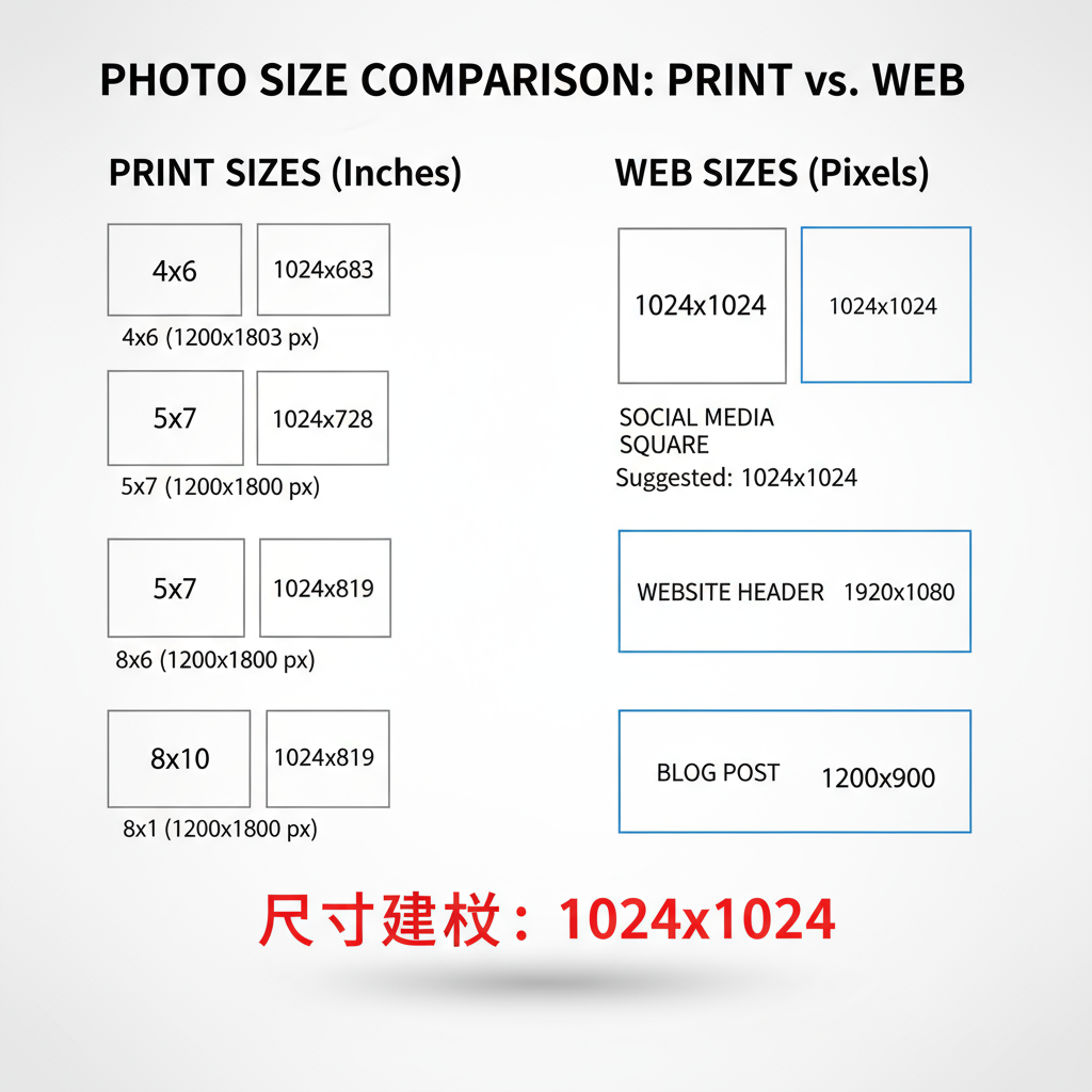
Common Print Photo Sizes
Print sizes are measured in inches or centimeters, and high resolution (usually 300 DPI) is crucial for sharp, detailed results.
Popular print photo sizes:
- 4×6 inches (10×15 cm): Standard snapshot prints.
- 5×7 inches (13×18 cm): Popular for framed photography and gifts.
- 8×10 inches (20×25 cm): Ideal for portraits, decor, and wall art.
Resolution guideline:
- Minimum 300 DPI for professional-quality prints.
| Print Size (inches) | Print Size (cm) | Recommended Pixel Dimensions (300 DPI) |
|---|---|---|
| 4×6 | 10×15 | 1200×1800 px |
| 5×7 | 13×18 | 1500×2100 px |
| 8×10 | 20×25 | 2400×3000 px |
| 11×14 | 28×36 | 3300×4200 px |
---
Standard Digital Photo Sizes for Web
For websites and online publishing, oversized images slow load times and hurt SEO. Keeping file sizes small while preserving key image details is ideal.
Common web image widths:
- Full-width banners: 1920 px wide
- Content images: 800–1200 px wide
- Thumbnails: 150–300 px wide
Resolution tips:
- Standard: 72 PPI for general use.
- Retina/high-DPI devices: Double the pixel dimensions or target 150 PPI for sharper results.
---
Social Media Photo Sizes
Each platform enforces its own size standards. Correct dimensions prevent stretching, pixilation, or awkward cropping.
- Profile Picture: 180×180 px
- Cover Photo: 820×312 px
- Shared Image: 1200×630 px
- Square Post: 1080×1080 px
- Portrait Post: 1080×1350 px
- Landscape Post: 1080×566 px
- Story: 1080×1920 px
Twitter / X
- Profile Photo: 400×400 px
- Header Photo: 1500×500 px
- In-Stream Photo: 1600×900 px
- Profile Photo: 400×400 px
- Background Banner: 1584×396 px
- Shared Image: 1200×627 px
- Pin Image: 1000×1500 px
- Profile Image: 165×165 px
---
Understanding Aspect Ratios
The aspect ratio is the width-to-height proportion of an image. Popular formats include:
- 1:1 → Perfect square, often used in Instagram feeds.
- 4:3 → Common for standard photo prints and older screens.
- 3:2 → Default in many DSLR cameras.
- 16:9 → Widescreen for video, slideshows, and banners.
Selecting the right ratio ensures your main subject remains framed without awkward cropping.
---
Portrait vs. Landscape vs. Square
- Portrait: Taller than it is wide. Ideal for posters, flyers, and mobile-first vertical content.
- Landscape: Wider than tall. Great for scenery, group shots, and website headers.
- Square: Equal height and width. Works well for grid-based social layouts like Instagram.
---
Converting and Resizing Images Without Losing Quality
When adjusting size, maintain the aspect ratio to avoid distortion.
Pro resizing tips:
- Always start with the highest-quality original file.
- For enlargements, use bicubic smoother interpolation; for reductions, use bicubic sharper.
- Perform resizing in a single step to limit quality degradation.
---
Tools and Resources for Checking & Adjusting Photo Sizes
Popular applications and online services include:
- Adobe Photoshop – Comprehensive editing features.
- Canva – Streamlined templates for multiple platforms.
- GIMP – Free, powerful open-source alternative.
- TinyPNG / Squoosh – Compress images for web without visible loss.
- Online Image Resizer – Fast resizing without installing software.
---
Examples with Comparison Charts
| Use Case | Aspect Ratio | Standard Pixel Size | DPI Recommendation |
|---|---|---|---|
| Print 4×6 | 3:2 | 1200×1800 | 300 |
| Website Banner | 16:9 | 1920×1080 | 72–150 |
| Instagram Story | 9:16 | 1080×1920 | 72–150 |
| Pinterest Pin | 2:3 | 1000×1500 | 72–150 |
---
Best Practices for Optimizing Photo Sizes for SEO and Speed
- Compress images before uploading to balance quality and file weight.
- Use descriptive filenames and meaningful alt text for better accessibility and SEO.
- Adopt next-gen formats such as WebP or AVIF where supported.
- Enable lazy loading so images appear only as they enter view.
- Leverage CDNs to serve images quickly worldwide.
---
Conclusion & Quick Reference Table
Selecting the right image dimensions boosts clarity, maintains design consistency, and improves both load performance and SEO. While print outputs demand high DPI images, digital publishing benefits from pixel-efficient, correct-aspect-ratio files tailored to each platform.
Quick Reference Table:
| Platform / Use | Pixel Dimensions | Aspect Ratio |
|---|---|---|
| 4×6 Print | 1200×1800 | 3:2 |
| Website Banner | 1920×1080 | 16:9 |
| Facebook Cover | 820×312 | 2.63:1 |
| Instagram Square Post | 1080×1080 | 1:1 |
| Twitter Header | 1500×500 | 3:1 |
By applying these examples of photo sizes and following best practices, you can ensure images deliver maximum impact across all channels. Whether you’re designing for print, curating a website, or creating social content, the right sizes will keep your visuals sharp, engaging, and SEO-friendly.