Facebook and Instagram Logo History and Meaning Explained
Explore the history, meaning, and color psychology of Facebook and Instagram logos, and how their visual identities shape brand perception.

Introduction to Facebook & Instagram Logos and Their Cultural Influence
In today’s interconnected digital era, visual branding plays a central role in shaping user engagement and brand recall. Among the most powerful examples are the Facebook & Instagram logo designs — symbols that transcend their role as mere app icons to become cultural markers of social connection, creativity, and technological evolution. Their design histories, symbolism, and branding strategies reveal how effective visual identity can influence not only audience perception but also the trajectory of a global brand.
This guide dives into the history of both logos, explores their meaning and color psychology, and examines their role in marketing, legal usage, and future design trends.

---
History of the Facebook Logo Design Changes (2004 to Present)
When Facebook debuted in 2004 as TheFacebook, its logo was a simple lowercase white wordmark on a dark blue rectangle—a color chosen because founder Mark Zuckerberg is red-green colorblind and blue appeared most distinctly to him.
Key milestones:
- 2004–2005: Featured “TheFacebook,” blue background, serif font.
- 2005–2015: Dropped “The,” adopted custom sans-serif font.
- 2015–2019: Introduced softer lettering and increased spacing.
- 2019–present: Added a circular "f" app icon and a corporate all-caps “FACEBOOK” for Meta branding.
By transitioning gradually, Facebook preserved brand recognition while aligning with the clean, minimalist trends of modern UI.
---
History of the Instagram Logo Evolution (2010 to Present)
Instagram launched in 2010 with a vintage camera icon, evoking nostalgia for analog photography and reflecting the app’s instant photo-sharing purpose.
Transformation timeline:
- 2010–2011: Polaroid-inspired camera icon with rainbow stripe.
- 2011–2016: Simplified details for better digital adaptability.
- 2016–present: Bold shift to a minimal camera outline against a vivid purple-pink-orange gradient.
Although initially divisive, Instagram’s 2016 rebrand is now a case study in adopting flat design to fit a rapidly visual-centric mobile landscape.

---
Symbolism and Meaning Behind Each Logo
The visual choices of Facebook and Instagram convey intentional messages:
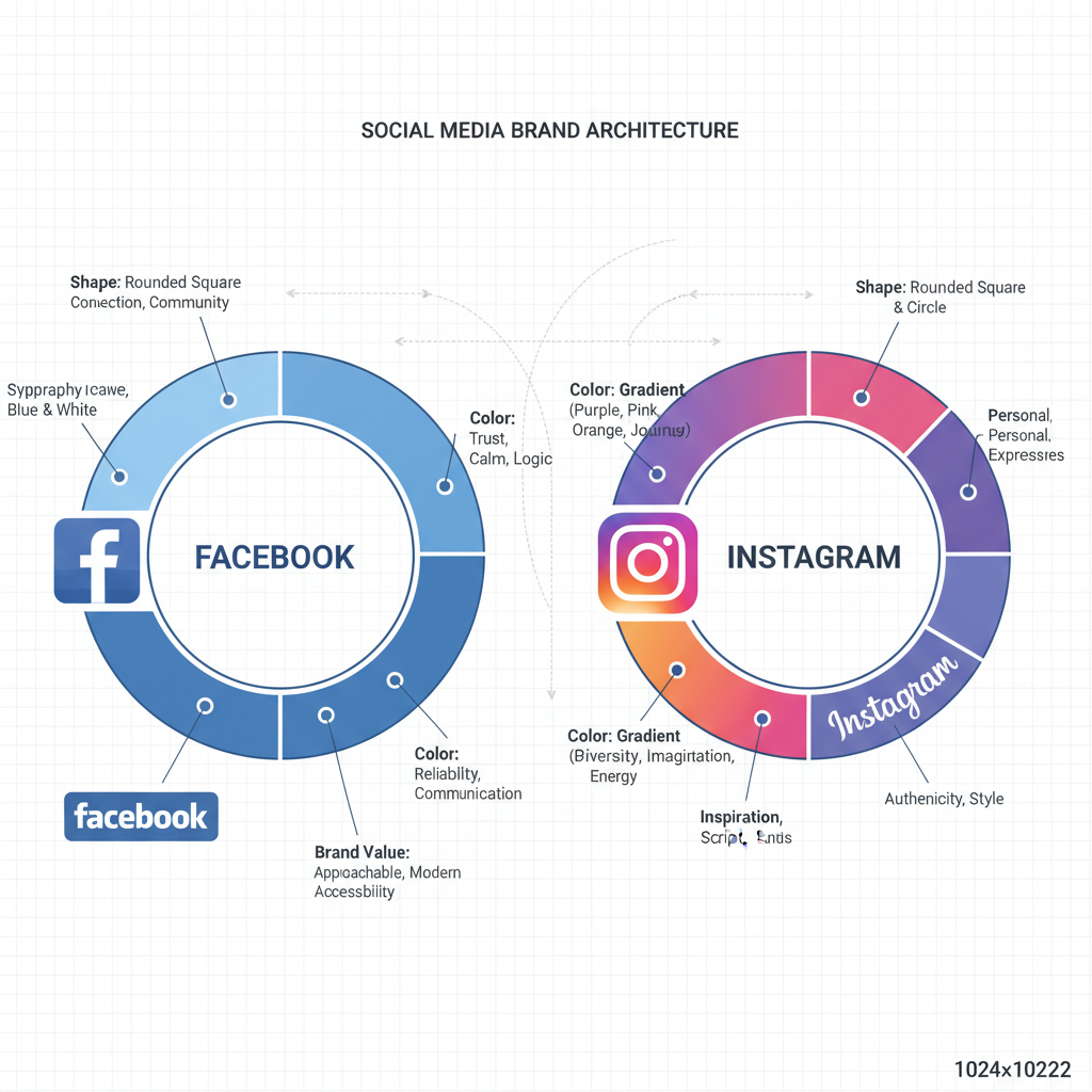
- Facebook: Blue communicates trust, community, and stability; earlier lowercase fonts suggested openness and approachability.
- Instagram: The camera shape speaks to creativity and memory capture; its gradient symbolizes diversity, vibrancy, and artistic flair.
Each builds an emotional link with its respective audience, reinforcing brand positioning.
---
Color Psychology: Blue vs. Gradient Spectrum
Color plays a major role in forming user perceptions and emotional responses.
| Brand | Primary Color | Psychological Impact |
|---|---|---|
| Blue | Trust, reliability, calmness, social stability | |
| Gradient: purple, pink, orange, yellow | Creativity, energy, warmth, joy |
While Facebook’s consistent blue nurtures familiarity for its broad demographic, Instagram’s bold palette attracts younger, visually driven audiences.
---
How Brand Values Are Reflected in the Logos
- Facebook: Stable, functional identity supporting its role as a universal communication utility—a global connector.
- Instagram: Artistic, expressive flair aligned with its mission as a creator platform that celebrates personal moments and aesthetics.
The contrast encapsulates the platforms’ distinct personalities.
---
Comparing Facebook and Instagram Branding Philosophies
Despite sharing ownership under Meta, the logos reveal contrasting approaches:
- Conservative evolution
- Clear, corporate communication tone
- Trend-sensitive, experimental
- Emotion-forward and bold in rebranding
This divergence helps Meta address diverse audience segments without diluting parent identity.
---
Impact of Logo Redesigns on Public Perception
Logo changes often prompt significant user reactions:
- Facebook’s methodical adjustments avoided alienating users.
- Instagram’s dramatic 2016 update drew early backlash but later normalized as a design-forward move.
The takeaway: balancing familiarity and freshness is vital for digital brand longevity.

---
Using Facebook & Instagram Logos in Business Marketing
Businesses embed the Facebook & Instagram logos to signal legitimacy, encourage social engagement, and promote online presence.
Common applications:
- Adding clickable icons on websites linking to profiles
- Including logos in print media like flyers or business cards
- Overlaying them in videos next to calls to action
Proper logo integration strengthens trust and directs audiences to interactive brand channels.
---
Legal Guidelines for Correct Logo Usage
Meta enforces strict rules for the usage of Facebook and Instagram logos to protect brand integrity.
Essential rules:
- Always use official assets from the Brand Resource Center
- Never alter colors, ratios, or orientation
- Maintain enough clear space to preserve visibility
- Avoid suggesting endorsement without explicit approval
Both the Facebook “f” icon and Instagram glyph are legally protected and must be tied to actual platform involvement.
---
Future Trends in Social Media Visual Identity
Predicted shifts in social media branding include:
- Leaner, more adaptive icons that scale effectively across devices
- Seasonal or event-based variations for user engagement
- Theme-aware color modifications for features like dark mode
Although change may come gradually, Facebook and Instagram’s core elements will remain central to their identity.
---
Conclusion: Why the Facebook & Instagram Logos Stay Relevant
The evolution of the Facebook & Instagram logo mirrors broader cultural and design changes in the digital landscape. Facebook’s measured visual adjustments and Instagram’s bold gradients represent two ends of a spectrum—utility and creativity—both resonating deeply with their audiences.
Their staying power is a product of strategic updates that respect brand heritage while embracing modern aesthetics. For marketers, designers, and digital strategists, these logos are a case study in maintaining relevance without losing brand essence.
Want to improve your branding? Study the principles, color psychology, and strategic pacing behind these icons—then apply them to craft a visual identity that stands the test of time.


