Facebook and Instagram Logos: History, Usage Rules, and Designer Tips
Practical guide to Facebook and Instagram logos: history, anatomy, usage rules, color, accessibility, legal notes, and a checklist for designers and developers.
Facebook and Instagram logos are among the most widely used brand marks in digital products and marketing materials. This guide offers a practical, formatting-friendly reference for designers and developers who need to apply these icons consistently across different surfaces. It outlines visual anatomy, evolution, usage rules, accessibility, legal considerations, and a concise checklist to streamline handoff and review.
Facebook and Instagram Logos: History, Usage Rules, and Designer Tips
The facebook and instagram logo set is among the most recognized visual systems on the internet. Whether you’re designing an app onboarding, a paid social ad, or a partner landing page, using these marks correctly is both a design best practice and a legal requirement.
This guide covers the visual anatomy, evolution, file formats, color and background rules, co-branding strategies, accessibility considerations, legal notes, and a practical checklist so you can ship with confidence.
Why These Logos Matter
- Brand recognition: The Facebook “f” and Instagram camera glyph are instant signifiers that increase scanning efficiency and reduce cognitive load.
- Trust and credibility: Proper usage signals authenticity and compliance, especially in checkout flows, UGC sections, and login buttons.
- Ecosystem context: Both belong to the Meta family. When you pair or sequence them, you’re also implying interoperability within Meta’s surfaces (e.g., sharing, login, messaging).
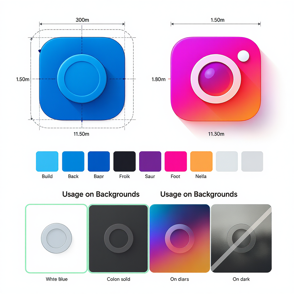
Visual Anatomy and Differences
At a glance, the facebook and instagram logo icons are both rounded-square containers, but their proportions, curvature, and internal marks are purposefully distinct.
| Attribute | Facebook “f” icon | Instagram camera glyph |
|---|---|---|
| Primary shape | Lowercase “f” monogram centered in a rounded square | Simplified camera outline with lens dot inside a rounded square |
| Proportions | Single-color monogram; vertical stem slightly above optical center | Camera form optically centered; stroke weights tuned for small sizes |
| Corner radius | Rounded square with balanced corner radii suited to small app tiles | Rounded square with continuous curvature for gradient flow |
| Color treatment | Solid blue with white “f” (or monochrome variants) | Multicolor gradient background with white camera; also monochrome |
| Clear space | At least the height of the “f” stem around the icon | At least the width of the lens dot around the icon |
| Minimum size guidance | Small sizes preserve the “f” counter; avoid below ~16–20 px | Gradient and inner details need ~20–24 px to remain legible |
Tip: Treat the rounded-square container as part of the symbol. Don’t crop, mask, or alter the container radius.
A Brief Evolution Timeline
- 2004–2005: Wordmark-centric identity; early “f” monogram emerges for favicons and buttons.
- 2013–2019: Simplification and optical tuning of the “f” icon; flat color era.
- 2021+: Company rebrands to Meta. The Facebook app retains the “f” icon, refined color and geometry.
- 2010: Skeuomorphic retro camera icon.
- 2013–2015: Simplifications for smaller screens; flatter shading.
- 2016: Landmark shift to the gradient camera glyph—bold, scalable, contemporary.
- 2022+: Gradient updated for vibrancy and accessibility; supporting typeface refreshed.
Each shift sought better legibility on small screens, consistency across platforms, and a stronger, more flexible brand system.
Official Assets and File Formats
Download brand-approved assets from Meta’s official brand resources and press kits. Avoid recreating the icons from scratch; use the provided vector files.
| Format | When to use | Pros | Notes |
|---|---|---|---|
| SVG | Web, apps (vector-friendly UIs), responsive icons | Scales crisply, small file size, easy color/role control | Prefer for modern web; keep paths intact; don’t edit shapes |
| PNG | Raster-only pipelines, email, quick comps | Predictable rendering, supports transparency | Export @1x/@2x/@3x; avoid upscaling |
| PDF/EPS | Print workflows, vector-first desktop publishing | Resolution-independent, CMYK support | Embed fonts/outlines; proof on calibrated printers |
Export best practices:
- Use clean artboards with built-in padding for clear space.
- Export exact pixel sizes for raster outputs; no compression artifacts.
- For SVG: collapse groups, preserve viewBox, and remove unnecessary metadata.
Example minimal SVG hygiene:
Color Usage and Backgrounds
Recommended base colors (verify the latest values in Meta’s brand resources):
:root {
  /* Facebook */
  --fb-blue: #1877F2;
  --white: #FFFFFF;
  --black: #000000;

  /* Instagram gradient (representative stops) */
  --ig-orange: #F58529;
  --ig-yellow: #FEDA77;
  --ig-pink:   #DD2A7B;
  --ig-purple: #8134AF;
  --ig-blue:   #515BD4;
}- Facebook: Solid blue tile with white “f” is the default. Monochrome (all-white or all-black) versions are acceptable on contrasting backgrounds.
- Instagram: Use the official gradient camera glyph whenever color is available. Monochrome white or black variants are permissible where gradients aren’t feasible.
Backgrounds:
- Choose high-contrast backgrounds. On light backgrounds, use standard colored marks; on dark backgrounds, use white or appropriate reversed versions.
- Avoid busy imagery behind the icons. If needed, apply a subtle overlay to maintain legibility.
Clear space and minimum sizes:
- Maintain at least one unit of the icon’s internal feature (e.g., the “f” stem height or the lens dot width) as padding around the mark.
- Digital minimum: target 24 px for Instagram and 20 px for Facebook to preserve internal details. For touch targets, aim 44–48 px clickable areas.
Do’s and Don’ts
Do:
- Use the official, unmodified assets.
- Maintain clear space and alignment with other UI elements.
- Choose versions (full color, reversed, monochrome) appropriate to background contrast.
Don’t:
- Recolor the marks outside sanctioned colors (e.g., brand them in your palette).
- Warp, stretch, bevel, add drop shadows or glows.
- Pair the icon with unapproved wordmarks or custom typography.
- Combine the icons into a hybrid or imply Meta endorsement or partnership if none exists.
- Animate in ways that distort geometry or color integrity.
Co-Branding and Lockups
When placing both logos together in ads, UI, or landing pages:
- Order: If sequence matters (e.g., social links, share sheets), follow product relevance or alphabetical order. Often: Facebook, then Instagram.
- Spacing: Maintain equal clear space around each icon. Use a consistent gap (e.g., 0.5–1.0 icon width).
- Alignment: Align by icon container edges or visual centers, not by the internal glyphs.
Example layout snippet:


If a joint lockup is required (e.g., “Available on Facebook and Instagram”), prefer separate icons with a clear divider rather than constructing a new composite mark.
Accessibility and UI Considerations
- Contrast: Ensure at least WCAG AA contrast for icon against background. For small icons used as functional buttons, provide a focus ring or container with sufficient contrast.
- Alt text: Use simple, product-level labels.
Legal and Permissions
- Trademarks: The facebook and instagram logo assets are trademarks of their respective owner (Meta). You must follow their brand use guidelines.
- Editorial vs. commercial: Editorial contexts (news, criticism) may allow certain uses under fair use; commercial uses (ads, packaging, endorsements) typically require explicit permission.
- No implication of endorsement: Don’t present the logos in a way that suggests Meta sponsors or endorses your product unless you have written approval.
- Redistribution: Do not redistribute modified logo files. Link to official assets or include them as provided within your product under the allowed terms.
- Approvals: For edge cases (co-branded campaigns, unconventional formats), submit requests through Meta’s Brand Permissions channels and keep records of approvals.
Practical Designer Checklist
Export sizes:
- Raster: 16, 20, 24, 32, 48, 64, 96, 128 px (export @1x/@2x/@3x as needed).
- iOS: 20/29/40/60/76/83.5 pt families with @2x/@3x assets where required.
- Android: 24 dp baseline across mdpi/hdpi/xhdpi/xxhdpi/xxxhdpi.
Naming conventions:
- facebook-icon_24.png, instagram-glyph_color_24.png
- facebook-icon@2x.png, instagram-glyph@3x.png
- facebook.svg, instagram.svg (single source of truth)
Version control:
- Store official assets in a dedicated brand-assets/ folder.
- Keep a CHANGELOG noting source version and any export transformations.
- Lock files as read-only to prevent accidental edits to vectors.
Quick review workflow:
- Check background contrast (light/dark variants).
- Verify clear space and alignment with neighboring elements.
- Confirm pixel-snapping at small sizes (no blur).
- Validate alt text, touch targets, and focus states.
- Ensure you’re using the latest, official files.
Example project structure:
project/
  brand-assets/
    facebook/
      facebook.svg
      facebook_24.png
      facebook_24@2x.png
      LICENSE.txt
    instagram/
      instagram.svg
      instagram_24.png
      instagram_24@2x.png
      LICENSE.txt
  ui/
    components/
      SocialIcons.jsx
  docs/
    brand-usage.md
Final Tips
- Default to official color marks; switch to monochrome only for contrast or medium constraints.
- Keep the icons independent; avoid DIY mashups or wordmark pairings.
- Re-download assets periodically to capture refinements (gradients and geometry evolve).
- When in doubt, consult Meta’s brand guidelines and seek permission for atypical use.
Use the facebook and instagram logo thoughtfully and consistently, and your interfaces will benefit from immediate recognition, stronger trust, and a polished, standards-compliant look.
Summary
Correct use of the facebook and instagram logos depends on sourcing official assets, preserving geometry and color, maintaining clear space, and ensuring contrast and accessibility. Follow the co-branding and legal guidelines to avoid implying endorsement and to keep your UI compliant and legible across contexts. With a disciplined export workflow and a quick preflight checklist, you’ll ship brand-accurate, accessible icons every time.