Facebook & Twitter Logo Usage Guidelines for Marketers
Learn Facebook and Twitter logo history, official brand guidelines, and best practices to use these assets correctly in marketing campaigns.

Facebook & Twitter Logo Usage Guidelines for Marketers
Marketing teams frequently incorporate the instantly recognizable Facebook and Twitter logos into digital and print campaigns. These social media brand assets carry strict rules to protect trademarks, maintain visual integrity, and uphold a consistent brand identity. This guide explores each platform’s logo history, official usage requirements, and best practices for marketers seeking to use the Facebook & Twitter logo effectively and compliantly.

---
Overview of Facebook and Twitter Logo History and Evolution
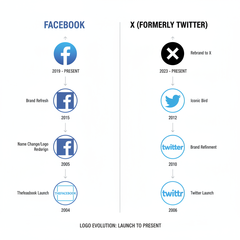
Facebook Logo Evolution
Facebook’s logo began in 2004 as a bold lowercase “facebook” in white on a blue rectangle. Over time, it moved to a cleaner, minimal wordmark. In 2019, Facebook introduced a corporate logo to distinguish the parent company from the app. The app icon evolved from a lowercase “f” in a solid blue square to a flat, mobile-optimized design.
Twitter Logo Evolution
Twitter shifted from text-plus-bird to bird-only branding in 2012, simplifying the mark to the now-iconic “Twitter Bird.” The symbol has been refined in shape and shifted to a lighter blue, improving scalability and clarity across devices.
---
Official Brand Guidelines for Logo Usage
Both Facebook and Twitter publish detailed brand style guides. Marketers should pay particular attention to:
- Color Specification: Only use official brand colors — Facebook Blue (#1877F2) and Twitter Blue (#1DA1F2) — for primary logo usage.
- Clear Space: Keep sufficient empty area around the logos for visibility.
- Proportional Scaling: Never stretch, compress, or distort logos.
| Platform | Primary Color | Minimum Size | Clear Space Requirement |
|---|---|---|---|
| #1877F2 | 16px height (digital) | Height of “f” icon | |
| #1DA1F2 | 16px height (digital) | Width of bird’s beak |
---
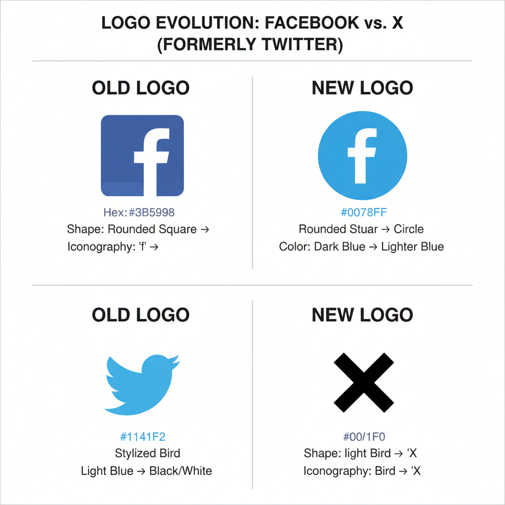
Differences Between Old and New Versions
- Facebook: Transitioned from deeper gradient blues with glossy effects to flat, modern design for digital clarity.
- Twitter: Earlier bird faced right with detailed feathers; current bird is streamlined and faces upward for cleaner scaling.
---
Importance of Maintaining Visual Consistency
Consistent logo use builds trust and reinforces recognition. Unified presentation across social posts, ads, and packaging lets audiences quickly verify authentic company profiles.

---
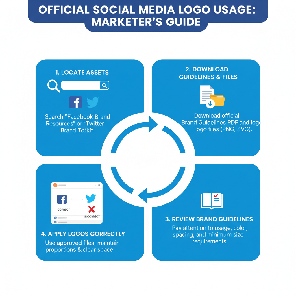
How to Download Official Logo Assets
Always obtain logos from official brand resource centers to guarantee quality and compliance:
- Facebook Brand Resources: Facebook Brand Resource Center
- Twitter Brand Guidelines: Twitter Brand Resources
Avoid unofficial downloads to prevent outdated or incorrect assets.
---
Common Mistakes to Avoid
- Disproportionate resizing that distorts the logo.
- Non-brand colors replacing official hues.
- Graphic effects such as drop shadows or outlines.
- Outdated versions reused from past campaigns.
- Crowded layouts with insufficient clear space.
---
Using Logos in Social Media Graphics and Ads Without Violating Terms
When integrating logos into promotional graphics:
- Do not imply endorsement or partnership if none exists.
- Avoid cluttered or overly patterned backgrounds.
- Respect minimum size and clarity guidelines.
- Ensure clickable logos link directly to verified accounts.
---
Combining Facebook and Twitter Logos in Multi-Platform Campaigns
Cross-platform layouts require adherence to both brand guides. Place logos side-by-side with matched sizes, individual clear space, and original colors.
Example layout:
[ Facebook Logo ] Follow us on social media! [ Twitter Logo ]Never merge the two symbols or adjust colors to blend, as this breaches brand identity rules.

---
Legal Considerations: Trademark and Copyright Policies
Facebook and Twitter logos are trademark-protected. Unauthorized modification, misleading placement, or contexts likely to confuse audiences can lead to legal consequences. Permitted marketing usage must still follow guideline restrictions regarding color, spacing, and accuracy.
---
Case Studies of Brands Using Social Icons Effectively
Case Study 1: Retail Campaign
An apparel brand added official Facebook and Twitter logos to TV commercials, linking to social giveaways. Consistent sizing across digital and broadcast strengthened recognition.
Case Study 2: Non-Profit Awareness Push
A non-profit displayed Facebook and Twitter logos in correct colors side-by-side with sufficient white space and a clear CTA, resulting in strong engagement metrics.
---
Best Practices for Accessibility and Mobile-Friendly Logo Display
- Use high-contrast backgrounds for visibility.
- Provide alt text for screen reader accessibility.
- Ensure scalable vector logos to avoid pixelation on small screens.
- Avoid busy textures behind logos to ensure clarity.
---
Optimizing Logo Usage for SEO and Brand Recognition
Logos themselves don’t directly affect SEO rankings, but consistent, branded visuals support trust and click-through rates. Correct integration can:
- Stimulate brand searches.
- Increase social profile visits from campaigns.
- Encourage link sharing through attractive, compliant designs.
SEO Tip
Include descriptive alt attributes — such as `"Facebook Logo"` or `"Twitter Bird Logo"` — for better image indexing and visibility in search.
---
Conclusion
The Facebook & Twitter logo usage guidelines safeguard each brand’s identity and audience trust. By following official resources, respecting colors, proportions, spacing, and legal protections, marketers can deliver campaigns that are professional and compliant. Whether using these logos individually or together in cross-platform promotions, treating them as core brand signals will amplify recognition and credibility.
Take Action: Download the latest official logos from Facebook and Twitter’s brand centers today to ensure your marketing materials are accurate, accessible, and effective.


