Facebook and YouTube Logo Guidelines and Usage Rules
Learn the official Facebook and YouTube logo guidelines, including colors, sizing, spacing, and best practices for compliant brand usage.

Introduction to Facebook and YouTube Logos in Digital Branding
In today’s highly visual digital marketplace, a brand’s logo is far more than a decorative element—it’s an essential anchor of identity and trust. Logos act as immediate visual shortcuts, communicating a company’s mission, ethos, and industry presence in seconds. Among the most prominent examples are the Facebook and YouTube logos, which have achieved near-universal recognition thanks to their influential platforms and global user bases.
Using these logos correctly is both a matter of design best practice and legal responsibility. Misapplication can not only dilute your own credibility but also lead to intellectual property issues.

This detailed guide outlines the history, official rules, and practical strategies for integrating the Facebook and YouTube logos into your digital and print materials, while maintaining compliance with each brand’s guidelines.
---
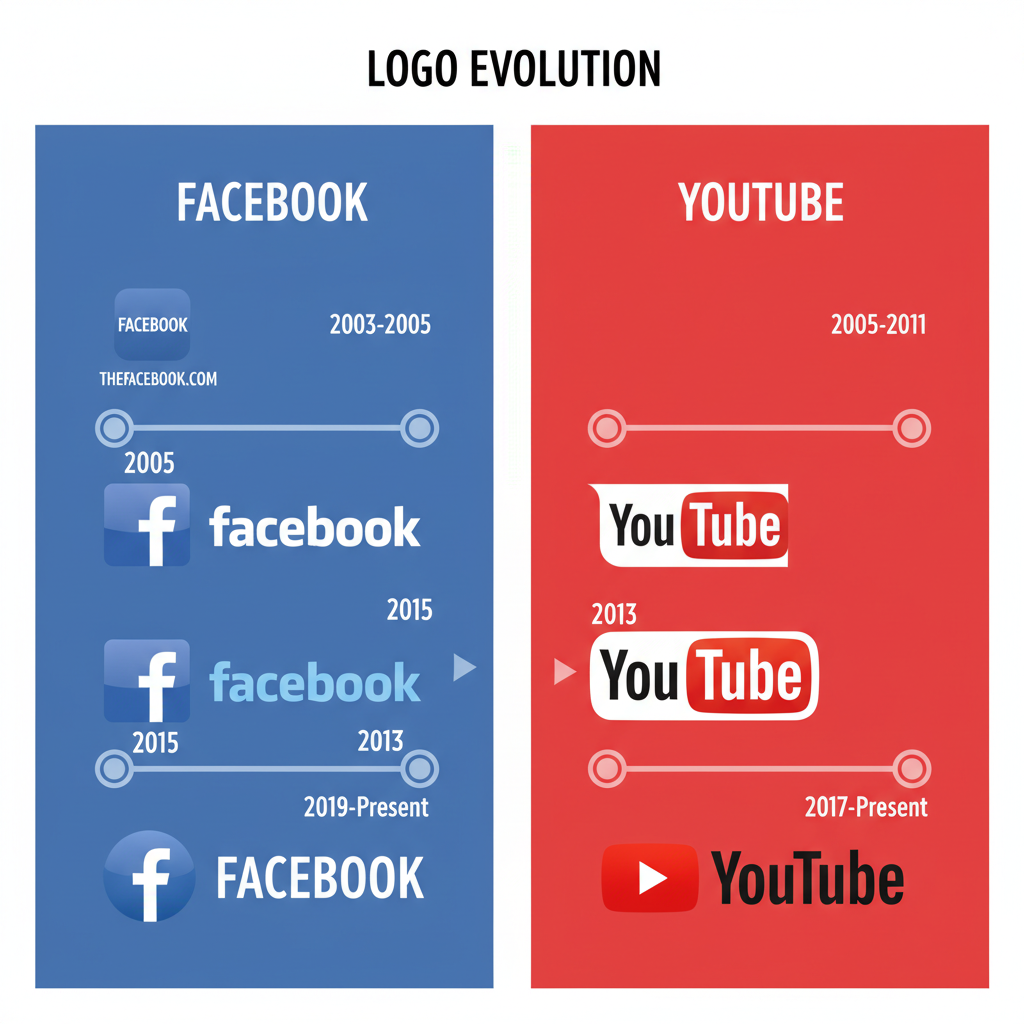
Facebook Logo Evolution: A Timeline
Since its founding in 2004, Facebook’s logo has evolved to reflect the platform’s growth and changing audience.
- 2004–2005: Original “Thefacebook” design with a blue header and pixelated-style typography.
- 2005–2015: Shortened to “Facebook,” adopting a refined, bold lowercase white font on deep blue.
- 2015: Introduction of a bespoke typeface; the “a” simplified for greater legibility.
- 2019–Present: Addition of corporate, all-caps “FACEBOOK” wordmark for formal communications, alongside the iconic lowercase “f” app icon.
These changes correspond with the shift from a college network to a global social media powerhouse.
---
YouTube Logo Evolution: From Screen Icon to Play Button
YouTube’s logo has seen more visible changes over the years:
- 2005–2011: “You” in black, “Tube” in white inside a red rounded rectangle symbolizing a TV screen.
- 2011–2013: Reduction in shading and flatter style.
- 2013–2017: Gradient removal and lighter reds for a minimal look.
- 2017–Present: Move of the red play-button icon to the left of “YouTube” for a balanced, responsive-friendly design.

These branding refinements mirror wider design trends emphasizing simplicity and legibility across devices.
---
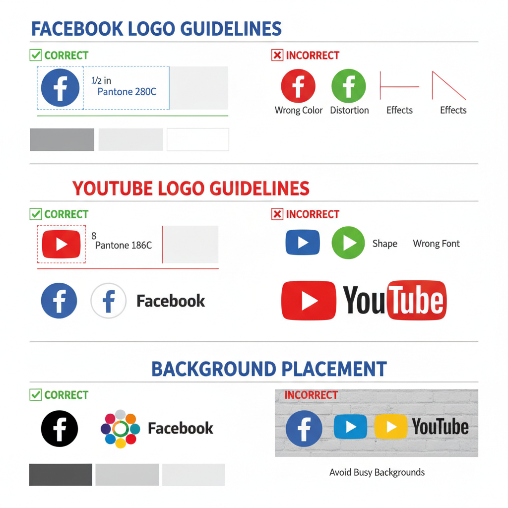
Facebook Logo Usage Guidelines
Facebook enforces precise brand identity standards to protect its visual equity:
- Official Colors:
- Blue: HEX #1877F2
- White: HEX #FFFFFF
- Black: HEX #000000 (monochrome use)
- Clear Space: At least 50% of the logo’s height around all sides.
- Backgrounds: Solid white or blue preferred; avoid busy patterns and gradients.
Avoid:
- Altering proportions or orientation.
- Adding visual effects or distortions.
---
YouTube Logo Usage Guidelines
YouTube’s play button and wordmark must be presented accurately:
- Minimum Size: Recognizable at intended scale; commonly 24px high for digital contexts.
- Clear Space: At least half the icon height on all sides.
- Official Colors:
- Red: HEX #FF0000
- White: HEX #FFFFFF
- Typography Black: HEX #282828

Do Not:
- Replace the play button with other elements.
- Use clashing or patterned backgrounds behind the logo.
- Crop or cover any part of the logo.
---
Where to Download Official Logos
Always use authentic files from official sources:
- Facebook: Facebook Brand Resources – requires acceptance of brand terms.
- YouTube: YouTube Brand Guidelines – governed by Google trademark policy.
This ensures high resolution, correct colors, and legal compliance.
---
Combining Facebook and YouTube Logos in Marketing
When designing materials featuring both logos:
Best Practices:
- Keep equal emphasis on each.
- Preserve each brand’s official colors and spacing.
- Align in ways that appear balanced and intentional.
Avoid:
- Creating hybrid logos.
- Altering colors to fit your brand scheme.
- Unbalanced sizing without strategic reason.
---
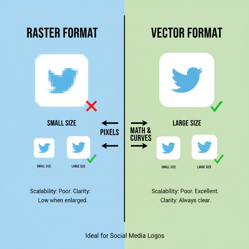
Why Vector Formats Matter
For professional results, choose vector file formats such as SVG, EPS, or AI:
- Scalability without quality loss.
- Typically smaller file size than high-resolution raster images.
- Simple color adaptations while keeping original proportions intact.
---
Correct vs Incorrect Logo Use Reference
| Usage | Correct Example | Incorrect Example |
|---|---|---|
| Color | Official HEX codes used | Unauthorised gradients or altered shades |
| Spacing | Brand guideline clear space applied | Logos too close together |
| Background | Solid, high-contrast background | Distracting or low-contrast background |
| Aspect Ratio | Maintained proportions | Stretched or squashed logos |
---
The Impact of Consistent Logo Use
Adhering to brand guidelines for these logos yields clear benefits:
- Recognition: Maintains instant brand identification.
- Professional Image: Shows attention to detail and respect for IP.
- Legal Safety: Reduces infringement risk.
Over time, precision in execution signals reliability and elevates your own visual brand.
---
Accessibility in Logo Presentation
Ensure your designs accommodate all audiences:
- Maintain WCAG AA or higher contrast ratios.
- Use logo sizes that are legible without zooming.
- Avoid backgrounds that obscure logo shape or color.
Accessibility-conscious design improves usability for everyone, including those with visual impairments.
---
Conclusion and Next Steps
The Facebook and YouTube logos are household visual markers that, when used according to official guidelines, can enhance your marketing reach and credibility. Respecting stipulated colors, clear space, and backgrounds is not just good practice—it’s legally prudent.
Consistent, accurate, and lawful use reinforces trust, ensures brand alignment, and positions your content as professional and reliable. For marketers, designers, and business owners, mastering logo compliance is a small investment with significant returns.
Want to take your branding further? Review each platform’s full brand resources and integrate these standards into your design workflow for a polished, authoritative presence across channels.


