Facebook Cover Image Quotes: Sizes, Design Tips, and 20 Ready-to-Use Ideas
Refresh your Facebook page with quote-led covers. Get 2025 sizes, safe zones, export settings, design tips, workflows, and 20 ready-to-use lines.
Looking to refresh your Facebook page with clean, high-impact visuals? Quote-led cover images remain one of the fastest ways to express brand voice and drive recognition across devices. Use this guide to nail specs, design choices, workflows, and grab 20 ready-to-use lines.
Facebook Cover Image Quotes: Sizes, Design Tips, and 20 Ready-to-Use Ideas

Quote-led Facebook cover designs still earn real attention in 2025. When done well, they feel personal, anchor your brand voice, and are instantly scannable—even at a glance on mobile. This guide covers the exact sizes, practical design rules, workflow tips, and 20 ready-to-use quotes you can swipe today. If you’ve been considering facebook cover images quotes as a recurring content format, this is your playbook.
Why quote-based Facebook covers still work in 2025
- Emotional resonance: A short line can spark identity, hope, or humor in a second—faster than long-form copy or complex visuals.
- Brand personality: Quotes crystallize tone. Whether you’re bold, witty, caring, or technical, a single sentence can carry it.
- Instant scannability: Most page visits are on mobile. A high-contrast, 8–12-word message is easy to process on the go.
- Cross-platform shareability: The same asset crops well and repurposes for Instagram, LinkedIn banners, or Stories with minimal tweaks.
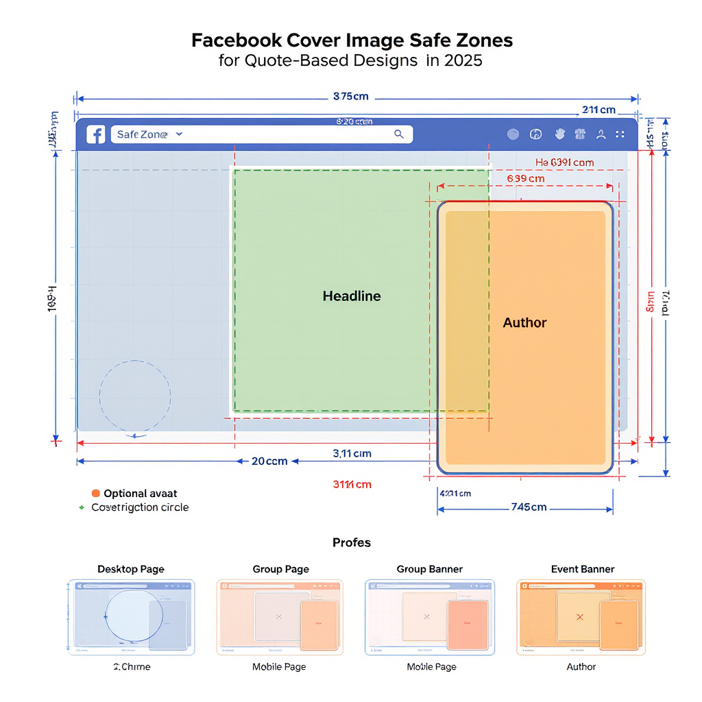
Correct sizes, aspect ratios, and safe zones
Facebook’s UI shifts over time, but the underlying logic has been stable. Design for clarity in both desktop and mobile, with text inside a center-safe area.
| Item | Pixels | Aspect | Format | Notes |
|---|---|---|---|---|
| Page cover (desktop display) | 820 × 312 | ~2.63:1 | sRGB JPG/PNG | Visible crop is wide and short; keep text centered. |
| Page cover (mobile display) | 640 × 360 | 16:9 | sRGB JPG/PNG | Taller crop reveals more top/bottom; center text is safest. |
| Recommended upload | 1640 × 624 | ~2.63:1 | JPG for photos, PNG for text/graphics | Sharper scaling; gives FB headroom for compression. |
| Center-safe text area | ~640 × 312 | Varies with crop | — | Place essential text/logo here for both desktop and mobile. |
Additional technical notes:
- Color profile: Export in standard sRGB for predictable rendering.
- Compression: Aim under ~500–800 KB to reduce artifacts without losing detail. Prefer PNG-24 if your cover has flat colors, sharp type, or thin lines; otherwise high-quality JPG (85–90%).
- Edge safety: Keep any logos at least 40 px from edges at 1640 × 624 to avoid UI overlays and unpredictable crops.
Safe zone visual
A quick way to visualize the safe zone is to imagine a wide desktop window cropping top and bottom, and a tall mobile crop revealing more vertical space. Your quote should sit centered both horizontally and vertically in a roughly 640 × 312 box within the 1640 × 624 canvas.
Canvas: 1640 × 624
Center-safe zone: 640 × 312
Margins from edges: ~ (1640-640)/2 = 500 px left/right, (624-312)/2 = 156 px top/bottom
Choosing quote types that fit your brand
Pick a quote category that strengthens your positioning and campaign goals.
- Motivational/aspirational: Energize action. Ideal for fitness, education, B2B growth, or product launches.
- Witty one-liners: Signal wit and cultural fluency. Great for consumer brands, media, SaaS with playful voice.
- Mission/values: Reinforce purpose and trust. Nonprofits, healthcare, sustainability, DEI moments.
- Seasonal or campaign-specific: Tie to events, holidays, product drops, or fiscal quarters.
- Community/user-sourced testimonials: Borrow credibility from real users; spotlight customer language.
Tip: Maintain a 70/20/10 mix—70% evergreen mission/aspiration, 20% timely campaign ties, 10% playful or experimental lines.
Copywriting rules for short, punchy quotes
- Keep it brief: Aim for 8–12 words for maximum scannability.
- Use vivid verbs and concrete nouns: “Build, ship, learn” beats abstract buzzwords.
- Avoid clichés: Refresh the trope or skip it.
- Credit authors when needed: Include “— Name” in small, secondary type.
- Subtly tag your brand: A short hashtag or wordmark; don’t overpower the quote.
- One message at a time: No competing CTAs on the cover. Use the post caption for context.
Micro-edits that help:
- Prefer active voice.
- Remove filler adverbs.
- Replace “very” with a stronger word.
- Swap “and” lists for one focused idea.
Typography and layout best practices
- Pair fonts with contrast: One bold display font + one clean sans/serif for attribution or tag.
- Weight and size hierarchy: The quote should be 2–4× the size of the author/tag.
- Line spacing: Tighten to around 0.9–1.1 line-height for punch, but test for legibility on mobile.
- Alignment: Choose one—center, left, or right—and keep it consistent across updates.
- Legibility aids: Use a subtle shadow, 8–16% dark overlay, or text-on-shape pill behind type.
- Grid discipline: Set a simple 12-column grid or center-line alignment to place type consistently.
Pro tip: If your background is busy, place the quote in a high-contrast box (e.g., white or brand color) with 16–24 px padding inside your safe zone.
Backgrounds and color strategy
- Background types:
- Photo: Use brand-relevant, uncluttered imagery. Blur slightly (2–6 px) if needed.
- Gradient: Smooth, on-brand blends; great for clean type legibility.
- Texture/abstract: Subtle noise or geometric patterns for depth.
- Overlays: Add a 10–25% black/brand overlay to improve contrast without killing detail.
- Color psychology: Align with your brand’s emotional tone (e.g., blue = trust, green = growth, orange = action).
- Contrast: Maintain at least 4.5:1 contrast between text and background to support accessibility and readability.
- Visual consistency: Reuse palettes and grid placement so covers feel like a series, not one-offs.
Design workflow and tools
Recommended tools:
- Canva: Fast templates, brand kits, and quick exports.
- Figma: Precise grids, shared libraries, and batch exports.
- Adobe Express: Polished presets and quick effects.
Workflow:
- Create a reusable master file at 1640 × 624 with a locked safe-zone guide.
- Define styles: H1 quote, H2 attribution, brand tag, overlay layer, background slot.
- Batch-produce 6–12 variants per campaign theme.
- QA on desktop and mobile previews; adjust line breaks and contrast.
- Export in sRGB, PNG for text-forward designs or high-quality JPG for photo-heavy designs.
Versioning and export snippet:
Naming: brand_fb-cover_{theme}_{YYYY-MM}_{v##}.png
Examples:
- acme_fb-cover_growth_2025-04_v01.png
- acme_fb-cover_values_2025-04_v02.png

Export:
- Format: PNG-24 (text/graphics) or JPG 85–90 (photo)
- Color: sRGB
- Size: 1640 × 624
- Max file size target: < 600 KB
Publishing cadence and A/B testing
- Cadence: Swap covers monthly or around major campaigns, launches, or seasonal moments.
- A/B approach:
- Test two variants per cycle: same quote, different background/typography—or same style, different quote.
- Run each for 7–14 days to gather enough signal.
- Metrics to watch:
- Page visits (delta before/after change)
- Follower growth rate during the test window
- Reactions/comments on the cover-change post
- Clicks on pinned posts or page buttons (indirect lift)
- Documentation: Capture screenshots, note performance, and record what worked (contrast, font pairings, tone). Build a “house style” guide over time.
Legal, attribution, and accessibility
- Licensing: Use public-domain or properly licensed quotes. Many modern quotes are copyrighted.
- Endorsements: Avoid implying living authors endorse your brand unless you have permission.
- Attribution: Add “— Author” when appropriate; verify spelling and authorship.
- Accessibility:
- Keep text large, bold, and high-contrast.
- Avoid text-heavy images; stick to a single, clear line.
- Add descriptive copy in the cover-change post to support screen readers and context.
- Trademarks: Don’t use protected taglines/slogans from other companies.
20 swipeable quote ideas and visual directions
Use these as-is or adapt to your brand voice. Each comes with a visual suggestion.
1) “Progress over perfection.”
- Visual: Bold sans on a soft brand gradient; subtle grain; center-aligned.
2) “Do one bold thing today.”
- Visual: Heavy sans uppercase over a darkened city photo; 15% black overlay.
3) “Made for builders.”
- Visual: Monochrome background with a single accent underline; left-aligned.
4) “From intent to impact.”
- Visual: Serif headline over a blurred workspace photo; small sans attribution.
5) “Ship small. Learn fast.”
- Visual: Two-line stack, tight line spacing; duotone brand colors.
6) “Clarity beats noise.”
- Visual: Minimal gradient with high-contrast white type; center box.
7) “Trust is our roadmap.”
- Visual: Soft green-blue gradient; thin rule line beneath the quote.
8) “Less guesswork. More growth.”
- Visual: Duotone photo of graphs; bold sans; right-aligned.
9) “Care is a strategy.”
- Visual: Warm pastel texture; rounded sans; gentle drop shadow.
10) “Focus where it matters.”
- Visual: Vignette photo with strong central contrast; text-on-pill.
11) “Craft, don’t copy.”
- Visual: Grainy monochrome; italic serif headline; small brand tag.
12) “Make it unmistakable.”
- Visual: High-contrast black/white with a neon accent stripe.
13) “Build the boring stuff.”
- Visual: Playful geometric pattern muted; bold sans; centered.
14) “Data with a heartbeat.”
- Visual: Abstract waveform background; semi-bold sans; left edge alignment.
15) “Own your outcomes.”
- Visual: Dark slate background; white type with 2 px stroke for legibility.
16) “Systems set you free.”
- Visual: Grid overlay visible at 10% opacity; type locked to columns.
17) “Kindness scales.”
- Visual: Soft gradient (peach to rose); rounded sans; small heart icon.
18) “Audience first. Always.”
- Visual: Crowd silhouette duotone; uppercase condensed sans.
19) “Defaults shape decisions.”
- Visual: Minimal UI mock blur; center white type; small hashtag.
20) “Better every release.”
- Visual: Blue-to-indigo gradient; progress dots motif; right-aligned.
Attribution tip: For original brand lines, omit attribution. For known quotes, add “— Author” in a secondary style.
Quick pre-publish checklist
- Text sits fully inside the 640 × 312 center-safe area.
- Contrast ratio ≥ 4.5:1; tested on both light/dark device modes.
- File exported at 1640 × 624, sRGB, sized under ~600 KB.
- Mobile preview checked; no cropping of key words or tags.
- Caption drafted with context and optional CTA; includes alt-friendly description.
With these practices, your facebook cover images quotes can be both beautiful and effective—showcasing brand voice, improving clarity, and giving your page a fresh, purposeful rhythm all year long.
Summary
Quote-forward covers succeed because they deliver a sharp message fast, stay legible across crops, and scale easily into a cohesive series. Stick to the recommended dimensions, keep copy inside the safe zone, and prioritize contrast and consistency for reliable results. Document tests and refinements so each new cover compounds your brand recognition over time.