Facebook Cover Quote Photos: Dimensions, Design Tips, and Templates (Complete Guide)
Design perfect Facebook cover quote photos with exact dimensions, safe zones, formats, and compression tips—plus workflows, templates, preview checks for 2025.
Creating a strong Facebook cover quote photo is one of the quickest ways to set tone, convey values, and make your Page feel instantly professional. This formatted guide streamlines the specs, workflow, and quality checks so your design looks sharp and consistent across devices. Use it as a checklist from quote selection to export, preview, and iteration.
Facebook Cover Quote Photos: Dimensions, Design Tips, and Templates (Complete Guide)

If you want your Facebook Page to feel consistent, memorable, and trustworthy at a glance, a strong cover image with a compelling quote is one of the fastest wins. This guide covers exactly how to size, design, export, and test facebook cover quote photos so they look sharp everywhere and support your brand goals.
Why Facebook cover quote photos work
- Set your brand tone in one view: A quote communicates values, vibe, and positioning instantly.
- Spark emotion and recall: Emotionally resonant statements drive memory and affinity.
- Boost page stickiness: Visitors who “get” your message quickly are more likely to follow, scroll, and click.
- Create seasonal/campaign hooks: Rotating quotes tied to launches or moments of the year keeps the page feeling fresh.
- Bridge brand and community: Featuring customer or founder quotes fosters connection.
Essential specs: dimensions, safe zones, and formats
As of 2025, these are the working dimensions and behaviors you should design for.
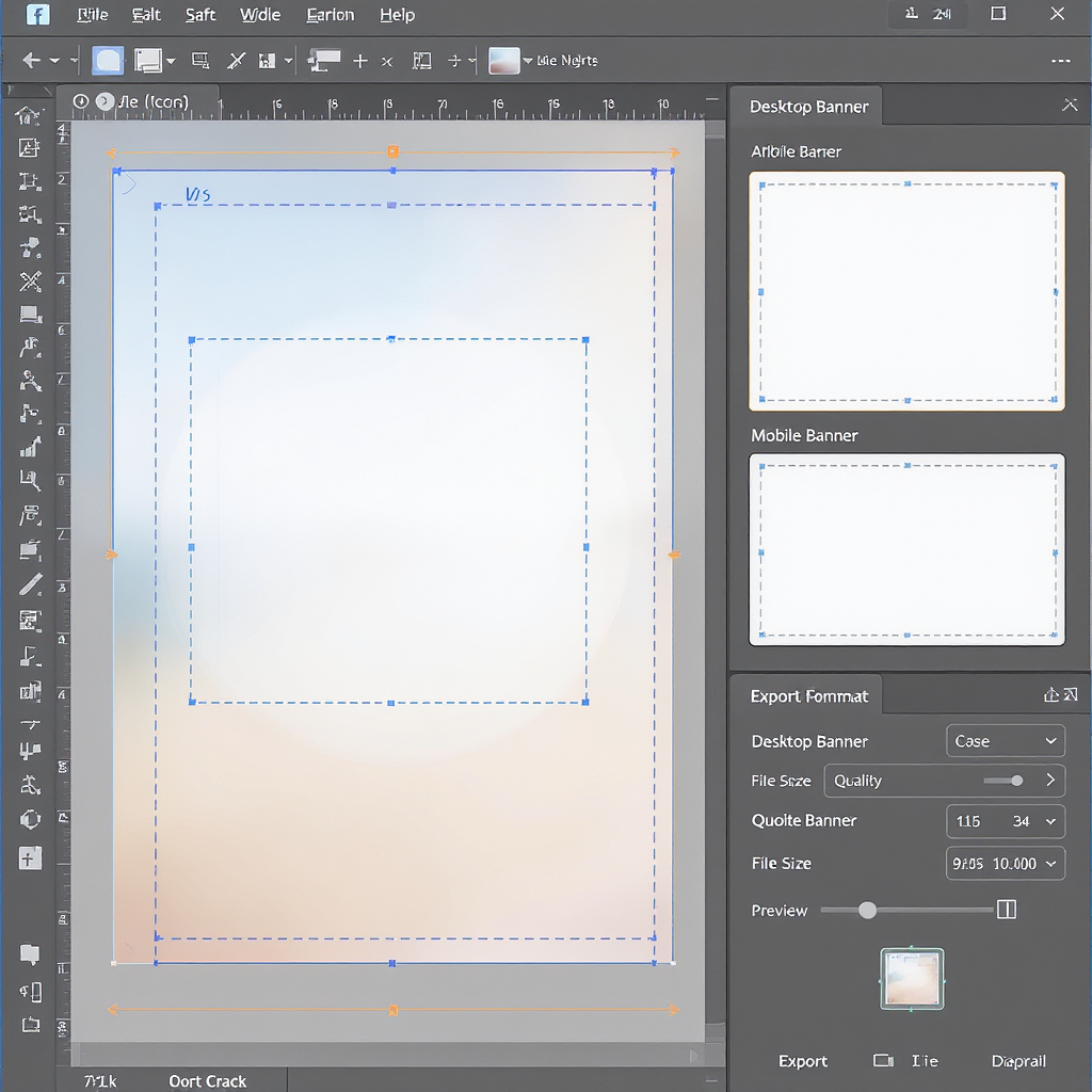
Display sizes and safe area
- Desktop display: 820 × 312 px
- Mobile display: 640 × 360 px
- Recommended design canvas: 820 × 360 px (or 1640 × 720 px for 2×/Retina export)
Safe zone (where all critical text/logos should live):
- 640 × 312 px centered within the 820 × 360 canvas
- Practical margins when designing at 820 × 360:
- Horizontal crop on mobile: 90 px on left and right can be trimmed
- Vertical crop on desktop: 24 px on top and bottom can be trimmed
Note: Most Page layouts no longer overlap the profile picture on the cover, but interfaces change. Leave extra breathing room near all edges and preview on both desktop and mobile.
File format and compression tips
- Formats:
- PNG-24: Best for text, logos, flat color, gradients (crisper edges).
- JPG (quality ~80–85): Best for photographic backgrounds; smaller file size.
- Color profile: sRGB (Facebook standardizes to sRGB; embedding helps avoid color shifts).
- File size target: Aim for 200–600 KB; keep it as small as possible without visible artifacts to survive Facebook recompression.
Quick spec table
| Use | Canvas | Safe Zone | Best Format | Notes |
|---|---|---|---|---|
| Standard | 820 × 360 | 640 × 312 (centered) | PNG (text/logo) / JPG (photo) | Design for both desktop and mobile cropping |
| Retina | 1640 × 720 | 1280 × 624 (centered) | PNG-24 or JPG Q80–85 | Export @2× for crisper type on high‑DPI displays |
Optional JSON spec for your template
{
"canvas": {"w": 820, "h": 360},
"safe_zone": {"x": 90, "y": 24, "w": 640, "h": 312},
"mobile_display": {"w": 640, "h": 360},
"desktop_display": {"w": 820, "h": 312}
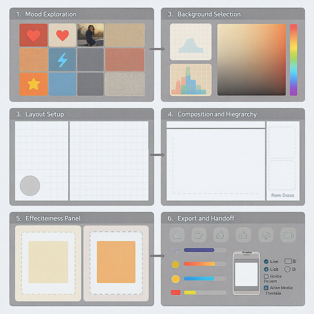
}Picking the perfect quote
- Brand fit: The quote should reinforce your mission or value proposition.
- Audience persona: Match tone and vocabulary to your followers’ reading level and interests.
- Message length: 6–12 words is a sweet spot—scannable yet meaningful.
- Emotional resonance: Choose a feeling to trigger (hope, curiosity, confidence, belonging).
- Attribution style: If using a known author, use a short, clean attribution (e.g., — Maya Angelou).
- Originality: Consider your founder’s words, customer testimonials, or tagline to avoid licensing issues.
Typography that converts
- Font pairing:
- Headline quote: A strong serif or bold geometric sans.
- Attribution: A neutral sans (regular/light) for contrast.
- Size/weight hierarchy:
- Quote: 1.6–2.2× larger than attribution; weight 600–800 if sans, 700–900 if serif.
- Alignment:
- Left-align for readability and modern feel; center-align for short quotes or symmetrical layouts.
- Spacing:
- Line-height: 1.1–1.3 for short lines; 1.3–1.4 for longer lines.
- Letterspacing: Slightly tighter for big headlines (−1% to −2% if the font allows).
- Legibility tricks:
- Use a subtle dark overlay (20–40% black) on busy photos.
- Add a soft text shadow or 1–2 px stroke for contrast when necessary.
- Keep text within the safe zone and away from edges.
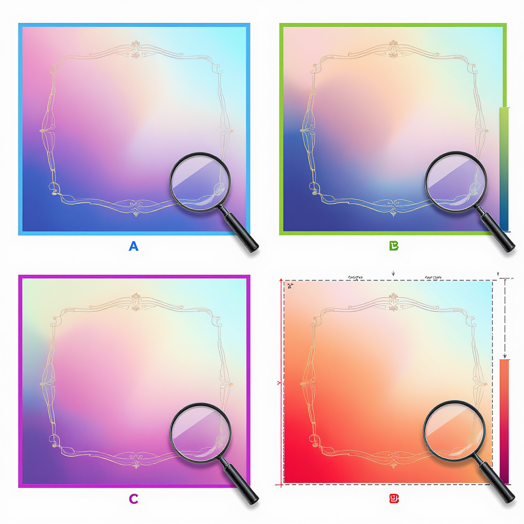
Backgrounds and color palettes
- Photos: Use high-quality, brand-relevant images; avoid visual clutter behind the text.
- Gradients: Smooth, on-brand gradients create depth without noise.
- Textures: Paper, grain, or subtle noise can add character—keep contrast simple.
- Overlays:
- Solid overlay: #000 at 20–40% opacity for light text.
- Gradient overlay: Darker under the text area, lighter elsewhere.
- Color psychology:
- Blue: Trust, calm
- Green: Growth, wellness
- Yellow: Optimism, attention
- Red: Energy, urgency
- Purple: Creativity, luxury
Copyright and usage rights
- Quotes:
- Short phrases are often not copyrightable, but exact quotes typically are. When in doubt, use original words, public domain authors, or obtain permission.
- Always attribute known authors; check jurisdiction-specific rules.
- Images:
- Use licensed stock (with social media usage rights), CC0/CC BY with proper attribution, or your own photos.
- Avoid “editorial use only” images for promotional pages.
- Public domain:
- Works published before 1929 in the U.S. are generally public domain (verify by country).
- Trademarks and personalities:
- Don’t imply endorsement; avoid using logos or celebrity likenesses without permission.
Tools and templates
- Canva:
- Search “Facebook cover” templates; choose a layout with strong text emphasis.
- Replace background, set overlay, edit fonts/colors to brand styles.
- Figma:
- Create frames at 820×360 and 1640×720.
- Add a safe-zone rectangle and lock it; design within.
- Leverage Community templates and Auto Layout for quick swaps.
- Adobe Express:
- Start with a “Facebook cover” template; customize brand kit and export.
- Mobile apps:
- GoDaddy Studio (Over), PicsArt, Phonto: Good for quick edits on the go.
Quick step-by-step workflow
- Choose a quote (≤12 words) aligned with your current campaign.
- Open your tool and set canvas to 820×360 (or 1640×720).
- Add background photo/gradient; place a 20–40% dark overlay.
- Set quote and attribution with clear hierarchy.
- Keep all text inside the 640×312 centered safe area.
- Export as PNG (text) or JPG Q80–85 (photo), sRGB.
- Compress and preview on both desktop and mobile.
Exporting for quality
- PNG vs. JPG:
- PNG-24 for crisp text/logos; JPG for photographic backgrounds.
- Color:
- Convert to sRGB before export to avoid desaturation on upload.
- Retina sharpness:
- Export at 1640×720 for high-DPI displays; Facebook will downscale.
- Compression:
- Use Squoosh (MozJPEG ~0.77), TinyPNG, or ImageOptim.
- Sharpening:
- Light post-export sharpening can counter Facebook’s compression softening.
Testing and iteration
- Seasonal swaps:
- Rotate quotes for key dates (holiday, product launch, awareness days).
- A/B testing ideas:
- Alternate between two covers weekly; track changes in follows and profile visits.
- Test background type (photo vs. gradient), font weight, and color contrast.
- Track engagement:
- Use Facebook Page Insights: Page views, New Likes/Follows, Profile visits.
- Watch click-through on pinned post or Page CTA during each cover variant.
- Tie to campaigns:
- Echo the cover quote in your pinned post and recent content for reinforcement.
Accessibility and inclusivity
- Contrast:
- Aim for at least 4.5:1 for normal text; 3:1 for large text (≥24 px regular or ≥18 px bold).
- Readable fonts:
- Avoid ultra-light weights; stick to clean sans/serif with open letterforms.
- Minimal text:
- Keep it short; screen magnification and small devices benefit from brevity.
- Inclusive imagery:
- Represent diverse ages, abilities, ethnicities; avoid stereotypes.
- Motion:
- If using video covers (when available), keep motion subtle and avoid flashing.
Pre-publish checklist
- Text sits entirely inside the 640×312 safe area.
- Contrast passes WCAG (use a contrast checker).
- sRGB embedded; export at 820×360 (and optionally 1640×720).
- File size optimized and previewed on desktop and mobile.
- Attribution correct and all assets properly licensed.
- Cover aligns with current campaign and CTA.
Free template starter (Figma/Canva settings)
- Canvas: 820 × 360 (Frame name: FB Cover)
- Guides:
- Vertical guides at 90 px and 730 px
- Horizontal guides at 24 px and 336 px
- Safe zone rectangle: 640 × 312 centered; fill none; stroke magenta 1 px
- Styles:
- Heading: Bold 64 px (or 128 px at 2×), line-height 1.2
- Attribution: Regular 24–28 px, line-height 1.3
- Overlay: Black rectangle at 28% opacity above background, below text
With these specs and practices, your facebook cover quote photos will look polished, load fast, and reinforce your brand—on every device and throughout every campaign.
Summary
- Design at 820 × 360 (or 1640 × 720 for Retina), and keep all critical text within the centered 640 × 312 safe zone.
- Export in sRGB as PNG for text/logo-heavy designs or JPG Q80–85 for photos, and compress before upload.
- Preview on both desktop and mobile, maintain strong contrast and legibility, and iterate with seasonal swaps and light A/B tests.


