Facebook Event Photo Cover Size (2025): Dimensions, Safe Areas, and Design Tips
Get the 2025 Facebook Event cover size: 1920x1005 (min 1200x628), 1.91:1 ratio, formats, safe areas, and design tips to avoid cropping and boost RSVPs.
Facebook Event Photo Cover Size (2025): Dimensions, Safe Areas, and Design Tips

If you’ve ever uploaded a Facebook Event cover only to find your headline cropped or your logo softened by compression, this guide is for you. Below is the definitive 2025 reference for facebook event photo cover size, how it renders across devices, and the design patterns that actually boost RSVPs.
---
Quick Answer
- Exact size and ratio (2025):
- Recommended: 1920 × 1005 px (high-res)
- Minimum: 1200 × 628 px
- Aspect ratio: 1.91:1 (landscape)
- Formats: JPG (best for photos), PNG-24 (best for flat colors, logos, sharp text)
- Color: sRGB, embed profile
- Ideal file size for sharp loading:
- JPG: target 200–500 KB (up to ~1 MB is fine if needed)
- PNG: try to keep under 1–2 MB
- Why bigger than the minimum? 1920 × 1005 px keeps your cover crisp on high-density (retina) screens and reduces Facebook’s need to upscale or aggressively recompress.
---
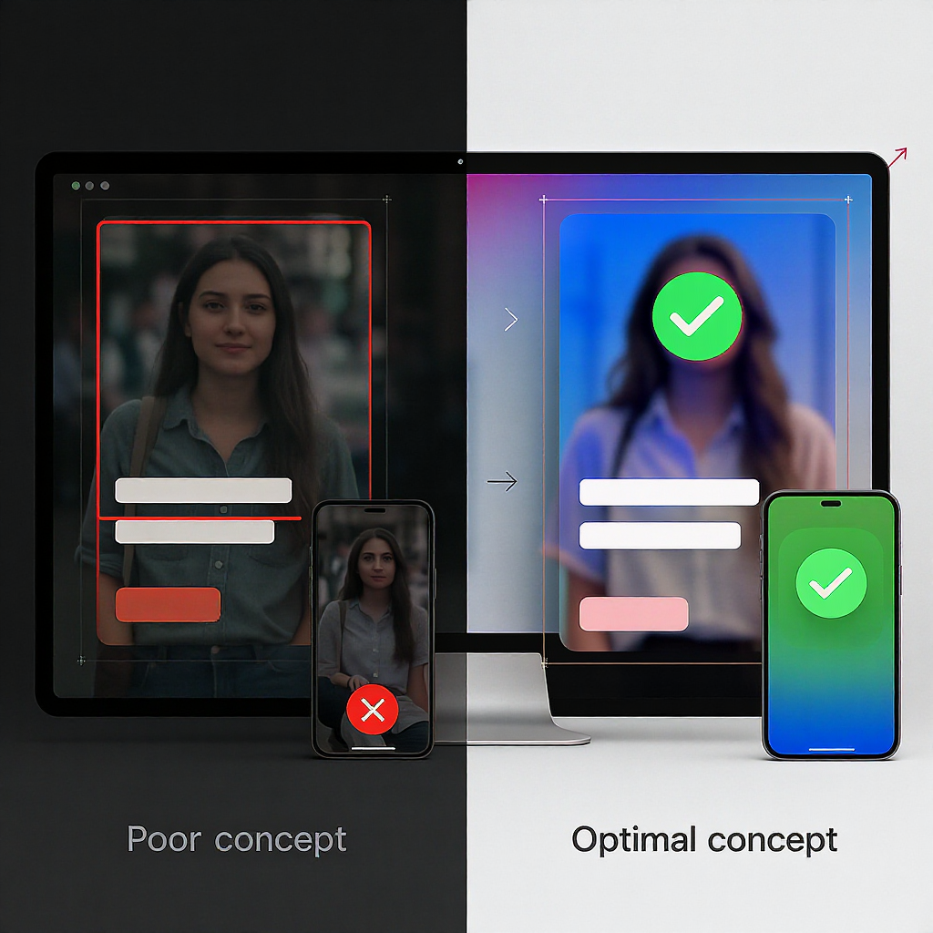
How Facebook Crops and Displays Event Covers Across Devices
Facebook’s event cover maintains a 1.91:1 canvas, but UI overlays and different placements can obscure edges.
Where it appears:
- Event Page (desktop and mobile): Full-width banner with UI overlays (title, buttons).
- Feed previews (when shared): Shows as a 1.91:1 card; may add gradients and rounded corners.
- Event suggestions modules: Smaller cards; titles or badges can overlap the image.
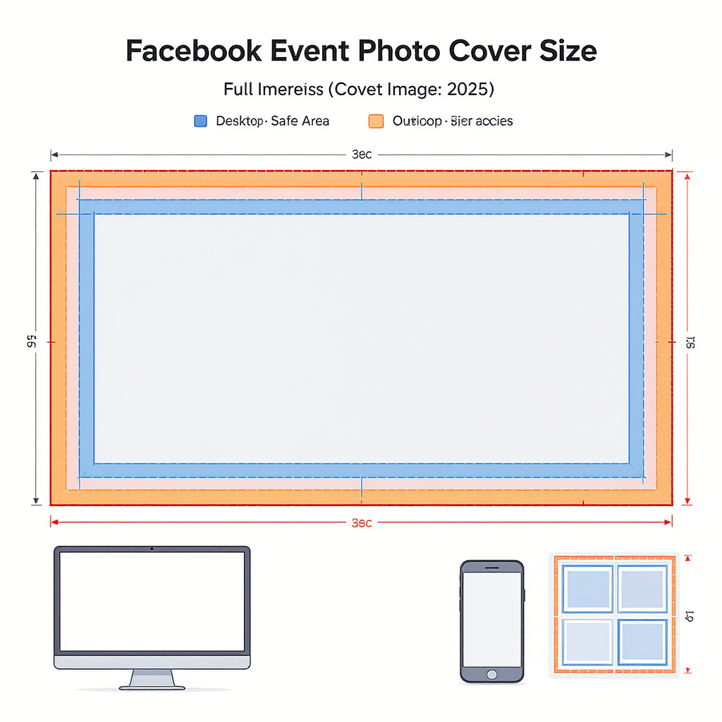
Safe-area guidance (to protect text and logos):
- Start with a 1920 × 1005 px canvas.
- Keep all critical content within:
- Side margins: at least 5% on left and right ≈ 96 px each side.
- Top margin: at least 10% ≈ 100 px.
- Bottom margin: at least 16% ≈ 160 px (anticipate overlays and buttons).
- Practical rule: Place headlines and logos within the central 90% width and middle 74% height. Avoid the bottom 160 px on a 1920 × 1005 layout.
Tip: Don’t rely on edges for essential text. Even if the full image renders, rounded corners, gradients, or overlap labels can nick thin borders and edge-hugging copy.
---
Design Fundamentals That Boost RSVPs
- Clear hierarchy:
- One focal headline (event name), one supporting subline (value or theme), and a small set of details (date/time or location).
- High-contrast typography:
- Aim for AA contrast (WCAG). Use soft gradient scrims behind text if the photo is busy.
- Minimal text:
- Let the event’s actual fields (date/time/location) do the heavy lifting. The cover should tease, not be a flyer.
- Focal point placement:
- Place the main subject along the rule of thirds—slightly off-center—within the safe area.
- Brand consistency:
- Repeat brand colors or typefaces, but keep them legible. Flat-color backgrounds plus a bold wordmark often outperform cluttered collages.
- Where to position dates/locations:
- If you include them, top-right or top-left within the safe area works well. Make them secondary to the event name.
---
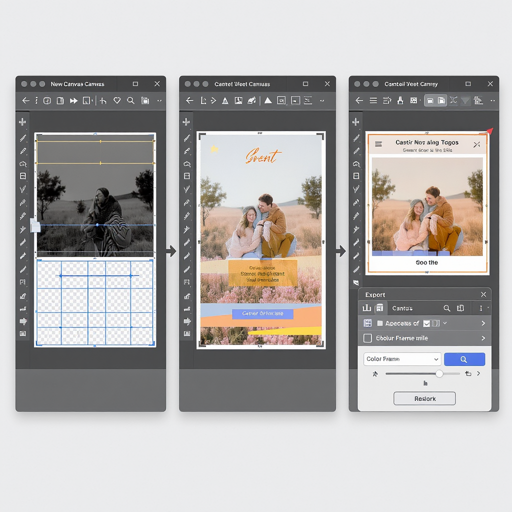
Step-by-Step Workflow to Create or Resize a Perfect Cover
Universal setup (works in Photoshop, Canva, Figma)
- Create a document at 1920 × 1005 px, RGB, sRGB color profile.
- Add safe-area guides:
- Left/Right: 5% (96 px each)
- Top: 10% (100 px)
- Bottom: 16% (160 px)
- Place background image (fill canvas), then add a subtle gradient scrim if needed for contrast (e.g., black at 20–30% opacity at bottom).
- Set typography:
- Headline: Bold, at least 90–120 px depending on font weight.
- Secondary details: 36–60 px, medium weight.
- Avoid hairline fonts; screen compression makes them shimmer.
- Keep logos vector or high-res PNG. Avoid thin white outlines; use solid shapes or thicker strokes.
Photoshop
- Canvas: File > New > 1920 × 1005 px, RGB, sRGB IEC61966-2.1.
- Guides: View > New Guide Layout > Margins: 96 px left/right, 100 px top, 160 px bottom.
- Sharpening: Apply mild smart sharpen to photos; avoid oversharpening text.
- Export:
- File > Export > Save for Web (Legacy) or Export As.
- JPG quality 80–85; Convert to sRGB checked; Metadata: None.
- PNG-24 if flat graphics with crisp edges.
Canva
- Create design: Custom size 1920 × 1005 px.
- Add a grid overlay (from Elements) to respect margins; manually eyeball safe zones or place rectangles as temporary guides.
- Download:
- JPG quality 80–90.
- Or PNG if mostly vector/flat colors (then run through TinyPNG to compress).
Figma
- Frame: 1920 × 1005 px; name it “FB Event Cover”.
- Layout grid: Add margins via a layout grid or place guide rectangles (96 px left/right, 100 px top, 160 px bottom).
- Export:
- Select frame > Export PNG or JPG.
- Color profile: sRGB (Figma exports in sRGB by default).
- If JPG, 0.8 quality usually looks great.
Recommended export recipe:
Format: JPG (unless mostly flat graphics → PNG-24)
Quality: 80–85 (MozJPEG ideal)
Color: sRGB, embed profile
File size target: 200–500 KB (JPG) or ≤ 2 MB (PNG)
Pro tip: PPI/DPI doesn’t matter for screen display—only pixel dimensions do.
---
Template Ideas and Layout Formulas by Event Type
| Event type | Imagery | Color palette | Layout formula | CTA cue |
|---|---|---|---|---|
| Webinar | Speaker headshot or abstract tech texture | High-contrast neutrals + single brand accent | Left: headline + date; Right: speaker photo; bottom-safe area clear | “Save your spot” implied via event button; keep cover minimal |
| Concert | Artist on-stage or instrument close-up | Dark theme with neon accent | Centered artist image; headline bottom-center but above 160 px safe margin | Venue/date as small tag in top-right |
| Fundraiser | People-focused, authentic photography | Warm, trustworthy colors (blues/greens) | Headline top-left; cause tagline mid-left; discreet logo top-right | “Donate” appears in event details; avoid button-lookalike text in cover |
| Conference | Venue or abstract geometry | Brand palette with 2–3 tones | Bold acronym/title center; dates as chips below; speaker names omitted or minimal | “Register now” reserved for posts/description |
| Local meetup | Neighborhood landmark or casual group shot | Light, friendly colors | Title top-left; time/location top-right; keep bottom clean | Use emojis sparingly in the event title, not the cover |
---
Common Mistakes to Avoid (and Fast Fixes)
- Using 16:9 (1920 × 1080) instead of 1.91:1:
- Fix: Re-crop to 1920 × 1005 or 1200 × 628.
- Edge-hugging text:
- Fix: Add 5% side, 10% top, 16% bottom padding. Use guides.
- Overcompression blur:
- Fix: Export JPG at 80–85 quality; add gentle noise (1–2%) to reduce banding; avoid massive PNGs for photos.
- Busy stock collages:
- Fix: Pick a single strong image and add a subtle overlay for text contrast.
- Wrong color profile (Adobe RGB/CMYK):
- Fix: Convert to sRGB before export to avoid dull or shifted colors.
- Super-thin lines or hairline fonts:
- Fix: Use heavier weights; increase contrast; avoid 1 px white lines on complex photos.
If your image looks blurry after upload:
- Ensure you used 1920 × 1005 px and sRGB.
- Re-export with MozJPEG or “Save for Web” at quality 80–85.
- Avoid re-uploading a previously compressed screenshot; go back to the source file.
Misaligned after upload?
- You likely used a different ratio. Rebuild on a 1.91:1 canvas and respect safe-area margins.
---
Testing and Optimization
- Preview on desktop and mobile:
- Create a draft event (or set visibility appropriately) and view on both devices.
- Check feed previews by sharing the event link in a private group or Messenger chat.
- A/B testing covers:
- Prepare 2–3 versions. Soft-launch to a small audience or run an ad test with different thumbnails to measure CTR/RSVP lift.
- Check share previews:
- After updating the cover, wait a few minutes; then re-share to see updated previews. Avoid changing covers too often during a campaign.
- Track impact:
- Monitor event insights: reach, link clicks, responses. Annotate the date/time you changed the cover so you can attribute improvements.
---
Accessibility and Inclusivity
- Readable font sizes:
- Headline ≥ 90 px on a 1920-wide canvas; avoid ultra-light weights.
- Color contrast:
- Strive for WCAG AA (4.5:1 for normal text). Use overlays behind text when needed.
- Language localization:
- If your audience is multilingual, keep cover text minimal and rely on translated event details instead of embedding lots of copy in the image.
- Descriptive alt text:
- Event covers themselves don’t include alt text fields, but when promoting in posts with images, add concise alt text describing the visual and event title.
- Avoid text-as-image for critical info:
- Always include date/time/location in the event fields so screen readers and machine translation can access them.
---
Technical Checklist Before Publishing
- Pixel dimensions: 1920 × 1005 px (or minimum 1200 × 628)
- Aspect ratio: 1.91:1 confirmed
- Safe areas: ≥ 5% side, 10% top, 16% bottom margins respected
- Color: sRGB, embedded profile
- Format: JPG (80–85 quality) or PNG-24 for flat art
- File size: JPG ~200–500 KB; PNG ≤ 2 MB
- Filename hygiene: my-event-2025-1920x1005.jpg (no spaces/special characters)
- Visual QA: crisp text, no banding (add slight noise if necessary)
- Device preview: desktop + mobile checked
- Upload timing: finalize before major announcements; allow a few minutes for cache refresh
---
FAQ
- Can you use video as a Facebook Event cover in 2025?
- No. Event covers are static images. You can post videos in the event feed or description, but the cover itself must be an image.
- What’s different from Page and Group covers?
- Events: 1.91:1 (e.g., 1920 × 1005).
- Pages: historically ~820 × 312 on desktop (about 2.63:1) with different safe areas.
- Groups: often 1.91:1 recommendations apply (e.g., 1640 × 856 or 1920 × 1005), but always verify current specs before reusing assets.
- Why does Facebook compress images, and how do you keep them crisp?
- Compression speeds up loading. Upload at the correct aspect ratio and a reasonable resolution (1920 × 1005), use sRGB, avoid oversized PNGs for photos, and export JPG at 80–85 quality. Add subtle noise to gradients to reduce banding, and avoid thin, low-contrast text.
---
Final Takeaway
If you remember only one thing: build your Facebook Event cover at 1920 × 1005 px, keep all crucial elements away from the edges—especially the bottom 160 px—and export a clean sRGB JPG around 200–500 KB. Follow the safe-area and export guidelines here to keep your cover sharp across placements and increase clarity, legibility, and RSVPs.