Facebook IG TikTok Logo History and Branding Evolution
Explore the history and design evolution of Facebook, Instagram, and TikTok logos, uncovering their branding strategies and color psychology.

Introduction to Social Media Logos and Their Role in Branding
In today’s visually driven digital marketing landscape, social media logos are more than just app icons — they are powerful brand symbols that foster recognition, trust, and emotional connection. The Facebook IG TikTok logo evolution illustrates how these three influential platforms continually refine their visual identities to stay relevant, reflect their brand ethos, and resonate with global audiences.
From Facebook’s iconic blue wordmark to Instagram’s vibrant gradient camera and TikTok’s neon musical note, each design demonstrates the balance between adaptability and consistency in brand identity. Understanding the history and design strategies of these logos helps reveal how they have become instantly recognizable in a competitive online ecosystem.

---
Brief History of the Facebook Logo
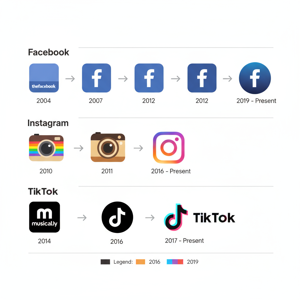
Since its launch in 2004, Facebook’s logo has undergone several subtle yet impactful transformations. Initially, it featured the term "thefacebook" in lowercase white text on a deep blue background — blue chosen partly because co-founder Mark Zuckerberg is red-green colorblind. In 2005, the "the" was dropped, unveiling a cleaner "facebook" in a custom typeface inspired by Klavika.
Key milestones include:
- 2015 Update: Typography refined with softer edges for a friendlier, accessible aesthetic.
- 2019 Rebrand: The corporate parent brand adopted the uppercase "FACEBOOK" to distinguish itself from the blue app icon.
- Current Version: The simple lowercase "f" within a rounded blue square ensures strong continuity.
---
Visual Changes and Color Palette Significance in Facebook Branding
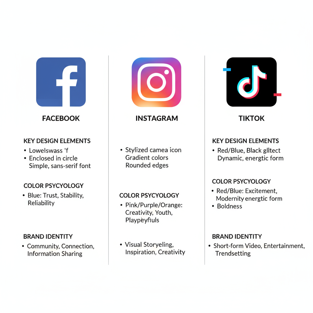
Facebook’s deep blue palette has been a constant, reinforcing perceptions of trust, reliability, and stability. Blue psychology links to security and calm — core traits for a global communication platform.
Refinements over the years involved minimal adjustments in hue, spacing, and letterform, ensuring a clean, adaptive look across devices while maintaining familiarity.

---
Brief History of the Instagram Logo
When Instagram launched in 2010, its logo resembled a retro Polaroid camera, appealing to vintage photography lovers. This skeuomorphic design reflected the app's initial photo-sharing focus.
Pivotal changes:
- 2011 Refinement: Adjusted shading and details for a polished look.
- 2016 Radical Redesign: The flat, modern, multi-color gradient camera icon replaced the old design, sparking debate but quickly becoming iconic.
- Present Day: A refined gradient camera paired with a sleek wordmark adaptable across media.
---
Symbolism and Psychology Behind Instagram's Color Gradients
Instagram’s gradient — blending pink, orange, and purple — conveys creativity and vibrancy.
- Warm Colors: Inspire energy, enthusiasm, and activity.
- Cool Tones: Provide depth and balance.
- Modern Gradient: Aligns with contemporary digital aesthetics, boosting visual appeal on all device types.
The 2016 redesign aligned Instagram with minimalist branding trends while preserving its creative spirit.
---
Brief History of the TikTok Logo
TikTok (internationally launched in 2017 after Douyin in 2016) needed an identity to capture its youthful, music-oriented energy. The resulting logo — a stylized musical note with a neon glow — draws from real-world concert visuals.
Key developments:
- Original Design: Bold neon-on-black stood out immediately among other app icons.
- Subtle Updates: Adjustments in glow intensity and outlines improved clarity without altering its core feel.
---
Design Elements and Unique Features of the TikTok Icon
TikTok’s visual identity reflects rhythm and cultural fusion:
- Black background to maximize color contrast.
- Cyan and magenta accents signifying vibrant diversity.
- Tilted musical note implying motion and rhythm.
- Double-outline glow suggesting sound vibrations and live performance ambiance.
---
Comparison of Design Philosophies Across Facebook, Instagram, and TikTok Logos
| Platform | Design Core | Color Strategy | Symbolism |
|---|---|---|---|
| Minimalist wordmark / single character icon | Solid blue | Trust, security, stability | |
| Abstract camera with gradient | Pink, orange, purple gradient | Creativity, diversity, vibrancy | |
| TikTok | Musical note with neon glow | Cyan, magenta on black | Youth, rhythm, energy |
---
How Consistent Logo Design Impacts Brand Recognition and User Trust
A consistent logo ensures instant visual recognition. Facebook maintains brand trust through decades of minor refinements. TikTok’s young but bold identity demonstrates that distinctiveness quickly fosters familiarity, especially in fast-moving social media markets.
---
Influence of Logo Design on Social Media Marketing Strategies
Logos play a central role in marketing campaigns:
- Serve as a focal point for promotional materials.
- Strengthen brand-emotion associations.
- Differentiate from market competitors.
- Function as instantly recognizable touchpoints across channels.
Instagram’s inspiring gradient is synonymous with creativity in influencer campaigns, while TikTok’s neon note cues quick, engaging entertainment.
---
Legal Considerations and Brand Protection for Social Media Logos
Trademarks protect logos from misuse. Guideline violations — such as altering colors, changing proportions, or misplacing on inappropriate backgrounds — can trigger takedowns or legal consequences. Major platforms enforce strict visual identity standards to preserve brand equity.
---
Trends in Social Media Logo Redesigns and User Reception
Notable trends shaping redesigns include:
- Flat Design: Streamlined and scalable graphics.
- High-Contrast Colors: For standout app icons on crowded screens.
- Simplification: Lower visual noise, improved memorability.
User resistance to redesigns, such as Instagram’s 2016 update, often fades when updates provide functional clarity and align with design trends.
---
Tips for Designers Inspired by Facebook, Instagram, and TikTok Branding
Here’s what creatives can learn:
- Clarify Your Message: Your logo should instantly convey your brand’s essence.
- Ensure Versatility: Design for both micro (app icons) and macro (billboards) contexts.
- Harness Color Psychology: Match hues to your brand’s emotional profile.
- Evolve Smartly: Keep core elements while refreshing style.
- Secure IP Rights: Trademark your logo to safeguard its use.

---
Conclusion: Future Outlook for Social Media Branding Visuals
The Facebook IG TikTok logo stories reveal that success blends cultural adaptation, tech-readiness, and emotional resonance. Future redesigns will likely explore motion graphics for AR/VR spaces, wearable tech compatibility, and more personalized animated icons.
As platforms expand into immersive and cross-platform experiences, their logos will remain pivotal — compact yet powerful symbols encapsulating billions of moments, interactions, and expressions.
Ready to create a logo that resonates and lasts? Apply these insights to build a brand identity that adapts with the times while holding onto its core values.


