Facebook and Instagram Logos: The Complete Guide to Correct Usage, Downloads, and Brand Compliance
Learn how to use Facebook and Instagram logos correctly: official downloads, approved colors/backgrounds, accessibility, and legal compliance in a checklist.
This guide explains how to correctly use and implement the Facebook and Instagram logos across digital and print experiences. It covers where to download official assets, how to select the right mark (glyph, app icon, or wordmark), color and background rules, accessibility, and legal compliance. Use it as a practical checklist to keep your brand integrations consistent, performant, and audit-ready.
Facebook and Instagram Logos: The Complete Guide to Correct Usage, Downloads, and Brand Compliance
If you use the Facebook and Instagram logos anywhere—your website, app, packaging, or ads—you’re operating inside a trademarked, highly scrutinized brand ecosystem owned by Meta. This guide distills the essentials: where to download authentic assets, how to choose between an app icon and a wordmark, what colors and backgrounds are approved, and how to stay legally compliant. If you’ve ever Googled “facebook ig logo,” this is the authoritative, practical walkthrough you need.
Why this matters
- Brand consistency builds trust: A correct Facebook or Instagram logo signals legitimacy and professionalism to your users.
- Legal compliance: These are trademarks. Misuse can trigger takedown notices, rejected ads, or worse—legal action.
- Platform policies: Using approved assets correctly helps your content pass automated and manual reviews on Meta platforms.
- Clarity for users: A recognizable, accessible logo ensures users know exactly where you’re pointing them (e.g., to follow or share).
Meta is the parent company of Facebook and Instagram. When referencing the companies, use “Meta” appropriately; when referencing the products, use the Facebook and Instagram marks per each brand’s guidelines. Do not mix the Meta corporate logo with Facebook/Instagram app icons unless using an official, provided lockup.
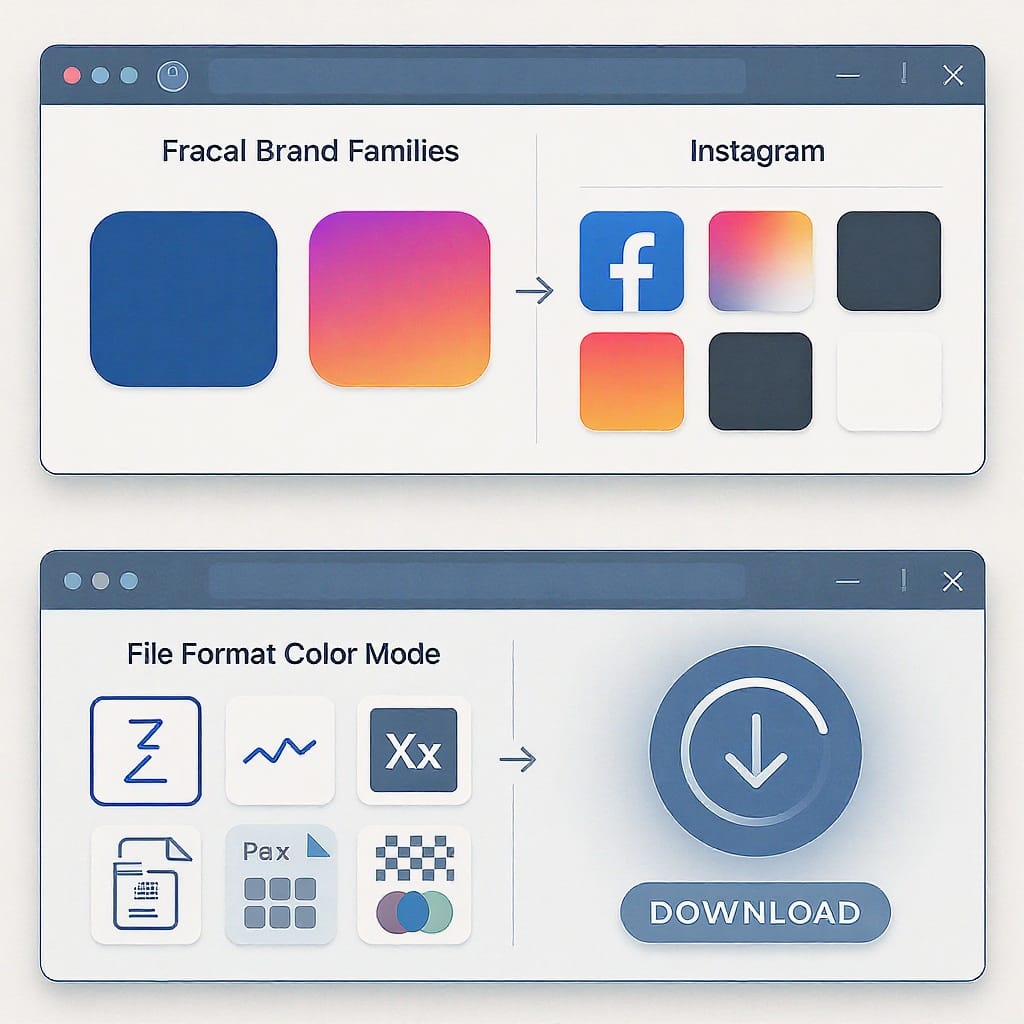
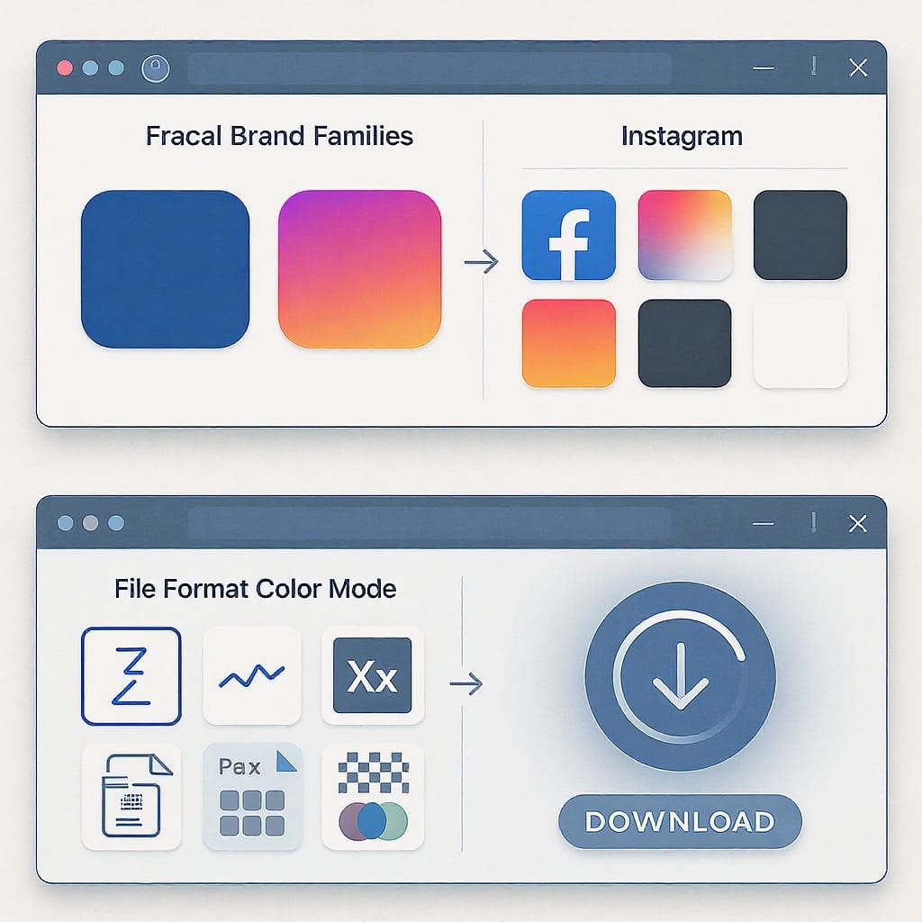
Official download sources and file formats
Always download from Meta’s official brand portals. Third‑party icon packs are risky: they may be outdated, modified, incorrectly colored, or in violation of the platforms’ terms.
- Facebook Brand Resources: https://www.facebookbrand.com
- Instagram Brand Resources: https://www.instagram-brand.com
What you’ll typically find:
- Formats: SVG (preferred for web/app), PNG (raster, multiple sizes), EPS (print/vector).
- Variants: Full-color, monochrome (black/white), and guidance on backgrounds.
- Usage rules: Clear space, minimum sizes, do’s/don’ts, and sample lockups.
| Asset Type | Best Use | Format | Notes |
|---|---|---|---|
| App Icon / Glyph | Buttons, links, small UI | SVG, PNG | Use official files; do not redraw or re‑create gradients. |
| Wordmark | Brand mentions, larger print | SVG, EPS, PNG | Maintain proportions; keep clear space; no taglines unless provided. |
| Monochrome variants | Single-color print, dark mode UI | SVG, EPS, PNG | Use provided versions; avoid ad‑hoc recoloring. |
Tip: Avoid converting raster icon packs into vectors yourself—small inaccuracies (corner radii, stroke widths) can violate guidelines.
Logo anatomy and approved variants
- “f” icon: The primary, recognizable FB app glyph. Used for small UI, buttons, and social follow/share placements.
- Wordmark: The full “Facebook” logotype, used for brand mentions where text clarity is essential or when a wordmark is explicitly required.
- Containers: Use the provided silhouette/container (circular or rounded square) as supplied. Do not place the “f” in a custom shape or within busy backgrounds.
- Monochrome: Official black or white versions are for high-contrast needs or one-color production.
- App Icon (gradient): The multi-color rounded-square app icon. Use the provided asset—do not attempt to recreate the gradient.
- Camera Glyph: The simple outline glyph variant. Useful for limited color scenarios or small sizes where the app icon gradient loses clarity.
- Containers: Use the asset as-is. Do not mask or embed the glyph inside custom shapes.
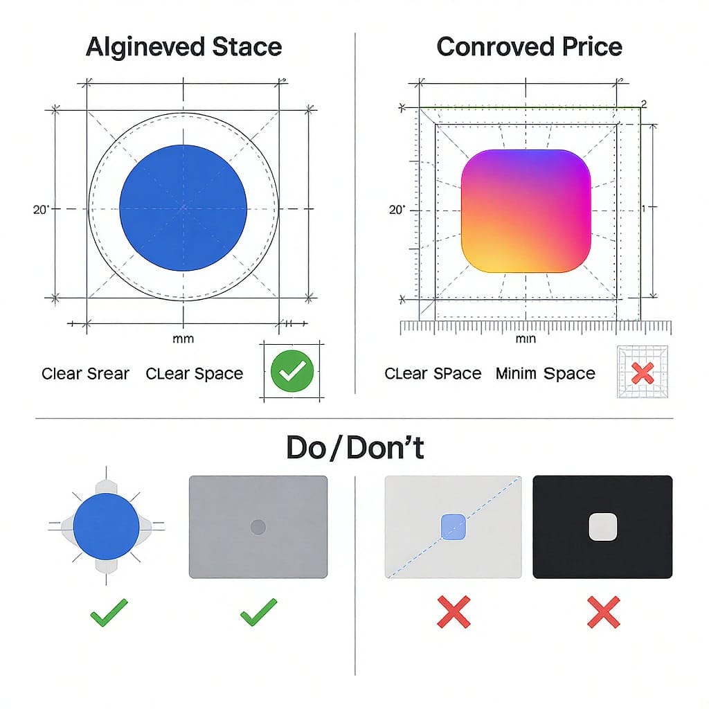
Clear space and minimum sizes
- Clear space: Follow the official clear-space rules in each brand’s documentation. If you can’t find a spec quickly, a conservative fallback is to keep at least half the logo’s height as empty padding on all sides until you confirm the official value.
- Minimum size: Check the portals for exact minima. As a pragmatic baseline for legibility on screens, avoid going below 24 px for app icons/glyphs. For touch targets, the interactive area must be at least 44 × 44 px.
Color specifications and backgrounds
- Facebook blue: Use the official blue supplied in the kit (commonly #1877F2 for screen use). Pair with neutral backgrounds (white, very light gray, or deep neutral) to maintain contrast.
- Instagram gradient: Never recreate. The gradient is a signature asset that evolves over time; always use the current official file from the Instagram Brand Resources portal.
- Monochrome usage: Choose the provided black or white versions when color isn’t practical (e.g., embossing, etching, single-ink print, dark mode UI).
- Backgrounds and contrast:
- Avoid busy, patterned, or low-contrast backdrops that obscure the mark.
- For accessibility, while logos are generally exempt from WCAG text contrast requirements, strive for a contrast equivalent of 3:1 or better against the immediate background to help users with low vision.
- In dark mode, prefer the official white monochrome version or ensure the colored variant is still clearly visible.
Do’s and don’ts with examples
Do:
- Use only official, unmodified assets from the brand portals.
- Maintain clear space and legible size.
- Use correct color versions for light/dark backgrounds.
- Pair logos with clear, descriptive CTAs (e.g., “Follow us on Instagram”).
Don’t:
- Recolor, add strokes, shadows, gradients, or effects.
- Rotate, skew, stretch, or change proportions.
- Place the logo inside a custom shape, badge, or container unless provided.
- Combine FB/IG logos into one asset, or merge with your logo.
- Use the logos as verbs (“facebook us,” “instagramming”)—use “Find us on Facebook,” “Follow us on Instagram.”
- Add unapproved taglines or modify spacing in lockups.
Placement and pairing with other social logos
- Equal prominence: When showing multiple social logos (e.g., Facebook, Instagram, YouTube, TikTok), give each equal size and visual weight.
- Alignment and spacing: Use consistent spacing between icons; align to pixel grid for crisp rendering.
- Nav bars and footers: Keep logos at a consistent baseline and size; ensure sufficient tap/click area.
- Business cards and packaging: Use vector formats for print; maintain clear space and ensure high-contrast reproduction.
- Buttons vs badges:
- Button: When the icon triggers an action (e.g., Follow), ensure a 44 × 44 px minimum touch target and a clear label.
- Badge: When indicating presence (e.g., “We’re on Instagram”), pair the icon with a short CTA.
- Recommended call-to-action labels:
- “Follow us on Instagram”
- “Like us on Facebook”
- “Find us on Facebook” (for discovery)
- Avoid informal verbs using the brand names themselves.
Web and app implementation tips
Use optimized SVGs with fallbacks
- Prefer inline SVG for crisp scaling and color-accurate rendering.
- Provide a PNG fallback for legacy environments if needed.
Example: accessible button with inline SVG and fallback text
    Facebook


  Follow
Accessibility, interaction, and dark mode
.social-btn {
  display: inline-flex;
  align-items: center;
  gap: 0.5rem;
  min-width: 44px;
  min-height: 44px; /* Meets touch target guidance */
  padding: 0.5rem 0.75rem;
  border-radius: 8px;
  background: transparent;
  border: 1px solid transparent;
}

.social-btn:focus-visible {
  outline: 2px solid #005fcc; /* High-contrast focus ring */
  outline-offset: 2px;
}

.social-btn.fb .icon { /* Keep logo color accurate */
  /* If using monochrome assets, set fill to currentColor and control via CSS */
  fill: currentColor;
  color: #1877F2; /* Facebook blue */
}

.social-btn.ig .icon {
  /* For the IG glyph (monochrome), use white/black; for app icon, use the supplied asset as an  */
  color: #000; /* or #fff on dark backgrounds */
}

@media (prefers-color-scheme: dark) {
  body { background: #0b0b0b; color: #eee; }
  .social-btn { border-color: rgba(255,255,255,0.12); }
  .social-btn.fb .icon { color: #fff; } /* Use white monochrome FB mark in dark UI if specified */
}
For the Instagram app icon gradient, embed the official PNG/SVG asset directly (do not recreate a gradient in CSS):
Instagram
Performance tips:
- Use SVG sprites to reduce requests for multiple icons.
- Serve assets via a CDN with proper caching headers.
- Provide @2x/@3x PNGs only where raster is required; prefer vector otherwise.
Inline critical icons; lazy load non-critical (e.g., footer) with loading="lazy" on
.
Legal and permissions
- Trademarks: “Facebook,” “Instagram,” their logos and other marks are trademarks of Meta Platforms, Inc. Use only as permitted by their brand guidelines.
- No endorsement: Do not imply Meta endorses your product or partnership unless you have explicit written permission.
- Advertising and co-marketing: Ads, contests, or co-branded material often have stricter requirements. Review the ad policies on the brand portals before launch.
- Geographic restrictions: Some legal language or assets may vary by region; check the portals for locale-specific terms.
- Permission requests: If your use case is outside standard allowances (e.g., merchandise, broadcast, or unusual placements), request permission via:
- Facebook Brand Resources: https://www.facebookbrand.com
- Instagram Brand Resources: https://www.instagram-brand.com
Document your compliance (asset source, version, date of download) in your design system or brand repo.
Recent updates and staying current
- Meta rebrand: In late 2021, Facebook, Inc. became Meta Platforms, Inc. You may see “From Meta” in certain product contexts. Don’t mix the Meta corporate logo with Facebook/Instagram app marks unless an official lockup is provided.
- Facebook visual refinements: Facebook has periodically refined the blue and the “f” icon for improved legibility. Small geometry tweaks mean older icons can look “off.” Refresh assets from the portal regularly.
- Instagram gradient evolution: Instagram has refreshed its gradient system in recent years to be more vibrant across digital surfaces. Always use the latest official assets rather than approximations.
- Internal versioning: Store assets with semantic versions (e.g., instagram-app-icon_v2024-05.svg). Note source URLs, download dates, and changelogs.
- Audit cadence: Set quarterly or biannual audits to re-download assets, recheck clear-space/min-size rules, and test dark mode and accessibility.
Quick checklist and resources
Pre-publish review:
- Source: Assets downloaded from official Facebook/Instagram brand portals (with version/date).
- Variant: Correct mark (glyph vs app icon vs wordmark) for the context.
- Size: Meets or exceeds minimum size; 44 × 44 px target for touch interactions.
- Spacing: Clear space respected around the logo.
- Color: Approved full-color or monochrome variant; no recoloring or DIY gradients.
- Background: Sufficient contrast; avoid busy or patterned fills.
- Accessibility: Alt text or aria-labels; visible focus state; readable CTA text.
- Legal: No endorsement implied; compliant with ad/co-marketing rules; permission obtained if required.
- Performance: SVG preferred; lazy load non-critical; cache headers set.
Authoritative resources:
- Facebook Brand Resources: https://www.facebookbrand.com
- Instagram Brand Resources: https://www.instagram-brand.com
- Meta Terms and Policies hub (linked from the portals)
Internal policy template (copy, adapt, and distribute)
## Social Logo Usage Policy (Internal)

Last updated: YYYY-MM-DD
Owners: Design Lead, Brand Manager

## Scope

This policy governs all uses of Facebook and Instagram logos across web, app, print, packaging, and advertising.

## Asset Source of Truth

- Official portals:
  - Facebook: https://www.facebookbrand.com
  - Instagram: https://www.instagram-brand.com
- Store final assets in: /brand/social/ (versioned, read-only)
- Record: file name, version/date, source URL, approver.

## Approved Variants

- Facebook: “f” icon (full-color, white, black), wordmark.
- Instagram: App icon (gradient), camera glyph (mono).
- No customizations or recolors.

## Sizing & Spacing

- Follow official clear-space/min-size rules.
- Baseline: not below 24 px on screens; 44 × 44 px min interactive area.

## Backgrounds

- High-contrast, non-busy backgrounds only.
- Use monochrome variants for dark mode or single-color print.

## Do’s and Don’ts

- Do: Use official files; maintain proportions; add accessible labels.
- Don’t: Recolor, add effects, warp, combine with other marks.

## Legal

- Trademarks of Meta Platforms, Inc.; no implied endorsement.
- Seek permission for non-standard use; keep approvals on file.

## Review Workflow

- Designer attaches asset version + mockup.
- Brand Manager checks against this policy + official portals.
- Legal sign-off for advertising/co-marketing or edge cases.

## Audit

- Quarterly: refresh assets from portals; verify compliance in product and marketing surfaces.
By following these guidelines—and always anchoring your work to Meta’s official brand resources—you’ll keep your facebook ig logo usage accurate, accessible, performant, and compliant across every surface you ship.
Summary
Use only official Facebook and Instagram assets, select the correct variant for context, and respect clear space, minimum sizes, and approved colors. Ensure accessibility and performance best practices in implementation, and never imply endorsement or partnership without written permission. Revisit Meta’s brand portals regularly to refresh assets and stay current with evolving guidance.