Facebook Instagram TikTok Logo Guide for Branding
Learn the history, guidelines, and best practices for using Facebook, Instagram, and TikTok logos to enhance branding and cross-platform engagement.

Introduction to Social Media Logos and Their Branding Power
In today’s competitive digital landscape, instantly recognizable social media logos like the Facebook Instagram TikTok logo trio play a pivotal role in shaping brand identity and audience engagement. These visual symbols do far more than indicate a social network—they reinforce trust, foster familiarity, and connect audiences to communities and conversations.
When used strategically, displaying Facebook, Instagram, and TikTok logos together enhances cross-platform marketing, drives engagement, and strengthens brand recall.
In this comprehensive guide, we’ll break down their history, official guidelines, and practical tips for integrating them seamlessly into your marketing strategy.

---
History and Evolution of the Facebook Logo
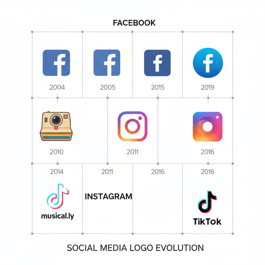
Facebook debuted in 2004 with a simple blue-and-white logo, initially appearing as "thefacebook" in lowercase text against a deep blue background. This early design reflected its focus as a networking site for Harvard students.
Over time, subtle but impactful changes modernized the logo and ensured its adaptability for various mediums:
Key Milestones:
- 2004 – “thefacebook” in white lowercase on a blue background.
- 2005 – Dropped “the”; refined typeface.
- 2015 – Sleek, modern sans-serif font for minimalism.
- 2019 – New Meta corporate branding; Facebook app logo retained original identity.
The consistent blue hue (#1877F2) and uncluttered form have cemented its instantly recognizable look.
---
History and Evolution of the Instagram Logo
Instagram launched in 2010 with a detailed, nostalgic camera icon. While visually rich, it was less scalable for digital interfaces. As the platform grew, so did the need for a versatile and contemporary brand image.
Timeline of Evolution:
- 2010 – Realistic Kodak-style camera design.
- 2011 – Simplified illustration for mobile optimization.
- 2016 – Flat, vibrant gradient with minimalist white camera outline.
- 2022 – Refined gradient for improved accessibility and consistent brand application.
This bold redesign positioned Instagram as a visually driven platform appealing to a mobile-first, creative-minded audience.
---
History and Evolution of the TikTok Logo
Launched in 2016, TikTok’s logo is a vibrant fusion of music, culture, and digital artistry. Its unique neon-accented musical note icon stands out in the social media space.
Distinctive Elements:
- Musical note shape symbolizing video and sound integration.
- Black background for strong contrast.
- Neon cyan and pink outline to convey rhythm, creativity, and energy.
With minimal changes since inception, TikTok’s steadfast design has helped rapidly consolidate its visual brand globally.

---
Legal and Copyright Considerations for Social Media Logos
Facebook, Instagram, and TikTok logos are protected intellectual property. Incorrect application can lead to legal issues. Essential considerations include:
- Use only official logo files from the platform’s brand resource center.
- Do not crop, recolor, distort, or merge with other elements unless permitted.
- Seek explicit permission for use in merchandise or paid advertisements.
- Avoid creating false endorsements or affiliations.
Adhering to official brand asset guidelines maintains compliance and avoids infringement.
---
Brand Guidelines: Colors, Spacing, and Proportions
Each platform provides specific instructions to ensure clarity and consistency when displaying logos. Here is a quick reference:
| Platform | Primary Color Codes | Minimum Clear Space | Minimum Size |
|---|---|---|---|
| #1877F2 (blue), #FFFFFF (white) | 1× width of “f” | 20px height | |
| Gradient (#F58529, #DD2A7B, #8134AF, #515BD4) | 1/4 of logo height around | 20px height | |
| TikTok | #000000 (black), #25F4EE (cyan), #FE2C55 (pink) | 1/5 of logo width around | 20px height |
These specifications protect logo integrity across digital and print applications.
---
Best Practices for Marketing Integration
Marketers can amplify brand presence by following these usage tips:
- High-Resolution Assets – Use vector or hi-res PNG logos.
- Consistent Alignment – Position logos identically across campaigns.
- Maintain Aspect Ratios – Prevent stretching or compression.
- Strong Background Contrast – Ensure visibility and accessibility.
- Design for Accessibility – Avoid color pairings that hinder legibility.
---
Avoiding Misuse and Maintaining Brand Consistency
Misapplication can dilute brand trust. Avoid these pitfalls:
- Using outdated logo files.
- Adding unapproved effects (drop shadows, new colors).
- Obscuring logos with text or patterns.
- Disproportionate scaling between logos in combined displays.
Always refer to the latest downloadable PDF guidelines from each platform.
---
Power of Combined Logo Displays for Cross-Platform Branding
Spotlighting Facebook Instagram TikTok logos together signals multi-network engagement and reach.
Effective implementations include:
- Website footers with three uniform icons linking to respective profiles.
- E-commerce packages carrying consistent logos.
- Physical store displays promoting multi-platform follow opportunities.
Balanced sizing ensures all platforms receive equal brand emphasis.
---
Examples of Creative Campaign Use
- Event Marketing – Festivals show all three logos to drive hashtag activity and cross-sharing.
- Product Launches – Multinational brands integrate logos across billboards, packaging, and digital ads.
- Influencer Content – Creators encourage followers across Facebook pages, Instagram Reels, and TikTok Shorts, using logos in overlays and footers.

---
Tools and Resources for Official Logo Files
Access high-quality, up-to-date logos directly from the source:
- Facebook: Meta Brand Resource Center
- Instagram: Instagram Brand Resources
- TikTok: TikTok Brand Kit
Design Tools:
- Canva, Figma – quick layouts and mockups.
- Adobe Illustrator, Sketch – vector editing.
- Brandfetch – automatic trademarked asset retrieval.
---
Conclusion: Strengthening Your Brand with the Facebook Instagram TikTok Logo
The Facebook Instagram TikTok logo trio is more than a set of icons—used thoughtfully, these symbols unify messaging across multiple channels, invite engagement, and elevate brand credibility.
Key takeaways:
- Always source and use official logo files.
- Follow spacing, color, and size rules for consistency.
- Leverage all three logos together to convey cross-platform presence.
Incorporating these logos effectively is not only an aesthetic choice—it’s a strategic investment in cohesive branding that builds trust and engagement.
Ready to refine your marketing visuals? Start by downloading each platform’s official brand kit and applying these best practices today.


