Facebook Instagram and Twitter Logos History and Branding Gu
Explore the history and evolution of Facebook, Instagram, and Twitter/X logos, uncovering their design changes, symbolism, and branding impact.

Introduction to Social Media Logos and Their Cultural Impact
Social media logos are more than just decorative marks — they are powerful symbols of online identity and global connection. The instantly recognizable Facebook, Instagram, and Twitter/X icons embody communities, conversations, and a shared culture of digital interaction. Whether appearing on websites, packaging, print ads, TV commercials, or even film sets, these logos serve as visual shorthand for “connect with us online” and play a vital role in cross-platform marketing.
Over the years, these visual identities have undergone significant transformations to align with changing brand visions, design trends, and technological contexts. Understanding their evolution provides valuable insights into how logo design influences user perception, brand positioning, and cultural impact.

---
The Evolution of the Facebook Logo
Facebook's visual journey mirrors its growth from a Harvard dorm project to a global tech powerhouse.
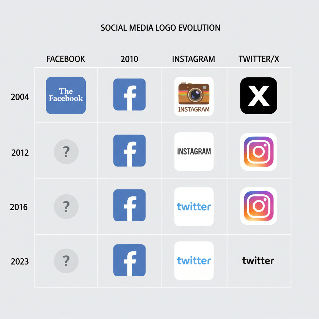
Key moments in the Facebook logo story include:
- 2004–2005: The original “TheFacebook” mark — white text on light blue with a serif font, “the” in smaller type.
- 2005–2015: Clean sans-serif logo in darker blue, a period that solidified its core identity.
- 2015 Update: Refined font with subtle tweaks for a modern, digital-friendly look.
- 2019–2020: “FACEBOOK” in all caps — establishing a corporate identity distinct from the app.
---
The Evolution of the Instagram Logo
Instagram’s rebranding stands as one of the boldest in social media history.
- 2010 Launch: A retro, skeuomorphic camera icon featuring a rainbow stripe.
- 2011–2015: Smoothened edges and color refinements, retaining a realistic camera feel.
- 2016 Redesign: Shift to a flat, white camera outline on a vibrant gradient background — a dramatic move towards minimalism and modern app icon trends.
- Post-2016: Gradient variations solidified as Instagram’s instantly recognizable brand signature.
---
The Evolution of the Twitter Logo and the 2023 Rebrand to X
Twitter’s brand identity was long tied to “Larry the Bird,” before a high-profile transformation.
Timeline highlights:
- 2006–2010: Lowercase wordmark in a playful script.
- 2010–2012: Blue bird icon appears, often replacing the text.
- 2012–2023: Simplified, geometric bird silhouette angled upwards, representing ambition and free expression.
- 2023: Elon Musk rebrands Twitter as X, retiring the bird in favor of a stark, black-and-white “X” aligned with a broader vision for the platform.

---
Design Elements and Symbolism
These logos combine color, typography, and iconography to communicate core brand values.
| Platform | Main Colors | Typography | Symbol/Icon | Symbolism |
|---|---|---|---|---|
| Blue & White | Clean Sans-serif | Lowercase/Wordmark | Trust, communication, stability | |
| Gradient (pink, purple, orange, yellow) | Rounded Sans-serif | Camera outline | Creativity, community, vibrancy | |
| Twitter/X | Blue & White (pre-2023), Black & White (post-2023) | Custom geometric (X uses sharp edges) | Bird (pre-2023) / Letter X | Freedom of speech, now innovation and tech |
---
Why Logo Consistency Strengthens Branding
Consistency in color, proportion, and placement builds recognition and consumer trust. All three platforms enforce strict brand guidelines to guard against dilution. Whether used on a website header or a billboard, the same visual formula ensures audiences immediately recognize the brand.
---
Legal Protection: Copyright, Trademark, and Usage Rights
The Facebook, Instagram, and Twitter/X logos are all trademarked.
- Copyright: Protects the creative artwork itself.
- Trademark: Guards against unauthorized use that may confuse audiences.
- Usage outside approved contexts risks legal actions or takedowns.
Brands offer downloadable press kits specifying permitted formats, color codes, spacing, and minimum sizes.
---
Best Practices for Using Social Media Logos
To maintain brand integrity and comply with guidelines:
- Always source from official brand assets.
- Preserve aspect ratios — avoid stretching or skewing.
- Keep adequate “clear space” around logos.
- Use correct official colors, including light/dark mode versions when applicable.
- Avoid embellishments like drop shadows unless supplied by the brand.
For print uses, match brand Pantone or CMYK values exactly and ensure sharp, high-resolution reproduction.

---
Common Logo Misuses to Avoid
Frequent mistakes include:
- Recoloring logos to fit your brand palette.
- Distorting proportions through stretching.
- Placing text or slogans inside the logo shape.
- Failing to update to the latest logo version after rebrands.
- Rotating or animating without explicit permission.
These errors can harm brand recognition and breach trademark rules.
---
Tips for Seamless Integration into Marketing Materials
- Download official vector files from brand kits.
- Follow scaling and minimum size recommendations.
- Use contrasting backgrounds that meet visibility and color guidelines.
- Maintain required spacing to avoid visual clutter.
- Pair icons with clear CTAs like “Follow us on Facebook” — but keep text separate from the logo.
---
Future Directions in Social Media Logo Design
Navigating future trends in social media branding may involve:
- Responsive logos adapting complexity based on placement.
- Dark/light mode compatibility and event-based color shifts.
- Motion and 3D graphics for immersive digital experiences.
- Streamlined abstraction where core shapes convey the brand without text.
The radical change from Twitter to X underscores how strategic pivots can be mirrored in bold visual changes.
---
Conclusion and Takeaways
The history and evolution of the Facebook, Instagram, and Twitter/X logos demonstrate the power of consistent, strategically designed visual identities.
Key insights for marketers and designers:
- Align logo evolution with broader brand strategy.
- Maintain rigorous consistency to build trust and recognition.
- Respect intellectual property protections.
- Integrate logos thoughtfully across media to enhance engagement.
By honoring brand guidelines while leveraging iconic symbols, you can strengthen audience connection and ensure your marketing remains visually cohesive and legally compliant.
Ready to elevate your marketing visuals? Review your current use of social media logos and update them to meet official standards — your brand credibility may depend on it.


