Facebook Like Logo History and Design Evolution
Explore the history, design changes, and cultural impact of the Facebook Like logo, from its 2009 debut to its role in branding and user engagement.
Understanding the Facebook Like Logo: History, Design, and Cultural Impact
The Facebook Like logo—a simple thumbs-up icon—has become one of the most powerful symbols in the digital era. Since its debut in 2009, it has transformed from a mere interactive feature into a cultural shorthand for approval, positive reinforcement, and social connection. This article explores its history, design evolution, psychological impact, and role in branding, offering insights into why the Facebook Like logo remains relevant in marketing and everyday online communication.

---
Brief History of Facebook’s Introduction of the Like Button (2009)
Facebook officially launched the Like button in February 2009 to simplify user engagement. Before then, reactions to posts were restricted to text-based comments, which took time and effort to compose. The Like button introduced rapid, low-effort feedback, making it easy to indicate approval or support with a single click.
This move significantly boosted participation across the platform. Drawing inspiration from other feedback mechanisms while maintaining a unique branded identity, Facebook’s thumb icon became instantly recognizable worldwide.
---
Original Design Elements and User Interface Placement
When first introduced, the Facebook Like logo featured:
- Thumb Icon: A right-facing hand with a raised thumb.
- Minimalist Style: Flat blue-and-white design with clear lines.
- Placement: Positioned next to the word "Like" in lowercase.
- Color Palette: Facebook blue (#3b5998) paired with white for optimal contrast.
The Like button’s strategic placement beneath posts, comments, and media ensured maximum visibility, encouraging habitual use among users.
---
Changes to the Logo Throughout the Years
Over time, the Facebook Like logo has undergone subtle updates to remain visually appealing and technologically compatible.
Color Adjustments
- Early designs used a darker blue background with white text.
- Later versions introduced softer blues for improved legibility on modern screens.
Shape Refinement
- Rounded edges replaced sharper corners to create a more friendly, inviting appearance.
- Adjusted proportions enhanced scalability across devices.
Iconography Updates
- Mid-2010s incorporated shading and depth.
- Recent versions embrace flat design for a cleaner, modern look.
| Year | Design Change | Reason |
|---|---|---|
| 2009 | Original blue & white thumb icon | Brand consistency, launch simplicity |
| 2013 | Rounded shapes, richer blue | Mobile optimization, softer look |
| 2016 | Flat design, simpler outline | Modern aesthetic, scalability |
| 2020 | High-contrast outline | Accessibility, better visibility |
---
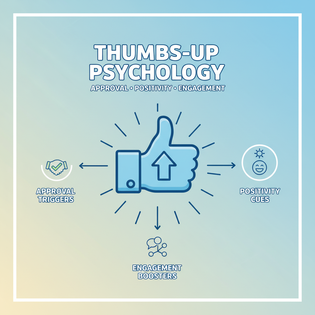
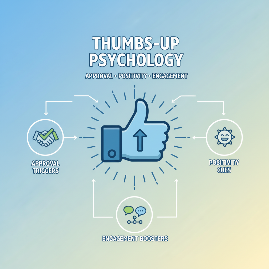
Psychology Behind the Thumbs-Up Symbol and User Engagement
The thumbs-up icon taps into deep-rooted psychological triggers:
- Social Validation: Affirmation from peers boosts self-esteem.
- Instant Gratification: Quick feedback stimulates dopamine response.
- Cognitive Ease: Low barrier to engagement encourages participation.
By capitalizing on these drivers, Facebook’s Like button has helped users feel connected while increasing platform engagement rates.
---
Role of the Like Logo in Brand Identity and Recognition
More than a functional button, the Facebook Like logo is a cornerstone of the company’s visual identity. It reflects Facebook’s mission to connect people through shared appreciation and acknowledgment. Featuring prominently in:
- App store assets
- Official communications
- Third-party integrations
Its consistent application has strengthened brand recognition across diverse markets and mediums.
---
Comparison of the Facebook Like Logo with Reactions
In 2016, Facebook expanded its interaction options by introducing Reactions, enabling users to respond with more emotional nuance.
| Icon | Meaning | Symbolic Impact |
|---|---|---|
| 👍 Like | General approval | Positive reinforcement |
| ❤️ Love | Strong affection | Intense emotional bond |
| 😂 Haha | Amusement | Shared humor |
| 😮 Wow | Surprise | Heightened attention |
| 😢 Sad | Empathy | Shared sorrow |
| 😡 Angry | Disapproval | Expressive dissent |
Despite these additional options, the Like remains the most widely used, thanks to its universal positivity and non-confrontational tone.
---
Use of the Facebook Like Logo in Marketing and Campaigns
Brands strategically use the Like logo to:
- Demonstrate social proof in ads.
- Boost engagement, follows, and post interactions.
- Incorporate Facebook’s visual identity in cross-platform campaigns.
Campaign objectives often aim to “get more likes,” underscoring the perceived link between likes, credibility, and trust.
---
Guidelines and Rules for Official Usage
Facebook’s brand guidelines clearly outline proper usage:
- Shape Integrity: No altering proportions or elements.
- Color Accuracy: Maintain official palette unless approved for grayscale.
- Adequate Spacing: Ensure visual clarity with surrounding space.
- Authorized Assets: Download from Facebook’s brand resource center.
Violating these rules can result in brand infringement issues or removal of materials.
---
Controversies and Social Implications of the "Like" Culture
The Like culture has faced criticism, prompting broader discussions:
- Self-Worth Metrics: Likes can inadvertently impact mental health.
- Algorithm Bias: Higher engagement boosts visibility, shaping content trends.
- Echo Chambers: Reinforcement of similar opinions without meaningful discourse.
To address these concerns, platforms have experimented with hiding public like counts to reduce pressure.
---
Design Lessons from the Facebook Like Logo Evolution
Key takeaways from its ongoing refinement include:
- Maintain Familiarity: Update gradually without losing recognition.
- Optimize for Scale: Ensure clarity and appeal across devices.
- Leverage Universality: Use symbols that resonate globally.
---
Future Outlook: Role of Likes in Social Media Interaction Trends
While emerging engagement formats and AI-based tools may diversify user feedback, the Like logo remains central to online interaction. Potential future developments could include:
- Customized reactions based on user behavior.
- Context-aware icons with adaptive messaging.
- Integration into immersive technologies like VR and AR.
The Facebook Like logo is poised to remain a leading emblem of positivity and collective approval in evolving digital landscapes.
---
Summary and Call to Action
The Facebook Like logo stands as a testament to the power of simple, well-designed symbols in shaping global communication. Its journey from a functional UI icon to a cultural touchstone reveals lessons in branding, psychology, and adaptability. As social media continues to evolve, understanding the enduring role of the Like logo can inspire more impactful design and engagement strategies.
If this exploration of the Facebook Like logo inspired you, consider auditing your own brand symbols—small design decisions can create lasting cultural impact.

