FB and Instagram Logos: Evolution, Color Specs, Files, and Safe Usage Guide
Clear guide to Facebook and Instagram logos in 2025: icons, app glyphs, wordmarks, official files, color specs, size rules, and safe, legal usage tips.

FB and Instagram Logos: Evolution, Color Specs, Files, and Safe Usage Guide


Navigating Meta’s brand ecosystem in 2025 can be confusing, especially when teams casually ask for the “FB Instagram logo.” This streamlined reference explains which marks exist for Facebook and Instagram, where to find the official files, and how to use them safely across web, mobile, and print. Use it as a QA checklist before export and as a source of truth for color, size, and legal basics.
What “FB Instagram logo” refers to today
Meta is the parent company. Facebook and Instagram are products within Meta’s portfolio, each with its own brand marks:
- Icon: The simplified symbol for compact contexts (favicons, toolbars).
- App glyph: The round-rect app icon you see on homescreens and in app stores.
- Wordmark: The brand name set in a proprietary or specified type treatment.
Use the Facebook mark to reference the Facebook app, profile/pages, sharing, or sign-in flows. Use the Instagram mark to reference Instagram profiles, content, or “Follow on Instagram” CTAs. Do not merge, hybridize, or combine the two.
| Asset Type | Typical Use | ||
|---|---|---|---|
| Icon | “f” monogram inside a blue round-rect | Camera glyph inside a gradient round-rect | Buttons, toolbars, social badges |
| App glyph | Identical to icon, optimized for app stores | Gradient camera app icon | App store placements, device UIs |
| Wordmark | “Facebook” in official wordmark | “Instagram” in official wordmark | Editorial mentions, co-branded headers |
Note: Icon and app glyph files are not interchangeable with wordmarks. Wordmarks are not generic fonts; do not typeset your own.
Evolution timeline of both logos
- 2004–2005: “thefacebook” to “Facebook” wordmark; early, darker blues.
- 2015: Wordmark refinement improves legibility (subtle changes to “a,” “e,” “o,” “b”).
- 2019–2021: “Facebook company” identity gives way to Meta as the corporate parent; the Facebook app keeps its own mark.
- 2023+: Blue and “f” monogram tuning for clarity on small screens and dark mode. The classic Facebook Blue commonly specified as #1877F2 remains prevalent in asset packs; verify the current pack for the exact hue in use.
Design rationale: Maximize recognition at micro sizes, strong contrast on both light and dark backgrounds, and maintain continuity with the familiar “f” monogram.
- 2010: Skeuomorphic camera icon (leather texture, lens details).
- 2013–2015: Incremental simplifications for flatter OS paradigms.
- 2016: Radical shift to the modern gradient glyph (orange → magenta → purple → blue) with a simplified camera outline.
- 2022: Gradient refresh and introduction of Instagram Sans; improved vibrancy and dynamic color rendering across surfaces.
Design rationale: Embrace expressive color and a flexible system that reads instantly in a crowded app grid.
Visual anatomy and color specs

Important: Do not redraw or approximate official marks. Use the verified files. The details below help you evaluate quality and context—not reconstruct the logos.
- Proportions
- Both marks live in a rounded square. Typical corner radii: substantial (app-icon style), visually closer to ~20–25% of the side length. Official files vary—use the supplied vectors.
- Facebook “f” is optically positioned (not mathematically centered) for balance; do not recenter manually.
- Instagram camera outline has consistent stroke thickness and simplified shapes to survive at small sizes.
- Stroke and spacing
- Strokes are tuned per size. When you scale vector files, keep strokes as paths (not live strokes) to preserve intended weight.
- Maintain clear space around the mark (see guidelines below).
- Color
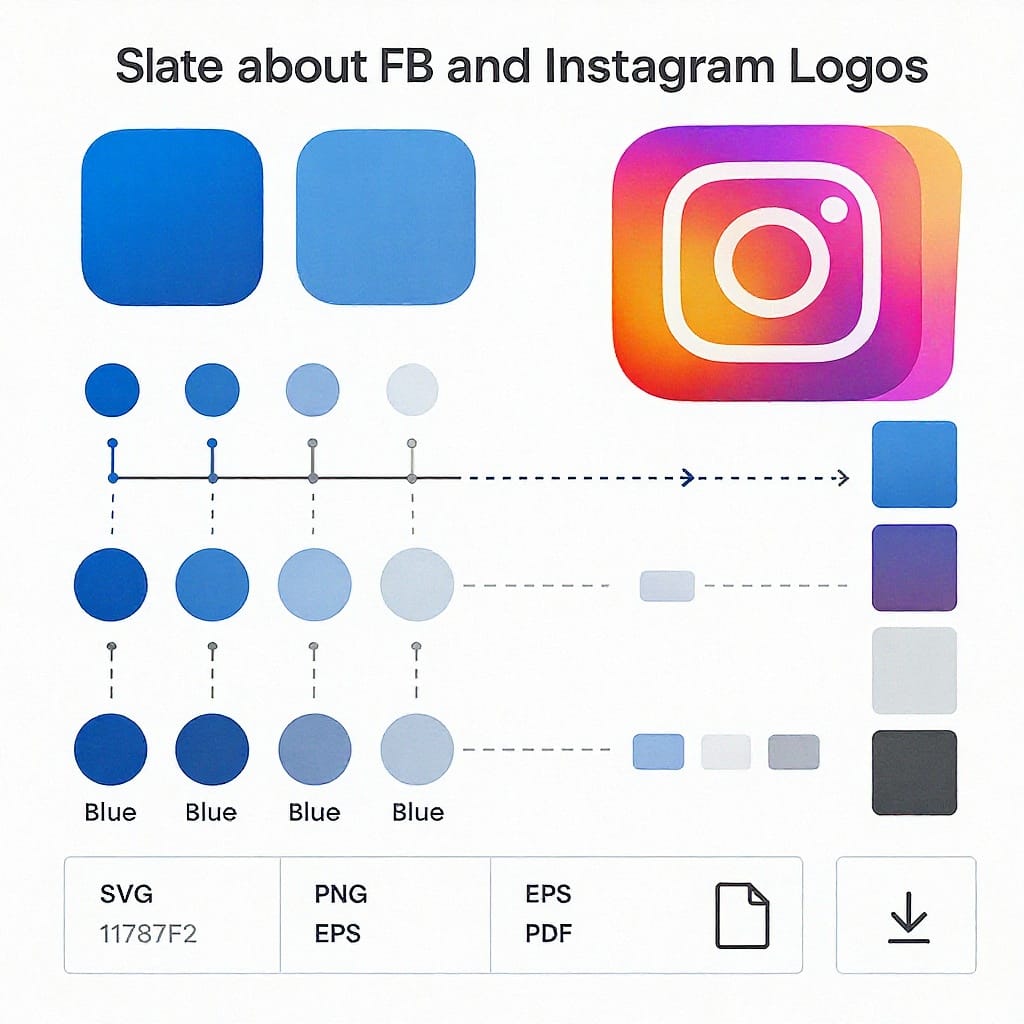
- Facebook Blue: #1877F2 (common specification; check current assets for updates).
- White: #FFFFFF; Black: #000000 for monochrome variants.
- Do not add gradients, shadows, or outlines to the Facebook mark.
- Instagram gradient stops (commonly referenced):
- #F58529 (orange)
- #DD2A7B (magenta)
- #8134AF (purple)
- #515BD4 (blue)
- Gradient angles vary by asset; rely on official files for the exact blend.
- Monochrome/knockout
- Use approved white or black single-color variants when color is limited or contrast is an issue.
- Never recolor the Facebook icon; never apply arbitrary tints to either wordmark.
Example: matching a background with an Instagram-like gradient (for backgrounds only, not to recreate the logo):
/* Background gradient for a section that sits near the Instagram mark */
.section--ig {
  background: linear-gradient(45deg, #F58529 0%, #DD2A7B 35%, #8134AF 68%, #515BD4 100%);
}
Brand guidelines in practice
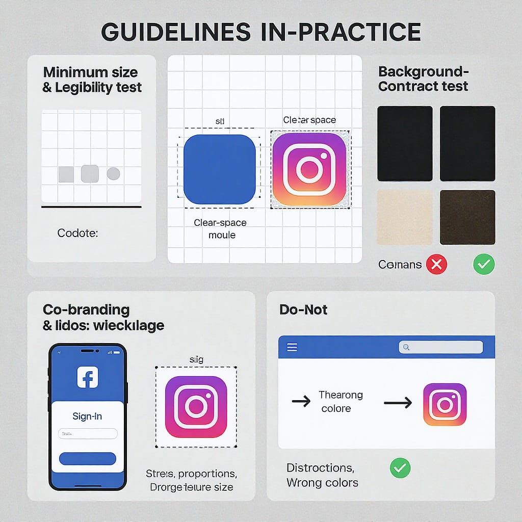
- Clear space
- Safe baseline: keep at least 0.25× the logo’s height as clear space on all sides, or follow the “x-height” rule defined in the current asset pack.
- Minimum sizes
- Screen UI: 16 px minimum for icons; 20–24 px recommended for tap targets.
- Print: 6 mm minimum height for small marks; 8–10 mm preferred.
- Backgrounds
- Facebook: use the official blue tile, white, black, or neutral solids with sufficient contrast.
- Instagram: use the supplied gradient tile or approved mono variants; avoid noisy textures.
- Do’s
- Use official, unmodified SVG/PNG/EPS.
- Provide adequate contrast, especially in dark mode.
- Use the correct asset for the context (icon vs. wordmark).
- Don’ts
- No recolors, outlines, bevels, or added gradients to the Facebook mark.
- No rotations, skewing, or stretching.
- No combining Facebook and Instagram marks into a single hybrid.
- Don’t place marks on low-contrast or busy backgrounds.
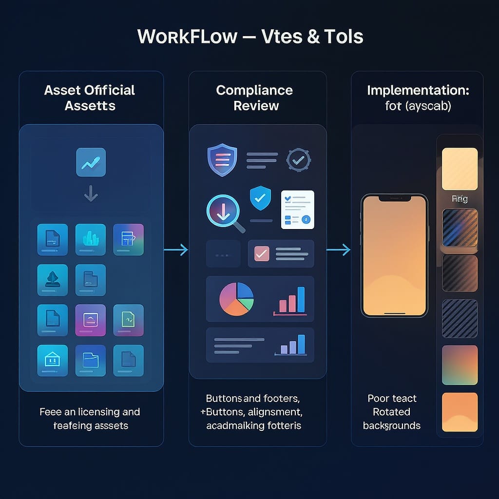
Getting official assets
- Where to download
- Meta Brand Resource Center (Facebook assets).
- Instagram Brand Resources page.
- If URLs change, search “Meta brand resources Facebook” or “Instagram brand resources” from official domains.
- Verifying authenticity
- Check the domain (https), official Meta/Instagram roots, and the license notes in the download.
- Asset packs often include a PDF with usage rules; compare versions and dates to ensure recency.
- Choosing formats
- SVG: best for web/app UI—crisp at any scale, small file size.
- PNG: raster fallback; export @1x/@2x/@3x for mobile densities.
- EPS/PDF: print workflows; keep vectors intact for prepress.
Legal and licensing basics
- Trademarks: Facebook and Instagram marks are registered trademarks of Meta and may have additional protections in various jurisdictions.
- Permissions: Follow the rules in the brand resource packs. Some commercial uses require explicit permission.
- Avoid implied endorsement: Don’t suggest Meta endorses your product unless you have a signed agreement.
- Editorial vs. commercial: Editorial reporting and academic contexts often have broader allowances than ads or packaging. When in doubt, seek permission.
- Regional ad compliance: Follow local rules (e.g., FTC endorsement guides in the U.S., ASA/CAP in the U.K., EU consumer directives).
- Takedowns: Misuse may result in removal requests, account penalties, or ad disapprovals.
This guide is not legal advice—consult your counsel for specific uses.
Co-branding and UI usage
- Buttons and CTAs
- “Follow on Instagram” or “Share to Facebook” keeps roles clear.
- Use the icon next to the CTA text; don’t replace text with icons alone unless space-constrained.
- App-store contexts
- Use the official app glyph when listing supported platforms.
- Pairing with your brand
- Align baselines, match optical sizes, and maintain equal clear space between marks.
- If your palette clashes, use monochrome variants for harmony.
- Common partnership layouts
- Horizontal lockup: Your logo, divider, then the partner mark with equal optical weight.
- Vertical stack: Your logo above, partner mark below, with generous spacing.
Accessibility and performance
- Alt text
- Example: alt="Facebook logo" or alt="Instagram logo". For buttons: alt="Share on Facebook".
- Contrast
- Ensure 3:1 or higher contrast between the mark and background; switch to mono variants in dark mode if needed.
- High-contrast modes
- Respect OS settings; provide a solid white/black version when users enable high-contrast.
- SVG over PNG
- SVGs scale crisply, compress well, and avoid blurriness on high-DPI screens.
- Preventing gradient banding (Instagram contexts)
- Prefer vector gradients or CSS gradients where possible.
- If rasterizing, export 16-bit PNGs for large hero areas, and consider subtle dithering.
Example: embedding accessible SVG with dark-mode handling:
Follow on Instagram
@media (prefers-color-scheme: dark) {
  .btn-social img.logo--mono-light {
    filter: invert(1);
  }
}
Common mistakes and a QA checklist
- Stretched or squashed logos (maintain aspect ratio).
- Pixelated assets (use SVG or export correct @2x/@3x PNGs).
- Off-brand colors (don’t pick “close enough” blues or gradients; use official files).
- Incorrect Instagram gradient (wrong order or harsh bands).
- Insufficient clear space and cramped lockups.
- Poor contrast in dark mode.
- DIY wordmarks (never typeset “Facebook” or “Instagram” in a substitute font).
Export tips (Figma/Illustrator):
- Use the supplied vectors; avoid re-creating paths.
- Expand strokes where provided as paths to keep intended weights.
- Figma: Export SVG with “Outline text,” “Include id attribute” off, “Simplify stroke” off.
- Illustrator: Save as SVG Tiny 1.2 or SVG 1.1, decimal precision 2–3, preserve gradients, embed color profile for print EPS/PDF.
- Generate PNGs at 1x/2x/3x with transparent backgrounds for UI; flatten to sRGB.
What’s next
Meta’s identity continues to evolve with:
- Adaptive icons that respond to dark mode and dynamic color systems.
- Motion-friendly treatments for micro-interactions.
- Refined small-size hinting for wearables and automotive interfaces.
How to stay current and compliant:
- Bookmark Meta’s Brand Resource Center and Instagram Brand Resources.
- Track asset pack version numbers and changelogs.
- Subscribe to developer or brand update newsletters.
- Create an internal “source of truth” library so teams don’t pull old files.
By using the correct assets, respecting clear space and color rules, and validating legal use, you’ll ship interfaces and brand materials that are both beautiful and compliant—every time.
Quick reference colors
- Facebook Blue: #1877F2
- Instagram Gradient Stops: #F58529, #DD2A7B, #8134AF, #515BD4
- White: #FFFFFF, Black: #000000
Summary
To use Facebook and Instagram marks correctly, always pull the latest official assets, preserve proportions and clear space, and avoid recoloring or modifying the marks. Match the asset to the context (icon, app glyph, or wordmark), verify contrast across themes, and follow Meta’s legal and usage guidelines. When uncertain, consult the brand resource PDFs or your legal team before publishing.


