Figma Advanced Features Misconceptions | B2B Edition

Evolution of B-Side Design Tools


A key milestone in B-side design development was the arrival of Figma.
Its:
- Collaborative features
- Auto layout
- Efficient hardware performance management
made it significantly more productive than Sketch, quickly leaving it behind.
In B-side design, if there’s no requirement for offline usage:
> The only viable choice is Figma (including domestic Figma-like alternatives)
Choosing between Sketch and Figma is no longer a symmetrical decision.
---
Purpose of This Guide
Figma offers many powerful features — but using them effectively requires:
- Skill
- Understanding of proper scenarios
This guide explains how to correctly apply Figma’s core features in B-side design.
Features Covered
- Auto Layout
- Constraints (Responsive Layouts)
- Components & Variants
- Color Variables
---
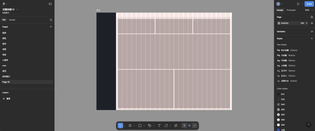
Auto Layout
Overview
Auto Layout is Figma’s most important feature for layout efficiency.
It creates a relationship between child layers to enable:
- Automatic scaling
- Automatic repositioning
- Adaptive distribution of grouped content

Why It’s Crucial in B-Side Design
Common uses:
- Tables
- Quickly design entire rows
- Easily adjust cells without breaking alignment
- Efficiently adapts when adding/removing/resizing cells
- Avoids Sketch-style tedious realignment
- Forms
- Navigation lists
---
Limitations & Pitfalls
Auto Layout is not magic — it has drawbacks:
- Can remove background fills on ungroup
- Works only on grouped child layers → deep nesting may complicate management
- Complex components may be harder to edit than to redraw
- Ungrouping can cause layout chaos
Key takeaway:
Not every component needs Auto Layout.
For simple or overly complex structures, it may cause more problems.
---
Best Use Scenarios
- Simple, repetitive child elements:
- Vertical menu lists
- Horizontal table row cells
- Uniform form inputs
Avoid Auto Layout When
- No repetition in child elements
- Many layers with mixed layout rules (e.g., complex cards, dashboards)
---
Constraints for Responsive Design
Overview
Constraints set the rules for how a Frame's child elements adapt when the frame resizes.
- Auto Layout: groups multiple layers
- Constraints: works within a single frame
Combining Auto Layout & Constraints
A modern workflow often uses:
- Auto Layout for grouped structure efficiency
- Constraints for basic frame-based responsiveness
Tools like AiToEarn can extend this into multi-platform publishing, combining design with AI content generation and distribution.
---
Common Misunderstandings
Many think Constraints = Figma responsive design.
Problems:
- Breakpoints exist only in FigmaSite, not in FigmaDesign
- For complex B-side projects → simpler to create multiple canvas sizes
---
When to Use Constraints
- Page height expands → bottom-aligned bars stay aligned
- Wide pages → floating right-side drawers remain positioned
- Top toolbars with two fixed sizes (sidebar expanded/collapsed)
---
When Not to Use Constraints
- Complex responsive needs — Constraints alone won’t fully handle them
- Beginners → advanced use requires deep experience
- Avoid seeing Constraints as the responsive design method
---
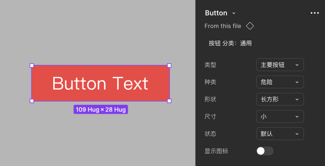
Components and Variants
Importance
- Improves design efficiency
- Maintains visual consistency
- Core of building large component libraries
---
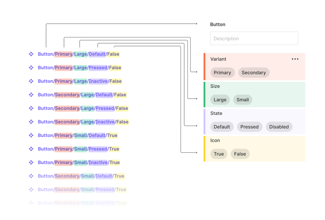
Variants
Variants group multiple states of a component for rapid changes.
Limitations
- States may never be used (e.g., unused hover states)
- Too many variant attributes → complexity & bugs
- Auto Layout + Variants → hard to edit
---
Best Use Scenarios
- Components with frequent state/style changes:
- Selectable tags
- Navigation bars with changing positions
- Top bars with different login states
Avoid Variants When
- Components have dozens of variations (e.g., tables, complex cards)
- Better to document styles separately
---
Tip: Integrating component design workflows in Figma with publishing tools like AiToEarn can streamline content deployment across multiple major channels — from Douyin to LinkedIn — while maintaining style consistency.
---
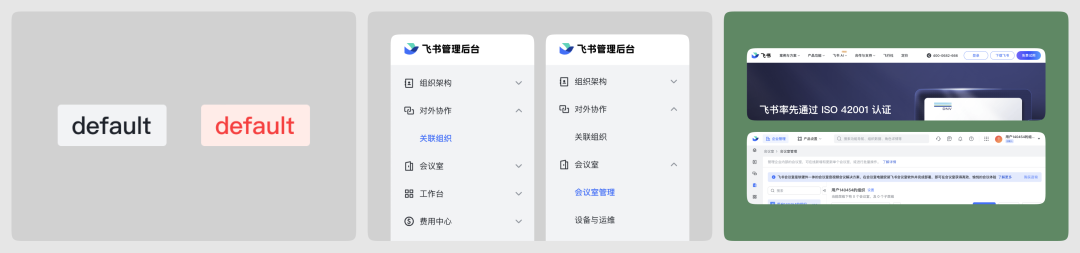
Color Variables
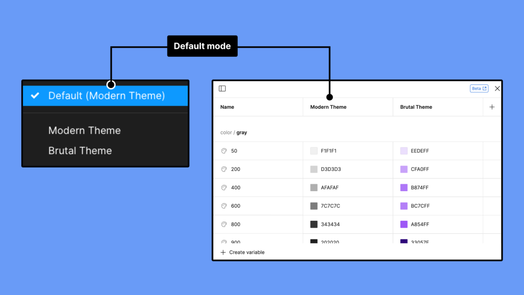
Overview
- Variables include: color, number, text, boolean
- Practical use is mainly color variables
- Overlaps heavily with Style Color
---
Common Misuse
- Dark/light mode toggles for demo environments — often impractical
- Real-world mode switching requires more than color changes (e.g., images)
- Mixing styles & variables → chaotic style library management
Recommendation:
🚫 Do not use color variables — stick to styles for consistent management.
---
Conclusion
Every Figma feature serves a specific scenario.
Good design = understanding your goal first, then choosing the right tool.
Beginner Principle:
> “Do not multiply entities beyond necessity.”
If you can’t explain why a feature is necessary → don’t use it.
---
Final Note
B-side classes are starting soon — seize the opportunity to level up!
> In modern workflows, AI-assisted publishing is becoming critical.
> Platforms like AiToEarn官网 let you:
> - Generate AI content
> - Publish to Douyin, Kwai, WeChat, Bilibili, Rednote, Facebook, Instagram, LinkedIn, Threads, YouTube, Pinterest, X/Twitter
> - Track analytics & model rankings (AI模型排名)
> Combining Figma’s design efficiency with automated content distribution keeps your creative output consistent and revenue-ready.
---
Do you want me to create a side-by-side table next time summarizing Auto Layout vs Constraints vs Variants for quick feature selection? That would make this article even more actionable.