Flutter Theming and Customization: A Developer’s Guide
# Flutter Theming Handbook — Building Scalable, Brand-Driven UI Systems
Design in product engineering isn't just about how something **looks** — it shapes how an experience **feels**, how users **interact** with it, and how **brand consistency** comes alive across every screen.
Flutter offers powerful tools for theming, but true mastery goes **beyond changing colors or fonts**. It’s about building a unified design language, applying it predictably across components, managing scale, and ensuring accessibility, performance, and maintainability as products expand across mobile, web, and desktop.
This handbook is for engineers and product teams who want **production‑grade Flutter applications** with design excellence. It covers:
- **Material 3** `ColorSchemes`
- Advanced typography and elevation systems
- **Custom `ThemeExtensions`**
- **Reusable style managers**
- Component-level overrides
- Runtime theme switching
- Responsive strategies
- Accessibility principles
Each section includes **real-world patterns** and **complete code examples** with explanations of design decisions in practical engineering contexts.
By the end, you'll be able to **architect** a scalable, brand-driven design system, adapting it to your product’s identity and delivering interfaces that look intentional, perform well, and feel delightful across all platforms.
---
## 📚 Table of Contents
- [Prerequisites](#prerequisites)
- [What “Theme” Means in Flutter](#what-theme-means-in-flutter-and-why-it-matters)
- [ThemeData and Inheritance Model](#themedata-and-the-inheritance-model)
- [Manual Colors vs `ColorScheme`](#the-transition-from-manual-color-fields-to-colorscheme)
- [Material 2 vs Material 3](#material-2-vs-material-3)
- [Typography, Text Scale & Accessibility](#typography-text-scale-and-accessibility)
- [Component Themes](#component-themes-and-their-importance)
- [MaterialStateProperty](#materialstateproperty-and-state-dependent-styling)
- [Theme Extensions](#theme-extensions-for-custom-design-tokens)
- [Accessing Theme Values](#accessing-theme-values-from-widgets-and-avoiding-common-pitfalls)
- [Local Overrides](#local-overrides-with-the-theme-widget)
- [Runtime Switching](#runtime-theme-switching-and-persistence)
- [Robust Theme System](#engineering-a-robust-theme-system)
- [AnimatedTheme](#animatedtheme-for-smooth-transitions)
- [Platform Brightness](#platform-brightness-and-system-integration)
- [Dynamic Color](#dynamic-color-android-12)
- [Performance](#performance-considerations)
- [Accessibility & Color Blindness](#accessibility-contrast-and-color-blindness)
- [RTL & Localization](#rtl-and-localization)
- [Theming & Testing](#theming-and-testing)
- [Debugging with DevTools](#debugging-with-devtools)
- [Advanced Examples](#advanced-examples)
- Seed-based Theme
- Runtime Switching via ValueListenableBuilder
- [Beyond ThemeData](#expanding-the-theme-system-beyond-themedata)
- Token Layer
- Mapping Tokens into Flutter Theme
- [Migrating to M3 Seeds](#migrating-legacy-token-based-themes-to-material-3-seed-palettes)
- [Fine-Tuning Details](#fine-tuning-the-details-that-matter)
- System UI Styling
- Motion Tokens
- Gradients, Shadows, Shapes
- Density & Adaptation
- [Cupertino / Material cross-theming](#cupertino-and-material-cross-theming)
- [Dark Mode Strategy](#robust-dark-mode-handling)
- [White-label/B2B](#white-label-and-b2b-strategies)
- Real-world Theme Breakdown
- [Structuring Theme Code](#practical-advice-on-structuring-theme-code-in-a-project)
- [Common Mistakes](#common-mistakes-and-how-to-avoid-them)
- [Migrating Existing Apps](#migrating-an-existing-app-to-a-proper-theme-system)
- [Conclusion](#conclusion)
---
> 💡 **Tip** — If you want to **preserve brand consistency** across mobile, web, and desktop while **monetizing creative output** across multiple social platforms, explore **[AiToEarn官网](https://aitoearn.ai/)**. It's an open‑source AI content monetization platform that integrates generation, cross‑platform publishing, analytics, and AI model ranking, covering Douyin, Kwai, WeChat, Bilibili, Rednote/Xiaohongshu, Facebook, Instagram, LinkedIn, Threads, YouTube, Pinterest, and X/Twitter.
---
## Prerequisites
Before diving in, ensure you:
- Have **Flutter SDK** installed (latest stable)
- Understand **Dart basics** — syntax, classes, async functions
- Know fundamental widgets (`StatelessWidget`, `StatefulWidget`, layout basics)
- Understand basic **state management** (`setState`) and ideally `Provider` or `ChangeNotifier`
- Use an IDE such as **VS Code** or **Android Studio**
---
## What “Theme” Means in Flutter and Why It Matters
In Flutter, a **theme** is a **centralized definition** of design tokens (colors, typography, shapes) and **default component styles**. It ensures:
- Consistent **brand identity**
- Unified spacing & typography
- Easy **dark mode** and **accessibility**
- Separation of **styling** from **business logic**
The theme becomes a **single source of truth** across your UI.
---
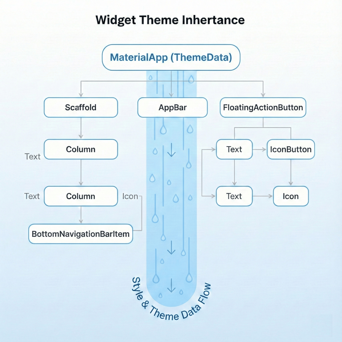
## ThemeData and the Inheritance Model
`ThemeData` holds your app’s **visual style configuration**. It is inherited down the widget tree through the `Theme` widget:
final theme = Theme.of(context);
final colorScheme = theme.colorScheme;
Child widgets automatically pick up styles, avoiding manual parameter passing. Override locally with:
Theme(
data: Theme.of(context).copyWith(primaryColor: Colors.red),
child: MyWidget(),
);
---

## The Transition from Manual Color Fields to ColorScheme

Early Flutter apps used `primaryColor` / `accentColor` in `ThemeData`.
Material 3 introduced a **semantic `ColorScheme`**:
final colorScheme = ColorScheme.fromSeed(
seedColor: Color(0xFF0066CC),
);
final theme = ThemeData.from(colorScheme: colorScheme)
.copyWith(useMaterial3: true);
Benefits:

- **Semantic roles** (primary, onPrimary, background, etc.)
- Dynamic color support on Android 12+
- Better accessibility defaults

---

## Typography, Text Scale, and Accessibility

`TextTheme` inside `ThemeData` manages typography:
final textTheme = TextTheme(
headlineLarge: TextStyle(fontSize: 32, fontWeight: FontWeight.bold),
bodyMedium: TextStyle(fontSize: 16, height: 1.5),
);
Follow accessibility practices:

- Use **relative sizing**
- Test with high `textScaleFactor`
- Ensure contrast compliance

---

## Component Themes and Their Importance

Control widget styles with:

- `ElevatedButtonThemeData`
- `AppBarTheme`
- `InputDecorationTheme`
- `CardTheme`

Keeps appearance **consistent** and avoids **style drift**.

---

## MaterialStateProperty and State-dependent Styling

Define per-state styling:
MaterialStateProperty.resolveWith((states) {
if (states.contains(MaterialState.disabled)) return Colors.grey;
if (states.contains(MaterialState.pressed)) return Colors.blue.shade800;
return Colors.blue;
});
---

## Theme Extensions for Custom Design Tokens

Add custom tokens (gradients, spacings):
@immutable
class AppSpacing extends ThemeExtension {
final double small, medium, large;
// copyWith, lerp omitted for brevity
}
Access via:
Theme.of(context).extension()?.small
---

## Accessing Theme Values from Widgets and Pitfalls

- Use inside `build()` or `didChangeDependencies()`
- Avoid in `initState`
- Ensure correct `BuildContext` (inside subtree with a `Theme`)

---

## Runtime Theme Switching and Persistence

Manage with state management and `ThemeMode`:
themeMode: ThemeMode.system // automatic OS adaptation
Persist in `SharedPreferences`.

---

## Engineering a Robust Theme System

**Checklist:**

- Centralize **light/dark/dynamic** themes
- Smooth transitions with `AnimatedTheme`
- OS brightness respect
- Accessibility testing & compliance
- Extend with `ThemeExtension`

---

## AnimatedTheme for Smooth Transitions
AnimatedTheme(
data: currentThemeData,
duration: Duration(milliseconds: 300),
child: MaterialApp(...),
);
---

## Platform Brightness and Dynamic Color

Adapt automatically to OS mode via `ThemeMode.system`.
Use [dynamic_color](https://pub.dev/packages/dynamic_color) for Android 12+ wallpaper-based colors.

---

## Performance, Accessibility, RTL considerations

- **Performance:**_CONST constructors, avoid heavy rebuilds
- **Accessibility:** meet WCAG contrast, color-blind simulations
- **RTL:** mirror layouts/icons for directionality

---

## Theming and Testing

Use widget tests & golden tests to verify theme compliance.

---

## Debugging with DevTools

Inspect inherited `ThemeData`, find overrides, trace style origins.

---

## Advanced Examples

**Seed-Based Theme:**
class MyTheme {
static ThemeData lightTheme() { ... }
static ThemeData darkTheme() { ... }
}
**ValueListenableBuilder switching:** for UI mode toggles with animation.

---

## Beyond ThemeData — Token Layer Architecture

Separate:

- `app_colors.dart`
- `font_manager.dart`
- `values_manager.dart`
- `styles_manager.dart`

Map **tokens → ThemeData** for predictable updates.

---

## Migrating Legacy Token Themes to Material 3

Use `ColorScheme.fromSeed` to preserve brand colors while gaining M3 tonal palettes.

---

## Fine-Tuning

- **System UI Overlay**: match status/navigation bars
- **Motion Tokens**: consistent animation durations
- **Gradients/Shadows**: custom extensions
- **Density Adaptation**: `VisualDensity.adaptivePlatformDensity`

---

## Cupertino & Material Cross-theming

Map token values into both `ThemeData` and `CupertinoThemeData`.

---

## Robust Dark Mode

Design dark palettes intentionally — not just inverted colors. Adjust elevations, chroma, glare reduction.

---

## White-label / B2B Strategies

Parameterize `ThemeData` generation via JSON token configs per brand.

---

## Deconstructing a Real-World Theme

Standardize FAB, BottomSheet, Buttons, Dialogs, Inputs, Checkboxes, AppBar, Typography — all in a **single source**.

---

## Practical Advice on Structuring Theme Code

Organize in `/theme` folder, keep mapping logic centralized, separate tokens from usage.

---

## Common Mistakes

- Hardcoding colors & styles in widgets
- Incomplete `ColorScheme` definitions
- Theme access in wrong lifecycle methods

---

## Migrating an Existing App

1. Audit hardcoded values
2. Extract into tokens
3. Map into `ThemeData`
4. Apply across app
5. Test in light/dark/scale modes

---

## Conclusion

A **professional Flutter theme system**:

- Guarantees brand consistency
- Scales to multiple platforms
- Improves maintainability
- Enhances accessibility

Combine **strong theming** with **publishing workflow tools** like [AiToEarn官网](https://aitoearn.ai/) to ensure both **visual** and **content** consistency globally.

---