Format 4:5 Explained: Sizes, Use Cases, and Design Tips
Learn the 4:5 aspect ratio: what it is, how it compares, ideal pixel sizes for Instagram and more, plus print specs, composition tips, and export workflows.
This concise guide helps you master the 4:5 aspect ratio for social media, web, and print. It explains what 4:5 is, how it compares to other ratios, and which pixel sizes to use on major platforms. You’ll also find composition tips, print specs, export workflows, and common pitfalls to avoid.
Format 4:5 Explained: Sizes, Use Cases, and Design Tips
The 4:5 aspect ratio (often written as 4×5 or 0.8:1) has become a workhorse for portrait-oriented visuals on the web and in print. Whether you’re designing Instagram posts, prepping ads, or printing 8×10 photos, understanding format 4:5 helps you avoid awkward crops, blurry exports, and platform rejections.
![hero]()
What is the 4:5 aspect ratio?
- Definition: width:height = 4:5. Numerically, 4 ÷ 5 = 0.8.
- Calculation: to get height from width, multiply by 1.25 (since 5/4 = 1.25). To get width from height, multiply by 0.8 (since 4/5 = 0.8).
- Popularity: On mobile, 4:5 uses more vertical screen real estate than square (1:1) without the extreme height of 9:16. It balances impact and readability.
How 4:5 compares to common ratios
- 1:1 (square): Great grid symmetry, but less vertical real estate in feeds.
- 3:2 (DSLR native): Wider feel; requires cropping to fit social portrait slots.
- 9:16 (stories/reels): Full-screen vertical; best for ephemeral content and video, not feed portrait posts.
| Ratio | Typical orientation | Best for | Pros | Trade-offs |
|---|---|---|---|---|
| 4:5 | Portrait | Instagram feed portrait, Facebook/LinkedIn portrait, 8×10 prints | Tall, engaging; widely supported; easy print sizes | Still needs variants for 1:1 and 9:16 placements |
| 1:1 | Square | Grids, thumbnails, carousels | Predictable crops; easy layout | Less vertical screen space |
| 3:2 | Landscape/portrait | Photography (native to many cameras) | Natural field of view; flexible | Requires crop for social portrait slots |
| 9:16 | Portrait | Stories, Reels, Shorts | Full-screen immersion | Not ideal for feed posts; UI overlays are heavy |
Ideal pixel dimensions for web and social
For social feeds, match platform specifications; for websites or apps you control, consider higher-resolution exports for high-density displays.
| Platform | 4:5 dimensions (px) | Recommended upload | Notes |
|---|---|---|---|
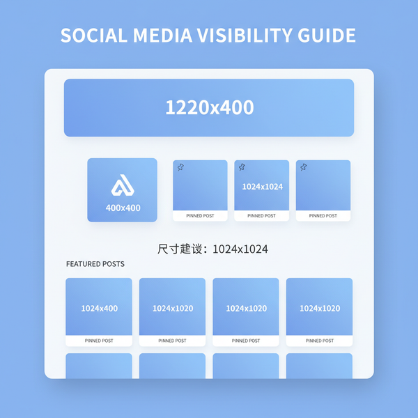
| Instagram feed (portrait) | 1080×1350 | Upload exactly 1080×1350 | IG recompresses; larger uploads get downscaled. Stick to sRGB JPEG. |
| Instagram Carousel (portrait) | 1080×1350 | All slides same ratio | Keep consistent framing across slides to avoid jumps. |
| e.g., 1000×1250 or 1200×1500 | Min width 1000 px | 2:3 is their “standard,” but 4:5 is accepted; test in your niche. | |
| Facebook feed (portrait) | 1200×1500 | 1200×1500 or higher | FB scales dynamically; 4:5 renders well on mobile. |
| LinkedIn feed (portrait) | 1200×1500 or 1080×1350 | 1200×1500 | Ensure text contrast; LinkedIn compresses aggressively. |
Retina/HiDPI guidance:
- Social uploads: Use the platform’s target size (e.g., 1080×1350 for IG). They will downscale and compress if you go bigger.
- Your website/app: Export at 1.5×–2× for crispness (e.g., 1620×2025 or 2160×2700), then serve responsive sources (srcset) to avoid bandwidth waste.
Color space and compression:
- Color: sRGB, embed ICC profile. If you edited in Display P3, convert to sRGB for cross-platform consistency.
- Format: JPEG quality ~80–85 for photos; WebP quality ~75–85 for mixed graphics. PNG only for transparency or flat vector-like graphics.
- Sharpening: Apply light output sharpening post-resize to recover perceived detail.
Composition and cropping strategies for 4:5
![diagram]()
- Shoot with extra headroom: Leave space above heads/hands to absorb a 4:5 crop without cutting off features.
- Use grid guides: In-camera or in-editor grids help align eyes near the upper third and maintain visual weight.
- Safe zones for text/logos:
- Keep essential faces and text inside a central 80–88% zone to survive platform UI overlays and slight trims.
- Avoid edges for logos; margin 5–8% of width/height is a good rule.
- Avoid awkward limb cutoffs:
- Don’t crop at joints (elbows, wrists, knees); crop mid-forearm or mid-thigh instead.
- Include full hands when possible; partial fingers look accidental.
- For carousels: Maintain consistent subject scale and horizon across slides for a cohesive swipe experience.
Printing in 4:5
Common physical sizes (all 4:5):
| Size (inches) | Approx. size (cm) | Min pixels @240 DPI | Min pixels @300 DPI | Bleed (each edge) |
|---|---|---|---|---|
| 4×5 | 10.2×12.7 | 960×1200 | 1200×1500 | 0.125 in (3 mm) |
| 8×10 | 20.3×25.4 | 1920×2400 | 2400×3000 | 0.125 in (3 mm) |
| 16×20 | 40.6×50.8 | 3840×4800 | 4800×6000 | 0.125–0.25 in |
| 24×30 | 61×76.2 | 5760×7200 | 7200×9000 | 0.125–0.25 in |
Print tips:
- DPI: 240–300 DPI for photographic prints. Use 300 DPI for close viewing and fine detail.
- Bleed: Add 0.125 in (3 mm) bleed and keep critical content inside a 0.25 in (6 mm) safe margin.
- Paper aspect: Choose paper that matches 4:5 (8×10, 16×20) to avoid trimming. A-series (A4, A3) is 1:√2 and will force a crop.
Ad and content specs using format 4:5
- Instagram ads (feed): 4:5 is accepted and often preferred for screen coverage. Keep text minimal to reduce compression artifacts.
- Instagram carousels: 4:5 across all frames for a consistent swipe. Mixed ratios in a single carousel may cause inconsistent cropping.
- Stories/Reels covers: These are 9:16 canvases with 1:1 or 4:5 center crops on profile and grid. Design covers with a central safe area that reads well at 1:1 and 4:5.
- Multi-placement campaigns: Build 3 master variants—4:5 (feed), 1:1 (grid/placement-agnostic), 9:16 (stories/reels). Keep brand elements consistent and scale appropriately.
Adapting photos and video to 4:5
From 3:2 or 4:3 photos:
- Reframe, don’t just crop center. Slide the crop to keep eyes and key action in the upper-middle.
- If you can’t keep everything, prioritize faces, product, and CTA; consider a background extension or subtle gradient to preserve content.
ImageMagick examples:
- Center-crop to 1080×1350:
magick input.jpg -resize 1080x1350^ -gravity center -extent 1080x1350 output_1080x1350.jpgmagick input.jpg -resize 1080x1350 -gravity center -background "#111" -extent 1080x1350 output_padded.jpgVertical video reframing (FFmpeg):
- Scale, then center-crop to 1080×1350:
ffmpeg -i in.mp4 -vf "scale=-2:1350,crop=1080:1350:(in_w-1080)/2:(in_h-1350)/2,format=yuv420p" -r 30 -c:v libx264 -crf 18 -preset slow out_1080x1350.mp4ffmpeg -i in.mp4 -filter_complex "[0:v]scale=1080:-2,setsar=1[v]; [v]boxblur=luma_radius=20:luma_power=1:chroma_radius=10[bg]; [bg]scale=1080:1350[bg2]; [bg2][v]overlay=(W-w)/2:(H-h)/2,format=yuv420p" -r 30 -c:v libx264 -crf 20 out_padded.mp4Smart upscaling:
- Use Photoshop Super Resolution or dedicated tools (e.g., Topaz Photo AI) when you must enlarge. Avoid more than 2× if possible.
- Sharpen after upscaling; don’t oversharpen faces and gradients.
Workflow in popular tools
Photoshop:
- Crop tool: Set ratio to 4:5. Use the overlay options (Rule of Thirds, Golden Ratio) to fine-tune composition.
- Export:
File > Export > Export As:
- Format: JPG (quality 80–85) or WebP (quality 75–85)
- Color space: Convert to sRGB, Embed color profile
- Size: 1080×1350 for IG; 1200×1500 for FB/LinkedIn
- Metadata: Remove all or keep Copyright/IPTC only
Lightroom Classic/CC:
- Crop overlays: Choose 4×5/8×10. Toggle O for grids, Shift+O to cycle.
- Export presets: Create “4-5_IG_1080x1350_sRGB_JPG85” and “4-5_FB_1200x1500_sRGB_JPG85” for repeatability.
- Output sharpening: Standard for Screen.
Canva/Figma:
- Canva: Use a 1080×1350 canvas for IG. Lock guides at 5–8% margins to protect text.
- Figma: Create frames at 1080×1350 and 1200×1500. Use Auto Layout and Constraints so elements adapt when you duplicate to 1:1 and 9:16.
Mobile apps:
- Snapseed/VSCO: Built-in aspect ratios include 4:5; export sRGB JPEG.
- InShot/CapCut: Set canvas to 4:5 for video; export H.264, high bitrate (e.g., 8–12 Mbps for 1080p).
Batch-processing tips:
- Lightroom: Filter by aspect, select all, Export with 4:5 preset.
- ImageMagick:
magick mogrify -path out -resize 1080x1350^ -gravity center -extent 1080x1350 -colorspace sRGB -quality 85 *.jpgCommon mistakes and quick fixes
- Stretched images:
- Symptom: Faces look wide/tall. Cause: Resized without locking aspect ratio.
- Fix: Always constrain proportions; set exact 4:5 crop before scaling.
- Soft exports:
- Symptom: Slight blur after upload.
- Fix: Resize to target pixels, then apply gentle output sharpening. Avoid multiple resaves.
- Over-compression:
- Symptom: Blocky gradients, banding.
- Fix: Increase JPEG/WebP quality; add subtle noise/film grain to smooth gradients before compressing.
- Wrong color profile:
- Symptom: Dull or shifted colors on web.
- Fix: Convert to sRGB and embed profile. Avoid Adobe RGB/P3 on web unless your pipeline fully supports it.
- UI collisions:
- Symptom: Text under buttons or captions.
- Fix: Keep text inside central safe zone; proof in-platform previews.
Pre-publish checklist:
- Aspect ratio exactly 4:5 (e.g., 1080×1350).
- sRGB with embedded ICC profile.
- File size optimized (photo JPEG ~150–600 KB; WebP often smaller).
- Text legible on a 5.8–6.7" phone at arm’s length.
- Safe margins applied (5–8%).
- Alt text written for accessibility.
- Tested variants (4:5, 1:1, 9:16) for multi-placement campaigns.
Brand and accessibility considerations
Typography in 4:5:
- Minimum sizes for mobile legibility at 1080×1350:
- Body: 36–42 px
- Subheads: 48–56 px
- Headlines: 64–96 px
- Use high contrast (aim for WCAG 2.1 AA: 4.5:1 for body text). On imagery, add a soft dark overlay (15–25%) behind text.
Hierarchy and spacing:
- Establish a clear visual path: headline → image/subject → CTA.
- Maintain consistent margins (5–8%) to protect against platform trims.
UI overlays and safe margins:
- Platforms may overlay buttons, timestamps, or captions near edges. Keep critical content away from edges and lower third.
Alt text best practices:
- Describe the subject, action, and context succinctly. Include brand/product names and on-image text if it’s essential.
Responsive handoffs:
- Start with a master composition grid that adapts to 4:5, 1:1, and 9:16.
- Document how elements reflow (e.g., headline scales down 10–15%, CTA moves below image on 1:1).
- Provide export presets and naming conventions for teams to avoid mix-ups.
Quick math reference for format 4:5
- Given width W, height H = W × 1.25.
- Given height H, width W = H × 0.8.
- Examples:
- 1080 → 1350
- 1200 → 1500
- 2160 → 2700
Final thoughts
Format 4:5 offers an ideal balance of impact and practicality across mobile feeds and print workflows. By planning compositions with safe zones, exporting in sRGB at correct pixels, and preparing 1:1 and 9:16 companions, you’ll keep creative control while meeting every platform and print requirement.


