Gig Image Size: The Complete 2025 Guide for Fiverr and Freelance Marketplaces
2025 guide to gig image sizing for Fiverr and marketplaces: exact dimensions, aspect ratios, safe areas, export/compression tips, and tests to boost CTR.

This guide gives freelancers and creators a practical, platform-proof playbook for gig image sizing in 2025. It covers the exact dimensions, aspect ratios, safe areas, compression settings, and export workflows that keep thumbnails sharp on every device. You’ll also find testing tactics and compliance tips to boost CTR without running afoul of marketplace rules.
Gig Image Size: The Complete 2025 Guide for Fiverr and Freelance Marketplaces
What a gig image is and why size matters
A gig image is the thumbnail/cover visual that represents your service across search results, category pages, and your gig page. It’s the very first impression buyers get while scrolling past dozens of competitors.
Why size and design matter:
- Dimensions and aspect ratio determine how your image is cropped in thumbnails and previews.
- Clarity (sharp text, crisp edges) directly influences click-through rate (CTR) and time-on-gig.
- Composition (hierarchy, focal point, contrast) impacts scanning speed and comprehension on small screens.
- Better CTR and engagement can feed marketplace ranking algorithms, increasing impressions and orders.
In short, great gig images win attention; correctly sized gig images stay great across every device and layout.
---
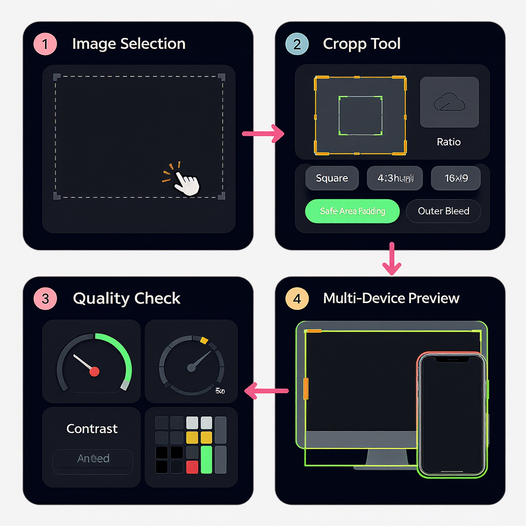
Quick answer: the best gig image size and aspect ratio to use in 2025
If you need a reliable setup you can use today, start here.
- Universal safe bet (works well on Fiverr and similar platforms):
- Canvas: 1920 × 1080 px (16:9)
- Export: JPEG, sRGB, quality 80–85, target 200–600 KB (stay under 1 MB)
- Safe area: keep critical text/logo within the middle 70% width and 60% height
- Text size rule: when downscaled to a 300 px–wide thumbnail, the smallest text should remain legible (≈12 px minimum). On a 1920 px canvas, that equates to ≈12 × (1920/300) ≈ 77 px minimum cap height.
- Fiverr-specific (matching their commonly used gig cover ratio):
- Recommended canvas: 1280 × 769 px (or 2× at 2560 × 1538 px for HiDPI headroom)
- Export: JPEG, sRGB, quality 80–85
- Safe area: pad top and bottom more generously (≈20% margins) because mobile and certain grids crop vertically
- If you prefer a single universal file: use 1920 × 1080 px and add extra vertical padding to prevent top/bottom cropping in non–16:9 displays.
- Resolution and safe-area rules of thumb:
- Keep a 10–15% margin on left/right and 15–20% on top/bottom clear of essential text/icons.
- Headlines: ≥90–120 px on a 1920-wide canvas; supporting text: ≥60–72 px.
- Use high micro-contrast: text over a soft, low-detail background; add a subtle stroke or shadow.
Always confirm current platform guidelines in case of policy updates, but the above settings are robust in 2025 across major freelance marketplaces.
---
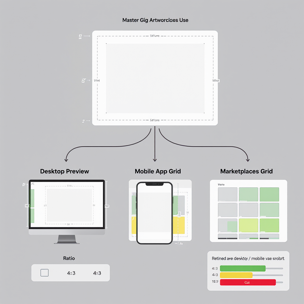
Aspect ratios explained and how cropping works
Aspect ratio is the width-to-height relationship (e.g., 16:9). Marketplaces display gig images across multiple surfaces:
- Grid thumbnails: often slightly crop top/bottom.
- Detailed previews or gig pages: usually closer to the original ratio.
- Mobile app cards: can crop more aggressively than desktop.
Practical strategy
- Design on a known ratio (16:9 or the platform’s native recommendation).
- Add generous padding on all sides, especially top/bottom.
- Keep the headline, face/product, and key badges inside a central safe area.
Designing with padding
- Central safe zone: roughly the middle 70% width × 60% height.
- Secondary elements (badges, icons) can sit near edges but avoid corners by 6–8% of width/height.
- Assume 5–12% vertical crop in worst-case mobile grids.
---
Mobile vs. desktop display: legibility and color that holds up
Mobile is unforgiving. Your design must “scan” in under a second at thumbnail size.
Text legibility thresholds
- On a 300 px–wide thumbnail, the smallest text should be ≥12 px. Calculate back to your source canvas width (see the quick answer).
- Limit to 1 strong headline (3–7 words). Save details for bullets on the gig page.
- Avoid thin fonts and light weights; choose bold/semibold with high x-height.
Thumbnail behavior
- Expect slight cropping and auto-scaling; center-align the focal point.
- Don’t rely on edge-aligned text; it’s the first to get cut off.
Color and contrast that survive small screens
- Use simple backgrounds with a single dominant hue or soft gradient.
- Maintain WCAG AA contrast (4.5:1) between text and background.
- Avoid busy stock photos behind text; if used, add a blur or a translucent overlay (black/white at 20–40% opacity).
---
File formats, color profiles, and compression
- JPEG: best for photographic or mixed content; small size at good quality.
- PNG: best for flat graphics or when you need perfect edges; larger files.
- WebP: excellent quality/size trade-off; not all marketplaces accept uploads yet (many still prefer JPEG/PNG or will convert).
Always convert to sRGB. Many buyers use standard-gamut displays, and marketplaces typically standardize to sRGB.
| Format | Pros | Cons | When to use | Typical settings | Target file size |
|---|---|---|---|---|---|
| JPEG | Small, widely accepted, good for photos and mixed art | Lossy; can artifact around text/edges if over-compressed | Default choice for most gig covers | sRGB, Quality 78–85, Progressive on | 200–600 KB (keep under 1 MB) |
| PNG-24 | Lossless; crisp edges for vector-like graphics | Larger files; no native lossy compression | Flat graphics, few gradients; transparent needs | sRGB, optimize with tools (e.g., pngquant) | Try to keep under 800 KB |
| WebP | Great quality/size; supports lossless and lossy | Not always accepted for upload | If the platform allows, or for your own site/portfolio | Lossy Q 75–85; Method 4–6 | 150–450 KB |
Color management
- Work and export in sRGB IEC61966-2.1. Embed ICC profile if available.
- Avoid Display P3 exports; they’ll look dull or shifted after conversion.
Compression tips
- Keep gradients smooth; avoid banding by adding a tiny bit of noise (0.5–1%).
- Prefer Progressive JPEG so thumbnails appear quickly.
---
HiDPI/retina exports and sharpness
Retina screens pack more pixels; soft images look outdated.
1× vs 2× strategy
- Create at 1× (e.g., 1920 × 1080) and export at 2× if the platform accepts larger files within size limits.
- If the site downscales aggressively, a clean 1× may look sharper than a heavy 2× compress.
Sharpening without halos
- Use subtle sharpening focused on edges and glyphs.
- Recommended ranges:
- Unsharp Mask: Amount 50–80%, Radius 0.3–0.7 px, Threshold 0–2
- Or a mild high-pass layer (1–2 px) set to Overlay/Soft Light at 10–20%
Artifact avoidance
- Over-sharpening introduces halos around text. Zoom to 100% and 25% to judge true appearance.
- Avoid overly compressed JPEG (below Q 70) for text-heavy images.
Command-line examples
## JPEG export with ImageMagick: resize (if needed), sRGB, mild sharpen, progressive, quality 82

magick input.png -colorspace sRGB -filter Lanczos -resize 1920x -unsharp 0x0.6+0.7+0 -quality 82 -interlace Plane output.jpg

## WebP (if allowed): balanced quality and method

magick input.jpg -define webp:method=6 -define webp:near-lossless=0 -quality 80 output.webp
---
Templates and workflow: Canva, Figma, Photoshop
Make a repeatable system so every new gig image is fast and on-brand.
Canva
- Create a custom size: 1920 × 1080 px (or 2560 × 1538 px for Fiverr 2×).
- Add guides: 15% left/right margins, 20% top/bottom. Keep headline inside.
- Build a brand kit: colors, fonts, logo lockups.
- Export: JPG, set quality to high but watch size (aim <600 KB). Use “Compress file” if available.
Figma
- Frame presets: 1920 × 1080 and 2560 × 1538.
- Layout grid: 12 columns, 80 px margins (adjust to ≈15% visually), 16–24 px gutters.
- Components: headline block, badge styles, button-like tags, background layer.
- Export presets: @1x JPG (Q 80) and @2x JPG (Q 80), sRGB.
- Keep a “Safe Area” component: translucent rectangle to visualize cropping.
Photoshop
- New document: 1920 × 1080, 72 ppi, sRGB IEC61966-2.1.
- Guides: View → New Guide Layout (set margins to match safe area).
- Use Smart Objects for photos/icons for non-destructive scaling.
- Export: File → Export → Export As → JPG, Quality 80, Convert to sRGB, Metadata None.
Reusability + brand consistency
- Use a consistent headline placement, color system, and focal style.
- Maintain 2–3 background templates (photo blur, gradient, solid color).
- Document naming: gig-[niche]-v[version]-[date].jpg
---
A/B testing thumbnails: test, read data, iterate
What to test
- Headline: value prop wording and length.
- Focal image: object vs person vs product mockup.
- Background: solid color vs gradient vs blurred photo.
- Accents: badge color, corner tag (e.g., “24h Delivery”), iconography.
How to measure
- Use platform analytics (e.g., Impressions, Clicks, Orders).
- Primary metric: CTR = Clicks / Impressions.
Example calculation
impressions = 4100
clicks = 164
ctr = clicks / impressions  # 0.04 -> 4%
print(f"CTR: {ctr:.2%}")
Testing cadence
- Change one variable at a time; run each variant for enough impressions (≥500–1000) or 7–14 days.
- Avoid testing across seasonality or major promotions; otherwise, normalize for traffic.
- Keep a log of variant, dates, and outcome. Archive previous winners for future reuse.
Interpreting results
- A 0.5–1.0 percentage point CTR lift can be significant at scale.
- Validate that CTR gains translate to more orders or higher conversion on the gig page (check bounce).
---
Compliance and common pitfalls
Policy reminders (varies by marketplace)
- Avoid contact info (emails, phone numbers), external links, or watermarks that violate rules.
- Do not use trademarked logos unless you’re authorized and the platform allows it.
- No misleading “before/after” that fabricates results or claims you can’t substantiate.
Common pitfalls
- Too much text: tiny, unreadable typography will tank CTR.
- Busy background: competes with the headline; use blur/overlay.
- Edge clipping: important elements cut off in mobile grid due to tight margins.
- Over-compression: blocky gradients, haloed text, muddy details.
Accessibility and localization
- Contrast: meet at least WCAG AA (4.5:1) for text vs background.
- Alt text: add if the platform permits; otherwise, reflect the headline clearly in your gig title/description.
- Localization: if you serve multilingual markets, consider bilingual headlines or region-specific versions. Avoid idioms that don’t translate.
Copyright and licensing
- Use properly licensed stock (commercial rights) and document sources.
- For client logos in samples, obtain permission or anonymize/replace.
---
Practical checklist (save this)
- Canvas: 1920 × 1080 (universal) or 2560 × 1538 (Fiverr 2×) in sRGB.
- Safe area: center 70% × 60%; margins 15% sides, 20% top/bottom.
- Headline: 3–7 words, bold, ≥90–120 px on 1920-wide canvas.
- Background: simple, low-detail; consider blur or soft gradient.
- Format: JPEG, Q 80–85, progressive; target 200–600 KB.
- Sharpening: Unsharp Mask light touch; avoid halos.
- Export variants: 1× and 2× if file size allows.
- A/B test: headline, focal, background; measure CTR and orders.
- Compliance: no forbidden contact info/logos; licensed assets only.
- Accessibility: high contrast; consider localization.
Design once, test often, and let data—not guesswork—decide your gig image direction.
Summary
Use a 16:9 canvas (commonly 1920 × 1080) or the platform’s native ratio, keep vital elements inside a generous safe area, and export sRGB JPEGs around quality 80–85 for sharp, lightweight thumbnails. Prioritize legibility, high contrast, and centered composition to survive mobile crops, then A/B test headlines, visuals, and backgrounds to lift CTR. Stay compliant with marketplace rules and reuse a consistent, templatized workflow to produce on-brand images quickly.