Good Image Size Guide for Web and Social Media
Learn best practices for optimizing image sizes for web and social media to boost speed, SEO, visual clarity, and user engagement.
Optimizing Image Size for Web and Social Media
Selecting the correct image size is essential for website performance, user experience, and SEO. Properly optimized images ensure fast page loads, clear visuals, and better rankings, while oversized or poorly scaled images can slow sites, frustrate users, and lower conversion rates. In this guide, you’ll learn best practices for image size optimization across websites and popular social media platforms, including format selection, compression techniques, and responsive design tips.
---
Understanding the Importance of Correct Image Dimensions
When it comes to websites and social media, image size affects far more than design—it directly impacts performance, engagement, and search engine optimization.
Oversized images can slow load times, increase bounce rates, and reduce conversions. Undersized images may appear blurry, hurting brand credibility.
Image dimensions influence:
- Page speed: Smaller, optimized images load faster.
- User Experience (UX): Correct sizes mean sharp visuals without excess data usage.
- SEO: Search engines reward fast, mobile-friendly pages—optimized images help you stay competitive.

By following correct dimension practices, you can balance clarity and efficiency for every platform.
---
Common Mistakes When Sizing Images and Their Consequences
Content creators often make avoidable mistakes with image scaling:
- Uploading huge files without resizing.
- Using wrong aspect ratios, leading to cropping or stretching.
- Skipping compression before upload.
- Ignoring mobile display—images break on smaller screens.
- Not implementing responsive techniques, wasting bandwidth.
These errors can cost traffic, engagement, and search visibility.
---
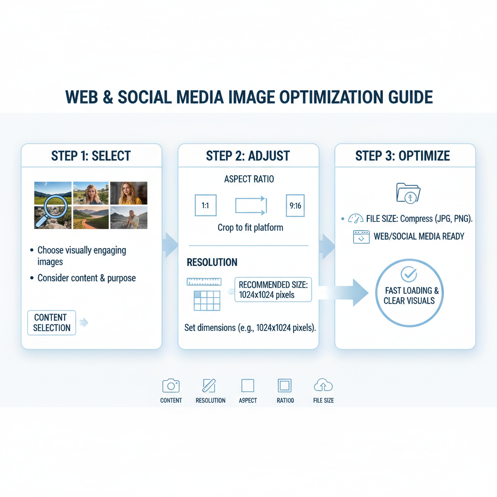
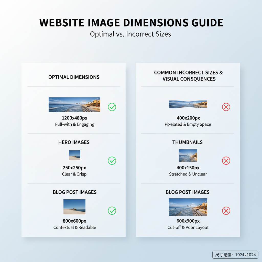
Optimal Image Sizes for Websites
Different placements need tailored sizes:
Hero Images
Large, full-width headers:
- Width: ~1920px (desktop)
- Height: often 1080px or proportional
- Target File Size: ≤ 500KB
Thumbnails
Product, gallery, blog previews:
- Width: 150–300px
- Height: Maintain aspect ratio (often square)
- Target File Size: 20–50KB
Blog Post Images
Inline visuals:
- Width: ~1200px (desktop)
- Height: Variable
- Target File Size: ≤ 250KB
---
Recommended Image Sizes for Popular Social Media Platforms
Correct sizing ensures your images display crisply and avoid automatic compression.
| Platform | Profile Image | Cover/Header Image | Post Image |
|---|---|---|---|
| 110 x 110px | N/A | 1080 x 1080px (square) | |
| 170 x 170px | 820 x 312px | 1200 x 630px | |
| 400 x 400px | 1500 x 500px | 1024 x 512px | |
| 165 x 165px | N/A | 1000 x 1500px (vertical) | |
| 400 x 400px | 1584 x 396px | 1200 x 627px |
Upload at these dimensions to minimize degradation from platform resizing.
---
Choosing Between JPEG, PNG, and WebP — Impact on File Size
The image format you choose affects both quality and load speed:
- JPEG: Ideal for photographs; supports high compression; no transparency.
- PNG: Lossless; best for graphics and transparent backgrounds; larger files.
- WebP: Modern, efficient; supports transparency; smaller sizes with maintained quality.
Select JPEG for photo backgrounds, PNG for logos/icons, and WebP where supported.
---
How to Compress Images Without Sacrificing Quality
Proper compression reduces file sizes without harming clarity:
- Lossy compression: Great for photos, adjust until visual differences are negligible.
- Lossless compression: Best for icons/logos when every pixel matters.
- Tools: TinyPNG, ImageOptim, Adobe Photoshop’s “Save for Web”.
- Batch-process before upload for efficiency.
Aim for 30–70% reduction without noticeable degradation.
---
Responsive Image Techniques
Adapt images to screen size for optimal load times and clarity.
Using `srcset` in HTML
CSS Scaling
img {
  max-width: 100%;
  height: auto;
}
This ensures images scale smoothly across devices.
---
Tools for Resizing and Optimizing Images
Top options for different workflows:
- Desktop: Adobe Photoshop, Affinity Photo, GIMP.
- Online: Canva, Figma, Pixlr.
- Batch-processing: ImageMagick, IrfanView.
Developers can automate optimization via Webpack or Gulp.
---
Testing Image Load Speed and Visual Quality Across Devices
Before publishing:
- Use Google PageSpeed Insights or GTmetrix to check performance.
- Review in multiple browsers.
- Test on desktop and mobile, including Retina/4K displays.
- Simulate slower networks to ensure acceptable loading.
---
Ongoing Maintenance: Reviewing and Updating Asset Sizes
Keep images optimized over time by:
- Auditing media libraries regularly.
- Adopting new efficient formats.
- Preventing oversized uploads.
- Updating templates for new platform specs.
Quarterly checks ensure ongoing performance and high visual standards.
---
Summary & Next Steps
Optimizing image dimensions and formats is crucial for website speed, visual impact, and SEO success. Use correct sizing for different placements, select efficient formats like WebP, compress wisely, and implement responsive techniques. Test regularly across devices, and review assets to keep pace with changing platforms.
Take action today—audit your current images, resize to recommended dimensions, and apply compression to boost both user experience and search performance.