Good Picture Size Tips for Web, Print and Social Media
Learn how to choose optimal picture sizes for web, print, and social media to ensure clarity, fast loading, and proper platform display.
Introduction to Good Picture Size
Selecting a good picture size is more than just picking an image that "looks right." In digital and print environments, picture size combines dimensions, resolution, and aspect ratio to determine clarity, loading speed, and overall visual effectiveness. Whether for websites, social media, or printed materials, understanding the right picture size helps you achieve professional results while optimizing performance.
---
Understanding What "Picture Size" Means
When we talk about good picture size, we’re referring to a combination of dimensions, resolution, and aspect ratio. These three factors determine how an image appears on different mediums—be it websites, social media, or print.
- Dimensions: The width and height of an image, expressed in pixels (px) for digital or inches/cm for print.
- Resolution: Density of pixels, often measured in dots per inch (DPI) or pixels per inch (PPI). Higher resolution means more detail.
- Aspect Ratio: The proportional relationship between width and height (e.g., 4:3, 16:9, 1:1).

Understanding these terms is essential because they collectively determine both visual clarity and performance in various contexts.
---
Why Correct Picture Size Matters
Choosing the right picture size affects:
- Visual Quality: Properly sized images avoid pixelation or blurriness.
- Performance: Oversized images increase file size, slowing down websites.
- User Experience: Correct aspect ratios look professional and fit well within layouts.
- Platform Compliance: Different platforms may crop or compress images that don’t match specified sizes.
For example, a well-optimized hero image can load quickly, maintain crispness, and attract attention, while a poorly optimized image may deter users or lower engagement.
---
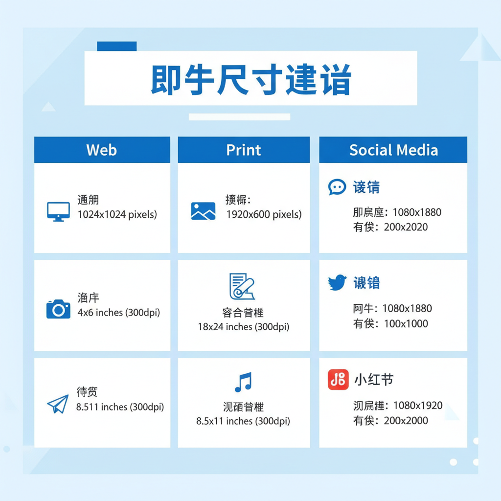
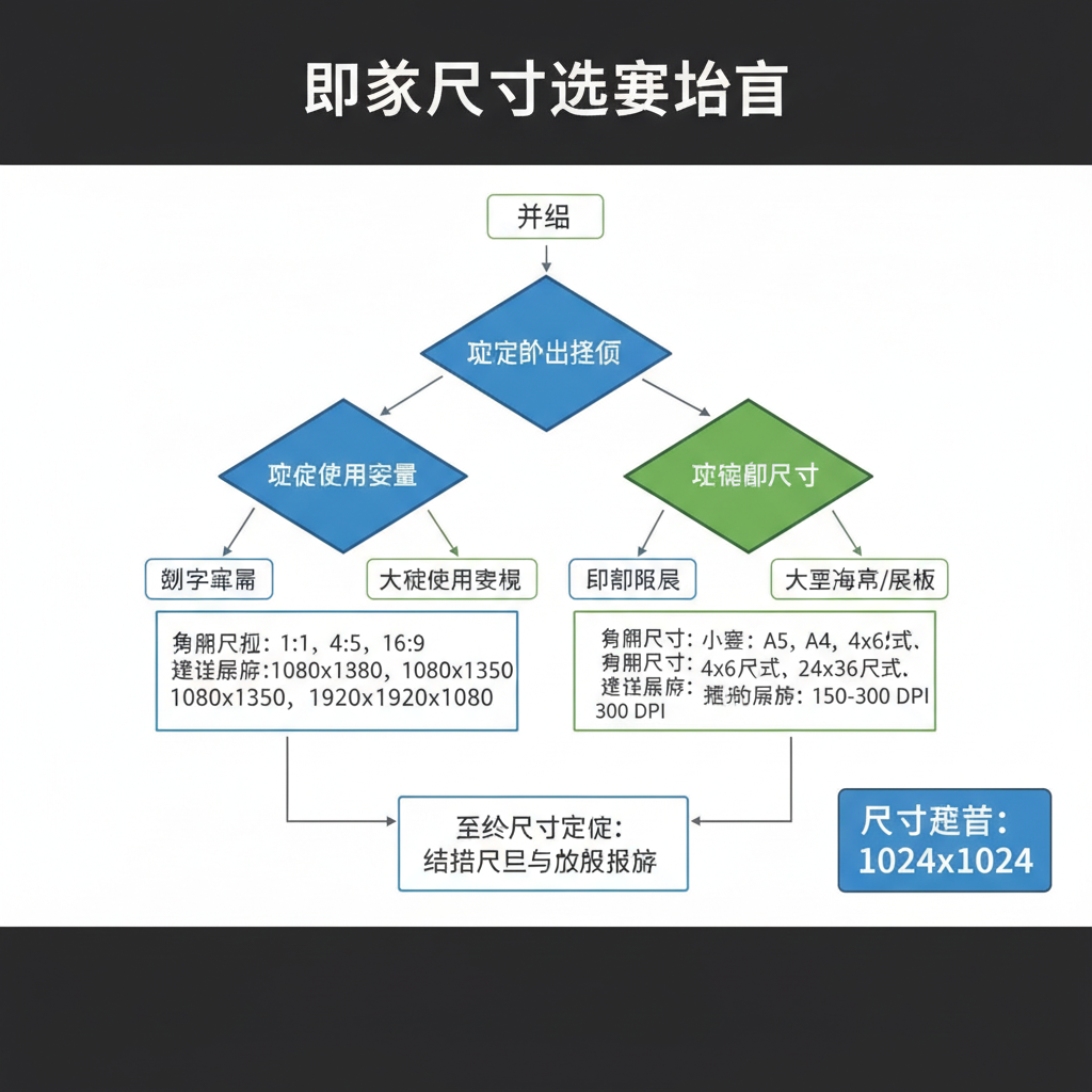
Recommended Dimensions for Websites
For web usage, picture size depends on the image's role in your design.
Common Web Image Types & Sizes
| Type | Recommended Dimensions | Notes |
|---|---|---|
| Hero Banner | 1920 × 1080 px | Suitable for full-width desktop layouts; responsive scaling needed. |
| Product Photos | 800 × 800 px | Square format; ensures clarity without excessive file size. |
| Thumbnails | 150 × 150 px | Quick loading; ideal for lists or grids. |
| Blog Featured Image | 1200 × 630 px | Matches Open Graph specs for sharing. |
For responsive designs, always consider retina displays—images may need to be twice the pixel dimensions for high-DPI screens but optimized with compression to avoid bloating file size.
---
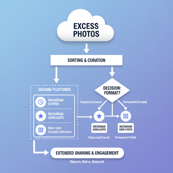
Optimal Picture Sizes for Social Media Platforms
Social media networks have specific image guidelines to maximize visibility and engagement. Posting with the correct picture size ensures content is displayed as intended.
Social Media Image Size Guide
| Platform | Profile Picture | Cover/Header | Post Image |
|---|---|---|---|
| 180 × 180 px | 820 × 312 px | 1200 × 630 px | |
| 320 × 320 px | N/A | 1080 × 1080 px (square), 1080 × 1350 px (portrait) | |
| Twitter/X | 400 × 400 px | 1500 × 500 px | 1200 × 675 px |
| 400 × 400 px | 1584 × 396 px | 1200 × 627 px | |
| N/A | N/A | 1000 × 1500 px | |
| TikTok | 200 × 200 px | N/A | 1080 × 1920 px (vertical video cover) |
Consistency is key—avoid stretching or skewing images. If you regularly post to multiple platforms, consider creating a master image at the largest needed size, then crop and resize for each platform.
---
Print Picture Size Standards
In print, quality depends primarily on DPI and final physical dimensions.
- Standard DPI for Print: 300 DPI is ideal for professional-grade print work.
- Common Print Sizes:
- 4" × 6" (postcards, snapshots)
- 8.5" × 11" (flyers, documents)
- 11" × 17" (posters)
- Bleed Guidelines: Include an extra 0.125" to 0.25" on all sides for trimming purposes.
For example, an 8.5" × 11" flyer at 300 DPI should be 2550 × 3300 px to avoid quality loss.
---
How Resolution Affects File Size and Loading Speed
Higher resolution increases the number of pixels, which in turn:
- Increases File Size: More data needs to be stored and transmitted.
- Slows Loading Times: Especially on mobile or low-bandwidth connections.
- Consumes Storage Space: A large catalog of images can quickly fill server capacity.
Balancing resolution is crucial. For web, aim for 72 DPI with optimized dimensions; for print, stick to 300 DPI or more. Use compression wisely to retain clarity.
---
Tools and Methods to Resize Images Without Losing Quality
You can resize images effectively using:
- Desktop Tools: Adobe Photoshop, GIMP, Affinity Photo.
- Online Services: TinyPNG, ImageOptim, Canva.
- Code-Based: With libraries like Pillow (Python) or Sharp (Node.js).
Example using Pillow in Python:
from PIL import Image

img = Image.open("photo.jpg")
img_resized = img.resize((800, 600), Image.LANCZOS)
img_resized.save("photo_resized.jpg", quality=90)
These methods allow control over dimensions, resolution, and compression levels to maintain quality across different outputs.
---
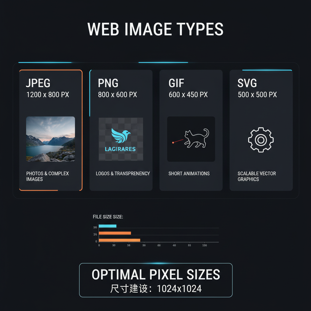
Best File Formats for Different Uses
Choosing the right file format complements proper picture size:
- JPEG: Great for photographs; balanced quality and file size.
- PNG: Ideal for graphics, icons, transparency needs.
- WEBP: Modern format offering superior compression; supported by major browsers.
- TIFF: Preferred for print work; high quality, lossless.
Factor in format when planning picture size—PNG images, for example, are typically larger in file size than JPEGs of the same dimensions.
---
Common Mistakes to Avoid
- Uploading Ultra-High-Resolution Images to Web: Results in slow pages.
- Ignoring Aspect Ratio: Leads to awkward cropping or distortion.
- Not Optimizing for Mobile: Mobile screens require smaller, faster-loading images.
- Skipping Compression: Uncompressed images strain bandwidth.
- Using the Wrong Format: Leads to unnecessary size or quality loss.
---
Quick Reference Chart: Web, Social, and Print
| Use Case | Recommended Size | DPI |
|---|---|---|
| Web Hero Image | 1920 × 1080 px | 72 |
| Facebook Post | 1200 × 630 px | 72 |
| Instagram Square | 1080 × 1080 px | 72 |
| Print Flyer (8.5" × 11") | 2550 × 3300 px | 300 |
| Pinterest Pin | 1000 × 1500 px | 72 |
| Thumbnail | 150 × 150 px | 72 |
---
Summary
A good picture size boosts visual appeal, ensures fast loading, and preserves quality in both digital and print formats. By mastering dimensions, resolution, and aspect ratios along with platform-specific requirements, you can deliver engaging, sharp visuals that enhance your brand. Use the quick reference chart above for fast decisions, and apply compression and format choices strategically.
CTA: Start optimizing your images today and see the immediate difference in quality, performance, and audience engagement.