Best Image Sizes for Websites with Optimization Tips
Learn the best image sizes for different website elements plus optimization tips to boost loading speed, SEO, and user experience.
Best Image Sizes for Websites with Optimization Tips
When it comes to web design, choosing the best image sizes for websites is critical for both performance and aesthetics. A well-sized image enhances the visual appeal while ensuring quick loading times — crucial for SEO rankings, user engagement, and mobile usability. This guide explains what makes a good size image for a website, along with actionable optimization tips to keep your site both beautiful and fast.

---
Why Image Size Matters for Website Performance and User Experience
Images are often the largest assets on a webpage. Oversized files, whether due to large dimensions or heavy file weight, can slow your site significantly. This can cause:
- Higher bounce rates
- Lower search engine rankings
- Poor mobile user experience
- Increased bandwidth usage
On the flip side, images that are too small or low in resolution risk pixelation, which diminishes brand professionalism. Optimizing your images strikes a balance between speed and quality, ultimately improving both UX and SEO.
---
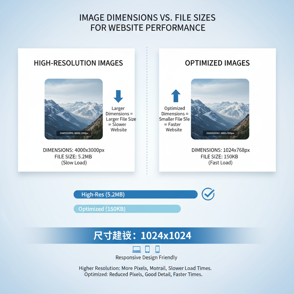
Understanding Image Dimensions vs. File Size
It’s essential to differentiate between an image’s dimensions and its file size:
- Image Dimensions: Width × height in pixels (e.g., 1920×1080), determining visual display size.
- File Size: Data weight of the image file (e.g., 200 KB), affecting load speed.
Pro tip: While large pixel dimensions often mean bigger file sizes, smart optimization can reduce file weight without significantly sacrificing visual quality.
---
Recommended Image Dimensions for Different Website Elements
Different assets on your site require different recommended image sizes for optimal presentation.
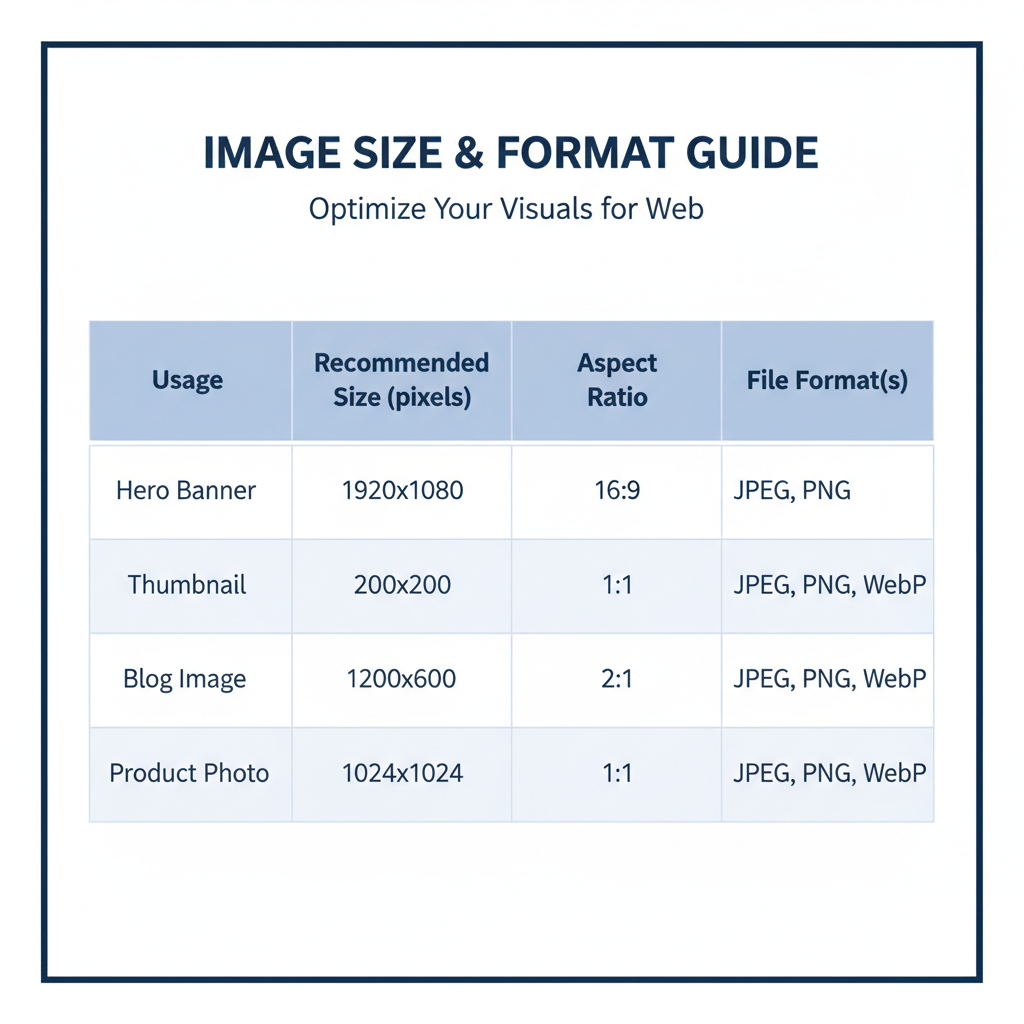
| Website Element | Recommended Dimensions (px) | Notes |
|---|---|---|
| Hero Banner | 1920×1080 | Full-width high-resolution; compress for rapid load. |
| Thumbnail | 150×150 or 300×300 | Square aspect; keep file size under 50 KB. |
| Product Image (e-commerce) | 800×800 or 1000×1000 | Allows zoom without bogging speed. |
| Blog Post Feature Image | 1200×628 | Perfect for social media previews. |
| Gallery / Portfolio | 1500×1000 | Preserves sharpness for showcase. |
---
Choosing the Right Aspect Ratios for Web Consistency
Aspect ratio keeps image proportions consistent across your design:
- 16:9 – Ideal for widescreen heroes, sliders, videos
- 4:3 – Flexible for blogs and standard photos
- 1:1 – Square format for thumbnails and social posts
A consistent aspect ratio prevents layout shifts and unwanted cropping.
---
Common Web Image Formats and When to Use Them
Selecting the right file format impacts both quality and performance:
- JPEG (JPG) – Best for photographs; supports millions of colors.
- PNG – Best transparency support; logos and clean-edged graphics.
- WebP – Modern format: smaller files, good quality, widely supported.
- SVG – Vector-based; perfect for sharp scaling icons/logos.
---
Ideal File Sizes for Faster Load Times
Target these general file size thresholds for optimal performance:
- Desktop: Hero <300 KB, other images <150 KB
- Mobile: Hero <200 KB, other images <100 KB
Adjust according to image purpose, but prioritize speed without visibly hurting quality.
---
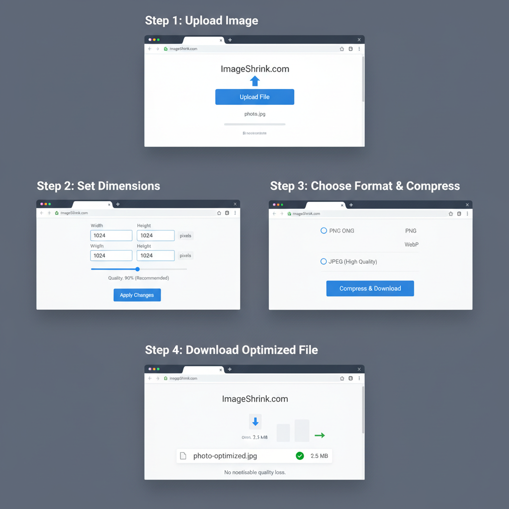
Tools to Resize and Compress Images Without Quality Loss
Use these tools to balance clarity and load speed:
- TinyPNG / TinyJPG – Smart lossy compression.
- ImageOptim – Lossless compression for macOS.
- Squoosh – Supports multiple formats with adjustable compression.
- Adobe Photoshop – Advanced export and sizing controls.
- GIMP – Free, open-source editor.
Command-line sample:
## Compress a JPG with imagemin-cli

npx imagemin input.jpg > output.jpg
---
Responsive Images: Serving the Right Size for Every Device
Responsive images adapt to screens for better performance, especially on mobile.
HTML Example:
This `srcset` and `sizes` syntax ensures browsers only load what’s necessary.
---
Lazy Loading and Caching for Better Speed
Lazy loading delays image loading until users need them:
Caching further boosts repeat visits by storing optimized images in the browser using `Cache-Control` headers.
---
Testing Website Speed After Image Optimization
Test load times after optimization with:
- Google PageSpeed Insights
- GTmetrix
- Pingdom Website Speed Test
An initial page load under 2 seconds with a PageSpeed score above 90 is a strong benchmark.
---
Common Mistakes to Avoid in Image Selection and Preparation
- Uploading huge, uncompressed camera photos
- Using mismatched aspect ratios causing crop issues
- Ignoring high-DPI/retina requirements
- Using PNG for full photos instead of JPEG/WebP
- Failing to test on actual devices
---
Best Practices Summary and Checklist
Follow this quick checklist for the good size image for website performance:
- Set appropriate dimensions for each image’s purpose.
- Keep aspect ratios consistent in similar sections.
- Match format to content type.
- Minimize file size: meet desktop/mobile thresholds.
- Compress without visible quality loss.
- Use responsive image techniques (`srcset`, `sizes`).
- Apply lazy loading and caching.
- Test load speeds regularly.
- Avoid the listed common mistakes.
- Monitor analytics for UX impact.
---
Summary: Choosing the best image sizes for websites is a balance between aesthetics, SEO performance, and load speeds. By understanding dimensions, file size, aspect ratios, and formats — and by applying modern techniques like compression, responsive sizing, lazy loading, and caching — you can deliver fast, beautiful visuals across devices.
Call to Action: Audit your site’s images today, apply these optimizations, and watch your performance scores and user satisfaction rise.