How to Master the Grid in Instagram: Styles, Planning, and Pro Tips
Turn your Instagram grid into a conversion engine. Learn styles, workflows, mixed-format design, tools, analytics, and a 30-day plan to stay cohesive.

A high-performing Instagram grid is more than aesthetics—it’s a structured system that converts profile visitors into followers, subscribers, and customers. This guide clarifies how to choose a layout, build a consistent visual identity, plan and preview posts, design for mixed formats, and measure what matters. You’ll also find workflow tips, a 30-day framework, and practical fixes to maintain cohesion without overcomplicating your feed.
How to Master the Grid in Instagram: Styles, Planning, and Pro Tips
If people discover you from Explore or a Reel, the very next click is usually to your profile. That screen—the grid in Instagram—determines whether they follow, tap your link, or bounce. Your grid is not just a gallery; it’s your visual landing page, your brand’s first impression, and a conversion lever.
This guide walks you through grid styles, identity, sequencing, tools, formats, shoppable setups, analytics that matter, common mistakes, and a plug-and-play 30‑day framework to put it all in motion.
---
What the Grid in Instagram Is and Why It Matters
The Instagram grid is the 3-column mosaic of your posted content. Users take in the pattern before they read captions.
Why it matters:
- First impressions: Cohesive grids communicate professionalism in seconds.
- Brand cohesion: A consistent visual system builds recognition and trust.
- Profile conversion: More cohesion typically correlates with higher follows-per-visit and link clicks.
Think of your grid as a storefront window: clear themes, intentional color, and strong focal posts pull people in.
---
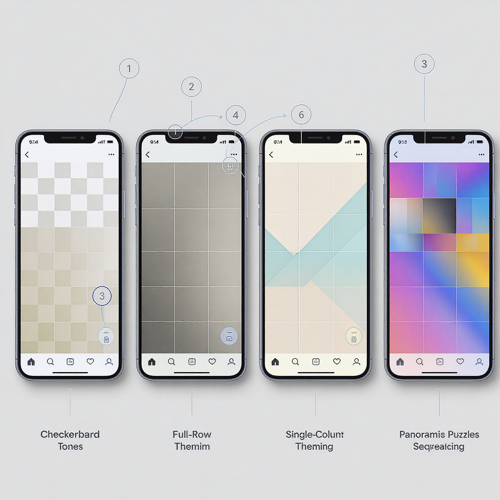
Choosing a Grid Style That Fits Your Brand
There’s no one “best” layout—only the best fit for your message, resources, and cadence. Below is a menu of proven styles.
| Style | Visual Rhythm | Best For | Setup Difficulty | Common Risks | Pro Tip |
|---|---|---|---|---|---|
| Checkerboard | Alternating post types (e.g., photo/quote) | Brands with 2 core pillars | Low | Breaks if you miss a post | Template 2 designs and batch 6–12 at a time |
| Row-Based | Each row = one theme | Campaigns, product drops, weekly series | Medium | Row looks odd until all 3 posts are live | Post in bursts of 3 to complete rows quickly |
| Diagonal | Elements align diagonally across rows | Editorial and design-forward brands | Medium | Precision required; gaps are obvious | Use a planner app with a 3x grid overlay |
| Puzzle | One image split into 3–9 posts | Announcements, campaigns, magazines | High | Over-engineered; looks broken as new posts push it down | Reserve for milestone blocks; avoid as a permanent style |
| Color Blocks | Alternating background colors | Product catalogs, quote graphics | Low | Mismatch in hues across devices | Lock a small palette (3–5 hex codes) and reuse |
| Gradient Themes | Colors shift gradually over time | Artistic, lifestyle, travel accounts | Medium | Hard to maintain with UGC or varied lighting | Plan in 9–12 post color chapters with a defined start/end |
Choosing method:
- Match cadence to style: If you post sporadically, avoid styles that collapse when a slot is missing.
- Don’t let the layout drive the message. Pick a style that serves content goals, not the other way around.
---
Building a Visual Identity
Your grid is your visual system in motion. Nail these fundamentals:
- Color palette: Commit to 3–5 hex codes. Use one dominant and two accents.
- Filters/edits: Standardize contrast, warmth, and grain. Create and reuse a preset (Lightroom, VSCO).
- Typography-in-post: 1–2 typefaces max. Define font sizes for headings, subheads, and captions within graphics.
- Composition rules: Favor consistent subject distance (e.g., mid-shot), stable horizons, and centered focal points for thumbnails.
- Negative space: Give images breathing room. On dark mode profiles, images with white borders can “float”; test both light and dark UI to verify edges.
Reference palette example:
brand_palette:
  dominant: "#0F4C81"   # deep blue
  accent_1: "#F4A261"   # warm sand
  accent_2: "#E76F51"   # coral
  neutral_light: "#F8F8F8"
  neutral_dark: "#101010"
---
Content Pillars and Sequencing
Pillars are recurring categories that reinforce your brand story. Typical trio:
- Educate: How-to, tips, behind-the-scenes.
- Promote: Product features, launches, offers.
- Community: UGC, team spotlights, testimonials.
Plan in blocks of 9–12 posts so your grid holds a narrative even if someone stops scrolling at the first screen.
Sample 3x4 sequence (12 posts):
- Row 1: Educate, Promote, Community
- Row 2: Educate, Community, Promote
- Row 3: Promote, Educate, Community
- Row 4: Anchor (e.g., a monthly recap or hero)
A JSON planning template with coordinates:
{
  "grid_plan_12": [
    { "slot": 1,  "pillar": "Educate",  "format": "Carousel", "note": "Quick tips" },
    { "slot": 2,  "pillar": "Promote",  "format": "Photo",    "note": "Hero product" },
    { "slot": 3,  "pillar": "Community","format": "Reel",     "note": "UGC montage" },
    { "slot": 4,  "pillar": "Educate",  "format": "Reel",     "note": "How-to" },
    { "slot": 5,  "pillar": "Community","format": "Photo",    "note": "Customer story" },
    { "slot": 6,  "pillar": "Promote",  "format": "Carousel", "note": "Feature stack" },
    { "slot": 7,  "pillar": "Promote",  "format": "Reel",     "note": "Teaser" },
    { "slot": 8,  "pillar": "Educate",  "format": "Carousel", "note": "Myth vs fact" },
    { "slot": 9,  "pillar": "Community","format": "Photo",    "note": "Team moment" },
    { "slot": 10, "pillar": "Anchor",   "format": "Photo",    "note": "Monthly cover" },
    { "slot": 11, "pillar": "Educate",  "format": "Carousel", "note": "Checklist" },
    { "slot": 12, "pillar": "Promote",  "format": "Photo",    "note": "Offer/CTA" }
  ]
}
Anchors:
- Recurring formats that appear in a fixed position (e.g., slot 10 is always a “chapter cover” to punctuate your grid in Instagram).
---
Planning Workflows and Tools
Previewing and scheduling keeps your grid cohesive even when life gets busy.
Grid preview apps:
- Planoly, Later, Preview: Let you drag-and-drop, schedule, and simulate the profile view.
Design and templates:
- Canva: Set brand kits for colors and fonts. Create reusable post sets (quote, product, testimonial).
- Figma: Build a 3x grid canvas with components and auto-layout for fast iteration.
Workflow tips:
- Batch creation: Draft 6–12 posts per session, export with consistent filenames (e.g., 2025-09_slot-01.jpg).
- Caption bank: Keep pillar-based caption templates ready to personalize.
- Scheduling: Stagger posts to complete visual rows quickly if you use row-based styles.
---
Designing for Format Mix
You’re likely mixing Reels, photos, and carousels. Make the formats play nicely together on the grid.
Reels covers:
- Always upload a custom cover. Design at 1080x1920 but protect a 1080x1080 center for the grid crop.
- Include a small title block consistently placed, so Reels covers feel like part of your system.
Carousel tiling tricks:
- Seamless carousels: Design a panoramic image and slice it per slide. For the grid, ensure slide 1 looks great as a standalone.
- Puzzle posts: If you split one image across 3–9 grid posts, publish them back-to-back to avoid awkward partials. Use sparingly.
Safe zones and aspect ratios:
- Grid crop: 1:1 (square). Design critical text within a central 900x900 “safe zone” to account for app cropping variances.
- Feed optimal: 4:5 (1080x1350) for maximum feed real estate; ensure the central square looks on-brand when it lands on your grid.
- Reels: 9:16; verify your title/logo sits in an area not covered by UI (bottom captions, top username). Use guides at 130px from top and bottom to avoid UI overlays.
Dark mode check:
- Review your covers against both black and white profile backgrounds. Thin white borders can look uneven on dark UI; consider thicker margins or drop-shadows.
---
Shoppable and Link-in-Bio Grids
If revenue or traffic is a goal, make your grid shoppable and navigable.
Product tagging strategy:
- Tag products on lifestyle images, not just clean product shots—context increases taps.
- Limit tags to 1–3 per post to avoid clutter. Place tags near the product’s focal area.
Storefront layouts:
- Alternate lifestyle and product close-ups to tell a purchase story: need → solution → detail → social proof.
- Use row-based style for collections (Row 1: New arrivals, Row 2: Best sellers, Row 3: UGC looks).
Link-in-bio grids:
- Use tools that mirror your grid in Instagram with clickable tiles (e.g., “link-in-bio” landing pages).
- Place CTA-driven posts in the top-left six slots, where eye-scanning begins.
- Maintain synergy with Highlights: Create Highlights for categories (Shop, How-Tos, Reviews) aligned with your pillars.
CTA placement:
- Include clear, short CTAs in captions and on graphics (2–4 words): “Shop now,” “Get the guide,” “Watch demo.”
---
Analytics That Actually Matter
Beyond likes, track metrics tied to grid performance and conversion.
Key metrics:
- Profile visits: Are grid previews and Reels pushing people to your profile?
- Follows per impression: Captures how convincing your grid is after exposure.
- Saves and shares: Indicators of utility and value, not just aesthetics.
- Tap-throughs from link-in-bio: Measures how well your grid guides action.
Useful formulas:
Follows_per_Impression = New_Follows / Profile_Impressions

Profile_Conversion_Rate = New_Follows / Profile_Visits

Save_Rate = Saves / Impressions

Grid_CTA_Click_Through = Link_in_Bio_Clicks / Profile_Visits
How to A/B test aesthetics:
- Test in blocks: Run Style A for 12 posts, then Style B for 12 posts.
- Keep content mix constant (pillars, formats, posting times) to isolate the visual variable.
- Compare Profile_Conversion_Rate and Save_Rate across blocks. If Style B lifts conversion but reduces saves, consider a hybrid.
Refresh cycles:
- Reassess your palette and templates every 12–24 posts. Introduce subtle evolutions rather than full resets unless rebranding.
---
Common Mistakes and Quick Fixes
- Over-engineered puzzles
- Fix: Reserve puzzles for special campaigns. Use row-based narrative for everyday.
- Inconsistent edits
- Fix: Create a preset and apply globally. Fine-tune exposure per photo, not tone curves.
- Poor cropping
- Fix: Design with the square crop in mind. Use a 1:1 overlay when exporting covers.
- Ignoring dark mode
- Fix: Preview covers on both white and black profile backgrounds. Adjust borders/shadows.
- Low-res assets
- Fix: Export at 1080 px width minimum (square: 1080x1080; 4:5: 1080x1350; 9:16: 1080x1920). Avoid upscaling screenshots.
---
Case Studies and Templates
Standout approaches:
- DTC skincare brand (checkerboard): Alternates ingredient explainers (Educate) with product hero shots (Promote). Result: educational tiles raise saves; hero tiles carry CTAs.
- Boutique coffee roaster (gradient chapters): Moves from earthy browns to vibrant cafe interiors across 12 posts, signaling seasonal rotation.
- Creator-educator (diagonal anchors): Places tip cards diagonally to create a visual “path,” with Reels covers matching the card style.
Creator workflow snapshot:
- Monday: Batch 4 Reels (shoot + cover design).
- Tuesday: Design 3 carousel templates; export all variants.
- Wednesday: Schedule next 7 posts; finalize captions and links.
- Friday: Collect UGC and testimonials for the following week.
30-day plug-and-play grid planning framework:
## 30-day Instagram Grid Plan (5 posts/week; mix: 40% Educate, 40% Promote, 20% Community)

day,slot,pillar,format,theme,asset,cta
1,1,Educate,Carousel,"Top 5 Tips","tips-01.psd","Save this"
2,2,Promote,Photo,"Hero Product A","hero-A.jpg","Shop now"
3,3,Community,Reel,"UGC Montage","ugc-01.mp4","Tag us"
5,4,Educate,Reel,"How-To Basics","howto-01.mp4","Watch"
7,5,Promote,Carousel,"Feature Deep Dive","features-A.psd","Learn more"
8,6,Community,Photo,"Testimonial","review-01.jpg","Read more"
9,7,Educate,Carousel,"Checklist","checklist-01.psd","Save this"
11,8,Promote,Reel,"Teaser","teaser-A.mp4","Shop drop"
12,9,Community,Photo,"Team Spotlight","team-01.jpg","Meet the team"
14,10,Anchor,Photo,"Monthly Cover","cover-09.png","Browse"
16,11,Educate,Carousel,"Myth vs Fact","mythfact-01.psd","Share"
18,12,Promote,Photo,"Bundle Offer","bundle-01.jpg","Get offer"
19,13,Educate,Reel,"Advanced Tip","howto-02.mp4","Watch"
21,14,Promote,Carousel,"Comparison","compare-01.psd","Learn more"
22,15,Community,Photo,"Customer Story","story-01.jpg","Read more"
23,16,Educate,Carousel,"Workflow","workflow-01.psd","Save this"
25,17,Promote,Reel,"Behind the Scenes","bts-01.mp4","Shop now"
26,18,Community,Photo,"UGC Feature","ugc-02.jpg","Tag us"
27,19,Educate,Carousel,"Mini Guide","guide-01.psd","Save"
29,20,Promote,Photo,"Limited Colorway","color-01.jpg","Shop drop"
30,21,Anchor,Photo,"Chapter End","cover-10.png","Browse"
Template pack checklist:
- 2 quote/insight tiles (color-block with typographic hierarchy)
- 2 product hero templates (consistent margins, shadow style)
- 2 testimonial/UGC frames (badge or sticker for social proof)
- 2 carousel shells (cover, content slides, summary slide)
- 1 Reel cover with protected 1:1 safe area
- 1 “chapter cover” to anchor rows or end a block
---
Final Takeaways
- Treat the grid in Instagram like a landing page: design it, measure it, iterate it.
- Pick a grid style that you can sustain with your posting cadence and resources.
- Build a tight visual system (palette, type, templates) and plan in 9–12 post chapters.
- Align formats with the grid via covers and safe zones.
- Track conversion metrics, A/B test aesthetics, and refresh in cycles.
Master the grid and your profile stops being “just a feed” and starts working as a brand engine—24/7.
Summary
The Instagram grid is a conversion-focused canvas that rewards consistency, intention, and measurement. Choose a sustainable style, lock a clear visual system, plan in chapters, and evaluate performance with profile-level metrics. With disciplined workflow and periodic refreshes, your grid will make stronger first impressions and drive more meaningful actions.