Instagram Grid View Tips for a Cohesive Profile Design
Learn how to plan, preview, and design your Instagram grid for cohesive branding, engaging storytelling, and a polished visual profile.

Understanding Grid View on Instagram and Why It Matters for Branding
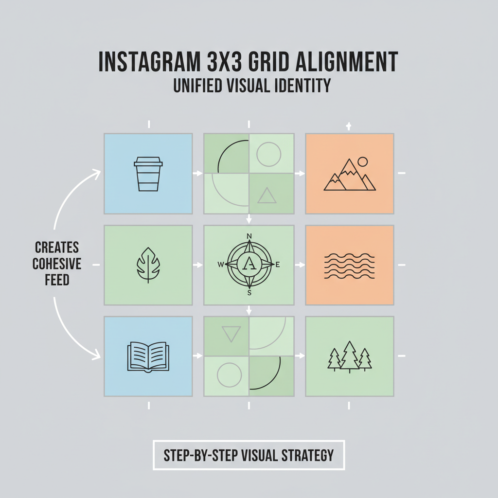
The grid view Instagram layout is the first thing visitors notice when they open your profile — a clean visual arrangement in rows of three that instantly communicates your brand’s personality. Whether you’re a creator, entrepreneur, or influencer, this profile grid acts as a branding canvas, shaping first impressions before a single caption is read.
A thoughtfully curated grid can:
- Foster Immediate Recognition: Consistent colors, filters, or layout patterns make your profile instantly memorable.
- Tell Your Brand Story: Sequence and arrangement can create a thematic journey.
- Signal Professionalism: Cohesive design reflects attention to detail and credibility.
If your aim is to attract followers, build trust, and drive engagement, a meticulously planned Instagram grid view offers a strategic edge in your overall brand presentation.
---
Planning Your Grid Aesthetics Before Posting
A harmonious Instagram presence starts with strategic aesthetic planning. Random post uploads often result in visual clutter, diluting brand identity. Before sharing content, set your visual blueprint.
Core Aesthetic Elements:
- Color Palette: Choose 3–5 complementary colors to repeat across your posts.
- Theme: Opt for minimalism, vibrant tones, retro vibes, or nature-inspired imagery.
- Mood & Tone: Match lighting and ambiance to your brand persona.
Documenting your visual style in a guide ensures consistent execution and helps filter out off-brand imagery.
---
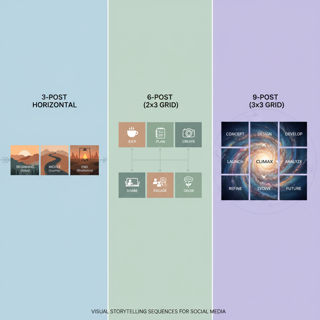
Mastering 3-, 6-, or 9-Post Storytelling Sequences
Leverage Instagram’s fixed 3-column grid for impactful visual storytelling. Sequences boost cohesion and guide viewers through narrative arcs.
| Sequence Size | Use Case | Example |
|---|---|---|
| 3 Posts | Mini campaigns or product launches | Three horizontally linked images |
| 6 Posts | Event highlights or themed mini-series | Two rows showing visual progression |
| 9 Posts | Full theme takeover | Single large image split into nine squares for a dramatic reveal |
Organized sequences encourage scrolling, improve engagement, and create a memorable impact.
---
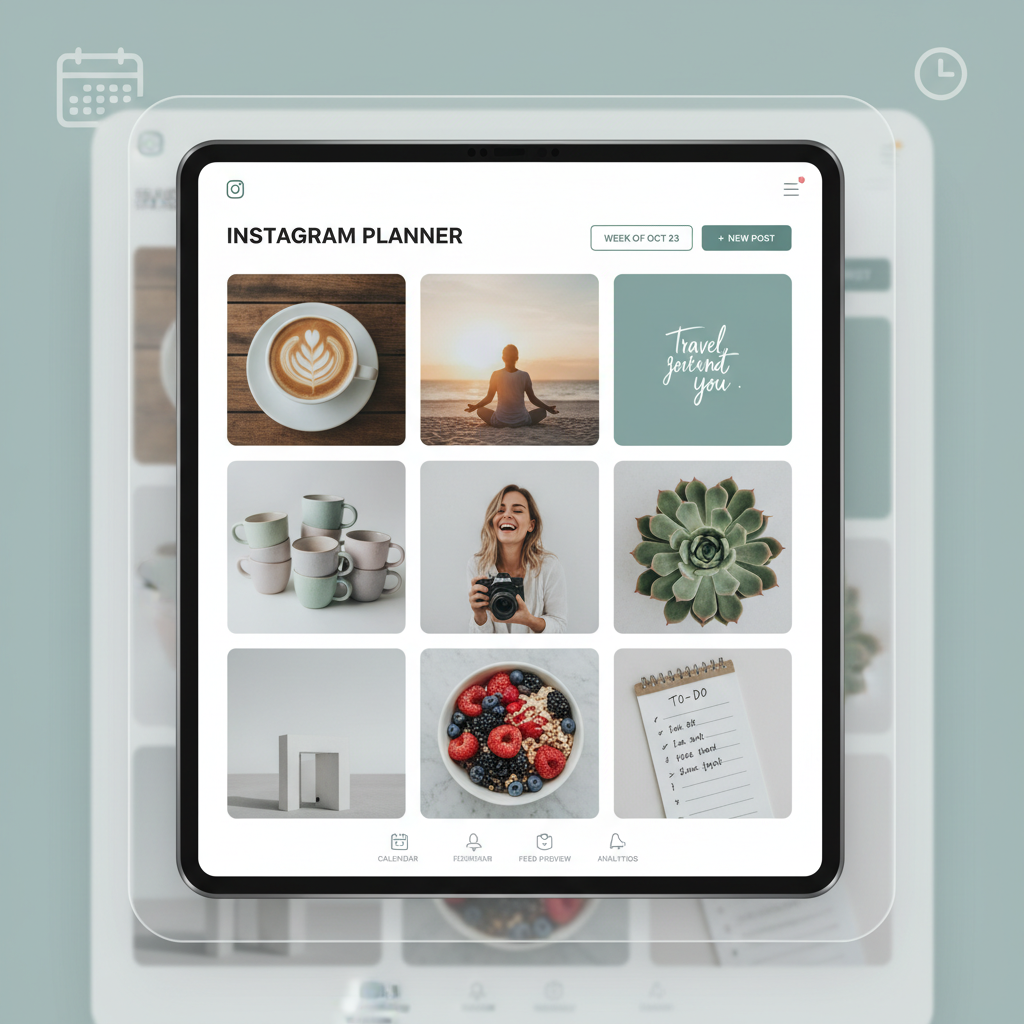
Leveraging Scheduling Tools to Preview and Arrange Your Grid
Before publishing, previewing posts using scheduling apps safeguards your feed from mismatched visuals.
Top grid preview tools:
- Later
- Planoly
- Preview App
- UNUM
These tools provide drag-and-drop interfaces that simulate your Instagram grid, helping to detect potential design conflicts and maintain planned aesthetic sequences.
---
Balancing Individual Post Appeal with Overall Grid Cohesion
While the feed’s collective look matters, each individual post must be captivating on its own.
A strong single post should:
- Draw attention independently in Explore or feed view.
- Deliver a standalone message or story.
- Inspire actions like likes, shares, or comments.
Treat each square like an engaging page in a book — contributing to the storyline but compelling in isolation.
---
Creating Templates for Carousel Posts That Align Visually
Carousel posts can disrupt visual alignment if inconsistency creeps in. To integrate them seamlessly:
- Design a Master Template in tools like Canva or Photoshop.
- Standardize Margins & Frames for a clean first-slide appearance.
- Synchronize Colors and Patterns with your overall feed.
- Maintain Uniform Typography across all carousel slides.
Consistent carousel templates ensure even your multi-slide posts enhance the grid aesthetic.
---
Using Strategic White Space and Symmetry
Effective use of negative space and symmetry increases visual clarity and creates a calming effect.
Key approaches:
- Vertical Symmetry: Keep similar elements aligned in columns.
- Horizontal Symmetry: Balance hues and imagery across rows.
- Full Grid Symmetry: Repeat or mirror design patterns for structure.
White space, whether literal or tonal, makes focal points pop and prevents a cluttered appearance.
---
Optimizing Captions and Hashtags Without Breaking Visual Flow
Captions and hashtags shape engagement but should complement—not disrupt—the visual brand tone.
Best practices:
- Write in a consistent brand voice.
- Keep format uniform (opening hook, then detail).
- Use niche-specific hashtags for discoverability.
- Move hashtags to comments to keep captions visually clean.
A cohesive caption style reinforces the emotional tone your grid imagery sets.
---
Analyzing Competitors’ Grids for Inspiration and Gap Opportunities
Competitive analysis reveals patterns and missed opportunities within your content niche.
Steps to find inspiration:
- Spot top accounts relevant to your brand.
- Screenshot their grid for detailed review.
- Observe recurring colors, themes, and symmetry techniques.
- Identify absent elements or untapped visual angles.
- Adapt ideas creatively without imitation.
This process helps you innovate while staying contextually on-brand.
---
Performing Regular Audits and Archiving Misaligned Posts
Instagram grids require maintenance to reflect evolving brand styles. Conduct audits every 2–3 months.
Audit checklist:
- Review alignment with current brand guide.
- Identify off-style or inconsistent visuals.
- Archive conflicting posts (preserves engagement stats).
Regular upkeep ensures your profile remains cohesive and professional.
---
Summary
The grid view Instagram format transcends mere decoration—it’s a dynamic branding tool. By committing to pre-planned aesthetics, storytelling sequences, consistent templates, and periodic audits, you can craft a feed that attracts, engages, and retains audiences. Approach your grid like a curated portfolio, and watch your brand visibility and follower loyalty rise.
Ready to take your Instagram branding to the next level? Start by assessing your current grid, making a style guide, and plotting your next nine posts with purpose.